Bathroom Color Schemes: Palettes That Transform
Color transforms bathroom mood and feeling. The right palette creates spa-like calm, energizing freshness, or sophisticated drama. Understanding how colors work in bathroom spaces helps you create exactly the atmosphere you want.
White and Neutral Palettes
Timeless white and neutral schemes dominate bathroom design for good reason.
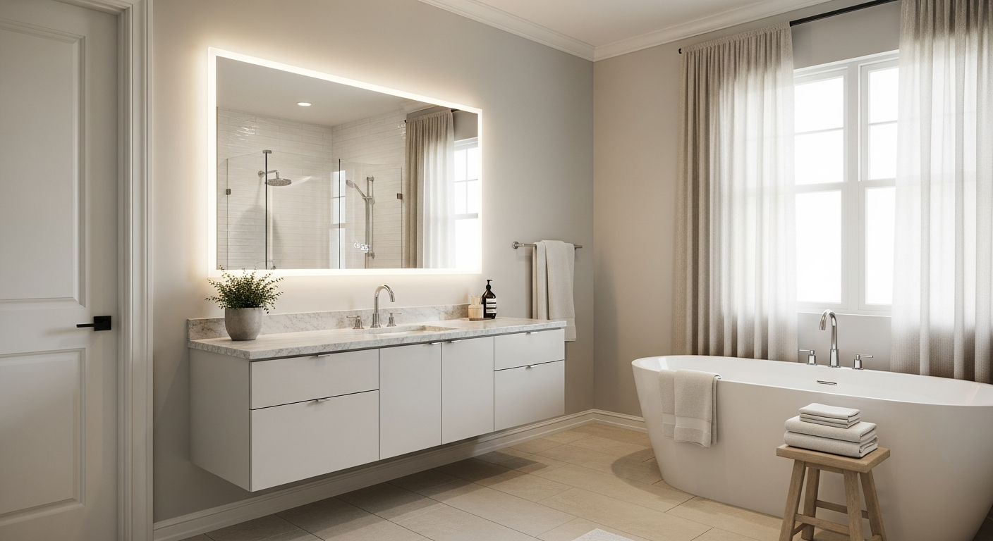
All-white impact: White bathrooms feel clean, bright, and spacious. They photograph beautifully and never date. Layer different white shades and textures for depth.
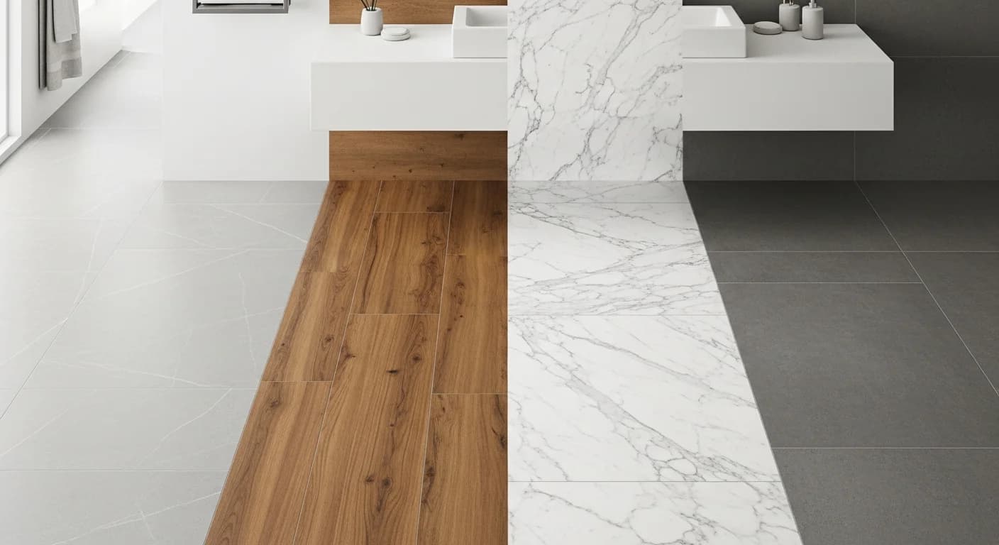
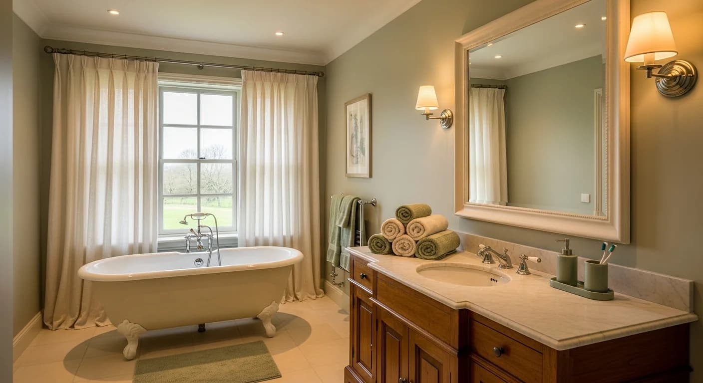
Warm vs. cool whites: Warm whites (cream undertones) feel cozy and traditional. Cool whites (blue or gray undertones) feel crisp and contemporary. Choose based on other fixtures and lighting.
Beige and greige: Gray-beige combinations create warm neutrality without stark white. Popular with natural stone counters and warm metal finishes.
Adding texture: Neutral palettes need textural variety to avoid flatness. Combine smooth tile with textured fabrics, matte and glossy finishes, wood with stone.
Accent pops: White and neutral base allows easy accent changes through towels, accessories, and plants. Update seasonally without renovation.
Blue Tones
Blue evokes water, sky, and calm—natural associations for bathrooms.
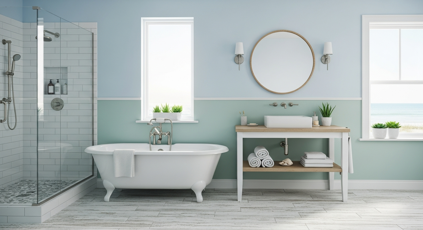
Spa-like pale blues: Soft blues create tranquil, water-inspired atmospheres. Perfect for bathrooms designed as retreats. Pair with white trim and natural materials.
Navy drama: Deep navy makes sophisticated statements. Use on vanities, accent walls, or tile. Balance with white fixtures and metallic accents to prevent heaviness.
Coastal vibes: Blue-and-white combinations evoke coastal living. Add natural textures—rope, woven baskets, driftwood—to complete the look.
Teal and turquoise: Blue-green tones feel vibrant and energizing. Perfect for bathrooms where you want morning energy rather than evening calm.
Blue tile impact: Blue tile on floors, walls, or in showers creates permanent color commitment. Consider painted walls or accessories for easier future changes.
Green Palettes
Green connects bathrooms to nature, creating refreshing, organic atmospheres.
Sage serenity: Soft sage green feels calm and sophisticated. Currently very popular for cabinets, walls, and tile. Pairs beautifully with white, brass, and wood.
Forest drama: Deep hunter or forest green creates moody, dramatic spaces. Stunning in powder rooms where bold choices feel appropriate.
Mint freshness: Lighter mint greens feel clean and energizing. Popular in retro-inspired bathrooms or paired with black-and-white tile.
Nature connection: Green walls or tile combined with plants create biophilic designs that improve wellbeing. Bathrooms become indoor gardens.
Green with gold: Green and brass or gold is a timeless, elegant combination. The warm metal elevates green from earthy to sophisticated.
Bold and Dark Schemes
Dark, dramatic bathrooms make powerful statements when executed well.
Black bathrooms: All-black or nearly-black bathrooms feel ultra-contemporary and dramatic. Requires excellent lighting and reflective surfaces to prevent cave-like feel.
Dark tile: Black, charcoal, or dark stone tile creates grounding effect. Often used on floors with lighter walls, or vice versa for contrast.
Moody walls: Deep charcoal, midnight blue, or forest green paint creates intimate, cocooning atmosphere. Works particularly well in windowless bathrooms.
Lighting requirements: Dark colors absorb light. Layer fixtures generously—vanity lights, ceiling fixtures, accent lighting. Natural light is extremely valuable in dark schemes.
Balance with white: White fixtures—toilet, tub, sink—provide necessary contrast in dark bathrooms. The interplay between dark and light creates visual interest.
Warm Tone Palettes
Warm colors create cozy, inviting bathrooms that feel welcoming.
Terracotta: Earthy terracotta tiles or paint bring Mediterranean warmth. Pairs with cream, white, and natural materials.
Blush pink: Soft pink feels fresh and flattering—skin looks great in pink-reflected light. Works in both feminine and sophisticated neutral schemes.
Sand and taupe: Warm neutrals feel cozy without committing to specific colors. Ground with deeper wood tones and metallic accents.
Warm metallics: Brass, gold, and copper fixtures add warmth to any palette. Particularly effective with cooler tile choices.
Natural wood: Warm wood vanities, shelving, or accents add organic warmth. Balance cooler tile and stone with wood elements.
Two-Tone Approaches
Dividing walls with two colors adds visual interest and architectural detail.
Upper/lower contrast: Different colors above and below chair rail or wainscoting height. Traditionally darker below, lighter above—but rules are made to be broken.
Wainscoting effects: Tile or beadboard on lower walls with painted upper walls creates classic look. Practical protection with design appeal.
Feature walls: One wall in contrasting color—often behind vanity or tub—creates focal point without overwhelming.
Color blocking: Bold geometric color divisions create contemporary, artistic effects. Requires confident execution.
Testing Colors
Bathroom lighting significantly affects color perception. Test before committing.
Lighting impact: Colors look different under incandescent, LED, and natural light. View samples at various times of day in your actual bathroom.
Large samples: Paint large swatches—at least 12 inches square—and observe over several days. Small chips are insufficient for color decisions.
Adjacent colors: Consider how paint colors look next to your chosen tile, counters, and fixtures. Colors influence each other.
Visualize Color Schemes
Committing to bathroom colors can feel risky—repainting isn't fun, and tile is permanent. Seeing palettes in your actual space before purchasing prevents regrets.
HanoDecor's Bathroom Visualizer lets you test color schemes on photos of your bathroom. Preview paint colors, evaluate tile options, and see how palettes work with your fixtures—choose your bathroom colors with confidence.
Bathroom Color Schemes FAQs
Written by
Michael Torres
Bathroom and Kitchen Design Specialist with 15 years of remodeling experience. NKBA-certified designer focused on functional layouts, fixture selection, and spa-inspired wellness spaces.