Living Room Color Schemes: Palettes That Work
Color is the fastest way to transform a living room—and the easiest place to make mistakes. The right palette creates harmony and sets your desired mood. The wrong one creates visual chaos or an atmosphere that doesn't match your lifestyle. Here's how to choose color schemes that work beautifully.
Start with Neutrals: The Safe Foundation
Neutral color schemes never go out of style, work with any furniture, and adapt easily as your taste evolves. They're not boring—they're versatile.
Warm white: Pure white can feel stark; warm whites with cream, ivory, or soft yellow undertones feel welcoming. Benjamin Moore White Dove, Sherwin-Williams Alabaster, and similar shades are perennially popular for good reason.
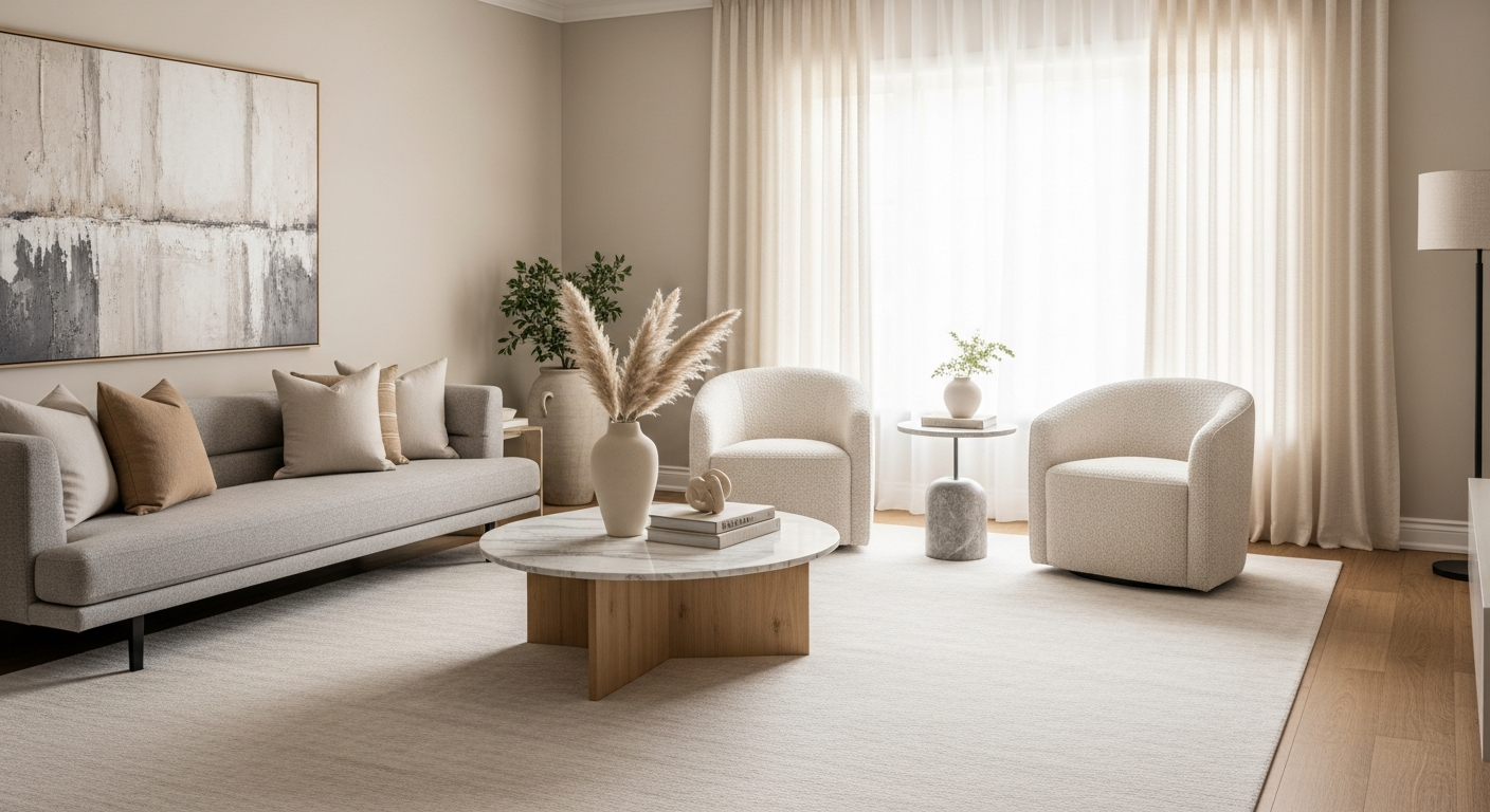
Greige (gray-beige): The hybrid of gray and beige offers gray's sophistication with beige's warmth. These versatile neutrals work with virtually any accent color and furniture style.
Warm gray: Gray with warm undertones (pink, yellow, or brown rather than blue) creates contemporary calm without coldness.
How to make neutrals interesting: Layer different neutral tones, add texture through materials and textiles, and use black accents for punctuation. Neutral doesn't mean monochrome.
Warm Color Palettes: Welcoming Energy
Warm colors—reds, oranges, yellows, and warm earth tones—create energetic, welcoming spaces that encourage conversation and activity.
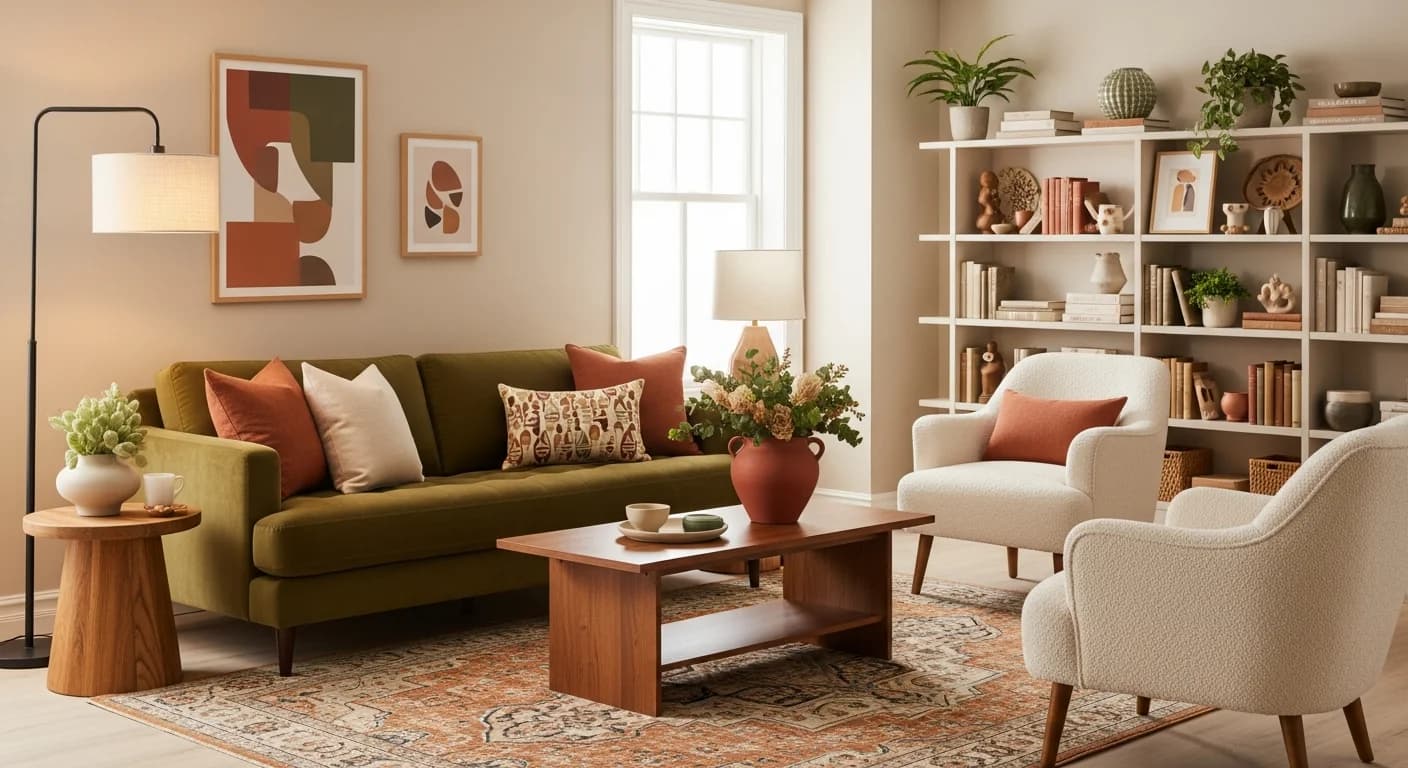
Terracotta and cream: Earth-inspired terracotta with creamy neutrals feels grounded and contemporary. Add natural materials like rattan and wood for cohesion.
Golden yellow and white: Sunny yellows create cheerful, optimistic spaces. Balance bright yellows with ample white and natural textures to prevent overwhelm.
Rust and olive: This earthy combination feels sophisticated and nature-connected. Add cream or tan as a neutral bridge between the two.
Warm color cautions: Warm colors advance visually, potentially making rooms feel smaller. Use them thoughtfully in compact spaces—perhaps as accents rather than wall colors.
Cool Color Palettes: Calm Sophistication
Cool colors—blues, greens, and purples—recede visually, creating calm, spacious-feeling rooms perfect for relaxation.
Blue and white: This classic combination works from coastal casual to formal traditional. Navy and white feels preppy; soft blue and white feels coastal; gray-blue and white feels modern.
Sage green and cream: Nature-inspired sage creates serene spaces that feel fresh without being cold. Add warm wood tones for balance.
Seafoam and sand: Beach-inspired palettes bring vacation vibes home. Keep other elements natural and minimal for cohesion.
Cool color cautions: Cool colors can feel cold, especially in north-facing rooms with limited natural light. Balance with warm wood tones, warm metals like brass, and plenty of texture.
Bold and Dramatic Palettes
For those who want their living room to make a statement, bold colors deliver impact and personality.
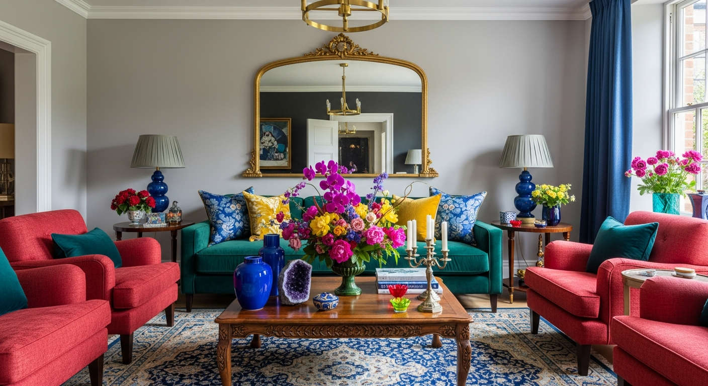
Deep navy: Navy walls feel sophisticated and enveloping without the heaviness of black. Pair with white trim and metallic accents for drama.
Emerald green: Rich, jewel-toned green creates luxurious, nature-connected spaces. Balance with neutral furnishings and natural materials.
Charcoal and white: High contrast charcoal walls with white trim and ceiling create dramatic modern spaces. Add warmth through wood and textiles.
Black accent walls: A single black wall creates focal point drama without overwhelming. Pair with lighter walls and ample lighting.
The 60-30-10 Rule
This design principle creates balanced, cohesive color schemes that feel intentional rather than random.
60% dominant color: This is usually your wall color or largest furniture piece. It sets the room's overall tone and should be fairly neutral or soft.
30% secondary color: Upholstery, curtains, rugs, and accent chairs often carry this color. It complements the dominant color while adding interest.
10% accent color: Throw pillows, artwork, decorative objects, and small accessories provide pops of your boldest color. This small percentage prevents overwhelming while adding personality.
Example: Warm gray walls (60%) + cream and tan furnishings (30%) + rust/terracotta accents (10%) = balanced, sophisticated warmth.
How Light Affects Color
The same color looks dramatically different depending on lighting—natural and artificial. Consider these factors before finalizing palettes.
Room orientation: North-facing rooms receive cool, indirect light that makes colors appear cooler. South-facing rooms get warm, direct light that warms colors. East rooms have warm morning light, cool afternoon light. West rooms reverse this.
Test in your space: Never choose colors based on store samples alone. Colors look completely different in your room with your lighting. Always test large samples on your actual walls.
Artificial lighting matters: Warm bulbs (2700K) bring out warm tones; cool bulbs (4000K+) bring out cool tones. Your evening lighting affects how colors appear during prime living room hours.
Visualize Before Painting
Color mistakes are expensive—both in paint costs and the frustration of living with wrong choices. Before committing to any color scheme, see how it will look in your actual space.
HanoDecor's AI Room Painter lets you test unlimited color combinations on photos of your living room. Try warm neutrals, compare blues and greens, or experiment with bold statements—all before buying paint. Find your perfect palette with confidence.
Living Room Color Schemes FAQs
Written by
Sarah Mitchell
Sarah is a certified interior designer (CID) with experience designing residential and commercial spaces across three continents. She curates our design style library and ensures all AI-generated designs follow established design principles.