How to Choose Paint Colors Using Color Psychology
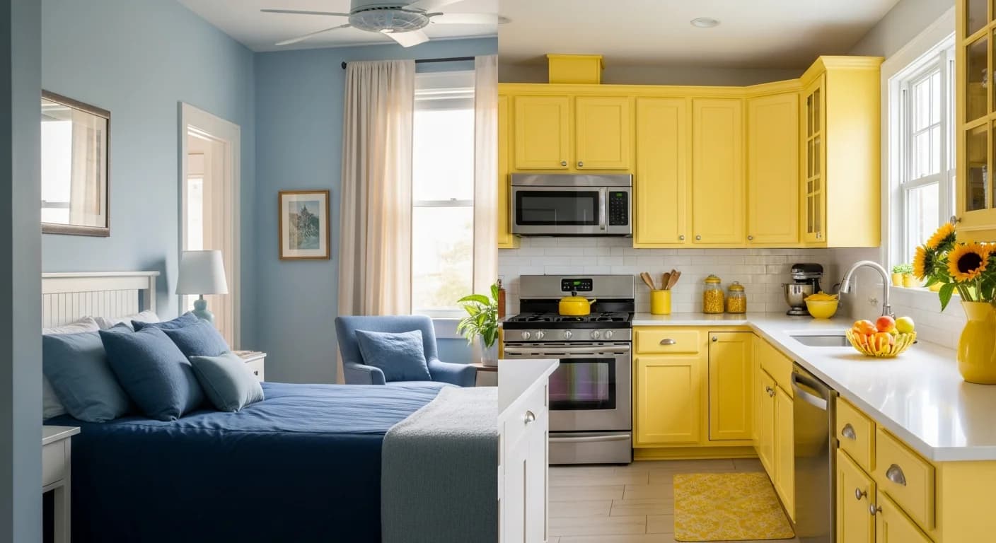
Walk into a spa and you immediately feel calm. Enter a fast-food restaurant and you feel energized (and maybe hungry). This isn't coincidence—it's color psychology at work. Understanding how colors affect mood and behavior can help you choose paint colors that create exactly the atmosphere you want in each room of your home.
The Science Behind Color Psychology
Color psychology studies how colors influence human emotion and behavior. While some responses to color are cultural (white represents purity in Western cultures but mourning in some Eastern ones), many reactions are universal and rooted in our evolutionary history.
Blue, for instance, is associated with sky and water—elements that historically signified safety and resources. Our brains are wired to find blue calming. Red, the color of blood and fire, triggers alertness and increased heart rate. These aren't just preferences; they're physiological responses.
When you understand these connections, you can strategically use color to support the function of each room. A home office might benefit from focus-enhancing colors, while a bedroom needs calming tones for better sleep.
Blue: Calm, Focus, and Productivity
Blue is the world's favorite color, and for good reason. It lowers blood pressure and heart rate, creating physical relaxation. Lighter blues evoke sky and water, promoting serenity. Deeper blues feel sophisticated and can actually enhance productivity.
Best for: Bedrooms (promotes sleep), home offices (enhances focus), bathrooms (spa-like calm), living rooms (relaxed socializing)
Caution: Very dark blues in rooms with little natural light can feel cold or depressing. In dining rooms, blue can suppress appetite (rarely used in restaurants for this reason).
Shades to try: Powder blue for airy serenity, navy for sophistication, teal for energy with calm, periwinkle for creativity.
Green: Balance, Nature, and Renewal
Green occupies the center of the color spectrum, making it the easiest color for the eye to process. It requires no adjustment from the eye, which is why it feels restful. Associated with nature, growth, and renewal, green brings the outdoors inside.
Best for: Any room, truly. Home offices (reduces eye strain), bedrooms (restful), kitchens (fresh, healthy associations), living rooms (balanced energy)
Caution: Avoid institutional greens (too clinical) or neon greens (overstimulating). Olive greens can feel dated if not balanced with modern furnishings.
Shades to try: Sage for soft sophistication, mint for freshness, forest green for drama, olive for warmth.
Yellow: Energy, Optimism, and Warmth
Yellow is the color of sunshine and immediately evokes happiness and energy. It's the first color the eye notices, which is why it's used for caution signs. In homes, yellow stimulates mental activity and creativity.
Best for: Kitchens (energizing morning spaces), home offices (creativity boost), entryways (welcoming first impression), breakfast nooks
Caution: Too much bright yellow can cause anxiety and agitation. It's difficult to read against (avoid for rooms where you'll read or work extensively). Babies cry more in yellow rooms—use sparingly in nurseries.
Shades to try: Soft butter yellow for warmth, mustard for sophistication, pale yellow for brightness without overwhelm.
Red: Passion, Energy, and Appetite
Red is the most emotionally intense color. It stimulates adrenaline and increases heart rate, creating excitement and passion. Red also stimulates appetite, which is why it's ubiquitous in restaurant design.
Best for: Dining rooms (stimulates conversation and appetite), accent walls (adds drama), entryways (bold first impression)
Caution: Red can increase blood pressure and respiration. Avoid in bedrooms where you want to wind down. Too much red can feel overwhelming or aggressive.
Shades to try: Brick red for warmth, burgundy for sophistication, coral for softer energy, terracotta for earthiness.
Purple: Creativity, Luxury, and Spirituality
Historically associated with royalty (purple dye was rare and expensive), purple still evokes luxury and sophistication. Lighter purples like lavender are calming, while deeper purples stimulate creativity and mystery.
Best for: Bedrooms (lighter shades for calm), creative spaces (deeper shades), meditation rooms, luxury accent walls
Caution: Purple can feel heavy in large doses. Very bright purples may feel juvenile or overwhelming. Balance with neutrals.
Shades to try: Lavender for serenity, lilac for softness, eggplant for drama, mauve for sophistication.
Neutrals: Flexibility and Sophistication
Whites, grays, beiges, and tans form the foundation of most color schemes. They're not psychologically inert—they set the stage for other colors and furnishings while providing their own subtle effects.
White: Creates openness and clarity but can feel sterile. Warm whites feel welcoming; cool whites feel modern.
Gray: Sophisticated and calming but can feel cold or depressing without warm accents. Best with natural light.
Beige and Tan: Warm, grounding, and universally appealing. Can feel boring without texture and accent colors.
Black: Bold and dramatic as an accent. Grounding and sophisticated in small doses. Overwhelming as a primary color.
Room-by-Room Recommendations
Bedroom: Cool blues, soft greens, or muted purples promote relaxation and better sleep. Avoid stimulating reds and bright yellows.
Living Room: Warm neutrals, soft blues, or sage greens create welcoming spaces for varied activities. Add personality through accent colors.
Kitchen: Warm whites, soft yellows, or light greens feel fresh and energizing. Red accents can stimulate appetite.
Home Office: Blues and greens enhance focus. Avoid reds (too stimulating) and warm grays (potentially depressing).
Bathroom: Blues, greens, and white create spa-like calm. Warm neutrals feel cozy in powder rooms.
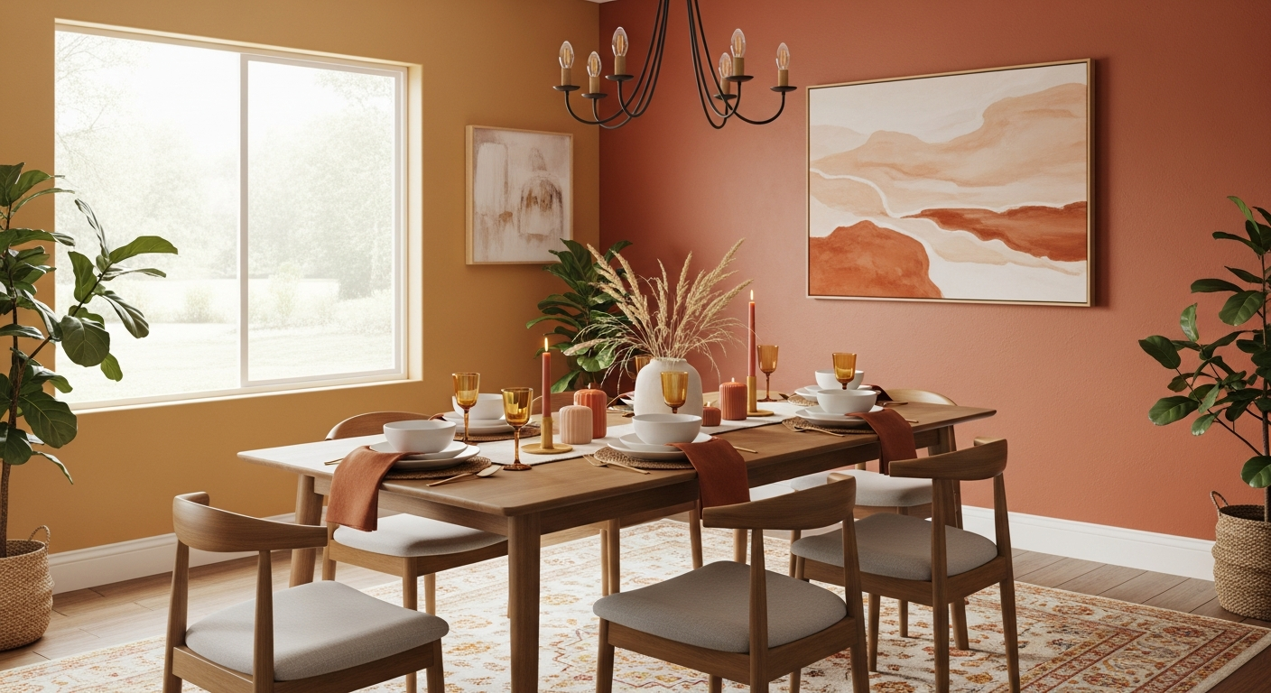
Dining Room: Warm tones like terracotta, deep red, or warm gray encourage lingering and conversation.
Apply Color Psychology with Confidence
Understanding color psychology is just the beginning—you need to see how colors will actually look in your specific rooms with your lighting and furnishings. What looks calming in one space might feel cold in another.
HanoDecor's AI Room Painter lets you experiment with psychologically-informed color choices on your actual walls. Test that calming blue in your bedroom or that energizing yellow in your kitchen—see exactly how it will look before committing. Explore our spa-inspired and luxury design ideas for more color inspiration.
How to Choose Paint Colors Using Color Psychology FAQs
Written by
Sarah Chen
Senior Color Consultant with 12 years of residential exterior design experience. Specializes in architectural color theory, paint technology, and curb appeal optimization.