Exterior House Color Palette Generator: Curb Appeal Combinations
Quick Summary
A comprehensive guide to generating exterior house color palettes for curb appeal. Covers the 3-color exterior formula (body, trim, accent), architectural style matching, coordination with fixed elements like roof and brick, HOA considerations, and 8 proven exterior color combinations with siding, trim, door, and shutter recommendations.
An exterior house color palette generator is one of the most valuable tools available to homeowners planning a paint refresh or full exterior renovation. Unlike interior painting where mistakes are hidden behind closed doors, exterior color choices are visible to the entire neighborhood every single day. The stakes are higher, the fixed elements are harder to change, and the color interactions with natural daylight, landscaping, and neighboring homes add complexity that interior palettes never face.
This guide covers everything you need to generate the perfect exterior house color palette for maximum curb appeal. You will learn the three-color exterior formula that professional painters use, how to match your palette to your home's architectural style, techniques for coordinating with fixed elements like roofing, brick, and stone, regional and HOA color considerations, and eight proven exterior color combinations that consistently deliver stunning results. Each combination includes specific recommendations for siding, trim, front door, and accent colors.
Why Exterior Color Palettes Need Special Attention
Exterior colors behave differently than interior colors for several important reasons. First, natural sunlight is far more intense than any indoor lighting, which washes out and lightens most colors by one to two shades compared to how they appear on a paint swatch. A medium gray that looks perfect on a two-inch chip will appear significantly lighter spread across 2,000 square feet of siding under direct sunlight. Always choose exterior colors one to two shades darker than what you think you want.
Second, exterior palettes must coordinate with unchangeable fixed elements. Your roof color, brick or stone facades, concrete walkways, and mature landscaping are all permanent features that constrain your palette choices. A palette generator designed for exteriors factors these fixed elements into its recommendations, ensuring that your paint colors complement rather than clash with materials you cannot easily change.
Third, exterior colors are seen from a distance and at multiple angles throughout the day. The same siding color appears differently on the shaded north side of your home versus the sun-drenched south side. Morning light casts warm golden tones while afternoon light is cooler and more neutral. These variations mean that your exterior palette needs to look good under a wider range of lighting conditions than any interior room palette.
The 3-Color Exterior Formula: Body, Trim, and Accent
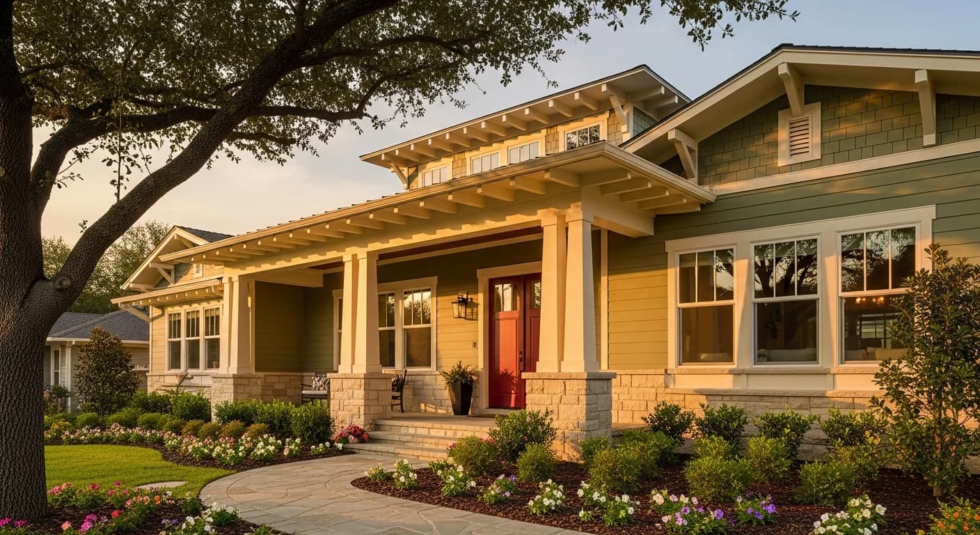
Professional exterior designers use a simple three-color formula that works for every architectural style: body color, trim color, and accent color. The body color covers siding, stucco, or the primary exterior surface and accounts for approximately 70 percent of the visible exterior. The trim color appears on window frames, door frames, fascia boards, soffits, and corner boards at roughly 25 percent. The accent color covers the front door, shutters, and any decorative details at about 5 percent.
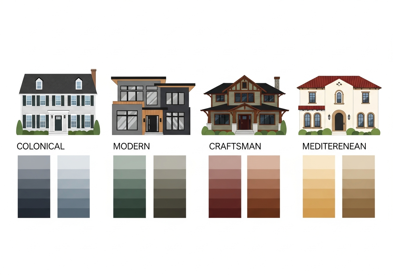
The body and trim should have enough contrast to define architectural details. If your body color is a medium tone, choose a light trim color like white or cream. If your body is very dark like charcoal or navy, white trim creates dramatic contrast. If your body is very light, consider a slightly darker trim in the same color family for a subtle tonal approach. The accent color is your opportunity to make a statement — deep red, rich navy, sage green, sunny yellow, or matte black front doors all create memorable curb appeal against the right body and trim combination.
Some homes add a fourth color for shutters that differs from the front door accent. This works best on homes with symmetrical facades where the shutters frame windows on both sides. The shutter color should complement both the body and trim colors without competing with the front door for attention. A common approach is using a darker shade of the body color for shutters and a contrasting bold color for the front door.
Matching Your Palette to Architectural Style
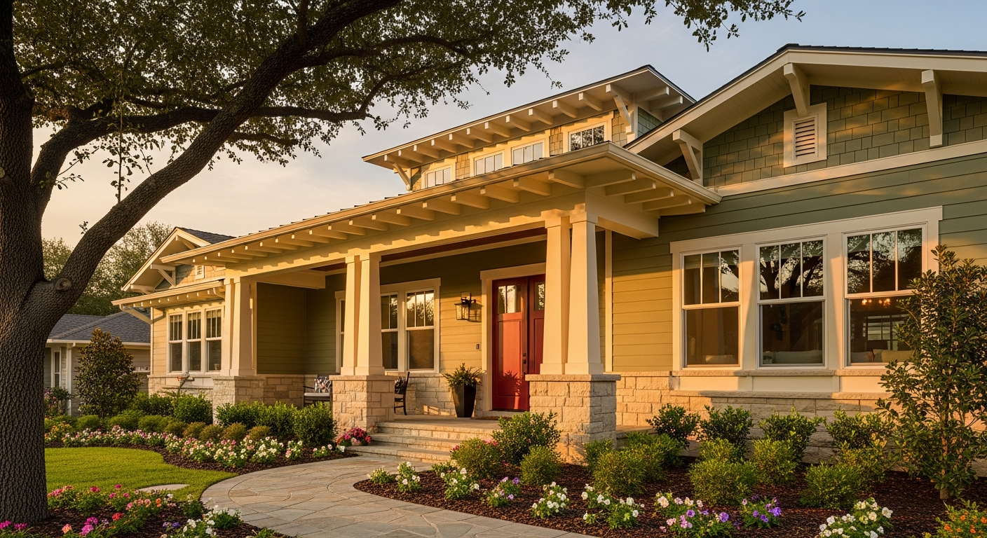
Every architectural style has a color palette tradition that enhances its design features. Colonial homes look best in historically inspired palettes: white, pale yellow, or slate blue body colors with white trim and dark green or black shutters. Craftsman bungalows favor earthy, natural palettes with warm browns, olive greens, and burnt orange accents that complement their natural wood and stone details.
Modern farmhouse exteriors typically combine a white or light gray body with black window frames, a black or dark charcoal front door, and natural wood accents like cedar beam details or a wood-clad gable. Mid-century modern homes embrace bold, unexpected color choices: mustard yellow, teal, coral, or olive paired with natural wood siding and contrasting geometric trim colors.
Mediterranean and Spanish Colonial homes work best with warm stucco tones — terracotta, warm white, sandy beige — paired with wrought-iron details and colorful tile accents. Tudor homes use the half-timbered structural framing as a design element, with dark brown or black timber against white or cream stucco infill panels. Matching your palette to your architectural style enhances the home's character rather than fighting against it.
Coordinating with Fixed Elements (Roof, Brick, Stone)
Your roof is the single largest color block on your home's exterior and the element most homeowners forget to consider when choosing paint colors. A warm-toned brown or terra cotta roof requires warm-undertone siding colors to avoid clashing. A cool gray or blue-black roof works with both warm and cool siding palettes. A green or mossy roof needs careful coordination — sage, cream, or warm gray siding complements it while cool blue or lavender siding conflicts.
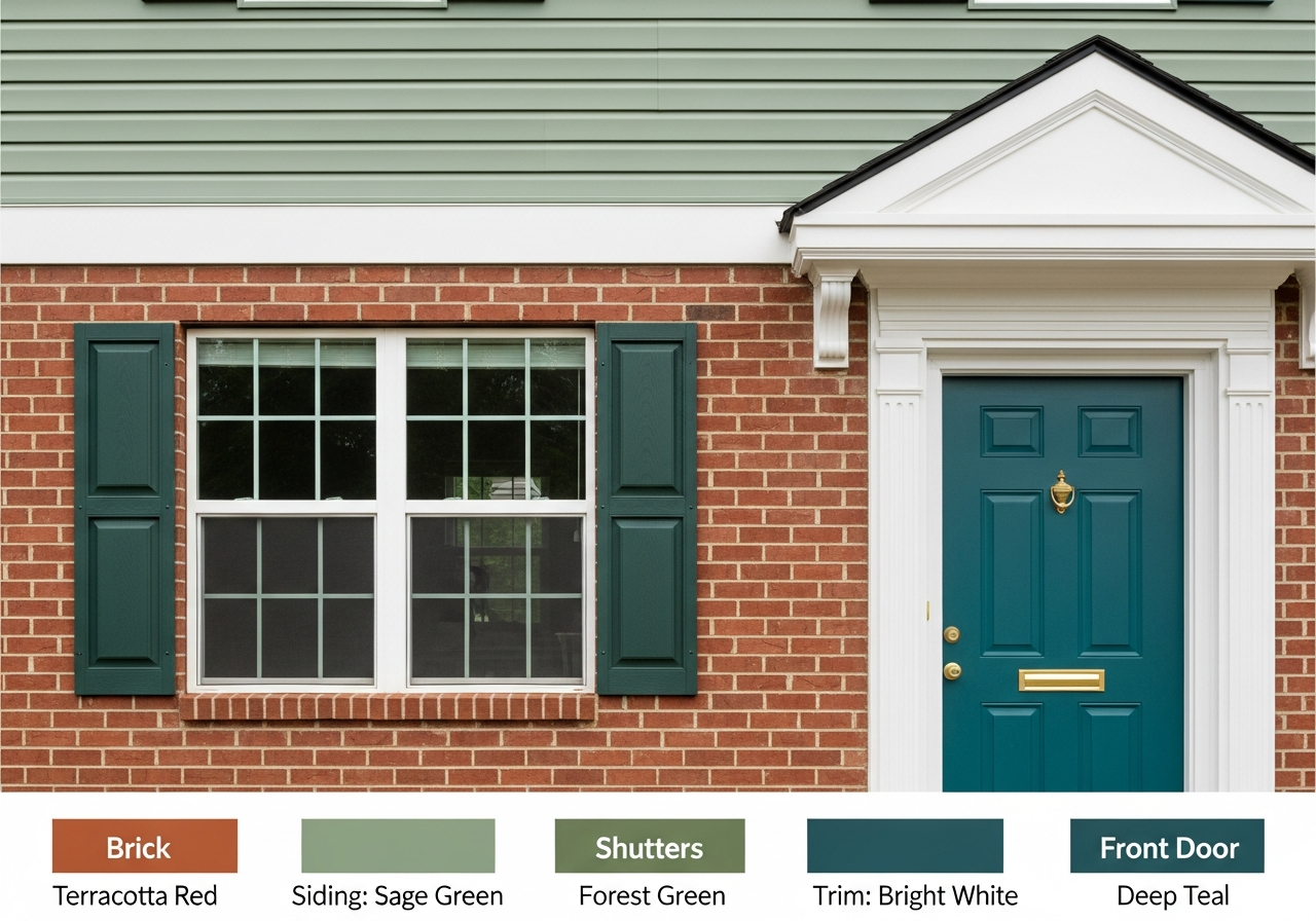
Brick and stone facades present similar coordination challenges. Red brick has strong warm orange-red undertones that conflict with cool-toned grays and blues. Pair red brick with warm whites, sage greens, warm grays with yellow undertones, or dark charcoal that provides contrast without clashing. Gray or limestone brick offers more palette flexibility and works well with both warm and cool siding options. Upload a photo of your home's fixed elements to the AI House Painter to see how different siding colors interact with your existing brick, stone, and roof.
Regional and HOA Color Considerations
Regional climate and architectural traditions influence exterior color choices. Homes in the sunny South and Southwest often use lighter, more reflective colors that reduce heat absorption and air conditioning costs. Desert homes embrace warm earth tones that blend with the natural landscape. Pacific Northwest homes tend toward deeper, richer colors — forest green, navy, slate — that stand up to the region's gray skies and lush green surroundings without looking washed out.
Homeowner association rules add another constraint that varies by community. Many HOAs maintain an approved color list that limits your options to a pre-selected palette. Before investing time in palette generation, check your HOA covenants for color restrictions. Some associations require color samples to be approved by a review board before painting begins. Even within restrictive HOA guidelines, a skilled palette generator can find combinations that satisfy the rules while expressing your personal style.
Neighborhood context matters beyond formal HOA rules. Your home's exterior is part of a streetscape, and colors that look beautiful in isolation may clash with neighboring homes. Stand at the street and photograph your home alongside its neighbors. Use this context photo when generating palettes to ensure your color choices complement rather than fight the surrounding visual environment.
8 Proven Exterior Color Palette Combinations
These eight exterior color combinations are tested favorites among professional painters and home designers. Each includes body, trim, and accent recommendations with the flexibility to adapt to your specific architectural style and fixed elements.
| Palette | Body | Trim | Accent Door | Best For |
|---|---|---|---|---|
| Classic Navy & White | Deep navy blue | Crisp white | Red or brass | Colonial, Cape Cod |
| Modern Farmhouse | White or pale gray | Black | Matte black or wood | Farmhouse, Modern |
| Sage & Cream | Soft sage green | Warm cream | Charcoal or plum | Craftsman, Cottage |
| Charcoal Monochrome | Dark charcoal | Lighter gray | Bright teal or yellow | Contemporary, Modern |
| Warm Earth Tones | Warm taupe or clay | Ivory | Terracotta or rust | Mediterranean, Southwest |
| Coastal Blue & White | Soft blue-gray | Bright white | Coral or seafoam | Coastal, Beach |
| Forest & Natural | Deep forest green | Warm white | Burgundy or gold | Tudor, Craftsman |
| Black & Natural Wood | Matte black | Natural cedar | Brass hardware | Modern, Scandinavian |
These combinations serve as starting points. Adjust body shade depth, trim warmth, and accent intensity based on your home's orientation, fixed elements, and regional climate. Use a palette generator to fine-tune each combination for your specific situation. For whole-house palette strategies that coordinate interior and exterior, see our whole house color palette guide.
Related Articles
Continue planning your exterior palette with these related guides: Whole House Color Palette covers connecting your exterior choices to your interior scheme. Benjamin Moore Color Palette Generator explores brand-specific digital paint selection tools. How to Remodel a House provides construction planning for exterior renovations. Browse our design ideas for exterior inspiration.
Frequently Asked Questions
How do I choose an exterior color that works with my roof?
Match the undertone temperature of your siding color to your roof color. Warm-toned roofs in brown, tan, or terracotta need warm-undertone siding colors. Cool-toned roofs in gray, slate, or blue-black work with both warm and cool siding. Upload a photo of your home to an AI exterior visualizer to test color combinations against your actual roof before committing to paint.
What exterior colors increase home value?
According to multiple real estate studies, homes painted in classic color combinations — white body with dark trim, gray body with white trim, or blue-gray body with white trim — sell faster and for higher prices than homes in bold or unconventional colors. Dark charcoal and navy exterior colors are increasingly popular and perform well in resale markets. Avoid trendy colors that may date quickly; instead, choose timeless combinations with strong contrast between body and trim.
Should I paint my front door a different color?
Yes, a contrasting front door color is one of the most impactful and affordable curb appeal upgrades. The front door accent color should contrast with both the body and trim colors to create a focal point that draws the eye to the entry. Popular front door colors include deep red, rich navy, sage green, bright yellow, and matte black. The right choice depends on your body and trim combination and the architectural style of your home.
How many colors should an exterior palette have?
Most exterior palettes use three to four colors: body, trim, accent door, and optionally a fourth color for shutters or decorative details. More than four colors on an exterior can look busy and disorganized. If your home has multiple material types — siding plus brick plus stone — count each material as a color in your palette and limit your paint choices to keep the total under five visible exterior colors.
Can I use dark colors on a small house?
Dark colors can work beautifully on small homes when paired with lighter trim that defines edges and creates the perception of architectural detail. A dark charcoal or navy home with crisp white window frames, door trim, and corner boards appears well-defined and intentional. The key is ensuring enough contrast between body and trim so the home's proportions remain visually clear. Light-colored trim prevents dark body colors from making a small home look like an undefined dark mass.
Visualize Exterior Colors with HanoDecor AI House Painter
See your exterior palette on your actual home before hiring a painter. The HanoDecor AI House Painter lets you upload a photo of your home and instantly preview any color combination on your siding, trim, door, and shutters. Test all eight palette combinations from this guide, adjust individual colors, and compare options side by side to find the perfect curb appeal transformation.
For interior color coordination, use the Color Palette Generator to create whole-house palettes that connect your exterior choices to every room inside. Preview interior colors in room photos with the Room Designer, or explore the complete HanoDecor Studio suite for all your color and design visualization needs. Browse our design gallery for thousands of real exterior and interior transformations.
Exterior House Color Palette Generator FAQs
Written by
Emily Rodriguez
Interior Design Editor covering living spaces, styling trends, and room makeovers. Former Architectural Digest contributor with a focus on accessible, budget-conscious design.