Home Color Palette Generator: Matching Paint, Furniture, and Decor
Quick Summary
A practical guide to generating a home color palette that coordinates paint colors, furniture finishes, and decorative accents into a cohesive whole. Covers starting from fixed elements like flooring and cabinets, matching paint to existing furniture, coordinating fabrics and textiles, harmonizing metal finishes and hardware, and using AI tools to preview palette combinations before purchasing.
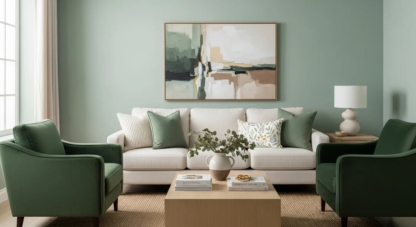
A home color palette generator solves one of the most frustrating design challenges homeowners face: getting paint, furniture, and decor to work together as a unified visual system. Choosing a beautiful wall color is easy in isolation, but making that color harmonize with your existing sofa fabric, wood floor tones, metal hardware, and decorative accessories requires systematic coordination that goes far beyond personal taste.
The difference between a room that looks pulled together and one that feels disjointed almost always comes down to palette coordination. Professional interior designers spend years developing an intuitive sense for which colors, materials, and finishes belong together. A home color palette generator distills that expertise into an accessible tool that analyzes your existing elements and recommends paint, textile, and accent colors that create cohesion across your entire space.
Why Paint, Furniture, and Decor Need One Palette
Most homeowners accumulate furniture and decor over years from different stores, at different times, and in different moods. The result is a collection of individually attractive pieces that may not form a cohesive visual story. A unified home color palette acts as the connective tissue that ties these disparate elements together, creating visual flow that makes each piece feel intentional rather than accidental.
A coordinated palette also simplifies every future purchase. When you know your home's core colors, you can quickly assess whether a throw pillow, rug, or piece of art will integrate into your existing space without bringing it home first. This saves both money from returns and the frustration of purchases that look great in the store but clash with your living room. The palette becomes a decision filter that makes shopping faster and more satisfying.
Color coordination extends beyond aesthetics into how spaces feel. Research in environmental psychology shows that rooms with harmonious color relationships are perceived as more comfortable, more spacious, and more inviting than rooms with clashing or random color combinations. Visitors may not be able to articulate why a room feels welcoming, but coordinated color is almost always a contributing factor. For foundational color theory, see our home decor color palette guide.
Starting with Your Fixed Elements (Floors, Cabinets, Countertops)
Every home has fixed elements that are expensive or impossible to change — hardwood floors, kitchen cabinets, countertops, fireplace stone, and exterior brick. These fixed elements contain colors and undertones that your entire palette must accommodate. Ignoring them is the most common mistake in home color planning. A generator tool works best when you upload photographs of these fixed surfaces and let the algorithm extract their dominant and secondary color values.
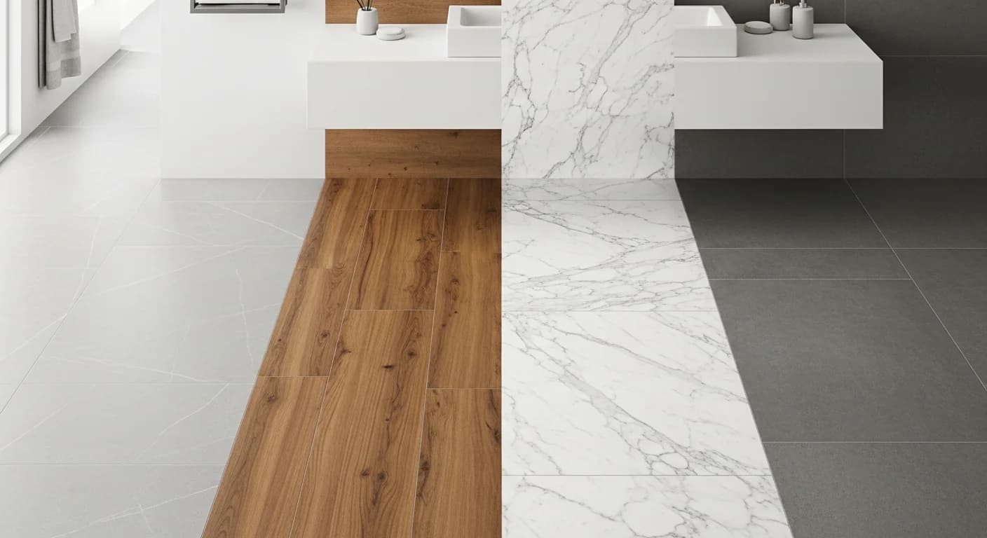
Wood floors are typically the largest fixed color surface in a home. Warm-toned floors with golden, honey, or red undertones require paint and fabric colors with compatible warm undertones. Cool-toned floors in gray, ash, or whitewashed finishes pair better with cool-undertone paint colors and fabrics. Mixing warm floors with cool walls is not impossible, but it requires careful bridging through transitional neutral furniture that contains both warm and cool elements.
Kitchen and bathroom countertops represent another fixed color anchor. Natural stone like granite, marble, and quartzite contains complex color veining that can serve as the starting point for an entire room palette. Extract three to four colors from your countertop's veining pattern and use those as the basis for backsplash tile, cabinet paint, and hardware finish decisions. A room-specific palette generator helps you build outward from these fixed elements systematically.
Matching Paint to Existing Furniture
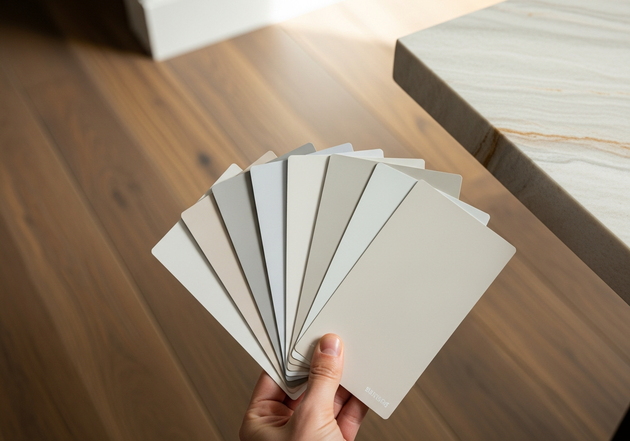
When your furniture is staying and only the walls are changing, the paint selection process must work backward from what you own. Photograph your largest upholstered pieces and extract their dominant colors using a palette generator. The generator will identify not just the surface color but the underlying undertone — information that is critical for paint matching because two colors can appear similar but clash due to incompatible undertones.
For neutral furniture in gray, beige, or cream, wall color options are broad but undertone alignment is essential. A warm beige sofa with yellow undertones will look dingy against a cool gray wall because the conflicting undertones create an unsettling visual tension. The same sofa will look beautiful against a warm greige wall or a warm sage green because the undertones are compatible. Use a generator to test wall color options against a photo of your room with existing furniture before purchasing sample pots.
Bold furniture pieces like a jewel-toned velvet sofa or a bright leather armchair become the anchor of your palette. Choose wall colors that create either contrast or complement. A deep teal sofa pops dramatically against warm white walls, or blends into a moody aesthetic against dark charcoal walls. The generator helps you explore both directions and see the results before committing. Visit our living room decor guide for more furniture and paint coordination strategies.
Coordinating Fabric, Textiles, and Soft Furnishings
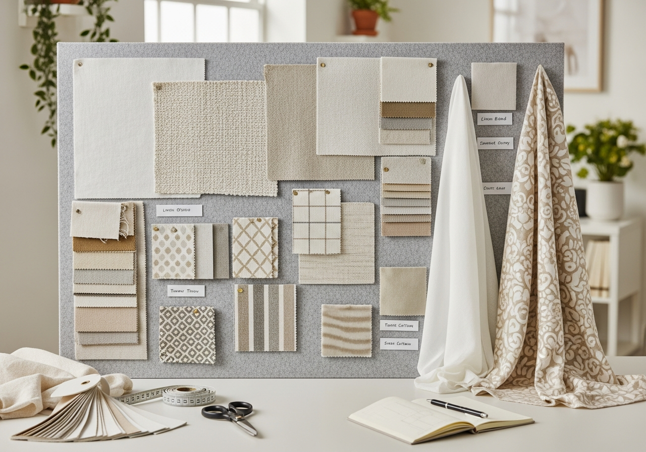
Textiles introduce pattern and texture alongside color, adding complexity to your palette coordination. The key principle is to vary the scale of patterns while maintaining palette consistency. If your sofa has a large-scale floral in blue and cream, your accent pillows might feature a small-scale geometric in the same blue family, and your curtains might be a solid cream that picks up the sofa's background color. This approach creates visual interest without color chaos.
Rug selection is one of the most impactful textile decisions because rugs occupy significant visual real estate and anchor the color story of an entire seating area. A multicolored rug can serve as the source palette for an entire room — pick up its dominant tone for walls, its secondary tone for upholstery, and its accent tone for throw pillows and decorative objects. This technique is a professional designer secret that guarantees cohesion because the rug already proves these colors work together.
Window treatments, bedding, and throw blankets are the easiest textiles to update seasonally while maintaining your core palette. Many homeowners keep a consistent wall-and-furniture palette year-round but swap lighter, brighter textiles for spring and summer and richer, warmer textiles for fall and winter. This seasonal textile rotation keeps your home feeling fresh without requiring paint or furniture changes. For bedroom-specific guidance, see our bedroom decor styling guide.
Metal Finishes and Hardware: Tying It All Together
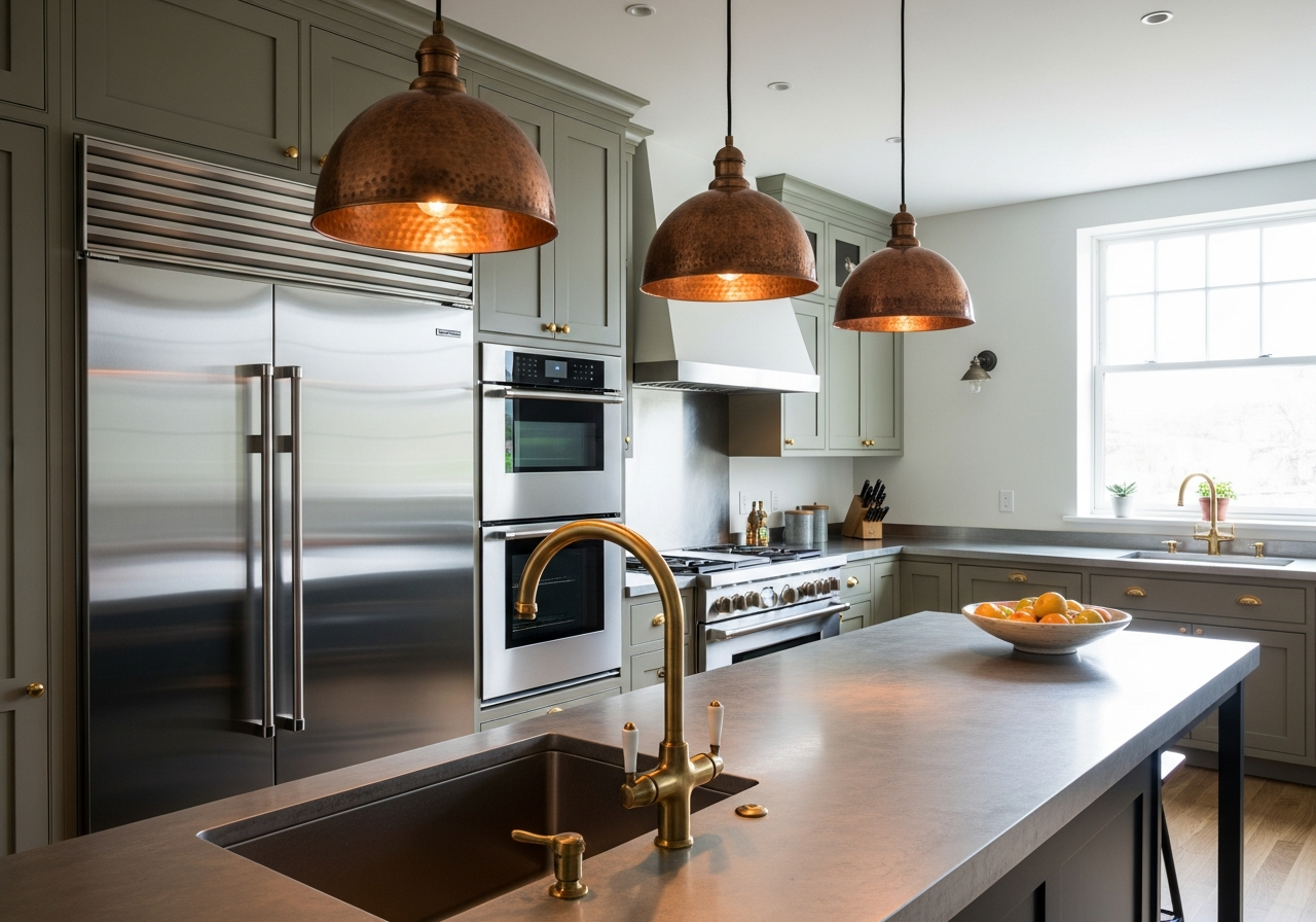
Metal finishes are the often-overlooked element that can either unify or fragment your home color palette. The current design consensus favors consistency within rooms and gentle variation between rooms. Within a single kitchen, your cabinet hardware, faucet, light fixtures, and appliance handles should share the same metal family. Between rooms, you can transition from brushed brass in the kitchen to matte black in the bathroom to polished chrome in the laundry room.
Warm metals like brass, gold, and copper complement warm color palettes and warm-toned wood finishes. Cool metals like chrome, silver, and nickel pair naturally with cool palettes and gray-toned woods. Matte black acts as a neutral that works with both warm and cool palettes, which is one reason it has become the most popular hardware finish for transitional and modern homes. The key is intentionality — mixing metals can look sophisticated when planned, but haphazard when accidental.
When using a home color palette generator, include your metal finishes in the color analysis. Upload photos of your existing hardware and let the tool recommend compatible paint and fabric colors. A palette that coordinates walls, textiles, wood, and metal creates a level of polish that distinguishes professionally designed spaces from amateur attempts. Our whole house palette guide covers how to maintain metal finish consistency across rooms.
Using AI to Test Your Home Color Palette Before Buying
AI visualization tools have revolutionized home color planning by allowing you to see exactly how a palette will look in your actual rooms before purchasing a single paint can or fabric swatch. Upload a photo of your room and the AI applies your chosen paint colors to the walls, swaps textile colors on your furniture, and adjusts lighting to show how colors shift from morning to evening. This process eliminates the expensive trial-and-error of buying sample pots and returning fabric orders.
The most effective AI palette testing involves comparing three to five complete palette options side by side in the same room photo. Rather than testing individual paint colors in isolation, apply your entire coordinated palette — walls, textiles, and accents together — so you can evaluate the overall visual effect. A color that looks too bold on its own might be perfectly balanced when surrounded by its complementary palette members.
AI tools also help bridge the gap between digital color and physical reality. By rendering your palette under different simulated lighting conditions — cool morning light, warm afternoon sun, and warm artificial evening light — you can identify colors that maintain their appeal across the full daily cycle. A color that looks perfect in afternoon warmth but turns sickly under LED kitchen lighting is a problem best discovered digitally rather than after painting three walls.
Frequently Asked Questions
How do I match paint color to my furniture?
Start by identifying the undertone of your furniture fabric or upholstery. Photograph your furniture in natural daylight and use a color extraction tool to identify its hex value and undertone. Then select paint colors with compatible undertones — warm with warm, cool with cool. Test paint samples on your wall next to the furniture under both natural and artificial lighting before committing. The undertone match matters more than the surface color match for overall visual harmony.
Should all rooms in my house have the same color palette?
Not identical, but related. A whole-house palette typically includes a shared neutral base that flows through hallways and connecting spaces, with room-specific accent variations. Your kitchen might emphasize warm tones from the shared palette while your bedroom emphasizes the cooler tones. This approach creates flow without monotony. The shared base color — often visible through doorways — is the thread that ties the house together visually.
What is the easiest way to update my home color palette?
The easiest palette update is through accessories and textiles — throw pillows, blankets, curtains, rugs, and decorative objects. These can shift your palette's accent color without touching walls or furniture. The next level is repainting accent walls or the entire room. The most impactful but most expensive update is replacing or reupholstering furniture. For maximum visual change with minimum effort, update three things simultaneously: pillow covers, a throw blanket, and one piece of wall art.
How do wood tones affect my color palette?
Wood tones are colors that must be included in your palette calculation. Warm woods like cherry, walnut, and honey oak have orange, red, and yellow undertones that need compatible warm paint and fabric colors. Cool woods like gray-washed oak, driftwood, and whitewashed pine have blue-gray undertones that pair with cool palette colors. Mixing wood tones is possible when they share similar undertone warmth levels, but avoid combining very warm and very cool woods in the same sightline.
Can I use a photo of my room to generate a palette?
Yes, photo-based palette generation is the most effective method for existing rooms. Upload a well-lit photo and the generator extracts the dominant colors already present in your space — floor tones, furniture fabric, fixed elements — and recommends complementary additions. This ensures new colors harmonize with what you already have rather than creating conflicts. Photograph in natural light for the most accurate color extraction results.
Related Articles
Continue building your perfect home palette with these guides: Interior Design Color Palette Generator provides room-by-room palette strategies. Whole House Color Palette covers creating flow between rooms. How to Decor a Living Room shows full room styling with coordinated colors. Browse our design ideas gallery for visual inspiration across every room type and style.
Generate Your Home Color Palette with HanoDecor AI
Ready to create a home color palette that ties paint, furniture, and decor into a cohesive design? Our Room Designer lets you upload a photo of any room and test complete palette combinations — wall colors, furniture fabrics, and accent pieces — in real time. See exactly how your chosen colors interact with your existing fixed elements before making any purchases.
Use our color palette generator to build harmonious palettes from inspiration colors, photos, or mood words. Then bring those palettes to life in the HanoDecor Studio with our full suite of AI-powered design tools. Explore our design gallery for thousands of professionally styled rooms that demonstrate cohesive color palette coordination across every design style.
Home Color Palette Generator FAQs
Written by
Priya Sharma
Priya is an award-winning UX designer who previously led design teams at Airbnb and Pinterest. Her focus on user-centered design ensures that HanoDecor's tools are intuitive and accessible to everyone, regardless of their technical background.