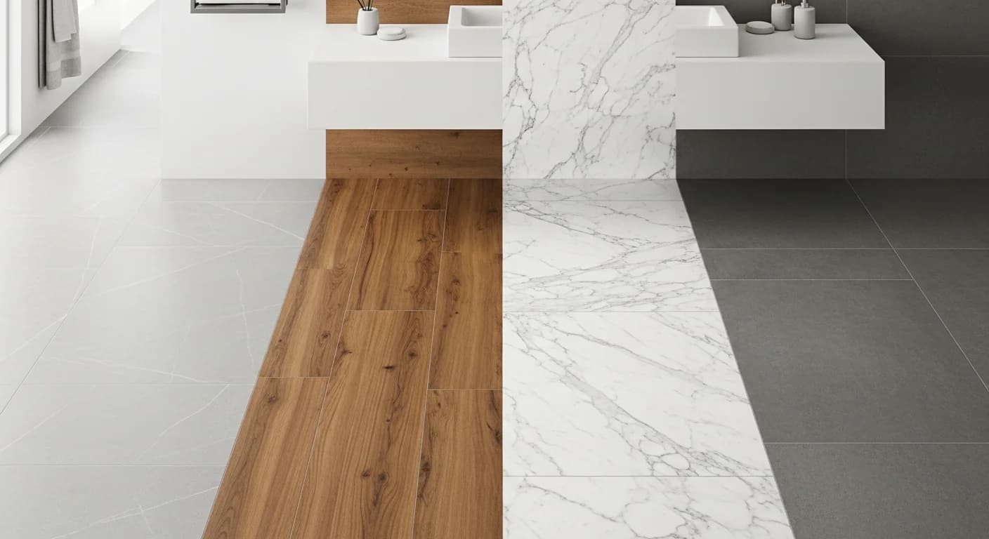
Interior Design Color Palette Generator: Room-by-Room Guide
Quick Summary
A comprehensive room-by-room guide to generating interior design color palettes using the 60-30-10 rule, color temperature principles, and AI-powered palette generator tools. Covers living room, kitchen, dining, bedroom, and bathroom palette strategies with practical tips on lighting impact and open-concept color coordination.
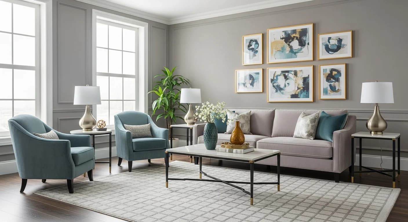
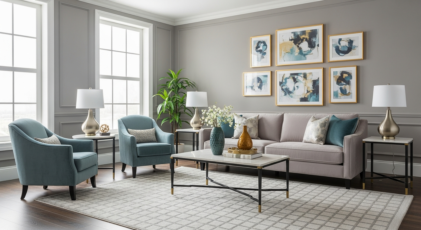
An interior design color palette generator takes the guesswork out of choosing colors for every room in your home. Instead of agonizing over hundreds of paint swatches at the hardware store, these digital tools analyze color relationships, undertones, and lighting conditions to produce harmonious palettes tailored to specific spaces. Whether you are refreshing a single living room or planning a whole-house color scheme, the right palette generator saves hours of decision-making and prevents costly paint-store returns.
Each room in your home serves a different purpose and evokes different emotions, which means each room benefits from its own carefully considered color palette. A kitchen palette prioritizes energy and warmth while a bedroom palette emphasizes calm and rest. This guide walks you through room-by-room palette generation strategies, starting with the foundational 60-30-10 rule and moving into specific recommendations for living rooms, kitchens, bedrooms, and bathrooms. Along the way, you will learn how lighting conditions affect color perception and how AI-powered tools can preview your palette choices in photorealistic room renderings.
Why Every Room Needs Its Own Color Palette
Color influences mood, perceived room size, and even how long people spend in a space. Research from the Scandinavian Journal of Psychology confirms that warm colors like terracotta and golden yellow increase perceived warmth and social energy, while cool colors like soft blue and sage green reduce heart rate and promote relaxation. A single palette applied to every room ignores these psychological differences and creates a flat, monotonous interior.
Room function dictates palette direction. Kitchens and dining rooms benefit from appetizing warm tones that encourage conversation and gathering. Bedrooms perform best with muted, cool-leaning neutrals that support melatonin production and sleep quality. Home offices need balanced palettes that sustain focus without causing eye fatigue. Bathrooms can range from spa-like neutrals to bold jewel tones depending on whether the goal is relaxation or visual drama.
Using an interior design color palette generator for each room ensures that your color choices are both emotionally appropriate and technically harmonious. The best generators let you input your room type, preferred mood, existing fixed elements like flooring and cabinetry, and then output a cohesive palette of five to seven colors. For a deeper dive into choosing colors by decor style, see our color palette home decor guide.
The 60-30-10 Rule for Interior Color Palettes
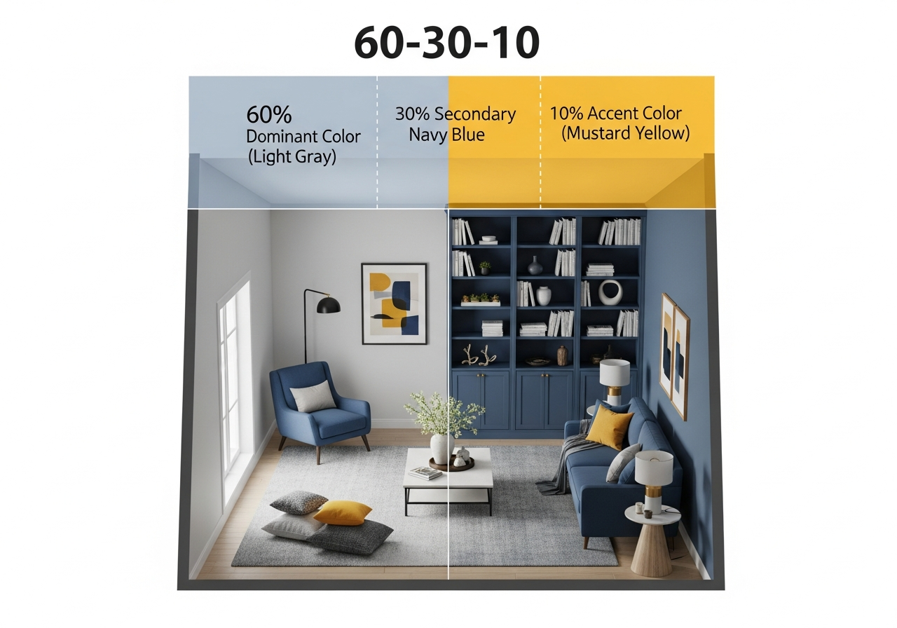
The 60-30-10 rule is the most reliable framework in interior design for distributing color across a room. It allocates 60 percent of the visible surface area to a dominant color, 30 percent to a secondary color, and 10 percent to an accent color. This ratio creates visual balance without monotony and works equally well in minimalist Scandinavian spaces and maximalist bohemian rooms.
The dominant 60 percent typically covers walls and large furniture pieces like sofas and area rugs. Choose a neutral or muted tone for this layer since it forms the visual foundation. The secondary 30 percent appears on curtains, accent chairs, bedding, and smaller furniture. This layer introduces depth and contrast. The accent 10 percent is your boldest color and shows up in throw pillows, artwork, vases, and decorative accessories. This is where you inject personality and seasonal flexibility.
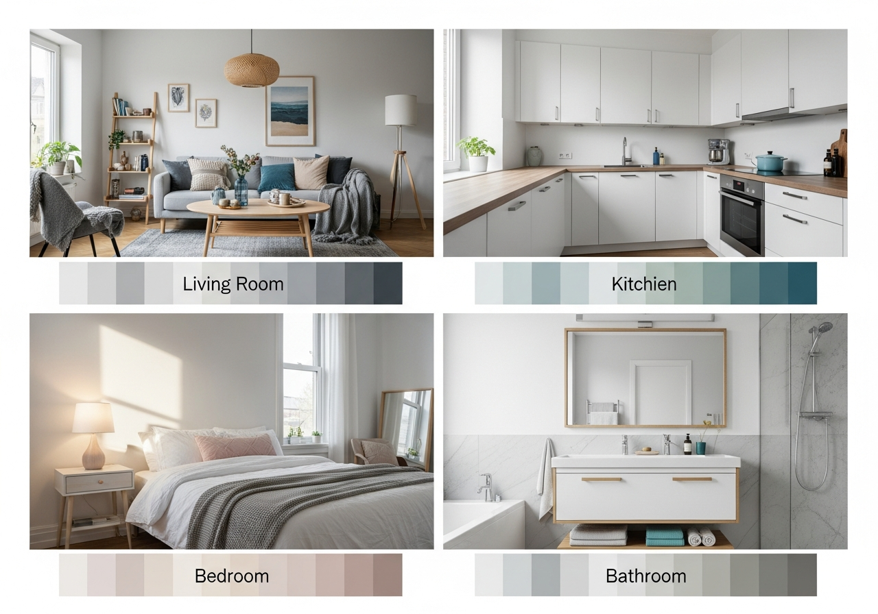
Most interior design color palette generators incorporate the 60-30-10 rule automatically. When you generate a five-color palette, the tool typically designates one color as dominant, one as secondary, one as accent, and two additional supporting colors for trim and ceiling. This structure prevents the common mistake of treating all colors equally, which results in a chaotic, visually fatiguing room. Our color palette generator labels each output color with its recommended role in the 60-30-10 framework.
Living Room Color Palettes That Set the Tone
The living room is the most social space in most homes, which means its palette should balance warmth, welcoming energy, and personal style expression. Warm neutral palettes built on greige, warm white, and camel create universally appealing living rooms that photograph well and complement most furniture styles. For more contemporary energy, consider a cool neutral base of pale gray or soft white paired with a saturated accent like deep navy, emerald green, or burnt sienna.
Living room palette generators should account for the room's natural light exposure. North-facing rooms receive cool, bluish daylight that makes warm colors appear muted and cool colors appear even cooler. Counter this by choosing warm-undertone neutrals as your dominant color. South-facing rooms receive warm, golden light that intensifies warm tones and softens cool ones. These rooms can handle cooler palettes without feeling sterile. For trending living room schemes, explore our living room decor guide and bedroom color combinations for adjacent room coordination.
A practical living room palette might include warm white walls at 60 percent, a charcoal or navy sofa and rug at 30 percent, and terracotta or brass accents at 10 percent. If your living room connects to a kitchen or dining area through an open floor plan, your palette needs to harmonize with adjacent spaces. Use the neutral through-line technique described in our whole house color palette guide to maintain flow across sightlines.
Kitchen and Dining Color Palette Ideas
Kitchen palettes are heavily influenced by fixed elements that cannot be easily changed: countertops, cabinetry, backsplash tile, and flooring. A palette generator for kitchens needs to work around these constraints rather than ignoring them. Upload a photo of your kitchen to an AI-powered palette tool to extract the dominant colors from your existing surfaces and then generate complementary wall, accent, and accessory colors that harmonize with what is already installed.
White and off-white kitchens remain dominant in 2027, but designers are increasingly introducing color through cabinetry. Sage green lower cabinets with white uppers, navy blue islands against warm wood perimeter cabinets, and terracotta-toned backsplashes against white quartz are all trending combinations. The dining area palette should complement the kitchen palette when the two spaces share sightlines, using a shared neutral as the connecting thread.
Bedroom Color Palettes for Rest and Relaxation
Bedroom palettes prioritize calm and rest above all else. Sleep researchers recommend muted, cool-leaning colors for primary bedrooms because these tones align with the body's circadian rhythm and support melatonin production. Soft blues, sage greens, warm grays, and lavender are consistently rated as the most sleep-friendly wall colors. Avoid high-chroma reds, oranges, and bright yellows on bedroom walls as these stimulate alertness and can delay sleep onset.
A restful bedroom palette might use soft warm white or pale greige on walls at 60 percent, medium blue or sage bedding and curtains at 30 percent, and cream or blush accents at 10 percent. The key is keeping contrast low between the dominant and secondary colors. High-contrast bedrooms feel energetic rather than restful. For cozy bedroom styling, see our bedroom decor guide.
Guest bedrooms and children's rooms can deviate from the muted palette rule since these spaces serve different functions. A guest bedroom benefits from a slightly warmer, more welcoming palette with richer earth tones. Children's rooms can incorporate brighter accent colors through bedding and wall art while maintaining a neutral base that grows with the child. Use the Room Designer to preview how different bedroom palettes look in your specific space before committing to paint.
Bathroom Color Palettes: Spa to Bold
Bathroom palettes span a wider range than most rooms because bathrooms serve dual purposes: functional hygiene space and personal retreat. Spa-inspired bathrooms lean on warm whites, soft grays, natural stone tones, and pale green or blue accents that evoke water and nature. These palettes create a calming retreat effect and pair well with natural materials like travertine, marble, and teak wood accessories.
Bold bathroom palettes are gaining popularity in powder rooms and half-baths where the smaller square footage allows dramatic color choices to shine without overwhelming. Deep emerald green, saturated navy, charcoal black, and rich plum are all trending for statement bathrooms. Pair these dramatic wall colors with brass or gold fixtures, a crisp white vanity, and natural wood accents to prevent the palette from feeling too dark or oppressive. A palette generator helps balance these intense colors by suggesting complementary lighter tones for trim, ceiling, and accessories.
How Lighting Affects Your Color Palette
Lighting is the single most important variable that changes how colors appear in a room. The same paint swatch can look completely different under natural daylight, warm incandescent bulbs, cool fluorescent tubes, and LED lighting at various color temperatures. Understanding this relationship prevents the frustration of choosing a perfect color at the paint store only to have it look wrong on your walls.
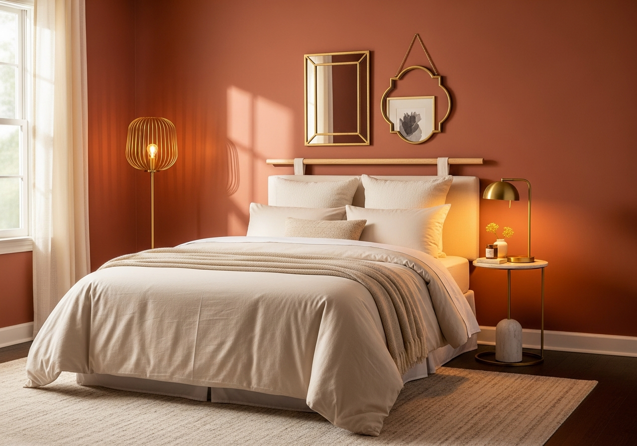
Natural light shifts throughout the day from warm morning tones to cool midday blue to golden afternoon warmth. North-facing rooms never receive direct sunlight and tend to cast a cool blue tone on everything. South-facing rooms receive abundant warm light that intensifies warm colors and softens cool ones. East-facing rooms get warm morning light and cool afternoon shade, while west-facing rooms reverse that pattern. Factor these directional light qualities into your palette decisions by testing samples on the actual wall at multiple times throughout the day.
Artificial lighting adds another layer. Warm-white LEDs at 2700K to 3000K enhance warm palettes and make cool colors appear slightly warmer. Daylight-balanced LEDs at 5000K to 6500K reveal true color values but can make warm palettes feel flat. For the most versatile option, install tunable white LED fixtures that let you adjust color temperature from warm evening mode to bright daylight mode. This technology works particularly well in kitchens and bathrooms where both task lighting and ambient mood lighting are needed. Use the AI House Painter to preview how your palette looks under simulated lighting conditions.
Related Articles
Continue exploring color palette tools and techniques with these related guides: Whole House Color Palette: Create Flow Between Rooms shows how to connect your room-by-room palettes into a cohesive home-wide scheme. How to Generate a Color Palette from a Photo teaches you to extract palettes from room inspiration photos. How to Choose a Color Palette for Home Decor covers the styling side of color coordination. Browse our living room ideas gallery for real-world palette inspiration.
Frequently Asked Questions
What is the best color palette generator for interior design?
The best interior design color palette generator combines color theory with room-specific recommendations. HanoDecor's palette generator is purpose-built for interiors and uses AI to suggest palettes based on room type, lighting conditions, and existing fixed elements. General-purpose tools like Coolors and Adobe Color are excellent for generating harmonious color combinations but lack interior-specific context like the 60-30-10 role assignment and lighting adaptation.
How many colors should be in an interior design palette?
A well-balanced interior design palette contains five to seven colors: one dominant neutral, one secondary color, one accent color, plus supporting tones for trim, ceiling, and small accessories. The 60-30-10 rule distributes the three primary colors, while the remaining two to four colors handle architectural details and decorative accents. For more on palette sizing, see our palette size guide.
Should every room in my house have a different color palette?
Each room should have its own palette variation, but all room palettes should share a common neutral thread that creates flow throughout your home. This is called the neutral through-line method. Choose one warm white or soft gray as your connecting color that appears in every room, then vary the secondary and accent colors room by room to match each space's function and mood.
How do I test a color palette before painting?
Start with digital visualization using an AI room designer that renders your chosen palette in a photo of your actual room. Then purchase peel-and-stick paint samples or small sample pots and apply large swatches on at least two walls in each room. View the samples under both natural daylight and evening artificial lighting over a minimum of 48 hours before committing to the full paint job.
Does natural light change how paint colors look?
Yes, natural light dramatically changes paint color appearance. North-facing rooms receive cool bluish light that intensifies cool colors and mutes warm ones. South-facing rooms get warm golden light that enhances warm tones. The same paint color can look completely different between a north-facing bedroom and a south-facing kitchen, which is why testing samples on the actual walls at multiple times of day is essential.
Generate Room-Perfect Color Palettes with HanoDecor AI
Stop guessing and start generating. Our AI Color Palette Generator creates room-specific palettes optimized for your lighting conditions, existing furnishings, and personal style preferences. Upload a photo of any room and receive a complete palette with 60-30-10 role assignments, hex codes, and complementary accent suggestions in seconds.
Want to see your palette on your actual walls before painting? The Room Designer renders photorealistic previews of your color choices in your uploaded room photo. Preview multiple palettes side by side, swap accent colors instantly, and share your favorites with family or your painter. Explore the full HanoDecor Studio for every color and design tool you need, or browse our design gallery for thousands of professionally designed room palettes.
Interior Design Color Palette Generator FAQs
Written by
Emily Rodriguez
Interior Design Editor covering living spaces, styling trends, and room makeovers. Former Architectural Digest contributor with a focus on accessible, budget-conscious design.