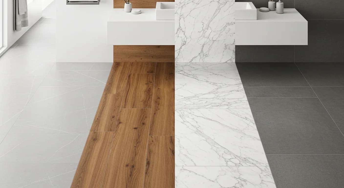
How to Generate a Color Palette from a Photo: 5 Methods That Work
Quick Summary
A step-by-step guide to generating color palettes from photographs using five methods: uploading room photos for interior palettes, extracting from nature and landscape images, pulling from art and design inspiration, using AI-powered extraction tools, and combining manual eyedropper sampling with color theory expansion.
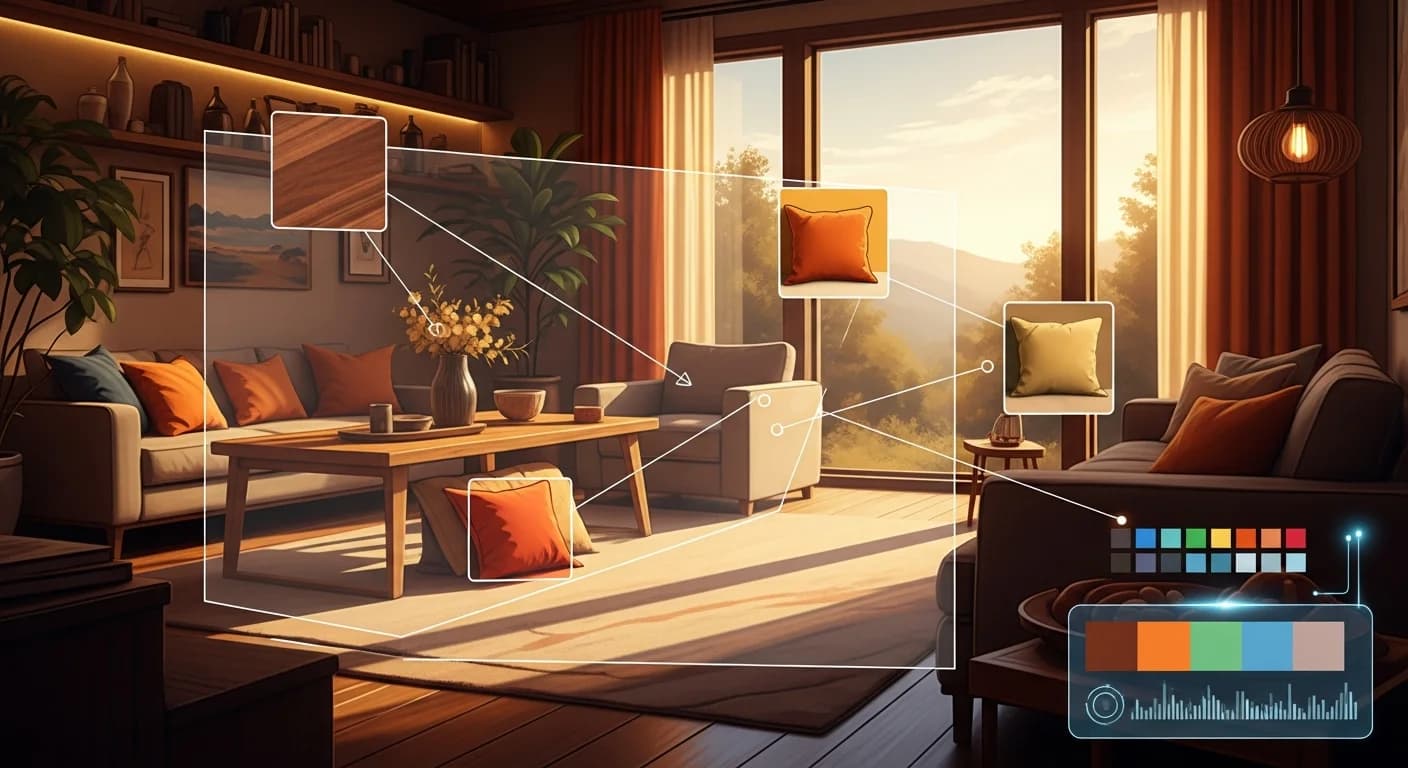
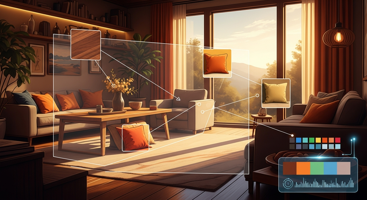
The fastest way to build a beautiful color palette from a photo is to let the image do the work for you. Every photograph contains a natural color story — the warm golds of a sunset, the muted greens of a forest floor, the soft neutrals of a Scandinavian interior. A color palette generator from photo extracts these dominant colors automatically, giving you a cohesive starting point for any design project.
Photo-based palette generation works because real-world images already contain harmonious color relationships. Nature, architecture, food, and interior photography all produce palettes that feel balanced and intentional because they capture light and color as they naturally interact. This guide walks you through five methods for generating palettes from images, covering everything from quick online tools to advanced AI-powered extraction.
Why Photos Make the Best Color Palette Starting Point
Photos capture color as the human eye naturally perceives it — influenced by lighting, texture, and spatial relationships. A color wheel generates mathematically correct harmonies, but a photograph captures emotionally resonant ones. The warm amber of late-afternoon sunlight bouncing off wooden floors, the cool blue-gray of morning fog through a window, the rich burgundy of autumn leaves against dark bark — these combinations feel right because they are grounded in reality.
For interior design specifically, extracting colors from a photo of a room you love gives you a direct roadmap to recreating that feeling in your own space. Rather than guessing which shade of blue matches the Mediterranean villa in your Pinterest save, a color extraction tool identifies the exact HEX values and RGB codes. You can then match those values to paint brands, fabric swatches, and furniture finishes with precision.
How Color Extraction Technology Works
Most color extraction tools use a clustering algorithm called k-means to analyze every pixel in an image and group similar colors together. The algorithm identifies the dominant color clusters — typically five to eight — and returns the center point of each cluster as a representative HEX value. More advanced tools use weighted sampling that prioritizes visually prominent areas over background noise.
AI-powered extractors go further by understanding semantic regions within images. Instead of treating every pixel equally, they identify objects — walls, furniture, textiles, flooring, sky, foliage — and extract the most design-relevant colors from each region. This produces palettes that are more useful for design applications because the extracted colors correspond to actual design elements rather than random pixel averages.
Method 1 — Upload a Room Photo for Interior Palettes
The most direct approach for home design is uploading a photo of a room you want to emulate. Find an interior photo from a design magazine, a hotel room you loved, or a friend's beautifully decorated living room. Upload it to a tool like the HanoDecor Color Palette Generator, Adobe Color, or Coolors and extract the dominant palette.
When using room photos, look for images taken in natural daylight for the most accurate color representation. Flash photography and heavily filtered social media images distort colors significantly. For the best results, use photos where you can see walls, flooring, furniture, and accents clearly — this gives the extractor enough distinct color regions to produce a comprehensive palette.
Once you have your extracted palette, map each color to a design element: the lightest shade likely corresponds to walls or ceiling, mid-tones to furniture and textiles, and the darkest or most saturated colors to accents and decorative objects. This mapping creates a practical implementation plan for recreating the palette in your own space. For room-specific guidance, see our interior design color palette guide.
Method 2 — Extract Colors from Nature and Landscape Photos
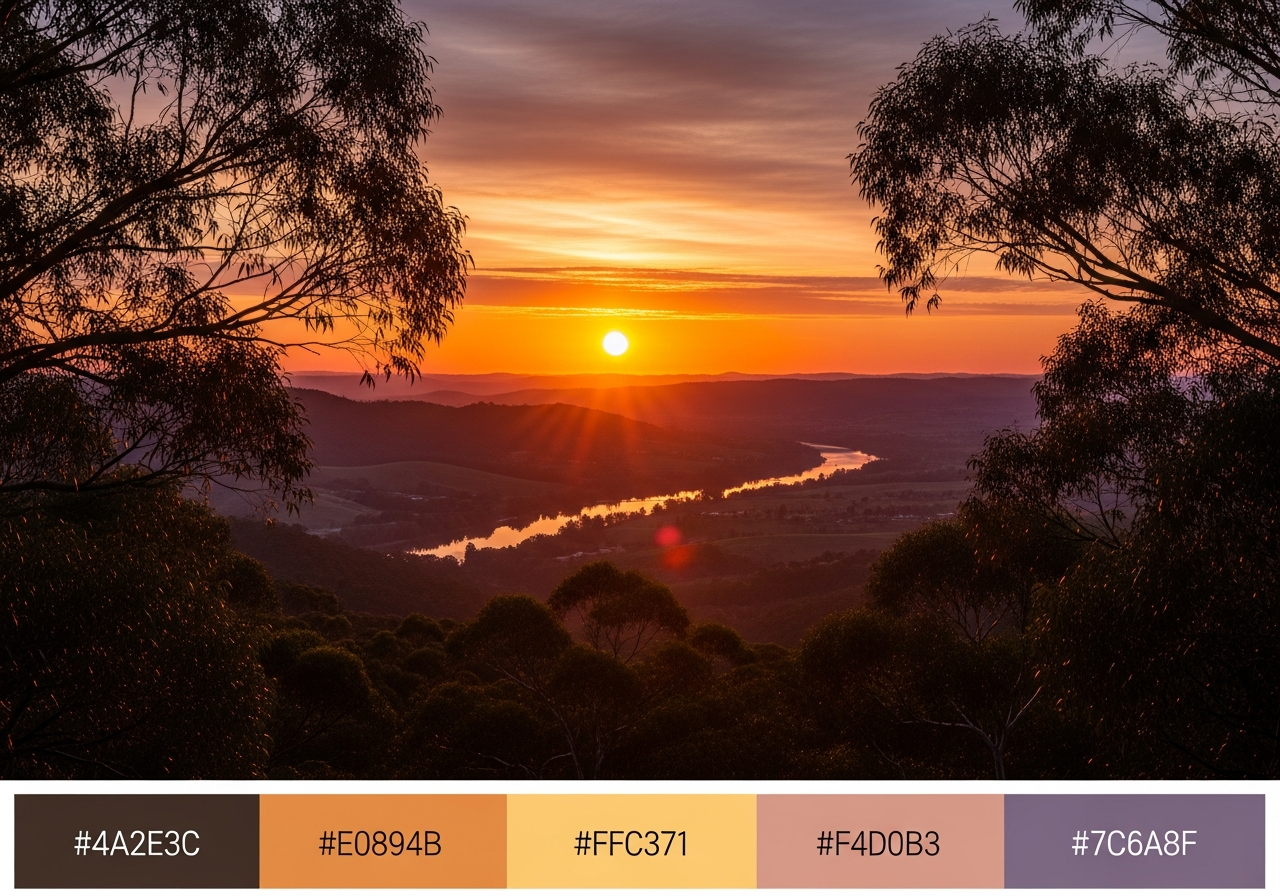
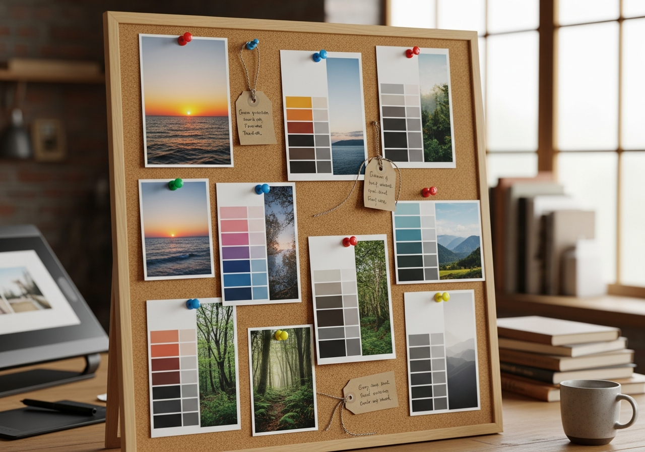
Nature photographs produce some of the most universally appealing color palettes because natural environments contain inherently harmonious color relationships. A forest scene yields rich greens, warm browns, and soft grays. A beach photograph produces sandy neutrals, ocean blues, and warm whites. A sunset delivers dramatic oranges, pinks, purples, and deep navy.
To extract the best palettes from nature photos, choose images with clear color variety rather than monochromatic scenes. A landscape with foreground flowers, mid-ground foliage, and a colorful sky gives the extractor more distinct color regions to work with. Seasonal photographs are particularly useful — autumn foliage produces warm earth-tone palettes that translate beautifully to living rooms and dining areas.
Method 3 — Pull Palettes from Art and Design Inspiration
Fine art, textile patterns, ceramic glazes, and graphic design posters all contain expertly composed color relationships. Master painters spent lifetimes perfecting color harmonies that extraction tools can capture in seconds. Upload a Monet water lily painting for a soft impressionist palette, a Rothko color field for bold minimalist contrasts, or a William Morris textile pattern for rich Victorian-era combinations.
Fashion photography, food styling, and product photography are equally rich sources. A beautifully styled cheese board yields warm golds, rustic reds, and creamy neutrals. A fashion editorial might produce a precise four-color palette of navy, blush, ivory, and metallic gold. The key is selecting images where color choices were intentional rather than accidental — professional photography and art consistently produce stronger palettes than casual snapshots.
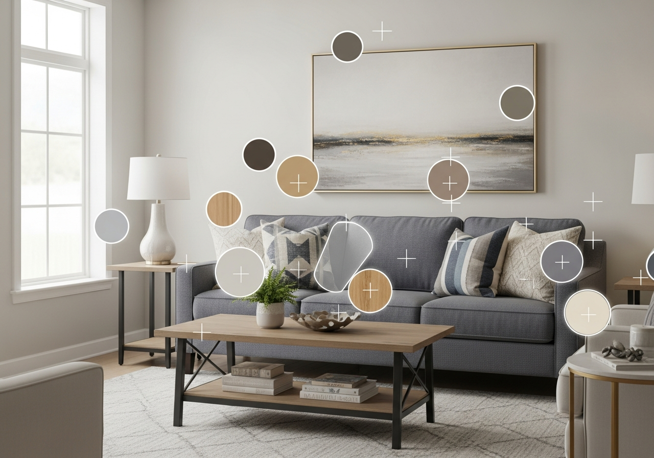
Method 4 — AI-Powered Smart Extraction
AI-powered extraction tools like those in our AI palette guide go beyond simple pixel clustering. These tools understand the context of an image — identifying walls, furniture, textiles, and accents as separate design elements and extracting the most relevant color from each. This produces palettes that are immediately actionable for design projects.
The HanoDecor Color Palette Generator uses AI extraction combined with room visualization, letting you see extracted colors applied to your own room in real time. Upload a photo of a room you love, extract its palette, then apply those same colors to a photo of your own space — all within one tool. This eliminates the gap between inspiration and implementation that makes color selection so challenging.
Method 5 — Manual Eyedropper Sampling with Color Theory Expansion
For maximum control, use an eyedropper tool in Photoshop, Figma, or any image editor to manually sample specific colors from a photograph. This lets you choose exactly which parts of the image to extract from — the precise shade of blue in a vase rather than the averaged blue across the entire image. Sample three to five key colors, then expand them using color theory rules.
Take your sampled HEX values and enter them into a color wheel tool like Paletton or Adobe Color. Use the analogous, complementary, or triadic harmony rules to generate additional colors that complement your hand-picked samples. This hybrid approach combines the emotional resonance of photo-extracted colors with the mathematical precision of color theory. For building palettes from specific color codes, see our hex code palette guide.
Tips for Getting Accurate Color Extraction Results
Use high-resolution images whenever possible. Low-resolution photos produce noisy pixel data that confuses extraction algorithms. Images at 1200 pixels wide or larger consistently produce the best results. Avoid heavily compressed JPEG files where color banding and artifacts distort the original colors.
Consider the lighting in your source photo versus the lighting in your target space. A palette extracted from a photo taken in cool northern daylight will feel warmer and more yellow than expected in a room with warm incandescent lighting. Use the HanoDecor Room Designer to test extracted palettes under different lighting conditions before committing to purchases.
Crop your source image to focus on the most relevant area before extracting. An interior photo with a large window view of trees might yield too many greens and blues from the outdoor scenery rather than the interior palette you want. Cropping tightly to the room elements ensures the extraction focuses on design-relevant colors.
Related Articles
Explore more color palette techniques and tools: Best Free Color Palette Generators Compared reviews 10 tools with extraction capabilities. Whole House Color Palette shows how to coordinate extracted palettes across multiple rooms. How to Use AI to Redesign a Room covers broader AI design tools. Browse the design gallery for photo inspiration.
Frequently Asked Questions
What types of photos produce the best color palettes?
Professional interior photography, nature landscapes, and fine art produce the strongest color palettes because their color compositions are intentional. Look for photos taken in natural daylight with clear color variety — at least three to four distinct hues visible in the image. Avoid heavily filtered Instagram photos or flash photography, which distort color accuracy significantly.
How many colors should I extract from a photo?
Five colors is the standard for most palette generators and works well for most design projects. This typically produces one dominant color, two secondary colors, and two accent colors — mapping naturally to the 60-30-10 rule used in interior design. Some tools offer four-color or eight-color extraction options depending on the complexity of your project.
Can I match extracted colors to specific paint brands?
Yes. Once you have HEX values from your extraction, use brand-specific color matching tools to find the closest paint match. Benjamin Moore, Sherwin-Williams, and Behr all offer online tools that convert HEX codes to their nearest paint colors. Keep in mind that screen colors never match paint exactly — always order physical samples before committing to large purchases.
Do extracted palettes work for both walls and decor?
Absolutely. The lightest colors in your extracted palette typically work for walls and large surfaces, while mid-tones suit furniture and textiles, and the most saturated colors serve as accents through throw pillows, artwork, and decorative objects. This mapping creates visual hierarchy and depth in any room. For detailed room coordination, see our home decor color palette guide.
Is photo-based extraction more accurate than AI generation?
Photo-based extraction and AI generation serve different purposes. Extraction captures the exact colors from a specific image you love, making it ideal for replicating a particular aesthetic. AI generation creates entirely new palettes based on learned color relationships, which is better for exploring options you have not seen before. The most effective workflow uses extraction for inspiration and AI generation for variations and alternatives.
Extract Colors from Any Photo with HanoDecor AI
Ready to turn your favorite photo into a design-ready color palette? The HanoDecor Color Palette Generator extracts dominant colors from any uploaded image and lets you preview those colors in your own room instantly. Upload an inspiration photo, extract the palette, then apply it to your space — all in one seamless workflow.
Explore the full HanoDecor Studio for additional AI-powered design tools. Browse our design ideas hub for thousands of curated room photos ready for palette extraction and design inspiration.
How to Generate a Color Palette from a Photo FAQs
Written by
Priya Sharma
Priya is an award-winning UX designer who previously led design teams at Airbnb and Pinterest. Her focus on user-centered design ensures that HanoDecor's tools are intuitive and accessible to everyone, regardless of their technical background.