How to Redesign Your Room with Color: Complete Paint and Palette Guide
Quick Summary
A comprehensive guide to redesigning any room with color, covering color psychology, undertone identification, room-by-room palette strategies, paint finish selection, accent wall techniques, and AI-powered color visualization. Includes practical tips for coordinating whole-home palettes and a detailed FAQ.
How to Redesign Your Room with Color: Complete Paint and Palette Guide
Learning how to redesign your room with color is one of the most transformative and cost-effective changes you can make to any space. A single gallon of paint costs under $50, yet it has the power to completely alter the mood, perceived size, and personality of a room. Color affects how you feel the moment you walk through the door — it can energize a home office, calm a bedroom, or make a cramped hallway feel twice as wide.
Yet choosing the right color remains one of the most stressful decisions homeowners face. With thousands of paint swatches available and endless trend lists to sort through, it is easy to feel paralyzed. This guide eliminates the guesswork. We walk you through color psychology, undertone identification, room-by-room palette strategies, paint finish selection, and how to use AI visualization tools to preview your colors before picking up a brush. Whether you are refreshing a single accent wall or coordinating a whole-home palette, these principles will help you redesign your room with color confidently.
Why Color Is the Most Powerful Redesign Tool
Before diving into palettes and paint finishes, it helps to understand why color has such a dramatic impact on interior spaces. Research from the Institute for Color Research shows that people make subconscious judgments about an environment within 90 seconds — and up to 90 percent of that assessment is based on color alone. The colors surrounding you influence your heart rate, appetite, concentration, and even perceived temperature.
From a practical design standpoint, color does three things simultaneously. First, it defines the emotional tone of a room — whether the space feels restful, stimulating, formal, or playful. Second, it manipulates spatial perception — lighter colors make walls recede and rooms feel larger, while darker tones pull walls inward for a cozy, enveloping effect. Third, color creates visual continuity (or intentional contrast) between rooms, guiding the eye through your home and establishing a coherent design narrative.
Compared to new furniture, flooring, or structural changes, paint is the highest-impact-per-dollar investment in home design. A full-room paint job typically costs between $200 and $800 in materials for a DIY project, or $1,000 to $3,000 with professional labor. That modest investment can make a dated room feel brand new — which is why understanding how to redesign your room with color is an essential skill for every homeowner.
Color Psychology for Every Room
Color psychology is the study of how different hues affect human emotion and behavior. While individual preferences vary, broad patterns hold true across cultures and age groups. Understanding these patterns helps you select colors that support the function of each room rather than working against it.
Blues and Greens: Calm, Focus, and Restoration
Blue is consistently rated the most calming color in interior environments. It lowers heart rate and blood pressure, making it ideal for bedrooms, bathrooms, and meditation spaces. Soft blues like powder blue and dusty blue create a serene backdrop without feeling cold — especially when paired with warm wood tones and creamy whites. Deeper blues like navy and indigo add sophistication and work well as accent walls or in libraries and home offices where concentration matters. If you are planning a bedroom redesign, blue is one of the safest and most effective starting points.
Green occupies a unique position on the color wheel as the hue most associated with nature, balance, and renewal. Sage green, olive, and forest green bring organic warmth to living rooms and kitchens. Lighter greens like mint and celadon work beautifully in bathrooms and sunrooms where you want a fresh, spa-like quality. Green pairs effortlessly with wood, stone, and natural fiber textures — making it a cornerstone of biophilic design.
Warm Neutrals: Versatility Without Boredom
Warm neutrals — including beige, taupe, greige (gray-beige), warm white, and cream — remain the most popular wall colors in American homes for good reason. They provide a flexible backdrop that works with virtually any furniture style, art collection, or accent color. The key to using neutrals successfully is choosing the right undertone. A warm neutral with yellow or pink undertones feels cozy and inviting. A neutral with green or gray undertones feels cooler and more contemporary.
Avoid the trap of thinking neutrals are boring. A room painted in a rich, warm white with layered textures — linen curtains, wool rugs, natural wood furniture — can feel just as intentional as a room drenched in bold color. The difference is that neutrals let your furnishings and art take center stage, while saturated colors make the walls themselves a focal point.
Warm and Bold Tones: Energy and Personality
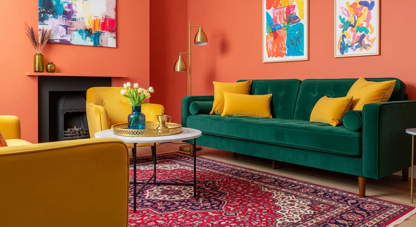
Reds, oranges, and yellows stimulate appetite and conversation, which is why they appear frequently in dining rooms, kitchens, and entertaining spaces. Terracotta, rust, and burnt sienna deliver the warmth of red-orange without overwhelming a room. Mustard yellow adds retro charm and pairs well with navy, charcoal, and forest green. Use bold warm tones strategically — as accent walls, in small powder rooms, or in spaces where you want to create an energizing, social atmosphere.
Deep, saturated tones like burgundy, emerald, and midnight blue have surged in popularity as homeowners embrace the color-drenching trend — painting walls, trim, ceiling, and even doors in a single rich hue. This approach creates a dramatic, cocoon-like effect that works especially well in living room redesigns and formal dining rooms.
How to Identify and Match Undertones
Undertones are the subtle secondary hues hidden beneath a color's surface. Every paint color has an undertone — even whites and grays. Mismatched undertones are the number one reason paint colors look wrong on the wall. A gray with blue undertones clashes with a beige floor that has yellow undertones. A white trim with pink undertones fights a cool green wall. Mastering undertone identification is the single most important technical skill for anyone learning how to redesign a room with color.
The Three Undertone Families
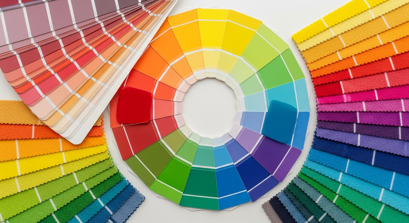
All undertones fall into three families: warm, cool, and neutral. Warm undertones include yellow, orange, red, and pink. Cool undertones include blue, green, and purple. Neutral undertones balance warm and cool with minimal lean in either direction. To identify a paint color's undertone, hold the swatch against a pure white piece of paper. The undertone becomes visible by contrast — you will see whether the color leans yellow, pink, blue, or green.
The Consistency Rule
The simplest rule for a cohesive palette is to keep undertones consistent across every surface in the room. If your wall color has warm undertones, your trim white should also have warm undertones. Your ceiling color, cabinet paint, and tile grout should all share the same undertone family. This does not mean every surface must be the same color — it means the colors you choose should come from the same underlying warmth or coolness. Breaking this rule intentionally can create interesting contrast, but unintentional mismatches almost always look like mistakes.
Test undertone compatibility by placing all of your paint swatches side by side in the room where they will be used. View them at different times of day — morning light, afternoon sun, and evening lamplight all shift how undertones appear. North-facing rooms amplify cool undertones and can make warm colors look muddy, while south-facing rooms intensify warm tones and can make cool colors feel warmer than expected.
Building a Room-by-Room Color Palette
A well-designed color palette for a single room typically includes three to five colors in a defined ratio. The most reliable formula is the 60-30-10 rule: 60 percent of the room's visual area is the dominant color (usually walls), 30 percent is a secondary color (upholstery, curtains, rugs), and 10 percent is an accent color (throw pillows, art, decorative objects). This ratio ensures visual balance without monotony.
Living Room Palettes
Living rooms serve multiple functions — entertaining, relaxing, reading, watching television — so they benefit from versatile palettes that feel neither too stimulating nor too subdued. Popular living room combinations include warm greige walls with navy accents and brass metallic touches, sage green walls with cream upholstery and walnut wood tones, and soft white walls with terracotta and dried-flower earth tones. For a complete approach to living room transformation, see our guide on how to redesign your living room.
Bedroom Palettes
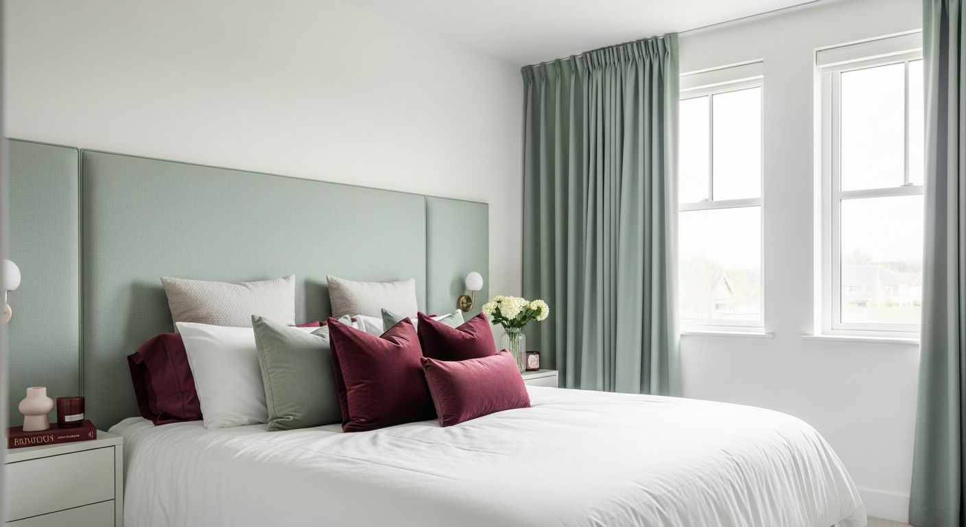
Bedrooms prioritize rest and relaxation, so the palette should lean toward calming hues with lower saturation. Soft blues, muted greens, warm taupes, blush pinks, and lavenders all promote sleep quality. Avoid high-contrast combinations and bright saturated colors on large surfaces — reserve those for accent pillows or art. If you are working with a limited budget, painting the bedroom walls is one of the highest-impact changes you can make. Our budget bedroom redesign guide covers strategies for maximizing impact without overspending.
Kitchen and Dining Room Palettes
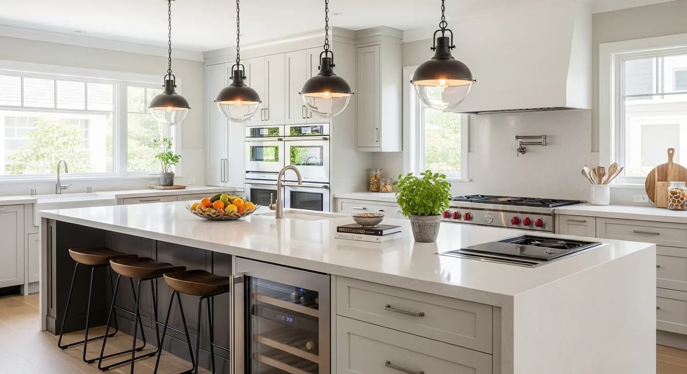
Kitchens balance function and aesthetics, so your color palette needs to work with permanent fixtures like countertops, backsplash, and cabinetry. White and off-white cabinets pair with virtually any wall color — from bold green to soft gray. Dark cabinets (navy, charcoal, deep green) create drama but require lighter walls or ample natural light to avoid feeling heavy. Dining rooms tolerate bolder choices because you typically use them for shorter, more social periods. Deep jewel tones like emerald, sapphire, and aubergine create intimate dining atmospheres.
Hallways and Transitional Spaces
Hallways, entryways, and staircases connect rooms, so their colors should bridge the palettes of adjacent spaces. A safe approach is to use the lightest neutral from your whole-home palette in transitional areas — this creates visual breathing room between more colorful rooms. If your hallway is dark or narrow, light warm whites and soft creams maximize the sense of openness. For hallways that lack natural light, our dark hallway redesign guide offers specific color and lighting strategies.
Coordinating a Whole-Home Color Palette
Individual room palettes need to work together when viewed as a sequence. As you walk from the entryway through the living room, down the hall, and into the bedroom, the color transitions should feel intentional — not jarring. The most effective approach is to select a base neutral that appears in every room (on trim, ceilings, or as a secondary wall color) and then vary the feature colors room by room while keeping undertones consistent.
Start by choosing your whole-home neutral — the color that will appear on all trim, doors, and ceiling throughout the house. This anchoring color ties everything together. Next, select two to three accent color families that complement each other. For example, a home might use blue tones in the bedrooms, green tones in the living areas, and warm earth tones in the kitchen — all connected by a consistent warm white trim and ceiling color.
A practical trick is to create a physical palette board for each room and then line up all the boards side by side. Look for colors that repeat (intentionally) across rooms and check that no two adjacent rooms create a jarring transition. If you see a clash, adjust the lighter or less saturated color to smooth the flow between spaces.
Choosing the Right Paint Finish
Paint finish (sheen level) affects how a color looks on the wall and how the surface performs over time. The same paint color in a flat finish looks dramatically different from the same color in a semi-gloss finish. Choosing the right finish for each surface is as important as choosing the right color.
Flat and Matte Finishes
Flat and matte finishes absorb light, hiding surface imperfections like drywall seams, patched holes, and minor texture differences. They create a velvety, sophisticated look that is popular for living rooms, bedrooms, and ceilings. The downside is durability — flat finishes are harder to clean and more prone to scuffing. Premium flat paints from brands like Benjamin Moore and Sherwin-Williams have improved significantly in washability, but flat finishes are still not recommended for high-traffic areas, kitchens, or children's rooms.
Eggshell and Satin Finishes
Eggshell offers a subtle low sheen that balances beauty with practicality. It is wipeable, hides moderate imperfections, and works in virtually any room. Satin has slightly more sheen than eggshell and offers better moisture resistance, making it the preferred choice for kitchens, bathrooms, hallways, and children's rooms. Most interior designers default to eggshell for living spaces and satin for high-use areas.
Semi-Gloss and High-Gloss Finishes
Semi-gloss is the standard finish for trim, baseboards, doors, and window frames because it is highly durable and easy to clean. It reflects light and creates a crisp contrast against flat or eggshell walls. High-gloss finishes are reserved for specialty applications — lacquered furniture, accent ceilings, or bold statement doors. High-gloss reveals every imperfection, so surfaces must be meticulously prepared before application.
Accent Wall Strategies That Work
An accent wall is a single wall painted in a contrasting or bolder color than the other three walls. When done well, it anchors the room, draws the eye to a focal point, and adds visual depth without overwhelming the space. When done poorly, it looks random and disconnects from the rest of the design.
The most effective accent wall is the one that naturally draws attention — the wall behind the bed in a bedroom, the fireplace wall in a living room, or the wall you see first when entering the room. The accent color should be noticeably different from the other walls but related in undertone. A room with warm taupe walls and an accent wall in deep navy (a cool color) works because the contrast is intentional and dramatic. A room with cool gray walls and a warm beige accent wall creates a confusing, unintentional clash.
Beyond solid color, consider texture-based accent walls — vertical wood slat panels, board and batten, limewash paint, or Venetian plaster. These techniques add depth and dimension while keeping the color palette cohesive. Limewash in particular has surged in popularity because it creates a handmade, European-inspired texture that catches light differently across the surface.
Using AI to Visualize Color Before You Paint
One of the biggest challenges when redesigning a room with color is the gap between how a paint swatch looks in your hand and how the color looks on an actual wall. Lighting, adjacent surfaces, room size, and furnishing colors all influence the final appearance. Traditional methods — buying sample pots and painting test patches — help but are time-consuming and limited.
AI-powered color visualization tools bridge this gap. Upload a photo of your room, select a color, and see a photorealistic preview of how that color will look on your walls — in your actual space with your actual furniture and lighting. HanoDecor's AI house painter lets you experiment with unlimited color options in seconds, so you can compare navy versus charcoal versus forest green on your living room walls without lifting a brush.
This technology is especially valuable when coordinating multi-room palettes. Visualize your hallway color next to your living room color to confirm the transition works. Test how a bold accent wall looks against your existing furniture. Try dramatic dark colors you might otherwise be too nervous to commit to — if it does not look right in the preview, you have not wasted paint or time. Combine the AI painter with the AI room designer to explore full redesign scenarios that include furniture arrangement, material changes, and color updates in a single visualization.

How Lighting Changes Everything About Color
The same paint color can look dramatically different depending on the light source illuminating it. Natural daylight reveals a color's truest hue. Incandescent bulbs add warm yellow tones, making cool colors appear warmer and warm colors appear more saturated. LED bulbs vary widely depending on their color temperature — a 2700K warm white LED mimics incandescent warmth, while a 5000K daylight LED casts a bluer, cooler light.
North-facing rooms receive cool, indirect light throughout the day, which amplifies blue and green undertones and can make warm colors look slightly muted. South-facing rooms get warm, direct sunlight that intensifies warm tones and makes cool colors feel livelier. East-facing rooms shift from warm morning light to cooler afternoon tones, while west-facing rooms do the opposite. Always evaluate paint samples in the actual room at multiple times of day — morning, midday, and evening with artificial lights on.
If a room has limited natural light, choose colors one to two shades lighter than your target on the paint strip. Dark rooms swallow color, so what looks perfect on the swatch often appears darker and muddier on the wall. Conversely, sun-drenched rooms amplify color intensity, so consider going one shade softer than your initial choice.
Common Color Mistakes to Avoid
Matching paint to a small swatch without testing. Paint swatches are tiny, and colors look very different at scale. Always paint a large test patch (at least 2 feet by 2 feet) on the actual wall before committing. Better yet, use an AI color visualization tool to see the color at full-room scale instantly.
Ignoring the ceiling. The ceiling is the fifth wall, and it interacts with your wall color more than most people realize. A pure bright white ceiling can clash with warm wall colors — opt for a tinted ceiling white that shares the wall color's undertone. Some designers tint the ceiling with 50 percent of the wall color for a subtle, enveloping effect.
Using too many colors in one room. More than three to four distinct colors in a single room creates visual chaos. Stick to the 60-30-10 framework and resist the urge to introduce a different color for every element. Forgetting to consider existing fixed elements. Your flooring, countertops, fireplace stone, and any tile you are keeping must be factored into the palette. The wall color needs to complement these permanent surfaces, not fight them.
Choosing color based on trends alone. Trends provide inspiration, but the best color choices reflect how you use the space and what makes you feel comfortable. A trending forest green might look stunning in magazine photos but feel oppressive in your small north-facing room. Always prioritize function, light conditions, and personal comfort over trend chasing.
Step-by-Step Color Redesign Process
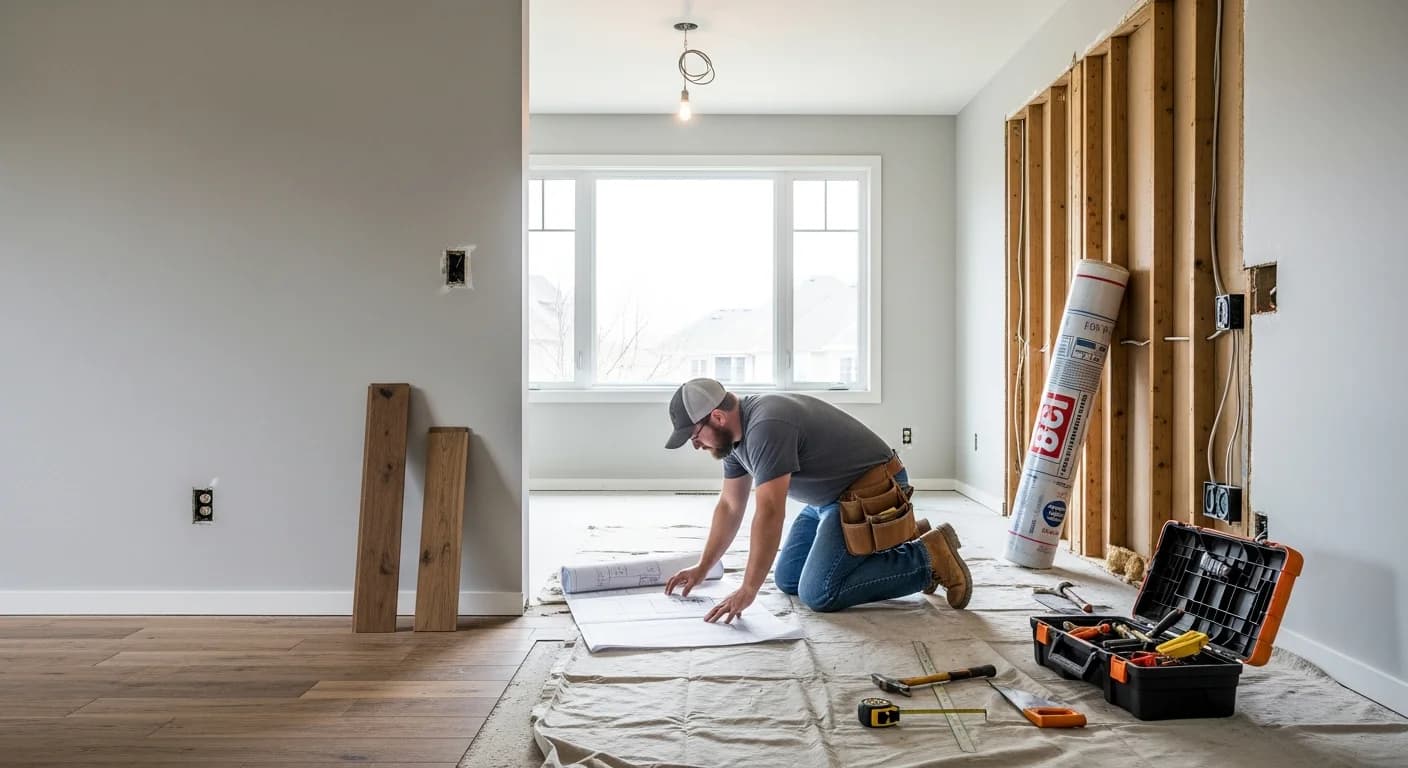
Follow this systematic process to redesign any room with color confidently. First, assess your fixed elements — flooring, countertops, tiles, and large furniture pieces you plan to keep. Note their undertones. Second, define the room's purpose and the mood you want to create using color psychology principles. Third, choose your dominant wall color based on the room's light exposure, size, and function.
Fourth, select secondary and accent colors using the 60-30-10 framework, keeping undertones consistent. Fifth, choose the appropriate paint finish for each surface — flat for ceilings, eggshell or satin for walls, semi-gloss for trim. Sixth, test your choices using AI visualization or large physical paint samples viewed at different times of day. Seventh, finalize your selections and begin painting — starting with the ceiling, then walls, and finishing with trim and detail work.
This process works whether you are painting a single room or coordinating color across your entire home. For bedroom-specific guidance, our complete bedroom redesign guide covers color selection alongside layout, lighting, and furniture arrangement.
Frequently Asked Questions
What is the best color to redesign a room with for resale value?
Warm neutrals consistently perform best for resale because they appeal to the broadest range of buyers. Light greige (gray-beige), warm white, and soft taupe make rooms feel larger and brighter while allowing buyers to envision their own furnishings in the space. If you want to add personality, use a universally flattering blue-gray or sage green in a secondary room — these colors test well in real estate photography and in-person showings without polarizing potential buyers.
How do I choose a paint color for a room with no natural light?
Rooms without natural light rely entirely on artificial lighting, so your bulb choice becomes critical. Use warm white LED bulbs (2700K-3000K) to create a comfortable ambiance, then select paint colors one to two shades lighter than your target. Warm whites, soft creams, and pale warm grays reflect the most available light and prevent the room from feeling cave-like. Avoid cool grays and blues in lightless rooms — they read as gloomy without natural daylight to activate them. If you want a dark, moody look despite limited light, commit fully with deep color on all surfaces and supplement with layered task lighting.
Can I use dark colors in a small room?
Yes, and sometimes dark colors actually work better in small rooms than light ones. Dark, saturated tones (navy, charcoal, forest green, deep plum) blur the boundaries between walls and corners, making it harder for the eye to identify the room's true dimensions. This creates a cozy, intimate atmosphere rather than highlighting how small the space is. The key is to commit fully — paint all walls, trim, and the ceiling in the same deep color for an enveloping effect. Then add contrast with lighter furnishings, mirrors, and good lighting.
How many paint colors should I use in my whole home?
A cohesive whole-home palette typically uses five to eight total colors: one consistent trim and ceiling color, one to two neutral wall colors for hallways and common areas, and two to four feature colors for individual rooms. Each feature color should share the same undertone family as your neutrals. This creates variety and personality without visual chaos. Going beyond eight distinct wall colors across a home risks feeling disconnected — unless your home is very large with clearly separated wings or floors.
Should I paint the ceiling the same color as the walls?
Painting the ceiling the same color as the walls — known as color drenching — is a bold design move that creates a dramatic, enveloping atmosphere. It works best with muted, sophisticated colors (sage green, warm gray, soft blue, deep navy) in rooms where you want an immersive, cozy feel. For rooms with standard 8-foot ceilings, matching walls and ceiling can make the space feel slightly smaller. In rooms with higher ceilings (9 feet or more), it adds warmth and intimacy. If full matching feels too bold, tint the ceiling color to 25-50 percent of the wall color's intensity for a subtle, harmonious effect.
How do I fix a paint color that looks wrong on the wall?
First, identify why it looks wrong. If the color looks too intense, the room likely gets more light than expected — try a version one or two steps lighter on the same paint strip. If the color looks muddy or gray, there is probably an undertone clash with your flooring, trim, or adjacent surfaces — switch to a color with a different undertone. If the color changes dramatically between morning and evening, your artificial lighting is shifting the hue — try different bulb temperatures. Before repainting, use an AI visualization tool to test alternative colors digitally and avoid another costly mistake.
How to Redesign Your Room with Color FAQs
Written by
Michael Torres
Bathroom and Kitchen Design Specialist with 15 years of remodeling experience. NKBA-certified designer focused on functional layouts, fixture selection, and spa-inspired wellness spaces.