Brand Color Palette Generator: Create a Cohesive Visual Identity
Quick Summary
A comprehensive guide to building a brand color palette using generator tools and color psychology principles. Covers the role of color in brand identity, psychological associations of different hues, step-by-step brand palette construction from primary through accent colors, consistency across print and digital media, industry-specific examples, and AI-powered palette generation for visual identity projects.
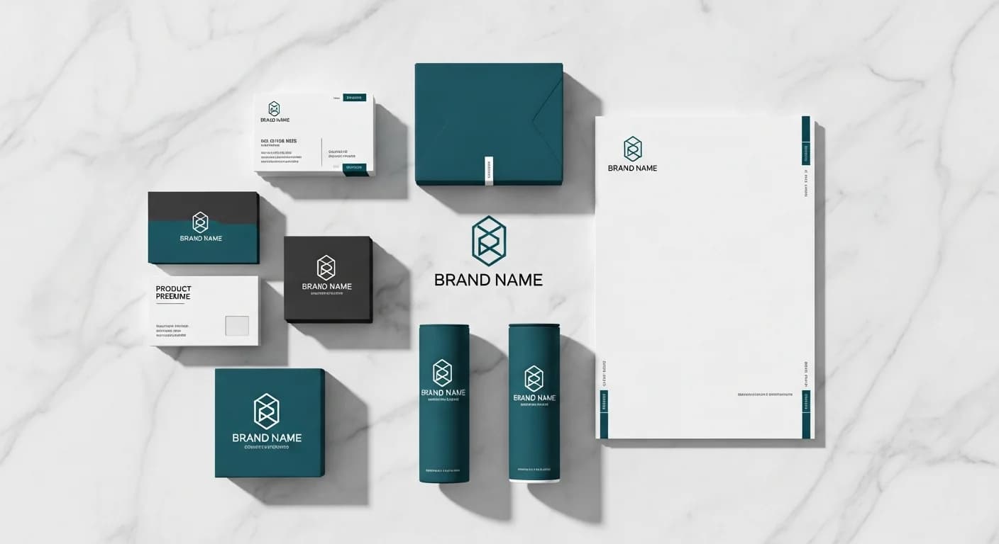
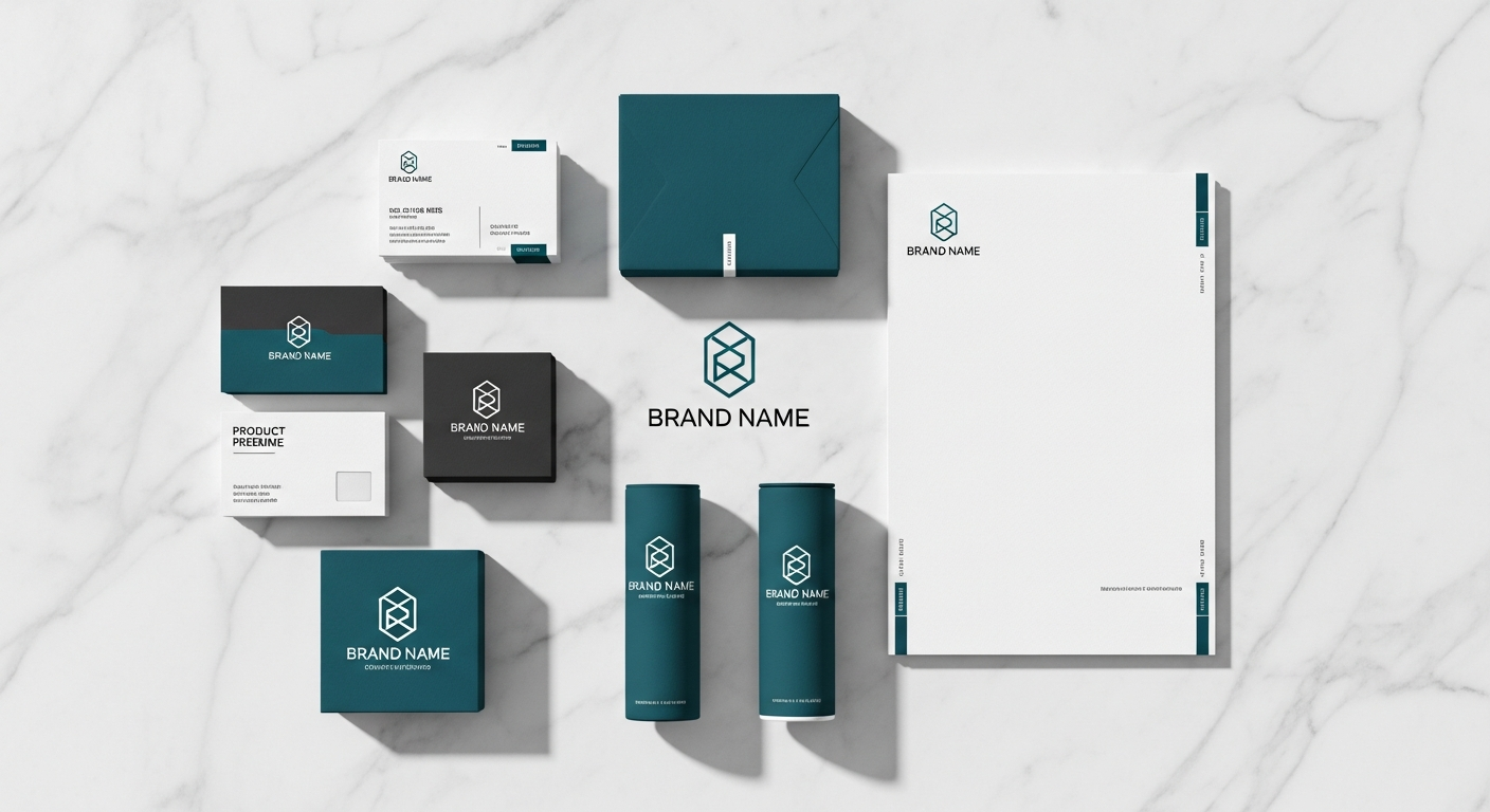
Your brand color palette is the foundation of every visual impression your business makes. Studies from the Institute for Color Research indicate that people make subconscious judgments about products within 90 seconds of initial viewing, and up to 90 percent of that assessment is based on color alone. A brand color palette generator helps you build a systematic, psychology-informed color system that communicates your brand personality, differentiates you from competitors, and creates instant recognition across every touchpoint.
Unlike choosing paint colors for a room or selecting a wedding palette, brand color selection carries commercial consequences that compound over years. Every email header, social media post, product label, and storefront sign reinforces or undermines your color identity. This guide covers the psychology behind effective brand colors, how generator tools accelerate the palette creation process, and the practical steps for maintaining color consistency from logo design through packaging and digital presence.
Why Brand Color Is Your Most Powerful Visual Asset
Color increases brand recognition by up to 80 percent according to research from the University of Loyola. Think of the instant association between Tiffany blue and luxury jewelry, Coca-Cola red and refreshment, or John Deere green and agricultural reliability. These brands have invested decades into owning their colors so thoroughly that the hue alone triggers brand recall without any logo or text visible. That level of color ownership is the ultimate goal of a brand color palette.
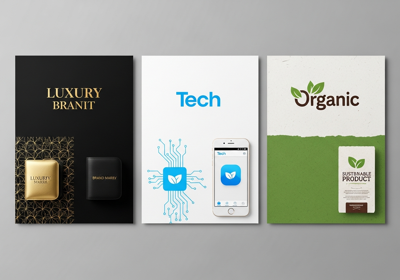
A strategic brand palette does more than look attractive — it communicates values, positions you within your market segment, and influences purchasing decisions. Financial institutions gravitate toward blues that signal trust and stability. Health and wellness brands favor greens that suggest vitality and natural ingredients. Luxury brands use black and gold to convey exclusivity. A palette generator helps you identify which colors align with your brand story and how to combine them into a system that works across every medium.
The most successful brand palettes are distinctive within their competitive landscape. If every competitor in your industry uses blue, a strategically chosen orange or teal can create immediate visual differentiation. A generator tool that includes competitive analysis features lets you upload competitor logos and identify the color whitespace in your market — the unclaimed territory where your brand can stand out.
Color Psychology for Brand Identity
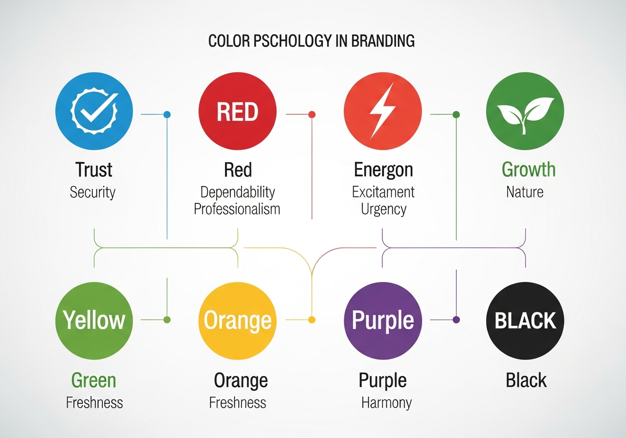
Color psychology is the study of how colors influence human perception and behavior. While individual responses to color vary by culture and personal experience, broad patterns hold consistent across large populations. Red evokes energy, urgency, and passion — which is why it dominates food, entertainment, and sale signage. Blue communicates trust, professionalism, and calm, making it the most popular color in corporate branding from technology to banking.
Green signals growth, health, and environmental responsibility. It works for organic food brands, financial services emphasizing growth, and sustainability-focused companies. Yellow communicates optimism and accessibility, often used by brands wanting to appear friendly and approachable. Purple has long been associated with creativity, luxury, and wisdom, making it popular in beauty, education, and premium service industries. Orange combines the energy of red with the friendliness of yellow, commonly used by brands targeting younger, action-oriented audiences.
Black and white are powerful brand colors in their own right. Black conveys sophistication, luxury, and authority — dominant in fashion, automotive, and premium technology branding. White communicates simplicity, purity, and modern minimalism. Many contemporary brands use black-and-white primary palettes with a single accent color for maximum contrast and memorability. Understanding these psychological foundations helps you make intentional choices when building your palette in a generator tool.
How to Use a Brand Color Palette Generator
A brand color palette generator streamlines what was traditionally a lengthy designer-led process into an interactive exploration. Start by inputting your primary brand color — this might be extracted from an existing logo, chosen based on color psychology, or pulled from an inspiration image. The generator then calculates harmonious companion colors using complementary, analogous, triadic, or split-complementary relationships from the color wheel.
Most professional generators allow you to lock certain colors and regenerate others, letting you keep your primary while exploring secondary and accent options. Look for tools that output colors in multiple formats simultaneously: hex codes for web, RGB for digital screens, CMYK for print, and Pantone for branded materials. This multi-format output eliminates the conversion guesswork that causes color inconsistencies between your website and your printed business cards.
For the most effective brand palette generation, combine an algorithmic tool with your industry knowledge. A generator might produce a mathematically perfect complementary palette that happens to look identical to your biggest competitor. Always cross-reference generated palettes against the competitive landscape. For additional exploration methods, see our guide to building palettes from hex codes which covers expanding a single brand color into a complete system.
Building a 5-Color Brand Palette: Primary, Secondary, Accent, Background, Text
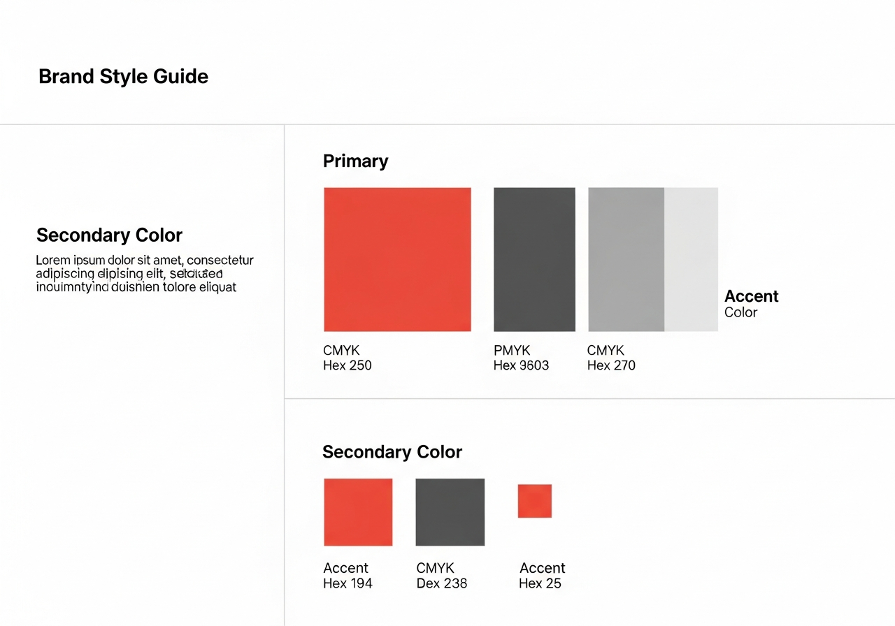
The most functional brand palette contains five color roles, each serving a specific purpose in your visual identity system. Your primary color is the hero — the color most associated with your brand name. It appears in your logo, primary call-to-action buttons, and the most prominent brand touchpoints. This color should be distinctive, memorable, and aligned with your brand personality through the psychology principles discussed earlier.
Your secondary color supports the primary without competing for attention. It often appears in secondary headings, supporting graphics, and complementary design elements. The accent color provides visual punctuation — it draws attention to specific elements like sale badges, notification indicators, or highlighted features. Use your accent color sparingly; its power comes from contrast against the more prevalent primary and secondary colors.
Background and text colors complete the system. Your background color is typically a neutral — white, off-white, light gray, or occasionally a tinted version of your primary at very low saturation. Your text color provides maximum readability against the background, usually near-black or a very dark version of your primary color. Together, these five roles create a flexible system that can style any design asset from a billboard to an email signature. Learn more about palette sizing in our color count rules guide.
Ensuring Color Consistency Across Print and Digital
One of the biggest challenges in brand color management is maintaining consistency between digital screens and printed materials. Screens use additive RGB color mixing where light creates colors, while print uses subtractive CMYK mixing where ink absorbs light. This fundamental difference means a vibrant electric blue on your website may print as a duller, more muted tone on your business cards unless you manage the conversion carefully.
Pantone spot colors offer the most reliable bridge between screen and print. By specifying a Pantone reference for your primary brand color, you give every printer a standardized physical swatch to match against. The investment in Pantone matching pays for itself by eliminating reprints caused by color drift. Include Pantone references alongside hex and CMYK values in your brand guidelines document so every vendor and designer has a definitive color reference. For professional Pantone matching techniques, see our Pantone palette guide.
Digital consistency requires attention to color profiles and display calibration. Specify sRGB as your standard color space for web assets. Provide exact hex codes in your brand guidelines and include light and dark variants of each color for use on different backgrounds. Test your palette on multiple devices — what looks perfect on a calibrated design monitor may shift significantly on a smartphone screen or a projector. Build light and dark versions of your brand palette for applications that support both modes.
Brand Color Palette Examples by Industry
Technology companies often build palettes around blue primaries with vibrant accent colors — think of IBM's blue, Microsoft's multi-color windows, or Dropbox's blue-to-purple gradient evolution. The technology sector is evolving toward more distinctive palettes as the market matures and pure blue becomes overcrowded. Gradient and multi-tone primaries are gaining popularity as brands seek differentiation within the blue-dominated landscape.
Food and beverage brands lean heavily into warm, appetite-stimulating colors. Red and yellow dominate fast food branding because they are proven to increase hunger and urgency. Premium food brands shift toward earthy greens, deep browns, and cream tones that signal natural ingredients and artisanal quality. Health-focused food brands increasingly use fresh green and white palettes with minimal accent colors to communicate clean, simple ingredient lists.
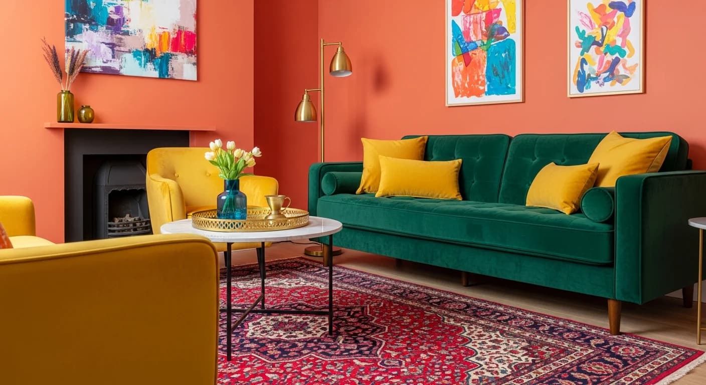
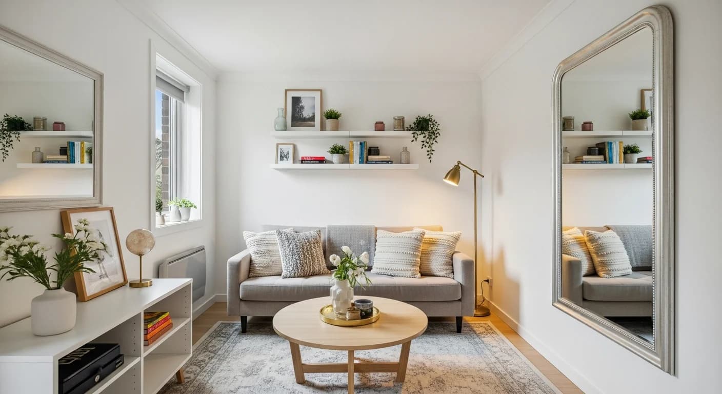
Interior design and home decor brands — including HanoDecor — often adopt sophisticated neutral-forward palettes with warm accent tones. This communicates design expertise, approachability, and an understanding of how color works in residential spaces. The palette itself demonstrates the brand's color sensibility. Professional services like law firms, accounting practices, and consultancies typically use conservative palettes anchored in navy, charcoal, or forest green with metallic accents that convey authority and trustworthiness.
Frequently Asked Questions
How many colors should a brand palette have?
A functional brand palette typically has five colors: primary, secondary, accent, background, and text. Some brands extend to seven or eight colors by adding semantic colors for success states, warning states, and information messages. Fewer than three colors limits design flexibility, while more than eight creates inconsistency as team members struggle to apply the right color in the right context. Start with five and expand only when a clear functional need arises.
Should I choose my brand colors before or after logo design?
Ideally, brand color selection and logo design happen concurrently as part of a unified brand identity process. However, if you must sequence them, choose your primary brand color first. The logo design can then incorporate and reinforce that color while exploring shapes, typography, and compositional options. Choosing colors after logo design risks constraining your palette to whatever happened to look good in the logo mockup rather than what strategically serves your brand.
Can I change my brand colors after launch?
Yes, brands evolve their color palettes regularly, but changes should be gradual and strategic. A sudden dramatic shift can confuse existing customers and erode brand recognition you have built. Many successful rebrands maintain the primary color while updating secondary and accent colors to feel more contemporary. If a primary color change is necessary, plan a transition period where old and new colors coexist in your materials before fully switching.
What is the difference between a brand palette and a brand color system?
A brand palette is the set of specific colors your brand uses. A brand color system includes those colors plus rules for how they are applied — which color goes on buttons versus headings, how much of each color should appear on a typical page, which colors pair together in charts, and how colors adapt between light and dark modes. The system ensures consistency even when multiple designers work on different projects simultaneously.
How do I protect my brand color from competitors?
While you cannot trademark a color in general use, you can trademark a specific color in a specific product category if you can demonstrate it has acquired secondary meaning — meaning consumers associate that color with your brand. Tiffany blue and UPS brown are trademarked in their respective categories. For most businesses, the practical protection comes from consistent, widespread use that creates strong consumer associations rather than legal filings.
Related Articles
Expand your color palette knowledge with these related guides: How to Build a Color Palette from a Hex Code covers expanding a single brand color into a full system. Website and UI Color Palette Generator ensures your brand colors meet accessibility standards online. Pantone Color Palette Generator covers professional color matching for print consistency. Browse the HanoDecor gallery for visual inspiration across design styles.
Generate Your Brand Palette with HanoDecor AI
Ready to build a brand color palette that communicates your values and stands out in your market? Our AI-powered color palette generator creates professional-grade palettes with harmonious color relationships, outputting hex, RGB, and complementary format references for immediate use in your brand guidelines.
See how your brand colors translate into interior spaces with the HanoDecor Studio. Whether you are branding a retail location, a restaurant, or a corporate office, visualizing your palette in physical environments ensures your colors work as beautifully on walls and furnishings as they do on screens and packaging. Explore our design ideas for inspiration across hundreds of curated color schemes.
Brand Color Palette Generator FAQs
Written by
Priya Sharma
Priya is an award-winning UX designer who previously led design teams at Airbnb and Pinterest. Her focus on user-centered design ensures that HanoDecor's tools are intuitive and accessible to everyone, regardless of their technical background.