Pantone Color Palette Generator: Professional Color Matching Guide
Quick Summary
A professional guide to Pantone color palette generators covering why Pantone matters for professional color work, the Pantone Matching System (PMS) numbering and swatch structure, Pantone Connect digital platform and palette generation tools, converting Pantone colors to hex, RGB, and CMYK for cross-media consistency, Pantone Color of the Year trend forecasting and its influence on design, and practical applications of Pantone colors in interior design including paint matching, fabric selection, and decor coordination.
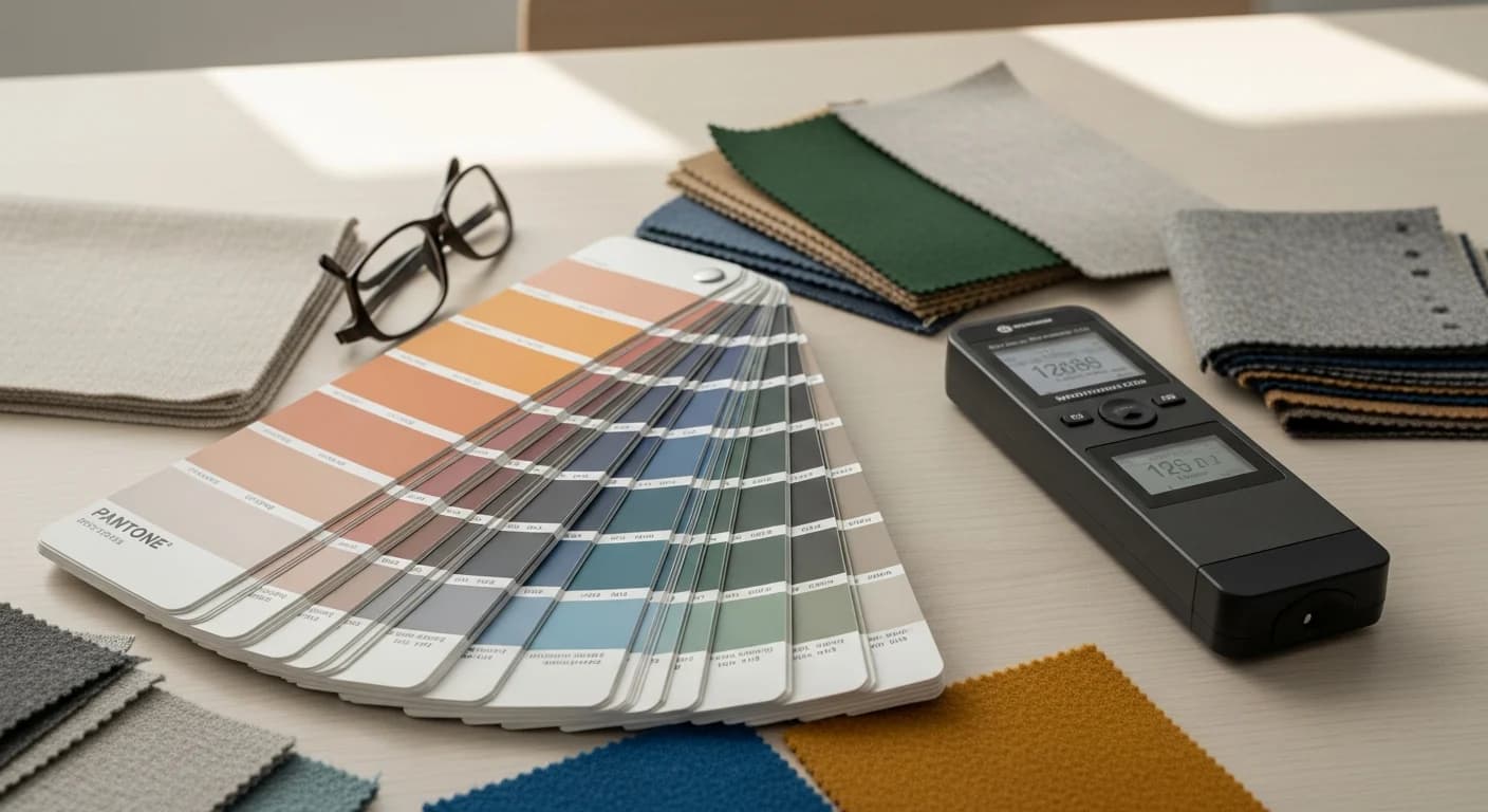
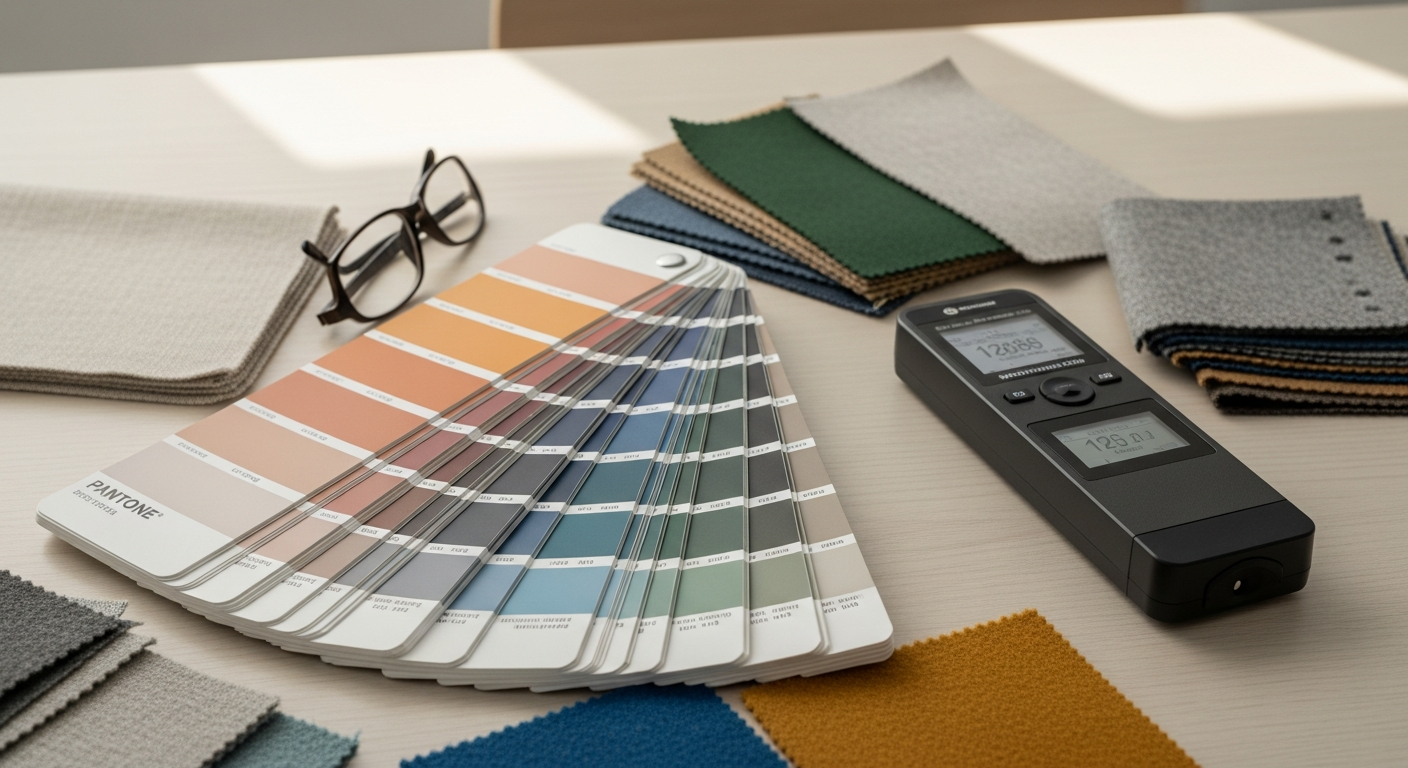
A Pantone color palette generator provides the precision that professional design work demands. While general-purpose palette tools create beautiful color harmonies, Pantone-based generators connect your digital palette to a universal physical color standard used by paint manufacturers, textile mills, printers, and product designers worldwide. When you specify Pantone 7621 C (a rich terracotta), every supplier receiving that specification can produce an identical color — eliminating the guesswork that plagues hex-code-only specifications.
The Pantone Matching System (PMS) has been the global language of color for over 60 years, with more than 2,390 spot colors in its library covering coated and uncoated paper, textiles (TCX), plastics, and architectural coatings. Whether you are selecting paint colors for an interior renovation, specifying fabrics for a furniture reupholstering project, or ensuring brand consistency across print and digital media, understanding how to generate and work with Pantone palettes elevates your color decisions from approximate to exact.
Why Pantone Matters for Professional Color Palettes
Digital color is inherently variable. The same hex code displays differently across monitors, phones, tablets, and projectors depending on screen calibration, ambient lighting, and display technology. Pantone solves this problem by providing a physical reference standard — a printed swatch on paper or a dyed fabric sample — that represents the definitive version of each color. When you hold a Pantone swatch against a painted wall or a fabric sample, you are comparing colors in the same medium under the same lighting conditions.
For interior designers, Pantone is invaluable for specifying colors across different materials. A living room design might require the same blue-gray tone on walls (paint), a sofa (fabric), a ceramic vase (glaze), and a wool rug (yarn). Specifying Pantone 7544 C for all four ensures the fabric supplier, the paint mixer, the ceramicist, and the rug manufacturer are all targeting the same exact color — rather than each interpreting a hex code through their own medium's color characteristics.
Brand consistency across touchpoints is another critical application. A brand that specifies its primary color as Pantone 2925 C can guarantee that its business cards, signage, packaging, uniforms, and website all display a matching blue — even when produced by different vendors using different printing and manufacturing processes. This consistency builds the visual recognition that drives brand equity over time.
Understanding the Pantone Matching System (PMS)
The Pantone Matching System uses a structured numbering scheme to identify each color uniquely. A typical PMS designation includes a number (indicating the color formula) and a suffix indicating the substrate: C for coated paper (glossy), U for uncoated paper (matte), CP for coated process (CMYK simulation), and TCX for textile cotton. The same color number looks different on coated versus uncoated paper because the substrate's absorbency affects how ink sits on the surface.
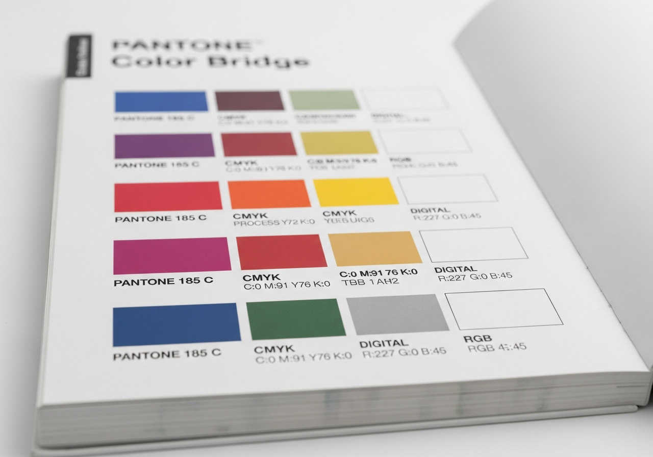
Pantone spot colors are mixed from a base set of 18 inks to create each specific shade. This ink-mixing process produces more vibrant, consistent colors than four-color process (CMYK) printing can achieve. However, spot color printing requires dedicated ink wells, making it more expensive for multi-color jobs. The Pantone Color Bridge guides show the closest CMYK simulation for each spot color, helping designers decide when the CMYK approximation is acceptable versus when true spot color printing is necessary.
The Pantone Formula Guide (the iconic fan deck) organizes colors chromatically, making it easy to find related shades by fanning through adjacent strips. The companion Pantone Solid Chips book provides tear-out swatches for physical comparison against materials and surfaces — essential for interior design work where holding a swatch next to a fabric sample or paint chip reveals nuances that screen comparison cannot capture.
Pantone Connect and Digital Palette Tools
Pantone Connect is the official digital platform that brings the PMS library into your design workflow. The platform includes a color palette generator that creates harmonious combinations from any starting Pantone color, a color picker that identifies the nearest Pantone match for any digital color, and a cross-reference tool that converts between Pantone, hex, RGB, CMYK, and LAB values. The free tier provides access to 15,000 colors, while the premium subscription unlocks the full library and advanced palette features.
Pantone Connect integrates directly with Adobe Creative Cloud, allowing designers to access Pantone colors from within Photoshop, Illustrator, and InDesign without leaving their design application. The Figma and Sketch integrations bring Pantone specification into UI design workflows where color accuracy for brand assets is critical. Our color palette generator complements Pantone Connect by providing interior-design-specific palette suggestions that you can then cross-reference with Pantone specifications.
Third-party Pantone palette tools extend the ecosystem. FindPantone.com provides free Pantone-to-hex conversion and palette exploration. Pantone Studio (the mobile app) uses your phone camera to capture colors from the real world and match them to the nearest Pantone shade — useful for matching a fabric at a showroom or a tile at a supplier to your specified palette. For more palette generation tools, explore our free color palette generators comparison.
Converting Pantone to Hex, RGB, and CMYK
Color conversion between Pantone and digital color spaces is essential but inherently imprecise. Pantone spot colors occupy a wider color gamut than sRGB or CMYK can reproduce — some Pantone blues, greens, and oranges have no exact digital equivalent. Conversion tools provide the closest possible approximation, but the match is approximate rather than identical. Pantone Connect flags these out-of-gamut situations, helping designers understand when a digital representation deviates significantly from the physical swatch.
For web and digital design, the hex and RGB conversions from Pantone are suitable for achieving visual similarity on screens. For print production, always specify the actual Pantone PMS number rather than relying on a CMYK conversion — the whole point of the Pantone system is bypassing CMYK's limitations. When a project spans both digital and print, maintain a dual-specification palette listing both the Pantone number (for physical production) and the hex code (for digital implementation).
LAB (CIELAB) values serve as the most device-independent conversion pathway. Converting Pantone to LAB first and then to hex or CMYK from LAB produces more accurate results than direct Pantone-to-hex conversions. Advanced design tools and color management software use LAB as the intermediate color space for all cross-system conversions. For understanding hex-based palette building, see our hex code palette guide.
Pantone Color of the Year and Trend Forecasting
The Pantone Color of the Year announcement, released each December for the following year, is one of the most influential events in the design industry. This single color selection influences fashion collections, home furnishing lines, cosmetics, graphic design trends, and interior paint palettes for the entire year. Paint companies like Benjamin Moore, Sherwin-Williams, and Behr release their own colors of the year, but Pantone's selection carries the broadest cross-industry impact.
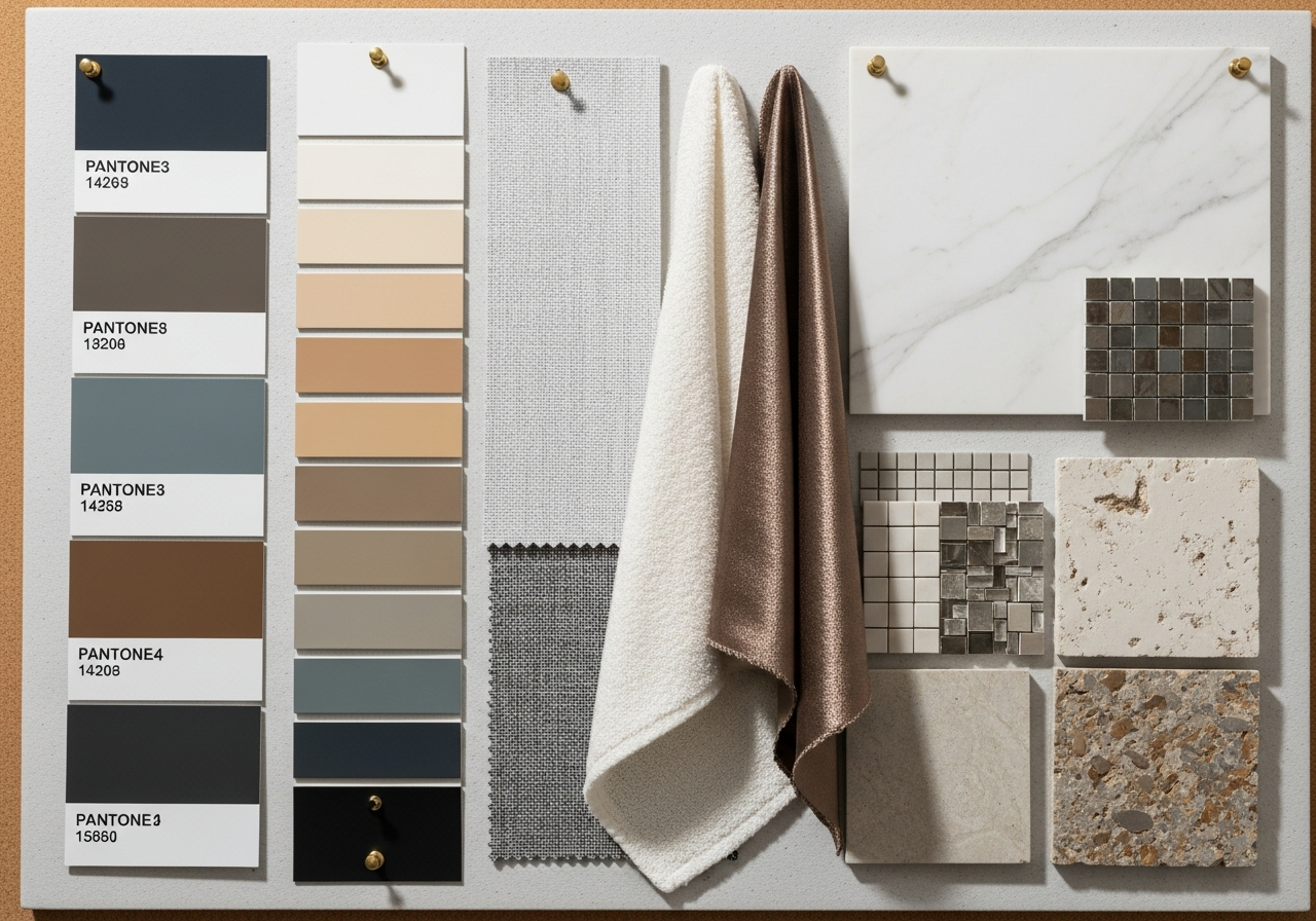
The Color of the Year is not chosen arbitrarily. Pantone's color team analyzes global trend signals across entertainment, art, fashion, travel, technology, and social media throughout the year. The selected color reflects the collective cultural mood — recent selections have leaned toward calming, nature-inspired tones reflecting a global desire for well-being and environmental connection. Understanding this trend pipeline helps designers anticipate which palettes will feel current versus dated. For how these trends translate into full room palettes, explore our home decor color palette guide.
For interior design, the Color of the Year provides a safe trend entry point. Incorporating it as an accent through accessories like throw pillows, artwork, and ceramics lets you participate in the current aesthetic without committing to a wall color or furniture piece that may feel dated in two years. Reserved application — a single accent wall, a statement chair, or a curated shelf display — keeps your space feeling current while your foundational palette remains timeless.
Using Pantone Colors in Interior Design
Interior designers use Pantone primarily for cross-material specification — ensuring that the blue on the walls matches the blue in the upholstery fabric, the ceramic tiles, and the custom cabinetry paint. Major paint manufacturers publish Pantone-to-paint conversion guides: Benjamin Moore's Color Portfolio, Sherwin-Williams' ColorSnap, and Behr's ColorSmart all offer Pantone cross-reference lookup. These conversions account for the difference between ink-on-paper (Pantone swatches) and pigment-in-binder (architectural paint). Browse our design ideas for real-world examples of professionally coordinated Pantone-specified interiors.
Fabric and textile suppliers increasingly reference Pantone TCX (Textile Cotton Extended) numbers, making it possible to specify a sofa fabric, curtain material, and throw blanket in the same Pantone shade. The AI house painter tool lets you visualize Pantone-specified colors on your actual walls and surfaces before purchasing paint or materials, bridging the gap between swatch books and finished rooms.
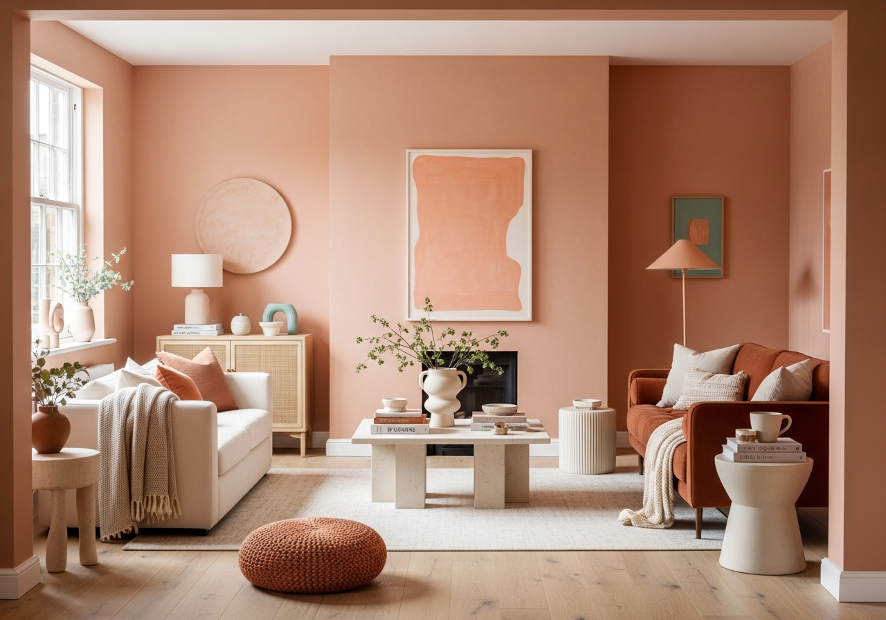
For DIY interior projects, the Pantone Studio mobile app simplifies color matching. Photograph a color you love — a restaurant wall, a hotel lobby detail, a piece of art — and the app identifies the nearest Pantone match along with paint brand equivalents. This workflow turns real-world inspiration into actionable specifications you can take directly to a paint counter or fabric showroom. For more on how brand-specific paint palettes work, explore our Benjamin Moore palette guide.
Frequently Asked Questions
Is Pantone Connect free to use?
Pantone Connect offers a limited free tier that provides access to approximately 15,000 Pantone colors, basic palette generation, and color conversion tools. The premium subscription (approximately $90 per year) unlocks the full Pantone library of over 15,000 colors across all substrates, advanced palette features, Adobe and Figma integrations, and trend forecasting data. For occasional use, the free tier is sufficient; professional designers typically benefit from the premium subscription.
Can I match a hex code to a Pantone color?
Yes, but with the understanding that the match is approximate. Pantone Connect, FindPantone.com, and various design tools allow you to input a hex code and find the nearest Pantone match. The accuracy depends on whether the hex color falls within the Pantone gamut — some digital colors have close Pantone equivalents, while others may only have distant approximations. Always verify the match visually against a physical Pantone swatch before using it in production.
What is the difference between Pantone C and Pantone U?
Pantone C (coated) shows how a color appears when printed on glossy, coated paper — colors appear more vibrant and saturated. Pantone U (uncoated) shows the same ink formula on matte, uncoated paper — colors appear slightly duller and more muted because the paper absorbs more ink. The same Pantone number in C and U uses identical ink but looks different due to the paper surface. Always specify both the number and the suffix when communicating color specifications.
How do I use Pantone colors for interior paint selection?
Start by identifying your desired Pantone color using swatches or digital tools. Then use the paint manufacturer's cross-reference guide — Benjamin Moore Color Portfolio, Sherwin-Williams ColorSnap, or Behr ColorSmart — to find the closest paint match. Order a sample pot and paint a 12-by-12-inch test patch on your actual wall. View the test patch in morning, afternoon, and evening light before committing to a full room. Paint on walls always appears slightly different from swatches due to surface texture and room lighting.
Do I need Pantone for home DIY projects?
For most home DIY projects, Pantone is helpful but not essential. Paint manufacturers' proprietary color systems (like Benjamin Moore's numbering) work perfectly for single-medium projects like painting walls. Pantone becomes valuable when you need to match colors across different materials — ensuring your wall paint, sofa fabric, and accent tiles all hit the same shade of blue. For simple single-room projects, your paint store's color matching service provides sufficient accuracy.
Related Articles
Continue exploring professional color tools and techniques: Build a Palette from a Hex Code covers digital color fundamentals that complement Pantone knowledge. Benjamin Moore Color Palette Generator deep-dives into paint-specific digital tools. Brand Color Palette Generator covers Pantone's role in building cohesive brand identities. Accessible Color Palette Generator ensures your Pantone selections work for all users. Browse our design ideas for color inspiration.
Match Pantone Colors to Your Room with HanoDecor AI
Bridge the gap between Pantone swatches and your real-world space with our AI-powered visualization tools. The color palette generator helps you discover harmonious color combinations that you can then cross-reference with Pantone specifications for professional-grade accuracy across every surface and material in your room.
Use the AI house painter to preview Pantone-matched paint colors on your actual walls before buying a single can. Upload a photo, select your colors, and see a photorealistic preview in seconds. Explore the full HanoDecor Studio suite for comprehensive design visualization, and browse our design gallery for thousands of professionally coordinated color examples.
Pantone Color Palette Generator FAQs
Written by
Emily Rodriguez
Interior Design Editor covering living spaces, styling trends, and room makeovers. Former Architectural Digest contributor with a focus on accessible, budget-conscious design.