How to Choose Exterior Paint Colors for Your Home Style
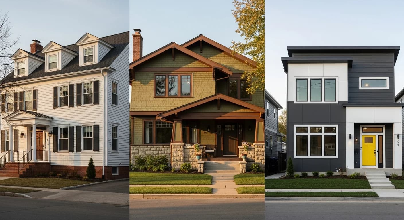
Your home’s architectural style tells a story, and the right exterior paint colors should enhance that narrative, not contradict it. A Victorian painted in stark modernist tones or a contemporary home in Colonial cream feels fundamentally wrong, even if the individual colors are beautiful. The most stunning exterior paint jobs work because the color palette honors the home’s architectural DNA while expressing the homeowner’s personality. As a professional painting contractor who has painted everything from 1890s Queen Annes to 2025 modern builds, I can tell you that choosing exterior paint colors by home style is the single most reliable path to an exterior you will love for years.
This guide walks you through the ideal color palettes for nine major architectural styles, explains how to work around fixed elements like brick, stone, and roof color, and gives you specific paint names and brands to consider. Whether your home is a classic ranch or an elaborate Victorian, you will find actionable color direction here. And when you are ready to see how colors look on your actual home, HanoDecor’s AI House Painter lets you visualize unlimited options instantly.
Why House Style Dictates Color Choices
Every architectural style was developed within a specific historical and cultural context that included preferences for materials, proportions, and yes, colors. Craftsman bungalows emerged from the Arts and Crafts movement, which celebrated natural materials and earth tones. Colonial homes reflected the formal symmetry and restrained palette of Georgian and Federal design traditions. Understanding this context does not mean you are locked into historical colors—it means you have a proven starting point that works with your home’s proportions and details.
Fixed elements are the non-negotiable components that your paint colors must harmonize with. Your roof color is typically the most expensive element to change and should be the starting point for any palette selection. Brown, gray, black, red, and terracotta roofs each dictate different color families. Stone veneer, brick facades, concrete foundations, and hardscape elements also have inherent colors that your paint must complement rather than clash with.
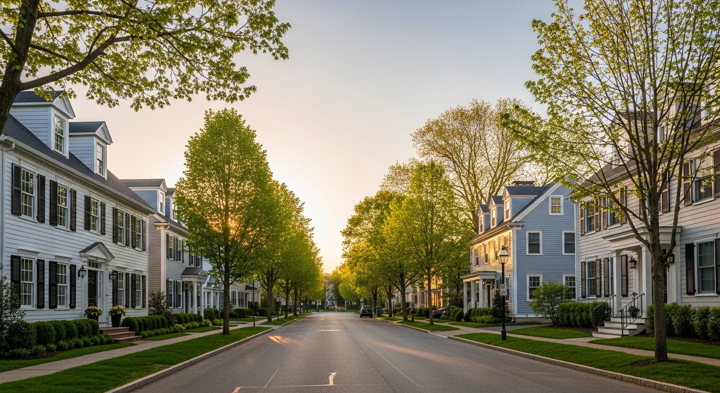
Neighborhood context matters more than most homeowners realize. While you want your home to express your individual taste, a neon-green house on a street of traditional neutrals hurts everyone’s property values, including yours. Many neighborhoods also have HOA requirements that restrict color choices. Check your HOA guidelines before falling in love with a bold color—but know that most HOAs approve a wide range of tasteful options. Regional context also plays a role: coastal homes look natural in blues and whites, desert homes suit earth tones and terracotta, and Pacific Northwest homes work beautifully in greens and grays.
For deeper insight into how specific colors affect mood and perception, our paint color psychology guide covers the emotional impact of different hues. Understanding color psychology helps you choose colors that not only match your home’s style but create the emotional impression you want visitors to experience.
Craftsman and Bungalow Colors
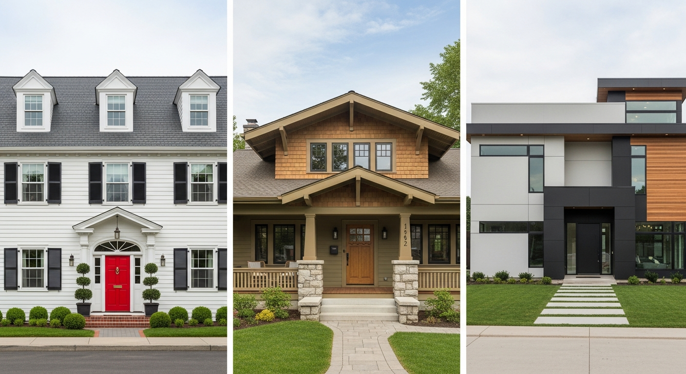
Craftsman homes and bungalows are among the most rewarding styles to paint because they traditionally use three to four colors, creating a rich, layered appearance. The Arts and Crafts movement that inspired these homes emphasized harmony with nature, so earthy tones are the foundation of any authentic Craftsman palette. Think olive green, warm brown, forest green, dark red, mustard gold, and deep amber.
The classic Craftsman color formula uses a dark to medium body color (olive, forest green, or rich brown), a lighter or contrasting trim (cream, buttercream, or warm tan), and a bold accent on the front door and decorative elements (deep red, teal, or amber). This multi-color approach highlights the architectural details—exposed rafters, tapered columns, and stone or brick porch supports—that define Craftsman style.
Specific paint recommendations from historic color collections include Sherwin-Williams’ Artisan line, which offers period-appropriate options like Roycroft Copper Red (SW 2839), Renwick Olive (SW 2815), and Rookwood Dark Brown (SW 2808). Benjamin Moore’s Historical Collection includes similar earthy tones like Evergreen (HC-22) and Newburyport Blue (HC-155). Behr’s Craftsman color palette features Spiced Cider and Mossy Oak as body options.
One key principle for Craftsman homes: keep the palette warm and grounded. Avoid cool grays, stark whites, and pastels that conflict with the style’s organic philosophy. If you want to modernize slightly, warm sage green or charcoal with cream trim updates the look while respecting the architectural tradition. Preview different Craftsman palettes on your home using HanoDecor’s Exterior Visualizer to find the perfect balance between tradition and your personal taste.
Colonial and Cape Cod Colors
Colonial homes and Cape Cod cottages are defined by symmetry, proportion, and understated elegance. The color palette should reinforce these qualities with clean, classic hues that feel timeless rather than trendy. White, cream, light gray, pale yellow, and slate blue are the traditional body colors, with darker shutters and doors providing contrast.
The standard Colonial color formula is beautifully simple: a light body color (white, cream, pale gray, or soft yellow), dark shutters (black, dark green, or navy), and a contrasting front door (red, black, navy, or forest green). This combination enhances the home’s symmetrical architecture by framing windows and creating a welcoming focal point at the entry.
Benjamin Moore has built a reputation for Colonial-appropriate colors, with options like Linen White (OC-146), Nantucket Fog (AC-22), and Hale Navy (HC-154) being perennial favorites. Sherwin-Williams offers Alabaster (SW 7008) for a warm white body, Naval (SW 6244) for shutters, and Passionate (SW 6316) for a traditional red door. For Cape Cod homes specifically, lighter colors work best because they complement the typical cedar shingle siding and the coastal light environment.
Symmetry-enhancing color strategies are particularly important for Colonial architecture. Keep the same color and sheen on all shutters, use matching trim around all windows, and maintain consistency from front to back. Any asymmetry in color application fights against the home’s architectural intent and looks unbalanced. For a broader look at color combinations, see our 25 stunning exterior color combinations guide.
Ranch and Mid-Century Modern Colors
Ranch homes emphasize horizontal lines, ground-level living, and integration with the surrounding landscape. The color palette should reinforce this horizontal emphasis with low-contrast combinations that make the home feel expansive and connected to its setting. Earth tones, muted blues, warm grays, and sage greens are natural fits for ranch architecture.
Ranch homes typically use a two-color scheme: body and trim. Unlike Colonial or Craftsman styles, ranch architecture has minimal decorative detail, so color restraint is key. Choose a body color that complements the landscape and a trim color that provides subtle definition without dramatic contrast. Popular ranch combinations include warm gray body with white trim, sage green body with cream trim, and warm beige body with chocolate trim.
For mid-century modern homes, the palette shifts slightly toward bolder, more saturated options. The mid-century aesthetic embraced color in ways that earlier styles did not, and a tasteful pop of color—particularly on the front door—is authentic to the era. Mustard yellow, turquoise, avocado green, and burnt orange are all period-appropriate accent colors. Benjamin Moore’s Color Stories collection and Sherwin-Williams’ Colormix Forecast both include mid-century inspired palettes. For a detailed exploration of ranch exterior makeovers with before-and-after examples, check out our ranch house exterior makeover guide.
The front door is the primary accent opportunity on a ranch home. Because the architecture is minimal, a bold door color creates the focal point that more ornate styles achieve through architectural detail. Consider colors like Benjamin Moore’s Caliente (AF-290) for a warm red, Sherwin-Williams’ Refuge (SW 6228) for a teal-blue, or Behr’s Turmeric for a warm gold. These accents read as intentional and stylish on ranch architecture.
Victorian and Queen Anne Colors
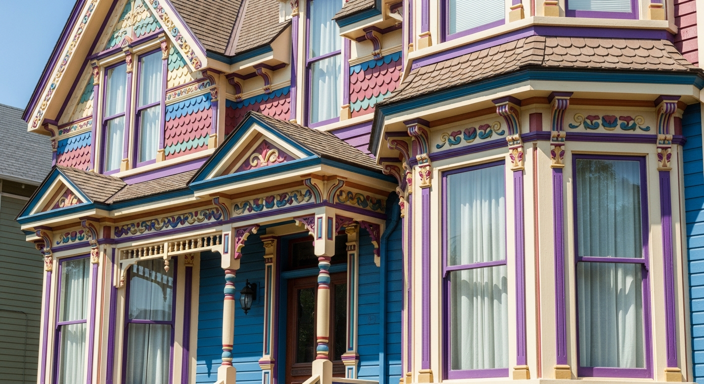
Victorian homes are the most colorful architectural style, and they welcome elaborate multi-color palettes that highlight their ornate decorative details. The famous “painted lady” tradition uses five to seven colors to distinguish different architectural elements: body, trim, window sash, decorative brackets, spindles, porch rails, and accent panels. This is not excess—it is deliberate highlighting of the extraordinary craftsmanship that defines Victorian design.
Jewel tones are the hallmark of Victorian color schemes: deep purple, teal, burgundy, gold, forest green, and rich ochre. These saturated colors were historically accurate (Victorians loved intense pigments) and they create the dramatic visual impact that complements ornate gingerbread trim, fish-scale shingles, and detailed cornice work. A classic Victorian palette might feature a dark teal body, cream trim, burgundy accents on decorative panels, gold on spindles, and a deep red front door.
Sherwin-Williams and Benjamin Moore both offer historic color collections specifically curated for Victorian homes. Sherwin-Williams’ Preservation Palette includes Rookwood Antique Gold (SW 2814), Rookwood Jade (SW 2812), and Rookwood Red (SW 2802). Benjamin Moore’s Historical Colors feature colors like Stratton Blue (HC-142) and Fairview Taupe (HC-85) that work beautifully on Victorian exteriors. These collections are formulated to match the pigment quality and depth of historical paints.
If you are painting a Victorian and feeling overwhelmed by the number of color decisions, start with the body color and work outward. Choose your dominant body color first, then select a lighter trim, and finally add accent colors for decorative elements. Each additional color should either complement or provide interesting contrast with the colors adjacent to it. Visualize your multi-color scheme before purchasing paint using HanoDecor’s AI House Painter—seeing five colors together on your actual home is far more revealing than looking at paint chips.
Tudor and English Cottage Colors
Tudor homes have one of the most distinctive and non-negotiable color frameworks in residential architecture. The defining feature is the contrast between stucco (or plaster) walls and dark exposed timber framing (half-timbering). The stucco portions are traditionally cream, warm white, or pale gold, while the timber is stained or painted in dark brown, near-black, or espresso. Deviating significantly from this formula undermines the entire Tudor aesthetic.
The key to painting a Tudor exterior is restraint. Let the architectural elements—the half-timbering, the steep roof, the prominent chimney—provide the visual drama. Your paint colors should support these features rather than compete with them. Cream or warm white stucco (Benjamin Moore’s White Dove OC-17 or Sherwin-Williams’ Creamy SW 7012) with dark brown timber (Benjamin Moore’s Espresso Bark OC-133 or Sherwin-Williams’ Black Fox SW 7020) is the classic combination that never fails.
For the front door on a Tudor, deep red, hunter green, or dark blue maintains the traditional feel while providing a welcoming focal point. Avoid trendy colors on Tudor doors—the architecture demands respect for its English heritage. Window trim should match either the timber color or the stucco color, depending on the specific Tudor variant. For more on door and trim color selection, visit our exterior trim and door colors guide.
Mediterranean and Spanish Revival Colors
Mediterranean and Spanish Revival homes draw their color inspiration from the sun-drenched landscapes of Southern Europe. Warm whites, terra cotta, ochre, soft gold, and muted peach are the body colors that honor this tradition. These warm hues complement the terracotta tile roofs, wrought iron details, and arched windows that define Mediterranean architecture.
The roof color is especially important for Mediterranean homes because terracotta tile roofs are highly visible and their orange-red tone influences the entire palette. Body colors should harmonize with the roof rather than fight it. Warm cream, soft gold, and pale apricot work beautifully under terracotta. Cool colors like gray, blue, and green should be used sparingly—as accent colors on doors, planters, or tile work rather than body colors.
Specific paint recommendations include Sherwin-Williams’ Ivoire (SW 6127), Benjamin Moore’s Monterey White (HC-27), and Behr’s Canyon Dusk for body options. For accent doors and decorative elements, consider deep turquoise, cobalt blue, or aged terra cotta—colors that reference Mediterranean tile and ceramic traditions. Browse our best exterior paint colors for curb appeal for more inspiration on colors that boost home value.
Modern and Contemporary Colors
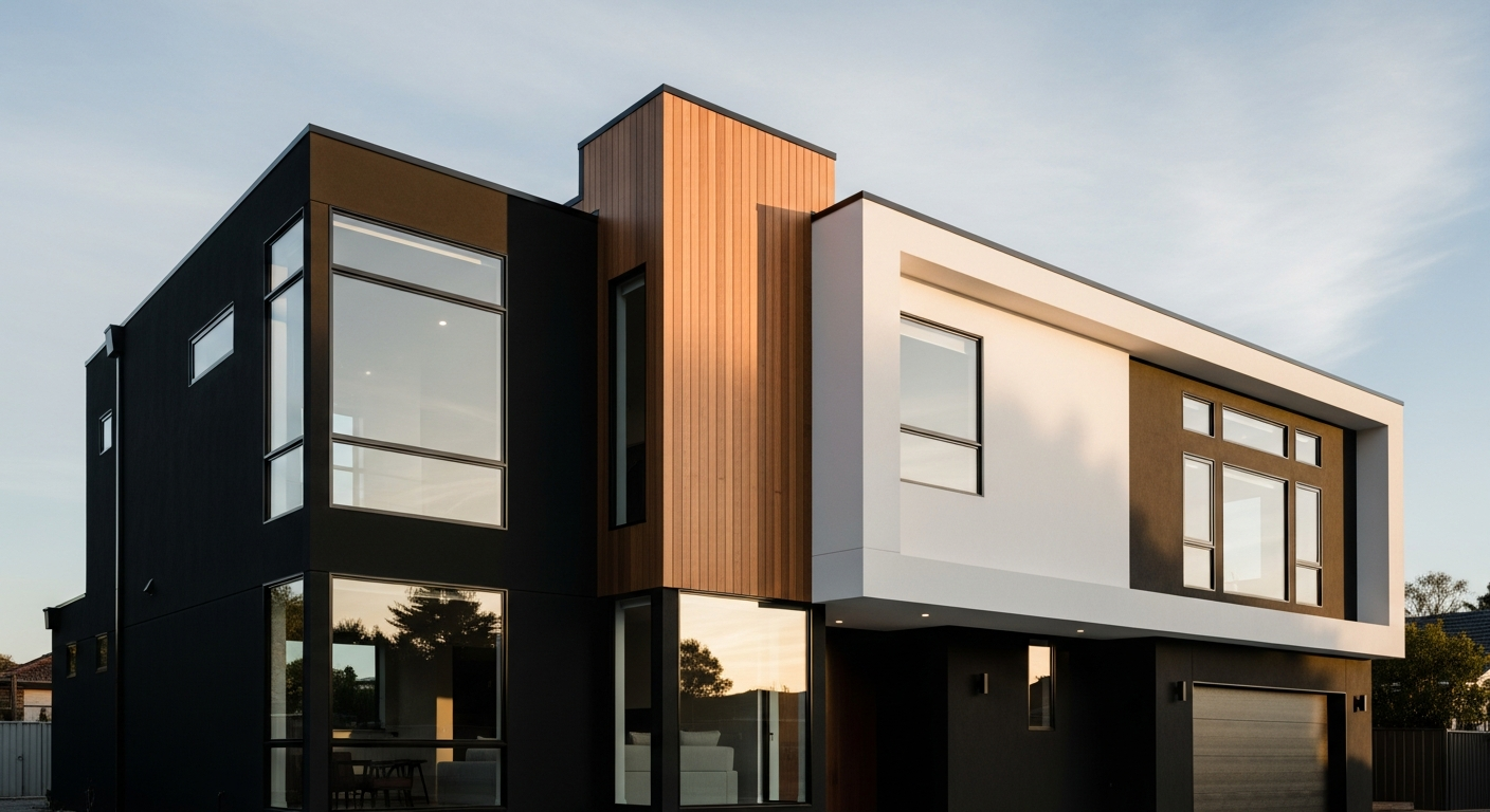
Modern and contemporary homes embrace high contrast and clean lines. The dominant trend is a bold body-and-trim combination: dark body (charcoal, near-black, dark navy) with crisp white trim, or conversely, white body with black trim and window frames. This binary approach aligns perfectly with modernist design philosophy, which values simplicity, geometry, and material honesty.
Monochromatic schemes are another strong option for contemporary architecture. Using different shades of the same color family—light gray siding with medium gray trim and dark gray accents—creates a sophisticated, cohesive look that lets the architecture speak. Material variation (metal panels, wood accents, concrete elements) adds visual texture without color complexity.
For modern homes, flat and matte finishes reinforce the contemporary aesthetic. The absence of sheen creates a clean, gallery-like appearance that highlights the home’s geometric form. This is one of the few styles where flat finish on siding is an aesthetic choice rather than a compromise. Sherwin-Williams’ Tricorn Black (SW 6258), Benjamin Moore’s Wrought Iron (2124-10), and Behr’s Broadway are popular dark body options. For white trim, Extra White (SW 7006) or Chantilly Lace (OC-65) provide the crispness that modern design demands. For a broader exploration of how finishes work across styles, see our exterior paint finishes guide.
Farmhouse Colors
The farmhouse style has evolved into two distinct branches, each with its own color palette. Modern farmhouse emphasizes the classic white body with black accents—black window frames, black hardware, black trim details—creating a clean, graphic look that feels both timeless and current. Traditional farmhouse leans toward warmer, softer tones: cream body with sage green or dusty blue trim, reflecting the agricultural heritage and natural surroundings.
For modern farmhouse, Sherwin-Williams’ Pure White (SW 7005) or Benjamin Moore’s Simply White (OC-117) provides the ideal crisp white body. Pair with Sherwin-Williams’ Iron Ore (SW 7069) or Benjamin Moore’s Black (2132-10) for trim and window accents. Board-and-batten siding in a contrasting shade adds architectural interest—consider a warm gray or soft green for this element.
Traditional farmhouse colors are warmer and more varied. Sage green (Sherwin-Williams’ Clary Sage SW 6178), cream (Benjamin Moore’s Navajo White OC-95), and soft butter yellow (Behr’s Cellini Gold) all work beautifully for body colors. Trim in warm white and doors in traditional red, dark green, or navy complete the pastoral palette. For inspiration on farmhouse and other exterior schemes, explore our exterior house color schemes guide.
Working Around Fixed Elements
The most challenging aspect of choosing exterior paint colors is coordinating with elements you cannot change. Your roof, brick, stone, concrete, and hardscape are fixed colors that your paint must harmonize with. Starting your color selection with these fixed elements—rather than choosing paint colors first—prevents frustrating mismatches.
Roof color should be your starting point. Brown roofs pair with warm earth tones, creams, and sage greens. Gray roofs work with cool neutrals, blues, and greens. Black roofs are the most versatile, complementing nearly any body color. Red or terracotta roofs demand warm body colors and look wrong with cool grays or blues. Match paint undertones (warm vs. cool) to your roof’s undertone for natural harmony.
Brick and stone color coordination follows similar principles. Red brick looks best with warm whites, creams, and sage—never with pink or orange tones that amplify the red. Tan or buff brick pairs beautifully with warm grays, sage, or chocolate. Gray stone works with blues, greens, and cool neutrals. The key is identifying whether your masonry has warm or cool undertones and selecting paint that matches that temperature. Use HanoDecor’s AI House Painter to test colors against your actual fixed elements—it is infinitely easier to evaluate harmony on a photo of your real home than on generic color charts. Browse ideas in our exterior ideas gallery for more inspiration.
Frequently Asked Questions
What if my house style doesn’t fit neatly into a category? Many homes blend elements from multiple styles, especially those built in the mid-20th century or later. In these cases, identify the dominant style elements and use that style’s palette as your starting point. A split-level with Craftsman-inspired stone columns might use a Craftsman earth-tone palette. A home with Colonial proportions but mid-century details could lean toward the cleaner Colonial palette with a modern accent door. When in doubt, neutral earth tones and warm whites work across nearly every style.
Can I paint a Victorian in modern colors? Technically yes, but proceed carefully. The ornate details of Victorian architecture are designed to be highlighted with multiple colors. Painting a Victorian in a single modern neutral effectively hides the craftsmanship that makes the home special. If you want a more contemporary feel, consider using muted versions of traditional Victorian colors rather than abandoning the multi-color tradition entirely. Slate blue instead of teal, warm gray instead of brown, and burgundy instead of red creates a modern Victorian look that respects the architecture.
How do I find the original historic colors of my home? For homes built before 1940, paint archaeology can reveal original color layers. Scrape carefully through paint layers in an inconspicuous area and examine the sequence of colors. Local historical societies often have documentation of original neighborhood color schemes. Sherwin-Williams and Benjamin Moore both offer historic color collections organized by era and region that can help you approximate period-appropriate choices even without physical evidence.
Should I follow HOA color rules or fight for my choice? Follow them. HOA color restrictions exist to maintain neighborhood consistency and property values. Most HOAs provide an approved color list that includes dozens of attractive options across multiple palettes. If you feel strongly about a specific color not on the list, submit a formal request with a visualization showing how the color looks on your home. Using HanoDecor’s Exterior Visualizer to create a photorealistic preview of your proposed color can be a powerful tool in getting HOA approval for non-standard choices.
How many exterior paint colors should I use? Most homes look best with two to three colors: body, trim, and front door/accent. Craftsman and Victorian homes can handle four to seven colors because their ornate details benefit from color differentiation. Modern homes often use just two (body and trim) for maximum clean-line impact. Using more colors than your style supports creates visual confusion, while using too few can make the home look flat and unfinished.
Find the Perfect Palette for Your Home Style
Choosing exterior paint colors that match your home’s architectural style is the foundation of a paint job you will love for years. But reading about color is very different from seeing it on your actual home. Light conditions, surrounding landscape, and neighboring homes all affect how colors read in reality.
HanoDecor’s AI House Painter lets you upload a photo of your home and instantly preview any color combination. Test historically appropriate Craftsman palettes, try a bold modern contrast scheme, or experiment with trending colors—all from your phone or computer. Seeing colors on your real home eliminates the guesswork and gives you the confidence to commit.
For a comprehensive exterior makeover that includes siding, landscaping, and architectural elements alongside paint colors, try HanoDecor’s Exterior Visualizer. Explore our design gallery and exterior ideas for inspiration from homeowners who have already transformed their homes. Check our pricing page to get started with your perfect palette today.
How to Choose Exterior Paint Colors for Your Home Style FAQs
Written by
James Park
Architectural Design Advisor specializing in exterior remodeling, siding systems, and structural home improvements. Licensed architect with 18 years of residential project experience.