Exterior House Color Schemes: 20 Designer-Approved Combinations
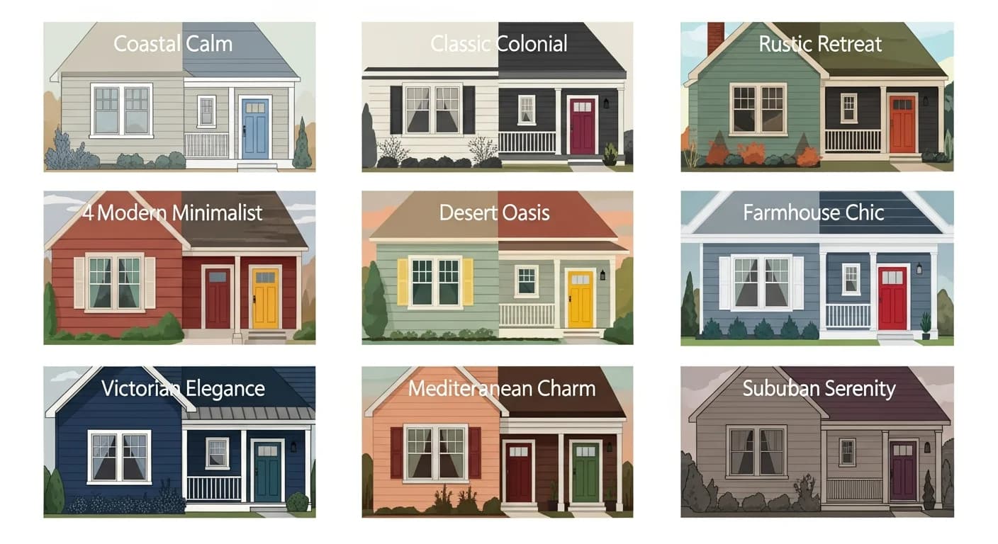
Choosing the right exterior color scheme is about much more than picking a single color you like. A truly stunning exterior uses three coordinated elements — body, trim, and accent colors — working together to highlight your home's architectural features and create visual harmony. After helping thousands of homeowners choose exterior palettes, I have compiled 20 designer-approved color combinations organized by architectural style. Each scheme includes specific paint color names from major brands so you can take this list straight to the paint store.
How to Build an Exterior Color Scheme
Every successful exterior color scheme follows the 60-30-10 rule: 60% body color, 30% trim color, and 10% accent color. The body color covers your siding and dominates the visual impression. The trim color defines architectural details — window frames, corner boards, fascia, and soffits. The accent color provides the focal point, typically on the front door, shutters, or a signature detail.
Color theory fundamentals guide your palette choices. Complementary color schemes (colors opposite on the color wheel) create energetic contrast — think blue siding with warm-toned accents. Analogous schemes (colors adjacent on the wheel) create harmony and flow — like green siding with blue-green trim and teal accents. Monochromatic schemes use different shades and tints of one color family for a sophisticated, understated look — charcoal body with medium gray trim and light gray accents.
Your roof color, stone, and landscaping are fixed elements that must influence your paint choices. These elements do not change with a paint job, so your color scheme must coordinate with them. A home with a brown shingle roof calls for warm-toned paint colors. A home with gray or blue-gray roofing complements cool-toned palettes. Stone or brick accents should be complemented, not competed with, by your paint selections. Understanding color psychology can also help you choose colors that create the emotional impression you want.
Before finalizing any color scheme, test your selections in multiple lighting conditions. Colors look dramatically different in morning light versus afternoon sun versus overcast skies. Use HanoDecor's AI House Painter to preview combinations on your actual home before purchasing paint.

Modern Farmhouse Color Schemes (4 Combos)
Modern farmhouse style has dominated exterior design for the past decade, and in 2026, it continues to evolve with warmer, earthier interpretations that move away from the stark white-and-black formula of earlier years.
Scheme 1 — Warm White + Crisp White Trim + Black Accents: Body in Sherwin-Williams Alabaster (SW 7008) or Benjamin Moore White Dove (OC-17), trim in SW Extra White (SW 7006), front door and shutters in SW Tricorn Black (SW 6258). This is the quintessential modern farmhouse palette — clean, timeless, and universally appealing. The warm white body prevents the sterile feel that pure white creates, while the black accents provide graphic contrast against board-and-batten or lap siding.
Scheme 2 — Sage Green + White Trim + Natural Wood Door: Body in Benjamin Moore Aganthus Green (CSP-815) or SW Evergreen Fog (SW 9130), trim in BM Chantilly Lace (OC-65), door in a clear-coat natural wood finish or stained medium brown. This combination connects the home to its landscape, reflecting the biophilic design trend that dominated 2025-2026. Sage green pairs beautifully with natural stone, aged copper fixtures, and mature landscaping.
Scheme 3 — Light Gray + White Trim + Charcoal Shutters: Body in SW Agreeable Gray (SW 7029) or BM Revere Pewter (HC-172), trim in pure white, shutters in SW Iron Ore (SW 7069). This is the safe but sophisticated choice that appeals to the widest range of buyers — making it excellent for homes approaching the resale market. The gray body avoids the maintenance challenges of pure white while the charcoal shutters add depth.
Scheme 4 — Cream + Warm White Trim + Navy Door: Body in BM Navajo White (OC-95), trim in BM Simply White (OC-117), front door in SW Naval (SW 6244). This palette adds warmth and personality while remaining universally appealing. The cream body reads as traditional and welcoming, the warm white trim avoids the cold contrast of bright white, and the navy door provides a sophisticated pop of color that complements both brass and matte black hardware.
Contemporary and Modern Color Schemes (4 Combos)
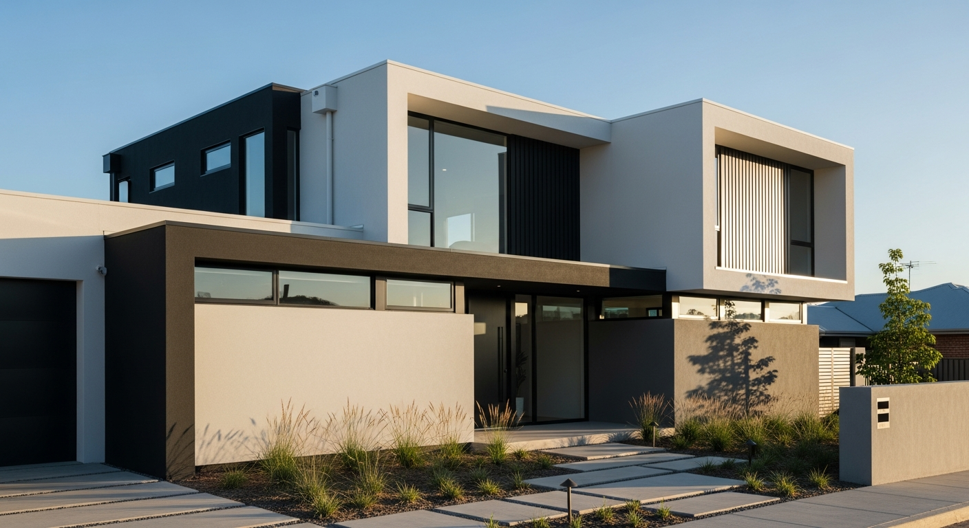
Contemporary homes use color to emphasize clean lines, geometric forms, and architectural materials. The palette tends toward high contrast and bold choices that would feel out of place on traditional architecture but perfectly complement modern design.
Scheme 5 — Charcoal + Matching Dark Trim + Matte Black Fixtures: Body and trim in SW Urbane Bronze (SW 7048) or BM Wrought Iron (2124-10), all hardware and fixtures in matte black. This monochromatic dark palette creates a dramatic, architectural presence that allows materials — metal, glass, concrete, and natural wood — to become the design stars. It works best on homes with large windows that provide light contrast and on architectural styles with strong geometric forms.
Scheme 6 — White + Black Trim + Bold Door (Red, Yellow, or Teal): Body in SW Pure White (SW 7005), trim and window frames in SW Caviar (SW 6990), door in SW Fireweed (SW 6328) for red, SW Cheerful (SW 6903) for yellow, or BM Aegean Teal (2136-40). This high-contrast combination is striking on mid-century modern and contemporary ranch homes. The bold door color becomes the focal point and conversation piece, while the black-and-white framework keeps the overall look refined.
Scheme 7 — Greige + Warm Tone Trim + Bronze Accents: Body in SW Accessible Beige (SW 7036) or BM Edgecomb Gray (HC-173), trim in SW Antique White (SW 6119), hardware in oil-rubbed bronze. This sophisticated neutral palette works on contemporary homes that want warmth without color commitment. The greige body adapts to its surroundings, looking warmer in sunlight and cooler in shade. Studies show greige exteriors sell for the highest premiums in most markets.
Scheme 8 — Navy + White Trim + Brass Hardware: Body in BM Hale Navy (HC-154) or SW Salty Dog (SW 9177), trim in BM Decorator's White (OC-149), hardware in polished or brushed brass. Navy is the bold neutral — dramatic enough to make a statement but classic enough to endure changing trends. This scheme pairs beautifully with white columns, pergolas, and traditional landscaping. It is particularly effective on Cape Cod, Colonial, and shingle-style homes that benefit from a deeper, more commanding presence.
Craftsman and Bungalow Color Schemes (3 Combos)
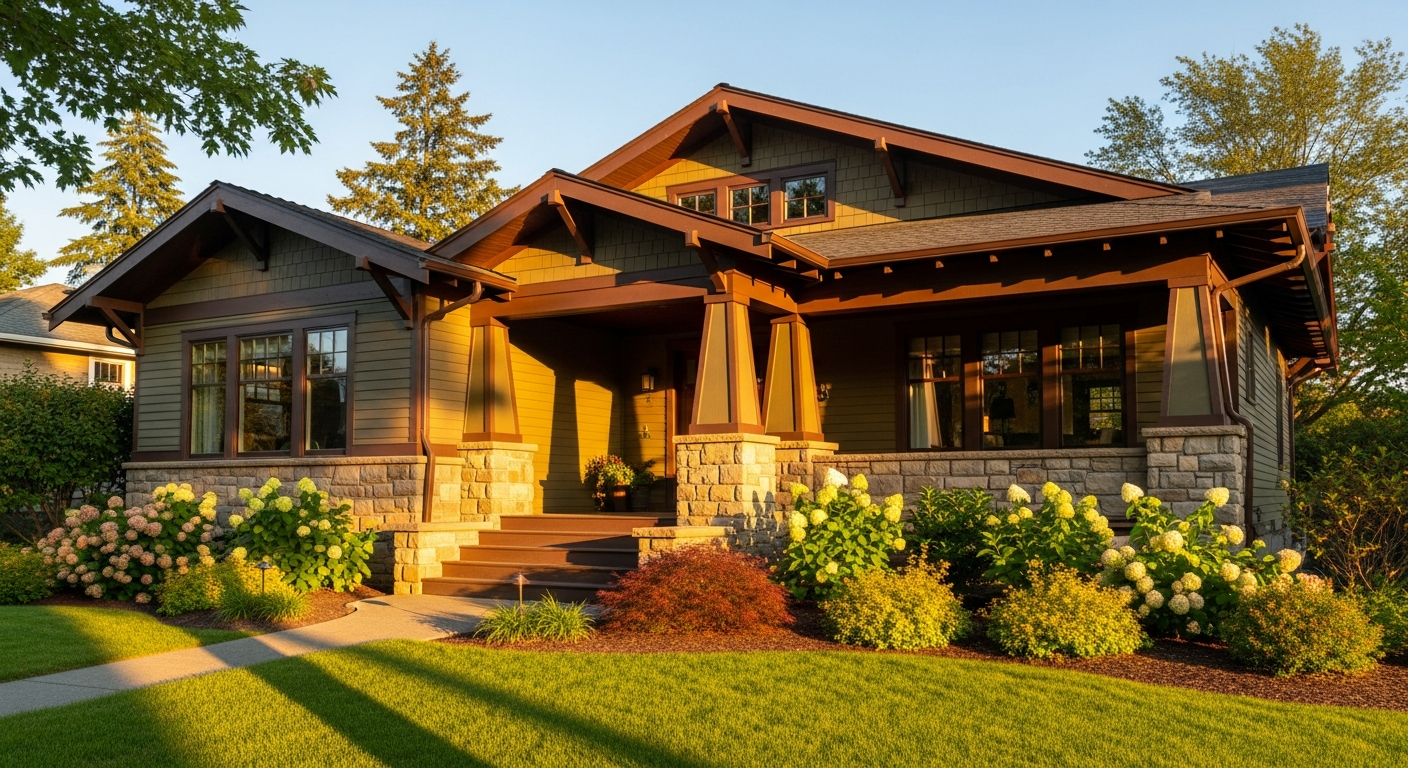
Craftsman homes traditionally use multi-color schemes with earthy, nature-inspired tones that honor the Arts and Crafts movement's connection to natural materials. These homes look best with 3 to 4 colors that define the body, trim, and multiple accent elements like columns, brackets, and rafter tails.
Scheme 9 — Moss Green + Cream Trim + Dark Brown Door: Body in SW Rookwood Dark Green (SW 2816) or BM Cushing Green (HC-125), trim in BM Linen White (OC-146), door in SW Van Dyke Brown (SW 7041). This combination pays homage to the original Craftsman color palette, connecting the home to its garden and landscape. The earthy green body with cream trim is historically accurate for Arts and Crafts-era bungalows, while the dark brown door grounds the composition.
Scheme 10 — Warm Brown + Ivory Trim + Deep Red Accents: Body in BM Woodcliff Lake (HC-86) or SW Smokey Topaz (SW 6117), trim in BM Ivory White (925), front door in SW Fireweed (SW 6328) or BM Caliente (AF-290). Rich brown body colors are quintessentially Craftsman and pair naturally with stone foundations and wooden porches. The deep red door adds the signature Arts and Crafts pop of color without overwhelming the earthy palette.
Scheme 11 — Slate Blue + White Trim + Hunter Green Door: Body in BM Providence Blue (1636) or SW Smoky Blue (SW 7604), trim in BM White Heron (OC-57), door in SW Billiard Green (SW 0016). This combination offers a fresh, modern take on the Craftsman palette while remaining architecturally appropriate. Slate blue is an unexpected choice that reads as sophisticated and serene, while the hunter green door maintains the nature connection central to Craftsman design philosophy.
Colonial and Traditional Color Schemes (3 Combos)
Colonial, Georgian, and Federal-style homes demand dignified, symmetry-enhancing color palettes that respect their formal architectural proportions. These homes look best with clean, classic combinations that have stood the test of centuries.
Scheme 12 — Classic White + Black Shutters + Red Door: Body in BM Chantilly Lace (OC-65) or SW Dover White (SW 6385), shutters in BM Black Beauty (2128-10), door in BM Heritage Red (1306) or SW Red Bay (SW 6321). This is the definitive Colonial palette — timeless, universally recognized, and endlessly appealing. The red door tradition dates to Colonial America when a red door signaled a welcoming home. This scheme works beautifully on brick-facade Colonials with the white applied to trim, columns, and porch elements only.
Scheme 13 — Pale Yellow + White Trim + Navy Blue Shutters: Body in BM Hawthorne Yellow (HC-4) or SW Humble Gold (SW 6380), trim in pure white, shutters in BM Van Deusen Blue (HC-156). Pale yellow is a historically accurate choice for Colonial homes in the mid-Atlantic and Southern regions. It creates a warm, sunny impression that photographs beautifully and maintains strong curb appeal across all seasons and lighting conditions.
Scheme 14 — Light Blue-Gray + White Trim + Charcoal Door: Body in BM Stonington Gray (HC-170) or SW Lazy Gray (SW 6254), trim in BM Decorators White (OC-149), door in BM Kendall Charcoal (HC-166). This modern interpretation of the Colonial palette replaces traditional white or yellow with a sophisticated blue-gray that feels current without being trendy. The charcoal door adds contemporary edge while remaining perfectly appropriate for traditional architecture.
Coastal and Beach House Color Schemes (3 Combos)
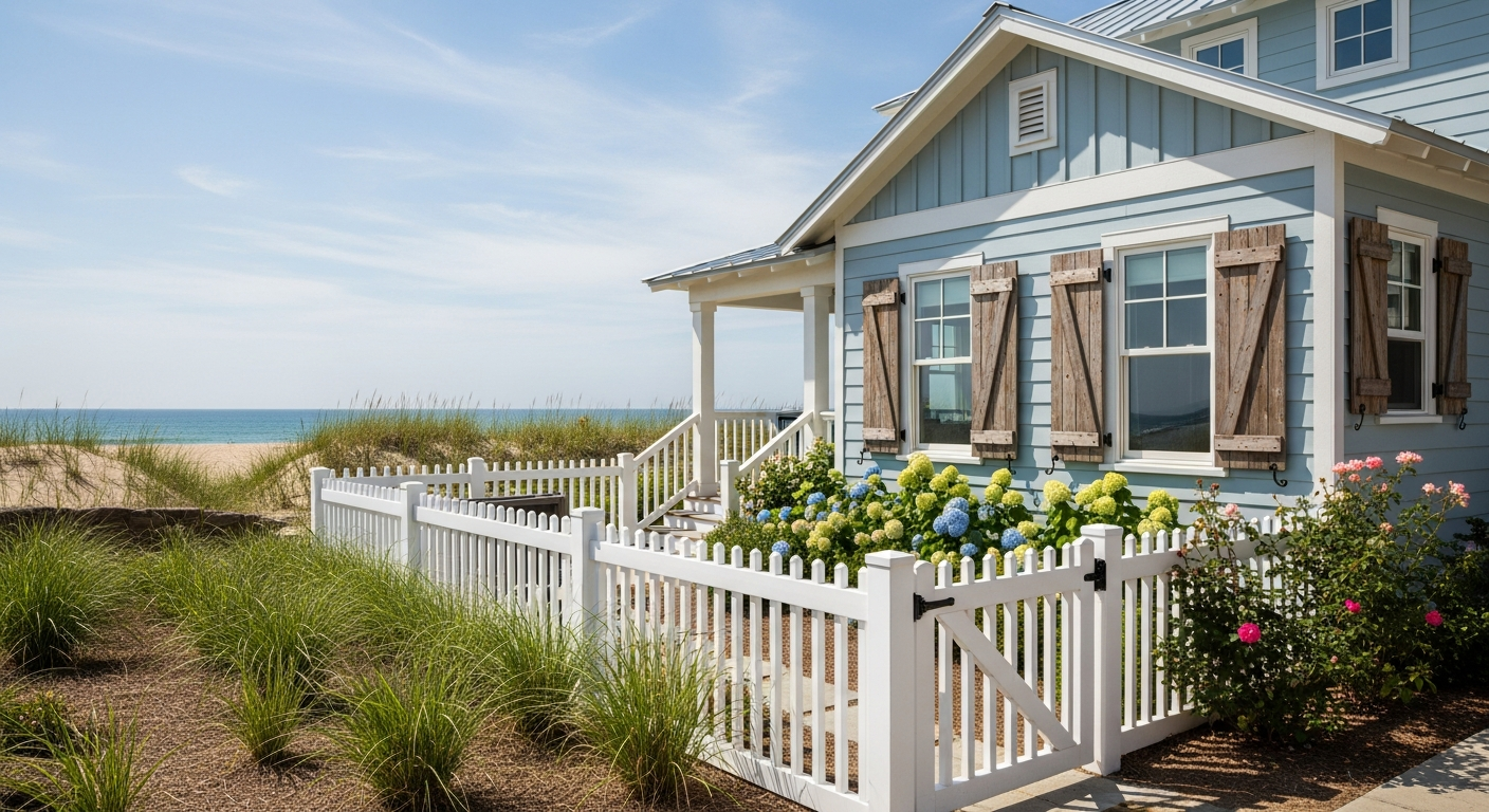
Coastal architecture calls for light, airy palettes that reflect the colors of sea, sand, and sky. These schemes work beautifully in waterfront and inland settings where a relaxed, vacation-inspired aesthetic is desired.
Scheme 15 — Soft Blue + White Trim + Coral Accents: Body in SW Tradewind (SW 6218) or BM Breath of Fresh Air (806), trim in pure white, door in BM Coral Reef (012) or shutters in a muted terra cotta. This quintessential beach house palette evokes clear skies and warm sand. The soft blue body is cheerful without being overwhelming, and the coral accent adds warmth that prevents the scheme from feeling cold or sterile. This combination works equally well on shingle-style cottages and contemporary coastal designs.
Scheme 16 — Sandy Beige + White Trim + Navy Door + Aqua Shutters: Body in SW Sand Dollar (SW 6099) or BM Manchester Tan (HC-81), trim in white, door in BM Hale Navy (HC-154), shutters in BM Wythe Blue (HC-143). This multi-element scheme captures the full coastal palette from sand to sea. The sandy beige body disappears against natural landscapes while the navy and aqua accents provide nautical personality. A natural rope-wrapped porch railing or driftwood accents complete the look.
Scheme 17 — Light Gray + White + Driftwood Brown Accents: Body in BM Gray Owl (OC-52) or SW Repose Gray (SW 7015), trim in pure white, accents in SW Smokehouse (SW 7040) or natural wood stain. This subdued coastal palette avoids the obvious blue-and-white cliché, instead drawing inspiration from overcast beach days and weathered timber. It is a versatile choice that translates well to both waterfront and suburban settings, appealing to homeowners who want a coastal vibe without a literal beach house appearance. It pairs naturally with curb appeal landscaping featuring ornamental grasses and native plants.
Mediterranean and Spanish Revival (3 Combos)
Mediterranean, Spanish Colonial, and Tuscan-inspired homes call for warm, sun-baked palettes that honor their Southern European roots. These schemes coordinate with terracotta tile roofs, wrought iron details, and stucco textures.
Scheme 18 — Warm Terra Cotta + Cream Trim + Dark Wood Door: Body in SW Cavern Clay (SW 7701) or BM Audubon Russet (HC-51), trim in BM Navajo White (OC-95), door stained dark walnut or painted in SW Black Fox (SW 7020). Terra cotta is the defining color of Mediterranean architecture, connecting the home to the sun-drenched landscapes of Spain and Italy. The cream trim softens the warmth while the dark wood door adds gravitas. This scheme demands proper stucco painting techniques for the best results.
Scheme 19 — White Stucco + Terracotta Tile Roof + Olive Accents: Body in SW Shoji White (SW 7042) or BM Swiss Coffee (OC-45), existing terracotta tile roof, shutters or door in SW Oakmoss (SW 6180) or BM Terrapin Green (2145-20). The classic white stucco and terracotta roof combination is the foundation of Spanish Colonial architecture. Adding olive green accents through shutters, trim details, or the front door provides the Mediterranean garden connection that completes the aesthetic.
Scheme 20 — Soft Yellow + White Trim + Wrought Iron Details: Body in BM Golden Straw (2152-50) or SW Compatible Cream (SW 6387), trim in pure white, wrought iron railings and fixtures in natural black. Tuscan-inspired homes glow in soft yellow tones that warm up at sunset and create a welcoming atmosphere throughout the day. The white trim provides clean contrast while the wrought iron details add architectural authenticity. This palette works beautifully with both terracotta and slate-colored tile roofs.
Color Schemes by Region and Climate
Beyond architectural style, your geographic location should influence your color choice for both aesthetic and practical reasons.
Northeast: Deeper, richer tones perform well against the gray skies common through much of the year. Dark greens, deep blues, and rich browns look striking in autumn foliage season and maintain visual presence under overcast skies. Light pastels can look washed out in flat winter light.
Southeast: Lighter colors reflect heat and reduce cooling costs. Pale yellows, soft blues, light grays, and warm whites are practical choices that also complement the lush green landscapes and bright sunshine of the region. Dark colors absorb more solar radiation, increasing surface temperatures and potentially shortening paint lifespan.
Southwest: Earth tones naturally complement the arid landscape — terracotta, adobe, warm sand, and muted sage harmonize with desert terrain. These colors also tolerate the intense UV exposure better than cool-toned alternatives, which can fade more noticeably in direct desert sunlight. Choose the best exterior paint colors that complement your regional landscape.
Northwest: Greens, blues, and natural wood tones echo the forests and waterways of the Pacific Northwest. Deep greens and slate blues are particularly popular in this region, complementing both the evergreen landscape and the frequent gray skies. Lighter greens and teals brighten homes during the darker months.
Colors That Boost Resale Value
If resale value influences your color decision, research data provides clear guidance on what buyers prefer and what affects offer prices.
Greige exteriors sell for the highest premiums in most markets. Greige, the warm blend of gray and beige, reads as modern and sophisticated while remaining neutral enough to appeal to the widest range of buyers. Homes with greige exteriors sell faster and for higher prices than homes in bold or unusual colors according to multiple real estate studies.
Black front doors generate up to $6,400 higher offers based on Zillow's analysis of residential sales data. Navy, charcoal, and other dark door colors also perform well. Bright, unusual door colors like pink, orange, or lime green can have the opposite effect, narrowing your buyer pool. A neutral body with a bold but tasteful front door color represents the sweet spot for maximum resale appeal.
Colors to avoid for resale include purple, bright orange, bright pink, and any highly personalized color that reflects individual taste rather than broad appeal. These colors do not necessarily hurt your sale price if the home is otherwise well-maintained, but they can increase time on market as some buyers mentally add a repainting cost to their offer calculation. Explore our exterior paint ideas for more combinations that balance personal style with broad appeal.
How to Test Your Color Scheme Before Painting
Never commit to an exterior color scheme based solely on a small paint chip from the store. Colors look dramatically different at architectural scale, in natural light, and against your home's fixed elements like roof, stone, and landscaping.
Paint sample boards and test patches: Purchase quart samples of your top 2 to 3 body color candidates and paint large test patches (at least 2 feet by 2 feet) on multiple walls of your house. View them in morning light, afternoon sun, shade, and overcast conditions over several days. Colors shift significantly between these lighting conditions — a color that looks perfect at noon may look harsh in morning light or flat on an overcast day.
AI visualization is the fastest and most comprehensive testing method. Upload a photo of your home to HanoDecor's AI House Painter and preview any color combination instantly. You can test dozens of combinations in minutes, comparing body-trim-accent variations without purchasing a single sample. This is especially valuable for seeing how dark colors will look on your specific home, since dark sample patches on light siding can be misleading about the final full-house appearance.
Common testing mistakes include testing only one swatch on one wall at one time of day, ignoring how the color interacts with adjacent fixed elements, and not considering how the color will look from the street at a distance. Always view your test from the curb — the distance at which most people will see your home — as well as up close. Browse our design gallery to see how different color schemes look on completed homes in real-world settings.
Frequently Asked Questions
Should trim be lighter or darker than the body? Traditionally, trim is lighter than the body to highlight architectural details and create a framing effect. However, the dark trim trend (dark body with matching or contrasting dark trim) has gained significant popularity on contemporary and modern homes. There is no absolute rule — light trim on a medium body creates classic elegance, while dark trim on a light body creates modern contrast. Both approaches work when executed thoughtfully as part of a coordinated scheme.
How many colors should an exterior have? Most homes look best with three colors: body, trim, and accent. Some architectural styles, particularly Victorian and Craftsman, traditionally use 4 to 7 colors to highlight their intricate architectural details. Contemporary homes may use only 1 to 2 colors for a streamlined look. Using more than 4 colors requires careful coordination to avoid a chaotic appearance.
Can I paint my front door a different color than my shutters? Absolutely. In fact, many of the most successful color schemes use a different accent color on the door than on the shutters. The front door is your home's focal point and benefits from standing out. Shutters can match the trim color, complement the body color, or serve as a third accent. The key is that all elements should feel intentional and coordinated within the overall palette.
What exterior colors make a house look bigger? Light colors reflect more light and create the illusion of larger surfaces, making homes appear bigger than they are. White, cream, light gray, and pale yellow are the most effective choices for maximizing perceived size. Dark colors absorb light and make surfaces recede, which can make a home appear smaller but also more dramatic and grounded. For small homes, light body colors with minimal contrast between body and trim create the most expansive appearance.
How do I match paint to my existing brick or stone? Start by identifying the dominant color in your brick or stone — is it warm (red, orange, tan) or cool (gray, blue-gray)? Choose paint colors from the same temperature family. Bring a loose brick or stone sample to the paint store for in-person color matching, or photograph it in natural light and upload to our AI House Painter for digital palette testing. Avoid competing with your masonry — choose colors that complement and frame it rather than clash with it.
Preview Any Color Scheme on Your Home
The best color scheme is the one that transforms your specific home's curb appeal while harmonizing with your neighborhood, landscape, and personal style. Before you commit to any of these 20 combinations — or create your own — use our AI House Painter to see exactly how it will look on your actual home. Upload a photo and experiment with unlimited color combinations until you find the perfect match.
For a complete exterior transformation preview, try HanoDecor's Exterior Visualizer to see your home with different siding materials, architectural details, and landscaping alongside your new color scheme. Explore our design gallery for real-world inspiration, visit our pricing page to budget your project, and check out our ranch house exterior makeover ideas or exterior paint color visualizer guide for more design inspiration tailored to your home's style.
Exterior House Color Schemes FAQs
Written by
James Park
Architectural Design Advisor specializing in exterior remodeling, siding systems, and structural home improvements. Licensed architect with 18 years of residential project experience.