Exterior House Paint Ideas: 25 Stunning Color Combinations
Quick Summary
Choosing the right exterior paint color combination can transform your home's curb appeal, boost property value by up to 5%, and make your house the standout on the block. With thousands of paint colors available from brands like Benjamin Moore and Sherwin-Williams, finding the perfect palette feels overwhelming.
In this guide, we break down 25 proven exterior house paint ideas and color combinations that work across different architectural styles. You will learn which classic pairings never go out of style, how to use nature-inspired palettes for a grounded look, and which bold modern combinations are trending in 2026. We also cover how undertones affect your color choice, which paint finishes work best on different surfaces, and how to test colors before committing to a full repaint.
Whether you are refreshing tired siding, updating your trim color, or choosing a statement front door color, these combinations have been curated from real homes and professional color consultations to help you design with confidence.
Classic and Timeless Combinations
Some exterior color combinations have endured for decades because they strike the perfect balance between sophistication and broad appeal. These classic pairings work on nearly every architectural style and remain strong choices for homeowners focused on long-term curb appeal.
Black and White
The black and white exterior is the definition of high-contrast elegance. A crisp white body with black shutters, trim, and front door creates a striking visual that never looks dated. This combination works particularly well on Colonial, Cape Cod, and modern farmhouse homes.
For the best results, choose a warm white like Benjamin Moore White Dove or Sherwin-Williams Alabaster rather than a stark pure white. The slight warmth prevents the house from looking clinical while still providing maximum contrast against the black accents. Use a true black like Sherwin-Williams Tricorn Black on shutters and the front door for impact.
Gray and White Trim
Gray siding with white trim has become one of the most popular exterior color palettes in recent years. This pairing offers a modern neutral look that complements both warm and cool landscaping. Medium grays like Benjamin Moore Coventry Gray or Sherwin-Williams Dorian Gray provide enough depth to anchor the house without feeling heavy.
The key to nailing this combination is matching the undertone of your gray to your home's fixed elements. If you have warm-toned stone or brick, lean toward a gray with taupe undertones. For homes with cooler elements like bluestone walkways, a blue-gray reads more naturally. Always pair your gray with a clean white trim to keep the overall look fresh.
Navy and White
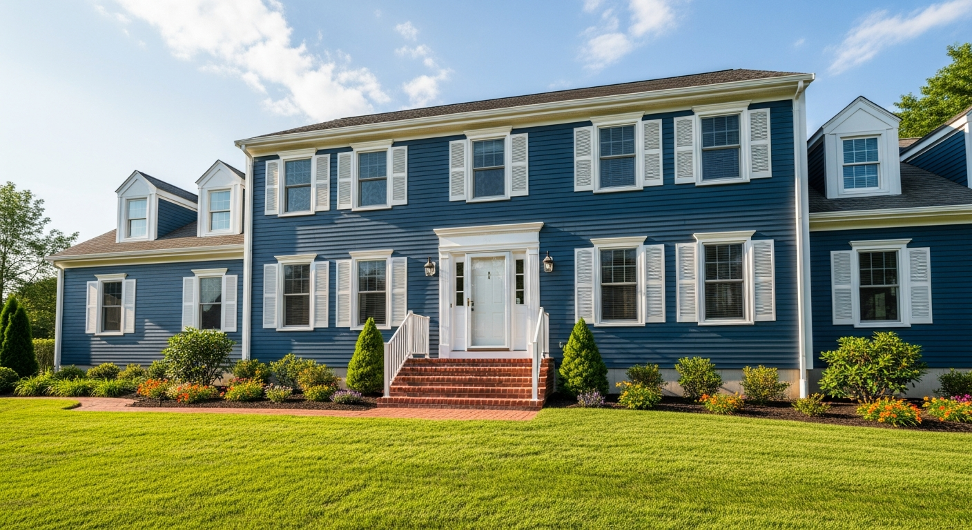
Navy blue with white trim delivers a classic nautical-inspired look that feels refined without being trendy. This combination is especially popular on traditional, Colonial, and Craftsman-style homes where the deep blue adds depth and character. Sherwin-Williams Naval or Benjamin Moore Hale Navy are perennial favorites among professional painters.
Navy works as a siding color because it reads as a sophisticated neutral in most lighting conditions. In bright sunlight it appears vivid and welcoming, while in shade it takes on a dignified richness. Pair it with bright white trim and consider a red or yellow front door for an accent that draws the eye toward your entry.
Nature-Inspired Palettes
Drawing color inspiration from the natural world creates exteriors that feel grounded and harmonious with their surroundings. These earth-toned combinations are ideal for homes nestled among mature trees, garden-forward landscapes, or rural settings where you want the house to complement rather than compete with nature.
Sage Green and Cream
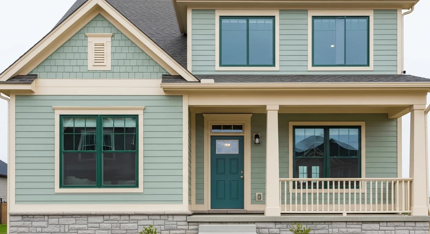
Sage green paired with cream trim is one of the most versatile nature-inspired combinations available. The muted green reads as a warm neutral in most light conditions, making it a distinctive alternative to gray or beige. Benjamin Moore Sage Wisdom or Sherwin-Williams Clary Sage capture this look perfectly.
This color palette shines on Craftsman and cottage-style homes where natural materials like stone, cedar shakes, or brick already anchor the exterior. The cream trim softens the overall look compared to a bright white, creating a cohesive warmth that extends from the siding to the window casings, fascia, and porch columns.
Tan and Forest Green
A tan body with forest green shutters and trim evokes traditional American architecture. This palette is especially effective on homes surrounded by mature landscaping, where the green accents echo the foliage and the tan body provides a warm, inviting canvas.
For the tan, look at Benjamin Moore Shaker Beige or Sherwin-Williams Accessible Beige. For the forest green accents, Benjamin Moore Essex Green or Sherwin-Williams Roycroft Bottle Green deliver the right depth. This combination is forgiving of imperfections in the siding and hides dirt and weathering better than lighter palettes.
Olive and Cream
Olive green with cream accents creates a sophisticated earth-toned exterior that feels current without chasing trends. Unlike brighter greens, olive has a subdued warmth that pairs naturally with stone, aged brick, and natural wood elements. This palette is seeing increased popularity in 2026 as homeowners move away from cool grays toward warmer, more organic color choices.
The beauty of olive is its adaptability. It works on modern farmhouses, traditional colonials, and even mid-century ranches. Pair it with cream trim for a softer look, or contrast it with a dark charcoal front door for added definition. Consider coordinating your trim and door colors to create a deliberate, designer-level palette.
Bold and Modern Combinations
For homeowners who want their house to make a statement, bold exterior color combinations deliver maximum visual impact. These palettes lean into contrast, unexpected pairings, and architectural drama. They work best on contemporary, modern, and transitional homes where clean lines let the color do the talking.
Black and Natural Wood
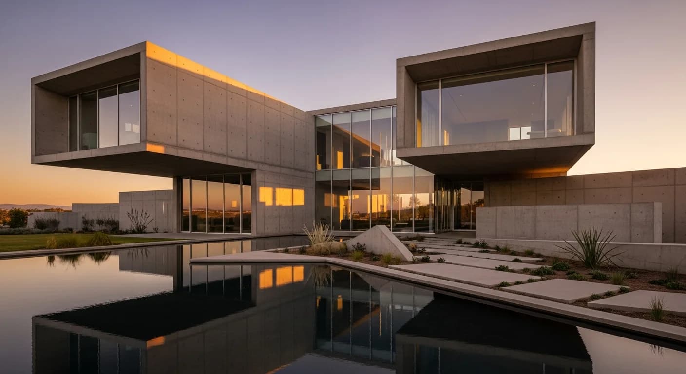
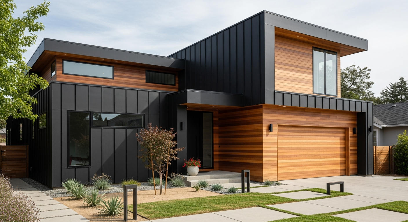
The black-and-wood exterior has become the defining look of modern residential architecture. Dark charcoal or true black siding paired with natural cedar, ipe, or walnut wood accents creates a striking contrast that feels both luxurious and connected to nature. This combination is particularly effective on flat-roof modern homes and contemporary farmhouses.
When using black as a primary siding color, material selection matters. James Hardie fiber cement siding in their dark palette holds up well, while darker siding materials may require heat-reflective formulations to prevent warping. Focus the wood accents on the entry, garage door, or a feature wall for maximum effect.
Charcoal and Red Door
A charcoal gray exterior with a bold red front door balances sophistication with personality. The charcoal provides a deep, moody backdrop that makes the red door pop without overwhelming the design. This palette works beautifully on Colonial, Craftsman, and modern homes alike.
Choosing the right red is critical. Avoid fire-engine reds that feel jarring. Instead, opt for deeper reds like Benjamin Moore Heritage Red or Sherwin-Williams Fireweed. These colors have enough brown or burgundy undertone to feel intentional. Pair the charcoal and red with white or light gray trim to frame windows and architectural details.
Warm Gray and Black Accents
Warm gray siding with black window frames, gutters, and trim is a contemporary combination that has surged in popularity. The warm gray reads as approachable and current, while the black accents add architectural definition and a modern edge.
The trick is choosing a gray with genuinely warm undertones. Colors like Sherwin-Williams Mindful Gray or Benjamin Moore Revere Pewter prevent the exterior from looking cold. The black accents should be consistent across all elements, including window frames, hardware, light fixtures, and house numbers, creating a cohesive design language across the facade.
Warm and Welcoming Palettes
Warm color palettes create exteriors that feel inviting from the moment visitors pull into the driveway. These combinations use earth tones, soft neutrals, and natural wood elements to establish comfort and approachability.
Beige Body with Chocolate Brown Trim: This rich, tonal combination adds depth without high contrast. The beige siding provides a warm, sandy canvas while the chocolate brown trim frames windows and rooflines with grounded elegance. Consider Sherwin-Williams Kilim Beige for the body and Benjamin Moore Townsend Harbor Brown for the trim.
Putty with Black Shutters and Door: Putty is a warmer alternative to standard gray that pairs beautifully with black accents. The subtle yellow and brown undertones give the exterior a welcoming glow, particularly in afternoon light. Look at Benjamin Moore Revere Pewter or Sherwin-Williams Tony Taupe.
Warm White with Natural Wood Accents: An all-white exterior gains character when paired with natural wood elements. Cedar shake accents on gables, a stained wood front door, or exposed beam details add organic warmth. This combination has become a signature of modern farmhouse design. Use trending warm white shades like Benjamin Moore White Heron or Sherwin-Williams Greek Villa.
Coastal and Cottage Colors
Coastal-inspired exterior palettes bring a relaxed, vacation-worthy feel to any home. These combinations use soft blues, weathered grays, and sun-bleached tones that evoke seaside living and pair naturally with white picket fences and lush gardens.
Blue-Gray with White Trim: This quintessential coastal palette works on everything from Cape Cod cottages to modern beach houses. A soft blue-gray like Sherwin-Williams Uncertain Gray or Benjamin Moore Boothbay Gray provides a calming backdrop. Paired with bright white trim, the combination feels fresh and breezy year-round.
Coastal Blue with Coral Accents: For a more playful coastal look, pairing a medium coastal blue with coral accents on the front door and planters creates a cheerful, resort-inspired exterior. This works best on smaller homes and cottages where bright accents feel charming rather than overwhelming.
Butter Yellow with White Trim: A soft butter yellow exterior with white trim is the classic cottage combination. The key is choosing a muted, sophisticated yellow rather than a primary yellow. Benjamin Moore Hawthorne Yellow or Sherwin-Williams Butter Up hit the right tone. This palette pairs beautifully with colorful garden landscaping.
10 More Proven Color Combinations
Beyond the top 15 combinations detailed above, these additional exterior color pairings have proven their staying power on homes across the country. Use this quick-reference list to explore even more options for your exterior paint color scheme.
- Slate Blue and Ivory: A refined pairing that works on Federal and Georgian-style homes, reading as a sophisticated alternative to standard gray.
- Terracotta and White: A Mediterranean-inspired combination bringing warmth and old-world charm. Pair with clay tile roofing for authenticity.
- Dark Green and Red Brick: Complement existing brick with dark green shutters and trim for a stately, traditional look.
- Pewter and Burgundy: A rich, dignified combination ideal for Victorian and Tudor homes with depth and character.
- Soft Gray and Teal Door: A neutral gray exterior with a bold teal front door adds personality to any street.
- Taupe and Black: A modern neutral combination offering more warmth than pure gray and black for transitional homes.
- Mushroom and Cream: This subtle, tonal pairing creates a serene exterior ideal for homes surrounded by natural landscaping.
- White and Black: A predominantly black exterior with white accents for a dramatic modern statement.
- Dusty Blue and Warm White: A softer take on the blue-and-white theme that reads more relaxed and cottage-inspired.
- Greige and Forest Green Door: Greige pairs beautifully with a deep forest green door for an earthy, current look.
Each of these combinations can be customized further by adjusting the trim, shutter, and front door colors. For more complete palette ideas, explore our guide to exterior house color schemes and combinations.
How Architectural Style Guides Color Choice
Your home's architectural style should be the starting point for any exterior color decision. Certain palettes enhance the character of specific styles, while mismatched colors can work against even the most beautiful architecture.
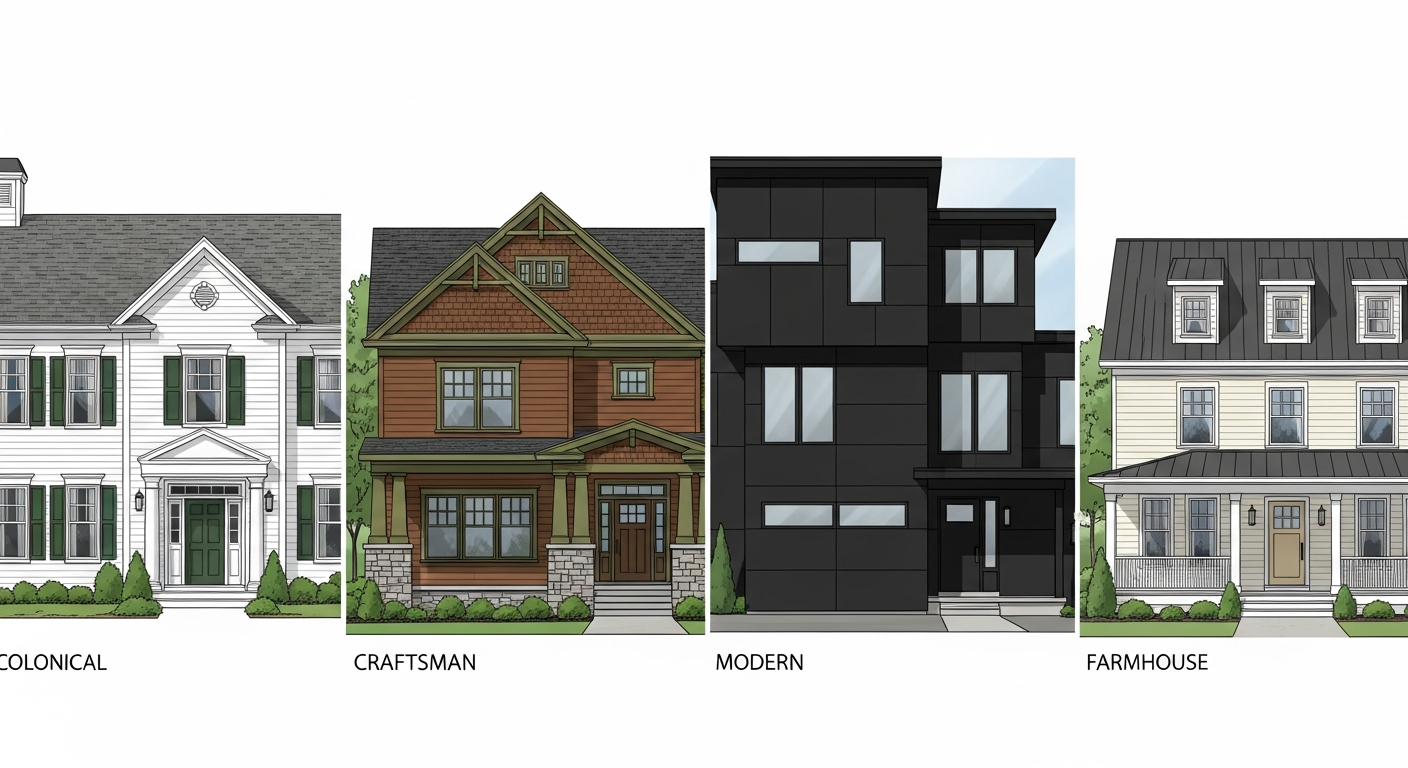
Colonial and Traditional: These homes thrive with historically informed palettes. Think white, cream, or pale yellow bodies with dark shutters in black, navy, or forest green. Avoid overly modern combinations that clash with traditional details like dentil molding and symmetrical windows.
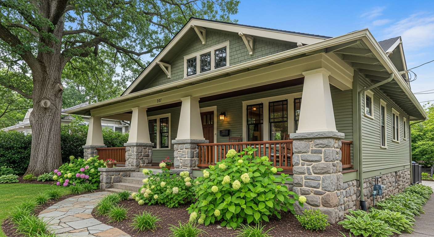
Craftsman and Bungalow: Craftsman homes look best in earthy, layered palettes with three or more colors. Use a medium-toned body color like sage green, brown, or warm gray, with a deeper shade on the trim and a contrasting accent on columns and the front door.
Modern and Contemporary: Clean lines and minimal ornamentation call for bold, high-contrast palettes. Black and white, charcoal and wood, or monochromatic gray schemes let the architecture speak. Avoid fussy multi-color schemes that compete with modern simplicity.
Farmhouse: Modern farmhouse exteriors favor white or warm white siding with black windows, metal roofing accents, and natural wood or stone details. Traditional farmhouses can embrace softer palettes with cream, sage, or butter yellow.
Mediterranean and Spanish: Warm earth tones are essential. Stucco in terracotta, warm beige, or soft peach paired with dark wood doors, wrought iron accents, and clay tile roofing creates an authentic look. For a deeper guide, see our article on choosing exterior paint colors by home style.
Understanding Color Temperature and Undertones
One of the biggest mistakes homeowners make when choosing exterior paint colors is ignoring undertones. Every paint color has an underlying hue, whether blue, yellow, green, or red, and that undertone dramatically affects how the color looks on your house in natural light.
Warm colors have yellow, orange, or red undertones. They create inviting exteriors and look best on homes that receive afternoon western light. Warm whites, beiges, tans, and creams fall into this category. If your home has warm-toned fixed elements like orange brick or sandstone, warm paint colors harmonize naturally.
Cool colors have blue, green, or purple undertones. They create crisp, sophisticated exteriors and look best in bright, direct sunlight. Cool grays, blue-grays, and navy blues all have cool undertones. Homes with bluestone or gray stone accents pair well with cool-toned paint.
The critical rule is consistency. Mixing warm and cool tones on the same exterior creates visual tension. If your siding color has warm undertones, your trim, shutters, and door should also lean warm. To test undertones, compare your paint samples against a true white card in natural outdoor light at multiple times of day. Understanding color psychology can also help you select hues that create the emotional response you want.
Exterior Paint Finish Selection
The right color is only half the equation. Choosing the correct paint finish for each exterior surface affects durability, appearance, and maintenance for years to come.
Flat or Matte Finish: Best for siding and large wall surfaces. Flat finishes hide surface imperfections like patched areas and uneven textures, providing a classic, non-reflective look. Modern exterior flat paints from premium brands have improved significantly in washability.
Satin or Eggshell Finish: The most versatile exterior finish, suitable for siding, trim, and architectural details. Satin offers a subtle sheen that highlights color depth while hiding moderate imperfections. It is easier to clean than flat and more forgiving than semi-gloss.
Semi-Gloss Finish: Reserved for trim, shutters, front doors, and window casings. The higher sheen creates visual contrast against the body color and adds definition to architectural details. Semi-gloss is also the most durable and easiest to clean, ideal for high-touch surfaces like door frames and railings.
A professional approach uses all three finishes strategically: flat on the body, satin on secondary trim, and semi-gloss on the front door and primary accents.
How to Test Colors Before Committing
Never choose an exterior paint color from a small swatch in a hardware store. Colors look completely different on a 2-inch chip versus a full wall, and indoor lighting distorts how exterior colors truly appear.
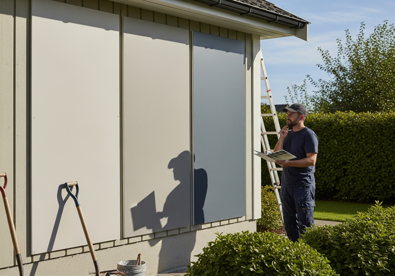
Paint Large Samples on Your Actual Wall: Purchase sample pots and paint at least a 2-foot by 2-foot section on your home's exterior. Paint samples on two different walls, one facing north for shade and one facing south or west for sunlight. Live with the samples for at least three to five days, observing them in different lighting conditions.
Use Foam Board for Moveable Samples: Apply sample colors to large foam boards that you can move around the house and hold next to fixed elements like your roof, stone work, and landscaping. This makes comparing multiple colors easier since you can line them up side by side.
Digital Visualization Tools: Modern technology allows you to preview colors on your actual home before touching a paintbrush. Upload a photo and experiment with different siding colors, trim options, and front door accents to compare dramatically different palettes.
Test in Different Lighting Conditions: The same paint color can look blue in morning shade, warm gray in afternoon sun, and almost purple at twilight. Photograph your samples at multiple times of day and compare side by side to understand how each color performs across conditions.
Before starting any exterior painting project, proper surface preparation is just as important as color selection. Understanding the full cost of house painting will also help you budget appropriately.
Frequently Asked Questions
What are the most popular exterior house paint colors in 2026?
The most popular exterior paint colors in 2026 include warm whites, sage greens, warm grays, and charcoal. There is a strong trend toward earthy, nature-inspired tones moving away from the cool grays that dominated the previous decade. Navy blue and black exteriors remain popular for a bold, modern look. Check our full guide to exterior paint color trends for 2026 for detailed analysis.
How many colors should I use on my home's exterior?
Most homes look best with three exterior colors: a primary body color covering the siding, a trim color for window casings and architectural details, and an accent color for the front door and shutters. Craftsman and Victorian homes can support four or five coordinated colors, while modern homes often look best with just two high-contrast colors.
Should my exterior paint be warm or cool toned?
Match your paint temperature to your home's fixed elements. If you have warm-toned brick, stone, or roofing, choose warm paint colors. If your fixed elements are cool toned like bluestone or gray slate, lean cool. The most common mistake is mixing warm siding with cool trim, which creates a disjointed look.
How do I choose a front door color that works with my siding?
Your front door should contrast with but complement your siding color. For neutral siding in white, gray, or beige, a bold door in red, navy, teal, or black adds personality. For colored siding like blue or green, a warm wood-toned or classic black door provides grounding contrast. See our exterior trim and door paint colors guide for specific recommendations.
How often should I repaint my home's exterior?
Most exterior paint jobs last 7 to 10 years depending on climate, sun exposure, paint quality, and surface preparation. Homes in harsh climates may need repainting every 5 to 7 years, while high-quality paints with proper prep can extend this to 12 to 15 years. Signs it is time to repaint include chalking, fading, peeling, cracking, or visible bare wood.
Does exterior paint color affect home value?
Yes. Studies consistently show that homes with well-chosen exterior color schemes sell faster and for higher prices. Neutral palettes with strong curb appeal, particularly whites, grays, and blue-grays, tend to perform best at resale. A fresh paint job alone can increase perceived home value by 2% to 5%.
What is the best exterior paint brand?
Benjamin Moore, Sherwin-Williams, and Behr are the three most recommended exterior paint brands among professional painters. Benjamin Moore Aura Exterior and Sherwin-Williams Duration offer the best durability and color retention. Read our detailed exterior paint brands comparison for a full breakdown.
Can I paint over vinyl siding?
Yes, but with limitations. You must use colors equal to or lighter than the original shade, as darker colors absorb more heat and can cause vinyl to warp. Use paint formulated for vinyl siding and clean the surface thoroughly before painting. Some homeowners prefer to explore alternative siding options if they want a dramatically different color.
Visualize Combinations on Your Home with HanoDecor
Choosing from 25 exterior color combinations on a screen is helpful, but seeing those colors on your actual home is transformative. With HanoDecor's exterior home remodel visualizer, you can upload a photo of your house and preview any of these color combinations in seconds.
Try a classic navy and white scheme, experiment with a modern black and wood combination, or test a bold charcoal and red door palette, all without buying a single can of paint. Our AI-powered tool lets you swap siding colors, adjust trim and shutter tones, and preview front door accents so you can make confident decisions before your painting project begins.
Stop guessing and start visualizing. Upload your home photo today and discover which of these 25 stunning color combinations looks best on your house. Visit our transformation gallery to see real before-and-after results, or explore our pricing plans to get started.
Exterior House Paint Ideas FAQs
Written by
Sarah Chen
Senior Color Consultant with 12 years of residential exterior design experience. Specializes in architectural color theory, paint technology, and curb appeal optimization.