Exterior Trim and Door Paint Colors: Accents That Transform
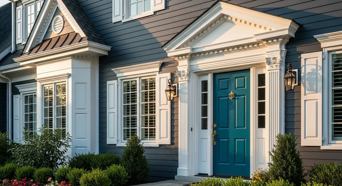
Your home's trim and front door occupy roughly 10% of the total exterior surface area, yet they create an outsized 90% of visual impact when someone drives by or walks up to your front porch. After two decades of painting homes professionally, I have seen modest homes become showstoppers with nothing more than a well-chosen trim color and a bold front door. Conversely, I have watched beautiful homes fall flat because the trim faded into the body color and the door was an afterthought. These finishing details define your home's personality, frame its architectural features, and create the lasting impression that shapes curb appeal. This guide walks you through every decision — from trim rules to door color psychology to hardware coordination — so your exterior looks intentionally designed rather than randomly painted.
Why Trim and Door Colors Make or Break Your Exterior
Trim serves as the visual frame for your home. Just as a picture frame defines and enhances the artwork inside it, exterior trim defines the edges of your architecture — window casings, corner boards, fascia, soffits, and rake boards. Without contrasting trim, your home reads as a flat plane of color. With well-chosen trim, every window, roofline, and architectural detail becomes crisp and intentional.
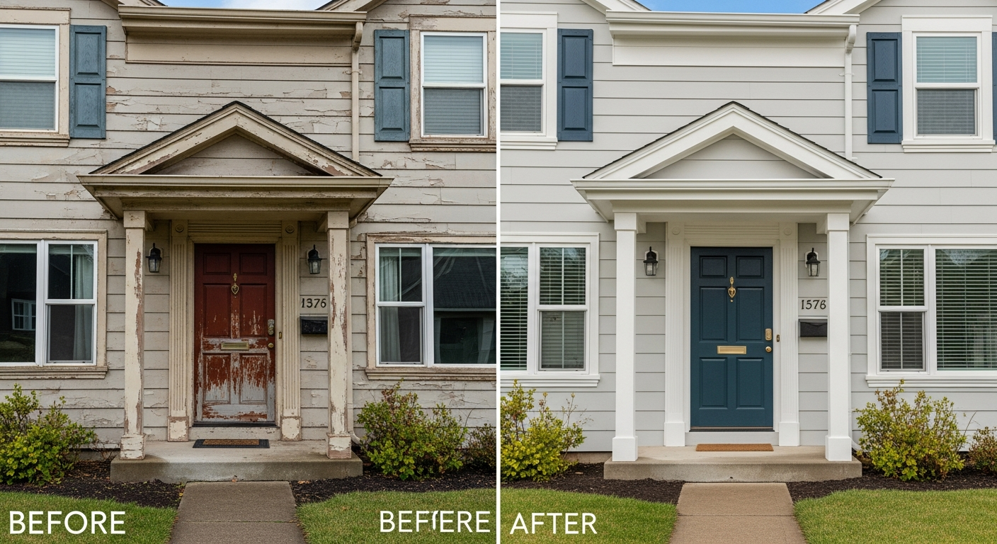
Before-and-after transformations consistently prove the power of trim color changes. A home painted in medium gray with matching gray trim looks flat and institutional. That same home with crisp white trim suddenly looks polished, defined, and architecturally interesting. Switch that white trim to charcoal, and the home transforms again into a modern, high-contrast showpiece. The body color stayed identical — only the trim changed.
Your front door is the single most impactful element of your entire exterior. It is the first thing visitors see, the focal point in every real estate listing photo, and the element that receives the most up-close scrutiny. Zillow research shows that homes with a black front door sell for approximately $6,400 more than expected, while certain other bold door colors also command premiums. A fresh, well-chosen door color is arguably the highest-ROI exterior update you can make — a single quart of quality paint and an afternoon of work can deliver a transformation that adds measurable value to your property.
When you consider that a full exterior body color change costs $3,000 to $7,000, but a trim and door refresh costs $500 to $1,500, the value proposition becomes clear. You get the majority of the visual transformation at a fraction of the price, and the project takes days rather than weeks. For homeowners who want maximum impact with minimum investment, trim and door work is where to focus first.
Trim Color Rules and Best Practices
White trim is the most popular choice for good reason. Bright White (Benjamin Moore OC-17), Chantilly Lace (BM OC-65), and Extra White (Sherwin-Williams SW 7006) are among the most specified exterior trim colors in professional painting. White trim creates clean contrast against virtually any body color, highlights architectural details, and gives your home a timeless, polished appearance. It works on Colonial homes, Craftsman bungalows, farmhouses, and most traditional architectural styles.
White trim is particularly effective when your body color is in the medium-to-dark range. A dark navy body with white trim creates dramatic contrast. A sage green body with white trim feels fresh and classic. Even a light gray body benefits from a slightly brighter white on the trim to create subtle definition. The key is choosing the right white — warm whites (with yellow or cream undertones) complement warm body colors, while cool whites (with blue or gray undertones) complement cool body colors.
Dark trim is the modern high-contrast trend that continues to gain momentum in 2026. Black, charcoal, and dark bronze trim reverses the traditional formula and creates a bold, architectural look. Sherwin-Williams Tricorn Black (SW 6258), Benjamin Moore Wrought Iron (2124-10), and Behr Carbon (N520-7) are all excellent dark trim choices. Dark trim works exceptionally well on light-colored homes — a white or cream body with black trim instantly reads as modern and intentional, even on traditional home styles.
Dark trim also creates visual weight and grounding. Homes with dark trim at the base, around windows, and along the roofline feel more anchored to their landscape. This approach pairs beautifully with the dark window frame trend that continues to dominate contemporary architecture. However, dark trim does require more maintenance — it shows dust and chalking more readily and absorbs heat, which can cause faster fading in southern exposures.
The monochromatic trim approach uses a lighter or darker shade of the body color for trim, creating subtle definition without contrast. This works well on modern and contemporary homes where a seamless, unified look is desired. A charcoal body with medium gray trim, or a taupe body with cream trim, creates sophistication through tone-on-tone variation. This approach is also effective when you want to downplay architectural elements rather than highlight them.
Regardless of which trim color strategy you choose, semi-gloss is the standard trim sheen. Semi-gloss provides superior durability, moisture resistance, and easy cleaning compared to satin or flat finishes. It also creates a natural contrast between the trim and body, even when colors are similar, because the sheen difference adds visual separation.
15 Front Door Colors That Boost Curb Appeal
Your front door is the ideal place to express personality and make a statement. Unlike body color, which covers thousands of square feet and must remain broadly appealing, your door is a small surface that can handle bold, expressive color. Here are fifteen front door colors that consistently deliver stunning results.
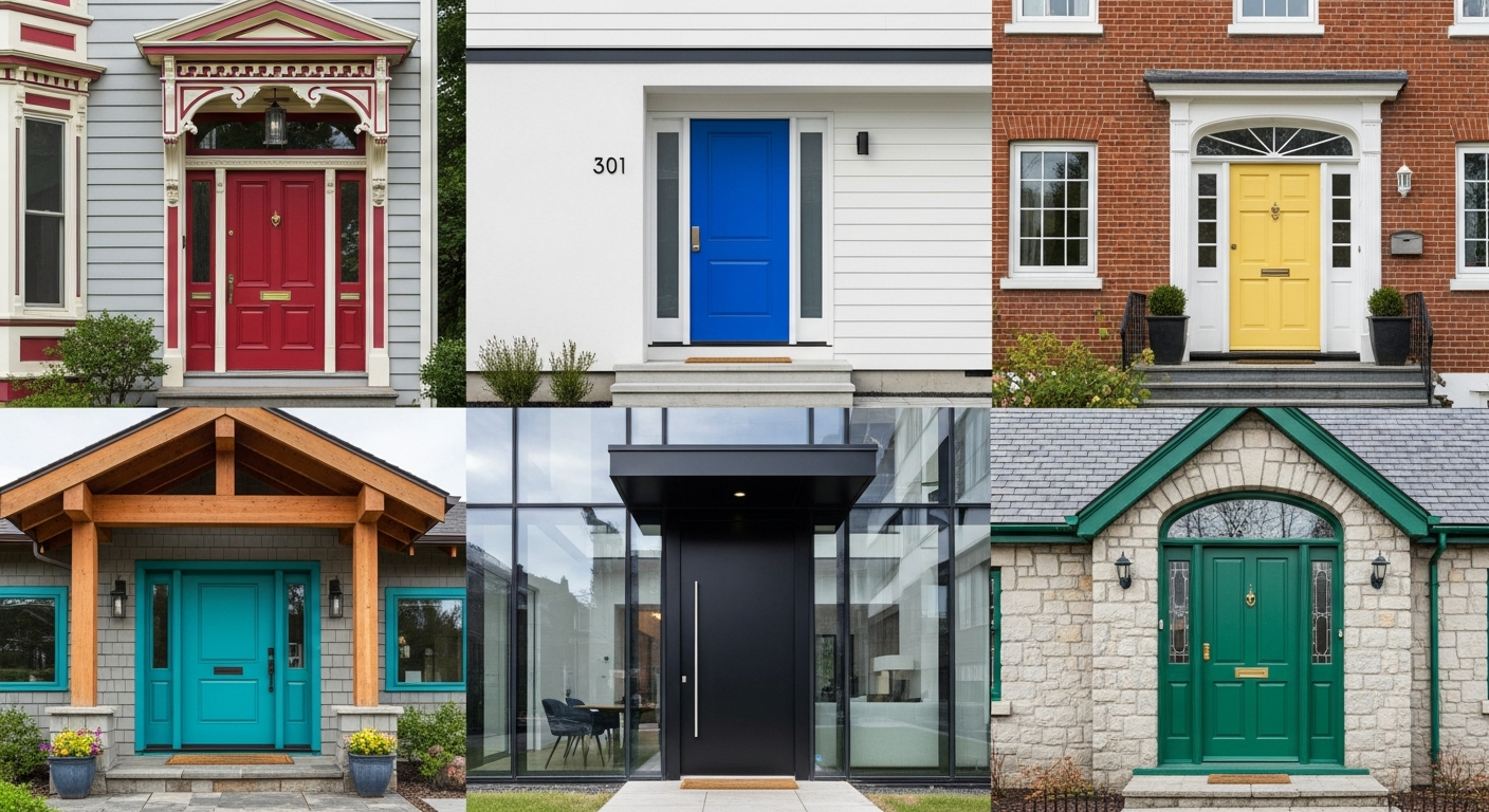
Classic Black remains the most popular and highest-value door color. Benjamin Moore Black (HC-190), Sherwin-Williams Tricorn Black (SW 6258), or Behr Black Suede (HDC-MD-04) all deliver rich, elegant black. It pairs with virtually any body color and architectural style. Navy Blue is the second most popular choice — Sherwin-Williams Naval (SW 6244) or Benjamin Moore Hale Navy (HC-154) create depth and sophistication. Deep Red commands attention without being jarring — try Benjamin Moore Heritage Red (HC-181) or Sherwin-Williams Fireweed (SW 6328).
Forest Green connects your home to its landscape — Sherwin-Williams Rookwood Dark Green (SW 2816) or Benjamin Moore Essex Green (HC-188) are timeless choices. Bright Yellow injects cheerful energy — Benjamin Moore Hawthorne Yellow (HC-4) is a classic. Charcoal Gray provides modern sophistication without the intensity of black — try Sherwin-Williams Peppercorn (SW 7674).
Teal brings coastal freshness — Benjamin Moore Galapagos Turquoise (2057-20) is stunning on white or cream homes. Coral adds warmth and personality — Sherwin-Williams Ravishing Coral (SW 6612) is a beautiful choice. Olive Green feels earthy and sophisticated — Benjamin Moore Hiking Path (524) works beautifully on warm-toned homes. Plum creates drama and depth — Sherwin-Williams Plummy (SW 6558) pairs wonderfully with gray or white exteriors.
Terracotta embraces the warm earth tones trending in 2026 — Behr Kalahari Sunset (MQ1-25) captures this look. Slate Blue offers a softer alternative to navy — Benjamin Moore Newburyport Blue (HC-155). Sage Green provides a subtle, nature-inspired statement — Sherwin-Williams Clary Sage (SW 6178). Mahogany stain gives a rich, natural wood look — use a quality exterior stain like Cabot Mahogany Flame. Turquoise brings playful energy to cottage and coastal homes — Sherwin-Williams Aquarium (SW 6767) is bold and fun.
When choosing your door color, consider your home's overall color palette and architectural style. The best door colors create intentional contrast with both the body and trim colors, drawing the eye to your entry and making your home feel welcoming and well-designed.
Front Door Colors by Architectural Style
Colonial and Cape Cod homes look best with classic door colors: black, deep red, hunter green, or navy blue. These historic styles favor traditional, dignified colors that complement their symmetrical facades. A black door with brass hardware is the quintessential Colonial combination, while a deep red door adds warmth without sacrificing formality.
Craftsman and bungalow homes pair naturally with earthy door colors: forest green, mahogany brown, olive, or rusty orange. These arts-and-crafts-inspired homes celebrate natural materials and warm, organic tones. The Craftsman door is often the primary design feature, so a rich stain or deep paint color that contrasts with the body color creates authentic character. Explore Craftsman-specific color ideas in our guide to exterior color schemes.
Modern and contemporary homes thrive with high-contrast or monochromatic door colors: black, charcoal, bright white, or a single bold accent like mustard or teal. Clean lines and minimal ornamentation mean the door color itself becomes the design statement. Matte black doors on white contemporary homes are especially striking.
Farmhouse-style homes look stunning with black, deep teal, sage green, or warm red doors. The modern farmhouse typically pairs a black door with white siding and black-framed windows, while traditional farmhouses can handle warmer, more rustic door colors that complement natural wood and stone elements.
Mediterranean and Spanish Revival homes call for warm door colors that complement terra cotta roofs and stucco walls: deep blue, turquoise, warm red, or rich brown. These styles also look beautiful with unpainted wood doors in a deep walnut or mahogany stain. The door hardware on Mediterranean homes should be iron or bronze to maintain authenticity.
For ranch-style homes, a bold front door is particularly effective because the horizontal profile of the home benefits from a strong vertical focal point at the entry. Mid-century ranch homes look exceptional with retro-inspired door colors like mustard, teal, or terra cotta.
Shutter, Gutter, and Downspout Color Strategy
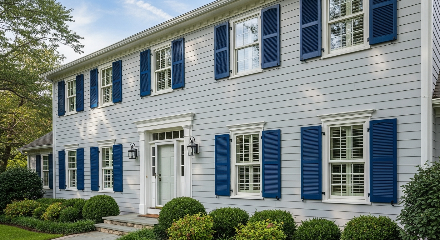
Shutters serve as secondary accent elements that frame your windows the way trim frames your home. The most common approach is to paint shutters the same color as your front door, creating visual continuity and tying the accent color throughout the facade. This works well when your door color is relatively subdued — black shutters with a black door, navy shutters with a navy door.
When your door is a bold statement color, consider painting shutters to match the trim color instead, keeping the bold color as a singular focal point. A bright yellow door loses its impact when repeated on twelve shutters — but paired with black or white shutters, it becomes a compelling, well-designed accent.
Gutters and downspouts should almost always match either the trim or the body color — the goal is to make them disappear rather than stand out. If your trim is white, white gutters blend seamlessly along the roofline. If your body is dark gray, dark gray gutters and downspouts become invisible against the siding. Never paint gutters and downspouts an accent color unless you specifically want them to become a design feature, which is rarely the goal.
Many homeowners overlook gutters during an exterior painting project, but mismatched gutters immediately cheapen the look of an otherwise beautiful paint job. When getting quotes from painters, always confirm that gutters, downspouts, and other accessories are included in the scope. The cost of painting these elements is minimal compared to the visual improvement. Check our complete painting cost guide for a full breakdown of project expenses.
Garage Door Color Coordination
The most common and generally best approach is to paint your garage door to match your body color. This strategy makes the garage visually recede, reducing the visual dominance of what is often the largest single plane on a home's front facade. On homes where the garage faces the street, a body-matched garage door keeps the architectural proportions balanced and directs attention toward the entry and windows instead.
Some homeowners choose to paint the garage door to match the trim color, which works well when the garage has panel details or decorative hardware that benefit from definition. White trim with a white garage door on a colored body creates a cohesive, clean look. Dark trim with a dark garage door creates a modern, unified appearance.
Using the accent or door color on the garage door is rarely advisable unless the garage is small and serves as an intentional design feature. A bold red garage door on a two-car garage overwhelms the facade and detracts from the front entry. The general rule is simple: the more surface area, the more subdued the color should be.
Carriage-style garage doors with decorative hardware and window inserts can handle more complex color treatments. Consider painting the body of the door to match the house while using the trim color for the panel details. This approach adds dimension and architectural interest to what would otherwise be a flat expanse. Use HanoDecor's Exterior Visualizer to preview different garage door color options on your actual home before committing.
Porch Ceiling and Column Colors
Porch ceiling color is a detail that separates good exterior paint jobs from great ones. The traditional choice is Haint Blue — a soft, sky-blue ceiling color with roots in Southern architecture and folklore. Benjamin Moore Gossamer Blue (2123-40), Sherwin-Williams Atmospheric (SW 6505), and Behr Watery (HDC-CT-26) all capture this timeless look. Haint blue porch ceilings create the illusion of open sky above you and add an unexpected touch of color that delights visitors.
If Haint blue is not your style, bright white or a very pale version of your trim color are safe, attractive alternatives. White ceilings reflect light downward, making covered porches brighter and more inviting. Avoid painting porch ceilings the same color as the body — this creates a cave-like effect and makes the porch feel closed in rather than welcoming.
Porch columns and railings should typically match the trim color. This creates visual continuity from the trim around your windows and roofline down to the porch level. Consistent trim color throughout unifies the facade and makes the architecture read as a cohesive design. Some homes benefit from columns painted in the body color with trim-colored caps and bases, creating a layered effect that adds sophistication.
For homes with stone or brick columns, paint only the cap and base trim elements, leaving the natural material exposed. This mixed-material approach honors the architectural detail while still maintaining color coordination throughout the painted elements of your exterior.
Choosing the Right Paint Sheen for Trim and Doors
Semi-gloss is the standard and most recommended sheen for both exterior trim and front doors. At approximately 35-70% gloss level, semi-gloss provides excellent durability, superior moisture resistance, and the ability to wipe clean with minimal effort. It also creates a natural visual contrast with satin or flat body paint, which enhances the definition between trim and siding even when colors are similar. Sherwin-Williams Duration in semi-gloss, Benjamin Moore Aura in semi-gloss, and Behr Marquee in semi-gloss are all excellent choices.
Satin is a reasonable alternative for trim when you prefer less shine or when your trim surfaces have minor imperfections that a higher sheen would highlight. Satin provides good durability and washability with a more understated, contemporary appearance. It works particularly well on modern and minimalist homes where high sheen would feel out of place.
High-gloss is reserved for front doors and decorative accents where maximum drama and durability are desired. A high-gloss black or navy door makes a powerful statement — the deep reflective surface adds richness and dimension that semi-gloss cannot match. However, high-gloss is extremely unforgiving of surface imperfections. Any dent, scratch, or rough spot will be visible, so surface preparation must be meticulous. Sand to 220-grit, prime with a high-build primer, and apply two thin coats for the best results.
One important consideration: your trim sheen should always be higher than your body sheen. If your body is painted in flat, your trim should be at minimum satin, but preferably semi-gloss. If your body is satin, your trim should be semi-gloss. This sheen hierarchy creates natural visual separation and is a standard professional technique that elevates the entire exterior. Learn more about how sheen affects appearance and performance in our complete paint finish guide.
Hardware and Fixture Coordination
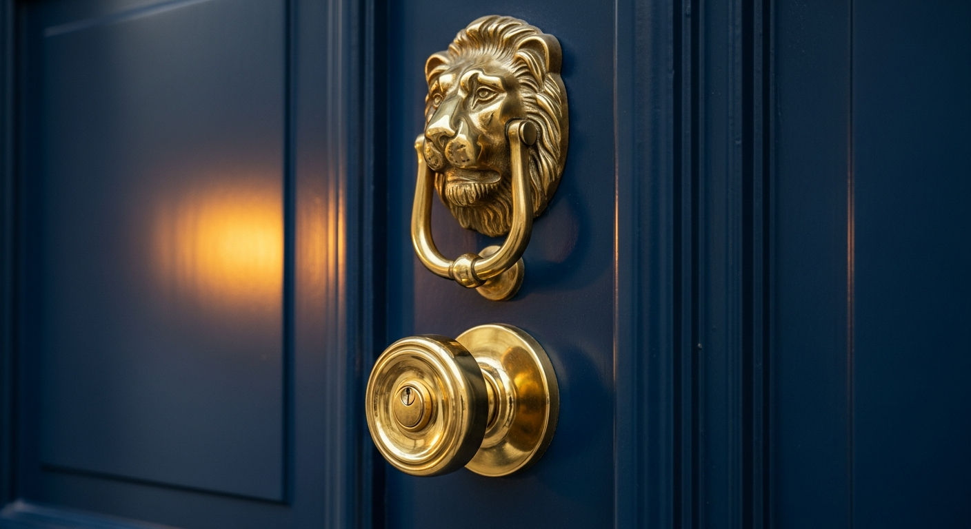
Your door hardware, light fixtures, house numbers, and mailbox should all share the same metal finish. This coordination creates a polished, intentional look that signals attention to detail. The most popular finish families in 2026 are matte black, satin nickel, and antique brass — and each sends a different design message.
Matte black hardware is the most versatile and contemporary choice. It works with virtually any door color and architectural style, from modern farmhouse to traditional Colonial. Black hardware creates contrast on light doors and blends seamlessly on dark doors. Brands like Schlage, Kwikset, and Emtek all offer comprehensive matte black collections that include door handles, deadbolts, kick plates, and house numbers.
Satin nickel and brushed nickel create a cooler, more transitional look. These finishes pair well with cool-toned paint colors — grays, blues, whites, and greens. They are particularly effective on coastal and contemporary homes where a polished but not overly formal aesthetic is desired.
Antique brass and aged bronze bring warmth and character. These finishes complement warm paint colors, earthy door tones, and traditional architectural styles. Craftsman, Tudor, and Mediterranean homes look especially authentic with warm metal finishes. Unlacquered brass that develops a natural patina over time is a premium choice for homeowners who appreciate living finishes that age gracefully.
Mixing metals can work when done intentionally — for example, a matte black door handle paired with brass light fixtures creates an eclectic, curated look. However, mixing should be a deliberate design choice, not an accident. When in doubt, stick with one metal family throughout your exterior entry zone. Browse our gallery of exterior transformations to see how coordinated hardware elevates the overall design.
Frequently Asked Questions
Should my front door match my shutters? Not necessarily. Matching your door and shutters creates a cohesive, traditional look, but it can also dilute the impact of a bold door color. If your door is a statement color like bright red or teal, consider painting your shutters to match the trim or body instead, keeping the bold color as a singular focal point at the entry. If your door is a classic color like black or navy, matching shutters creates elegant consistency across the facade.
What color should I paint my trim if my house is gray? White trim is the safest and most popular choice for gray homes. Crisp white creates clean contrast that highlights architectural details and makes gray siding look intentional and polished. For a modern look, try dark charcoal or black trim on a light gray body. For a monochromatic approach, choose a lighter gray for trim — the subtle tonal variation creates sophistication without high contrast. Use our AI House Painter to preview all three options on your actual home.
Can I paint my front door a bold color in an HOA neighborhood? Most HOAs regulate body and trim colors but are more lenient about front door colors, since the door is a relatively small surface area. Review your HOA's architectural guidelines carefully — many explicitly permit accent doors. If your HOA requires approval, submit your color choice with a physical sample or a visualization showing how it coordinates with your existing exterior. Bold doors that complement the home's palette are usually approved more easily than random or clashing choices.
What is the best paint for a front door that gets direct sun? For south- and west-facing doors that receive intense sun exposure, choose a premium exterior paint with advanced UV protection. Sherwin-Williams Emerald Urethane Trim Enamel and Benjamin Moore Aura Grand Entrance are both formulated specifically for doors and provide exceptional fade resistance and durability. Dark colors absorb more heat than light colors, so if your door receives intense afternoon sun, consider a UV-stable formulation and apply lighter colors or use a storm door for additional protection. Semi-gloss or high-gloss sheens also provide better UV resistance than flat or satin finishes.
How often do I need to repaint exterior trim and doors? Exterior trim typically needs repainting every 3 to 5 years, while doors may need attention every 2 to 3 years due to higher wear from opening, closing, and direct hand contact. South-facing surfaces degrade faster than north-facing ones. Regular maintenance — cleaning trim annually, touching up chips and dings promptly, and inspecting caulk seals — can extend these intervals significantly. When you notice fading, chalking, or peeling on trim, it is time to plan your next surface prep and painting project.

Preview Door and Trim Colors on Your Home
Choosing trim and door colors from a small paint chip is one of the most unreliable ways to make this decision. Colors shift dramatically between a 2-inch chip under store lighting and a full-scale application in natural sunlight. The best way to see exactly how your chosen colors will look is to use digital visualization tools that show the actual colors on your actual home.
HanoDecor's AI House Painter lets you upload a photo of your home and preview any trim, door, or shutter color instantly. Test a crisp white trim against a charcoal body, see how a navy door looks next to your existing brick, or compare three different shutter colors side by side — all without opening a single paint can.
For a comprehensive exterior visualization including siding, trim, doors, and landscaping, try HanoDecor's Exterior Visualizer. This tool lets you see your entire home transformed with coordinated colors and materials, so you can make confident decisions before spending a dollar on paint. Check our pricing page to explore all available visualization options and start designing your perfect exterior today.
Exterior Trim and Door Paint Colors FAQs
Written by
James Park
Architectural Design Advisor specializing in exterior remodeling, siding systems, and structural home improvements. Licensed architect with 18 years of residential project experience.