Clothing Color Palette Generator: Build a Capsule Wardrobe by Color
Quick Summary
A comprehensive guide to using a clothing color palette generator for building a capsule wardrobe. Covers the neutral base strategy with blacks, whites, grays, and navy, adding accent and statement colors, seasonal wardrobe color rotation for spring through winter, top fashion palette generator tools, and techniques for coordinating your wardrobe palette with your home decor style.
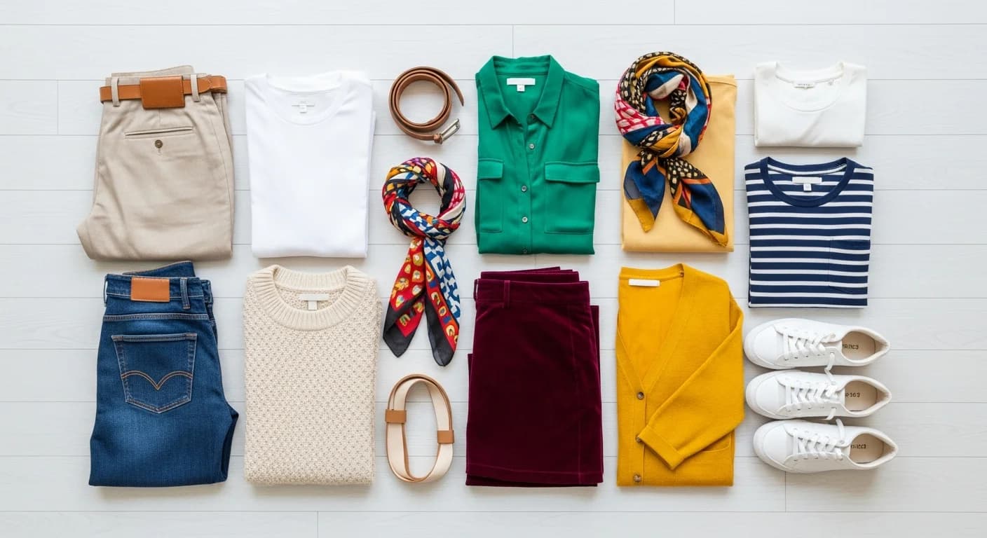
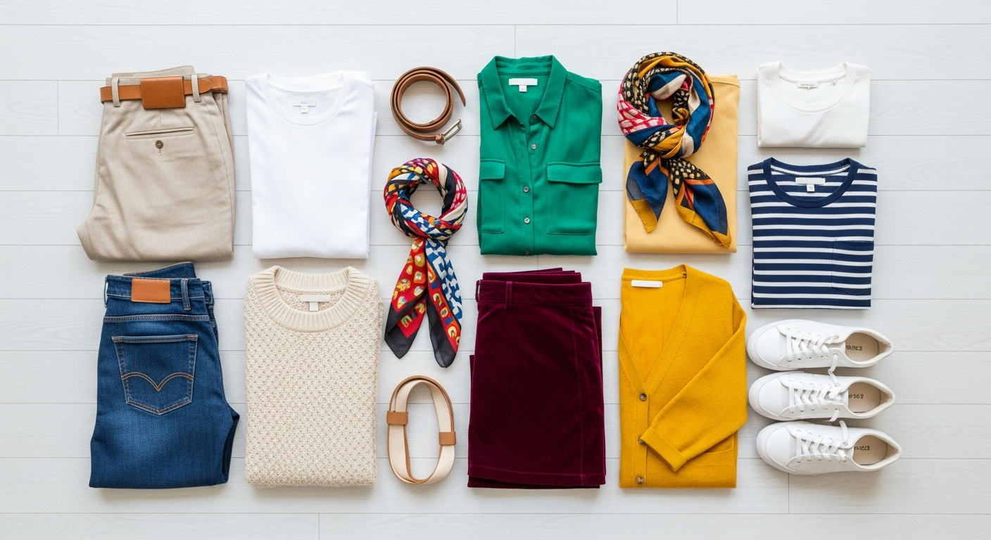
A clothing color palette generator transforms the overwhelming task of wardrobe building into a systematic, enjoyable process. Instead of staring at a closet full of clothes with nothing to wear, a curated color palette ensures every piece coordinates with multiple others, creating dozens of outfit combinations from a compact collection. The average person wears only 20 percent of their wardrobe regularly, but a palette-driven capsule wardrobe flips that ratio by eliminating mismatched purchases.
Fashion stylists have used color coordination systems for decades, but digital palette generators make these techniques accessible to everyone. Whether you are building a professional wardrobe, a casual weekend collection, or a travel-ready capsule, the principles remain the same: start with a neutral base, add accent colors that complement your skin tone, and rotate seasonal statement pieces to keep your look fresh without constant shopping.
Why a Color Palette Simplifies Your Wardrobe
A cohesive wardrobe color palette eliminates decision fatigue every morning. When every top works with every bottom and every jacket pairs with every dress, getting dressed takes minutes instead of a frustrating twenty-minute shuffle. Research from the Journal of Consumer Psychology shows that reducing daily decisions in low-stakes areas like clothing frees mental energy for more important choices throughout the day.
The financial benefits are equally compelling. A typical American spends $1,800 per year on clothing, with an estimated 30 percent of those purchases becoming rarely worn impulse buys. A palette-driven approach cuts waste by ensuring every new piece integrates with existing items. A well-curated 30-piece capsule wardrobe can generate over 100 unique outfit combinations, making each garment work harder for your investment.
Beyond practicality, a consistent color palette creates a recognizable personal style. Think of how instantly identifiable certain public figures become through their signature color choices. You do not need to wear one color exclusively, but having a defined palette of 8 to 12 coordinated shades creates visual cohesion across your entire wardrobe. For more on finding your personal color identity, explore our personal color palette generator guide.
The Neutral Base Strategy for Capsule Wardrobes
Every successful capsule wardrobe starts with a neutral foundation. Neutral colors serve as the backbone because they pair with virtually everything and create a polished look on their own. The four core neutral families are black, white and cream, gray, and navy or dark brown. Your personal coloring and lifestyle determine which neutral family becomes your primary base.
For warm undertones, choose cream over stark white, chocolate brown over black, and camel over gray. For cool undertones, lean toward pure white, charcoal, navy, and true black. Most people look best anchoring their wardrobe in two primary neutrals — one dark and one light — with a third mid-tone neutral for layering pieces. This three-neutral foundation should represent roughly 60 percent of your total wardrobe pieces.
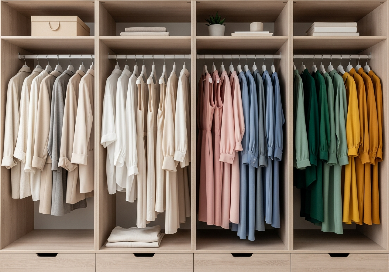
Key neutral base pieces include tailored trousers in your dark neutral, a blazer in your mid-tone neutral, basic tees and button-downs in your light neutral, a versatile coat in your dark neutral, and denim in a wash that bridges your neutral palette. These foundational items should be the highest quality you can afford since they receive the most wear and define the overall tone of your wardrobe.
Adding Accent and Statement Colors
Accent colors bring personality and visual interest to your neutral foundation. A well-chosen capsule wardrobe includes two to three accent colors that complement each other and pair seamlessly with your neutral base. These accents typically represent 25 to 30 percent of your wardrobe and appear in sweaters, blouses, scarves, shoes, and accessories.
Use the color palette generator to test accent color combinations before shopping. Input your neutral base colors and explore complementary, analogous, or triadic accent options. For example, a navy and cream neutral base pairs beautifully with dusty rose and sage green accents, creating a sophisticated four-color wardrobe palette that works across all seasons and occasions.
Statement colors are the final layer, representing 10 to 15 percent of your wardrobe. These are bolder, more saturated shades reserved for special pieces — a red dress, a cobalt blazer, or emerald accessories. Statement pieces should still harmonize with your overall palette. The simplest approach is choosing statement colors that sit on the same temperature spectrum as your accents: warm accents pair with warm statements, and cool accents pair with cool statements.
Seasonal Wardrobe Color Rotation
A smart capsule wardrobe adapts to seasonal changes without requiring a complete overhaul. The seasonal rotation strategy keeps your neutral base consistent year-round while swapping accent and statement pieces to match the season's mood and temperature. This approach typically requires 30 to 40 core pieces for a four-season wardrobe, plus 8 to 12 seasonal accent items that rotate in and out of active use.
Spring palettes favor soft, warm tones — blush pink, soft peach, light sage, and butter yellow work as seasonal accents over your neutral base. Summer shifts toward brighter, cooler tones including sky blue, coral, mint, and lavender. Autumn brings warm depth with rust, olive, burgundy, and mustard. Winter calls for rich, saturated shades like forest green, plum, cranberry, and midnight blue alongside your dark neutrals.
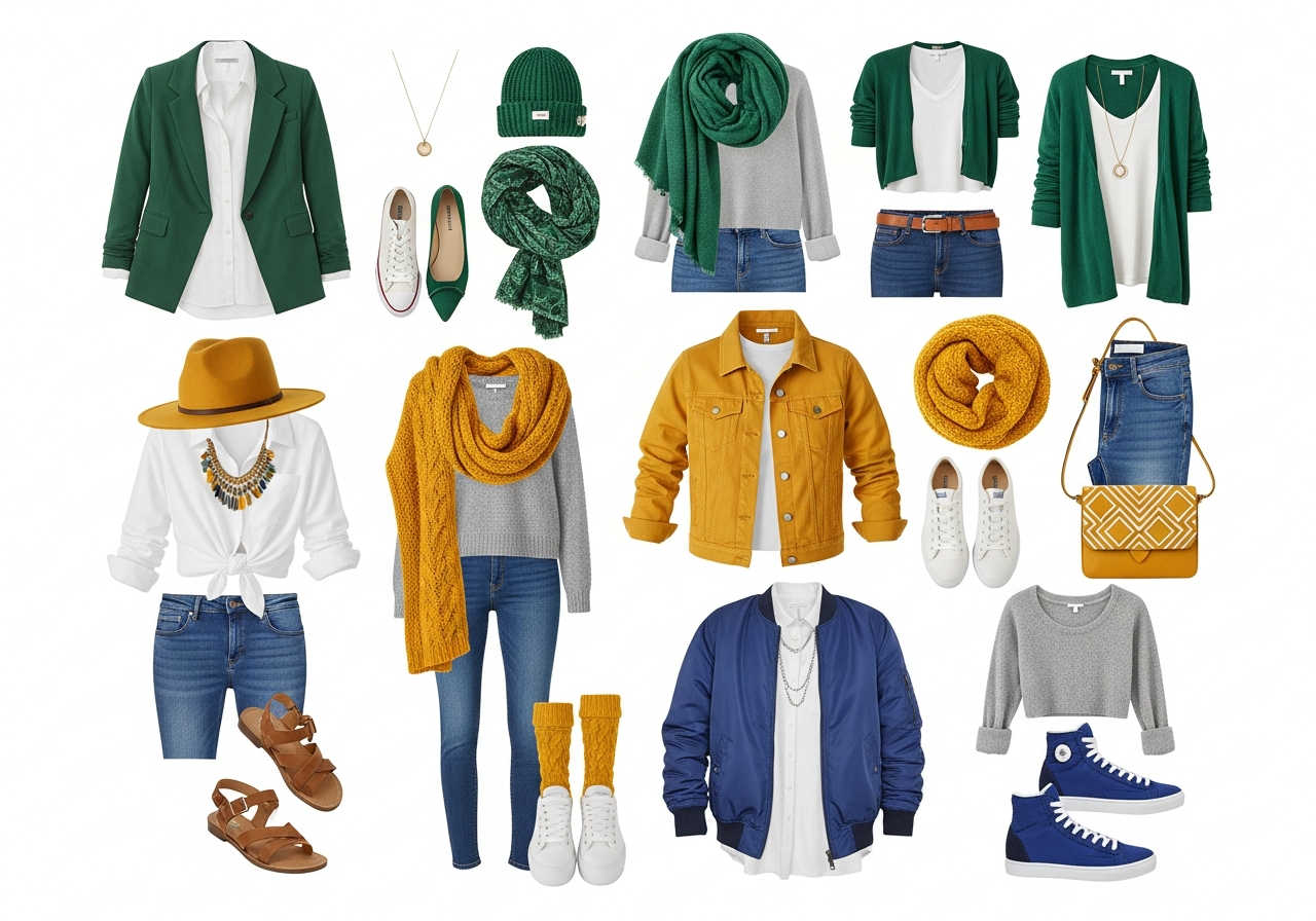
The key to seasonal rotation is ensuring your seasonal accent pieces still coordinate with your year-round neutrals. Before purchasing a seasonal item, hold it against your two primary neutrals. If it works with both, it earns a spot in your capsule. If it only works with one or neither, skip it regardless of how trendy it appears. For pastel palette inspiration, explore soft tones that work beautifully for spring and summer seasonal rotation.
Tools for Generating Fashion Color Palettes
Several digital tools specialize in generating fashion-appropriate color palettes. General-purpose palette generators like HanoDecor's color palette generator work well when you input your skin tone, hair color, and style preferences. The tool suggests harmonious combinations that account for color temperature and contrast levels appropriate for clothing worn near the face.
Specialized fashion palette tools include Stylebook, Cladwell, and Smart Closet — apps that digitize your existing wardrobe and suggest color-coordinated outfits. These tools photograph each garment, extract its dominant colors, and map your wardrobe's color distribution to identify gaps and redundancies. For a broader comparison of palette generation tools, see our free color palette generators guide.
When using any generator for fashion purposes, prioritize palettes with high versatility scores — meaning each color pairs well with at least three others in the palette. Avoid palettes where colors only work in specific combinations, as this limits outfit options. A yarn color palette generator can also help coordinate knitting and textile projects with your existing wardrobe colors for handmade accessories that integrate seamlessly.
Coordinating Your Wardrobe with Your Home Decor
Your personal color palette naturally extends beyond your closet into your living space. People who feel most at home in warm earth tones tend to gravitate toward similar warmth in their interior design — terracotta walls, natural wood furniture, and amber-toned textiles. This unconscious coordination creates a sense of visual harmony between your personal style and your environment.
Use your wardrobe palette as a starting point for home decor decisions. If your closet is anchored in navy, cream, and blush, consider those same tones for throw pillows, artwork, and accent pieces in your living room. The room designer tool lets you visualize interior palettes that echo your personal color story. For comprehensive guidance, explore our home decor color palette guide.
This wardrobe-to-home connection also works in reverse. If you have already established a strong color palette in your home, consider how your daily outfits photograph against that backdrop for video calls, social media content, or simply the visual pleasure of seeing your whole world in harmony. Explore finding your decor style for techniques that bridge personal fashion and interior aesthetics.
Frequently Asked Questions
How many colors should be in a capsule wardrobe palette?
A capsule wardrobe palette typically includes 8 to 12 colors total: 3 to 4 neutrals forming the base, 2 to 3 accent colors for personality, and 1 to 2 statement colors for special pieces. This range provides enough variety for diverse outfits while maintaining cohesion. Fewer than 8 colors can feel monotonous, while more than 12 starts to dilute the coordinated effect. For more on optimal palette sizing, see our palette size rules guide.
Can I use a color palette generator designed for interior design for fashion?
Yes, general-purpose color palette generators work well for fashion with one adjustment: clothing palettes need higher contrast between pieces worn near the face and those worn on the lower body. Interior palettes often favor subtle tonal variations, while fashion palettes benefit from clearer value differences between tops and bottoms. Generate your base palette with any tool, then adjust the lightness values to ensure flattering contrast near your face.
How do I find colors that flatter my skin tone?
Start with the vein test: examine the veins on the inside of your wrist in natural light. Blue or purple veins suggest cool undertones, green veins suggest warm undertones, and a mix suggests neutral undertones. Cool undertones look best in jewel tones, blue-based reds, and silver metals. Warm undertones shine in earth tones, orange-based reds, and gold metals. Neutral undertones can wear most colors successfully.
What is the best neutral base for a beginner capsule wardrobe?
For beginners, navy and white is the most versatile neutral base. Navy is softer than black near the face, making it universally flattering, while white provides clean contrast. Add gray as a third neutral for layering, and you have a foundation that works across casual, professional, and dressy contexts. As your palette confidence grows, experiment with brown, olive, or charcoal as alternative neutrals.
How often should I update my wardrobe color palette?
Your core neutral base should remain stable for years, evolving only if your coloring changes significantly due to hair color, tanning, or aging. Accent colors can refresh seasonally or annually based on personal preference and emerging trends. Statement colors are the most flexible — swap one statement piece per season to keep your wardrobe feeling current without overhauling your entire palette.
Related Articles
Expand your color coordination skills with these related guides: Personal Color Palette Generator helps you discover the colors that flatter your natural coloring. Pastel Color Palette Generator explores soft tones perfect for spring and summer wardrobe rotation. How to Choose a Color Palette for Home Decor extends your personal palette into your living space. Browse design ideas for visual inspiration across styles.
Explore Color Palette Inspiration with HanoDecor AI
Ready to build your perfect wardrobe color palette? Our AI-powered color palette generator creates harmonious combinations tailored to your preferences. Input your favorite neutrals, and the tool suggests accent and statement colors that complement your base while flattering your skin tone and personal style.
Take your color coordination further with the HanoDecor Studio, where you can visualize how your personal color palette translates into interior design. See how wardrobe-inspired tones look on walls, furniture, and textiles throughout your home. Browse our design gallery for thousands of real-world examples of cohesive color palettes in action.
Clothing Color Palette Generator FAQs
Written by
Lisa Wang
Sustainable Design Writer focused on eco-friendly materials, energy efficiency, and budget-conscious home improvement. LEED Green Associate with expertise in low-impact renovation strategies.