Personal Color Palette Generator: Find Colors That Suit You
Quick Summary
A comprehensive guide to finding your personal color palette through seasonal color analysis and skin undertone determination. Covers the four-season and twelve-season color analysis systems, DIY methods for identifying undertones at home, comparison of online personal color generators, and practical application of your color season to both wardrobe building and home decor decisions.
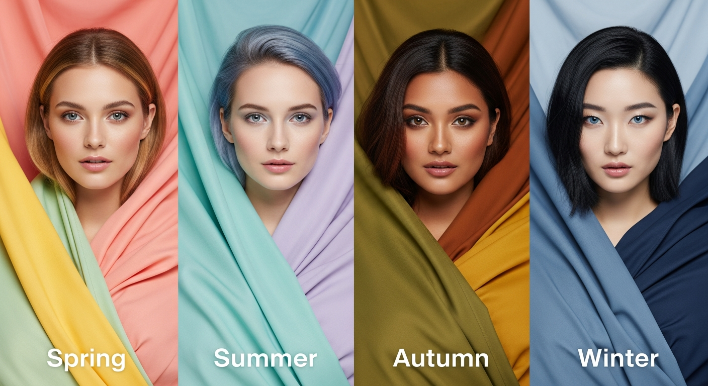
A personal color palette generator helps you discover which colors naturally complement your skin tone, eye color, and hair color. Rooted in seasonal color analysis — a system developed in the 1980s and refined through decades of fashion and image consulting — personal color theory identifies whether you are best suited to warm, cool, or neutral color families. Understanding your personal palette transforms both wardrobe shopping and home decor decisions from guesswork into confident, flattering choices.
The concept is simple: certain colors make you look vibrant, healthy, and polished, while others wash you out, emphasize dark circles, or create an unflattering contrast against your natural coloring. A personal color palette generator analyzes your features — through uploaded selfies, quiz responses, or AI-powered skin tone detection — and maps you to a color season with a corresponding palette of your most flattering shades. This guide covers the analysis systems, DIY determination methods, and how to extend your personal palette from your closet to your living room.
What Is a Personal Color Palette?
A personal color palette is a curated set of colors that harmonize with your natural physical features — your skin undertone, hair color, and eye color. Unlike a design palette chosen for aesthetic preference, a personal palette is based on the optical interaction between colors and your complexion. When you wear or surround yourself with colors from your personal palette, your skin appears smoother, your eyes look brighter, and your overall appearance gains a natural glow.
The personal color palette concept extends beyond fashion into home decor, makeup selection, and even the color of your car. Interior designers have long understood that homeowners feel most comfortable in rooms painted with colors that flatter their complexion because those are the colors that feel instinctively right. Your personal palette is a bridge between how you present yourself to the world and the spaces you create around you.
Professional color analysis sessions typically cost $150 to $400 and involve draping fabric swatches against your face under controlled lighting. Online generators replicate this process digitally at no cost, though with varying degrees of accuracy. The best approach combines a digital generator for initial direction with some in-person experimentation using clothing and paint samples to confirm your results.
Understanding Seasonal Color Analysis (Spring, Summer, Autumn, Winter)
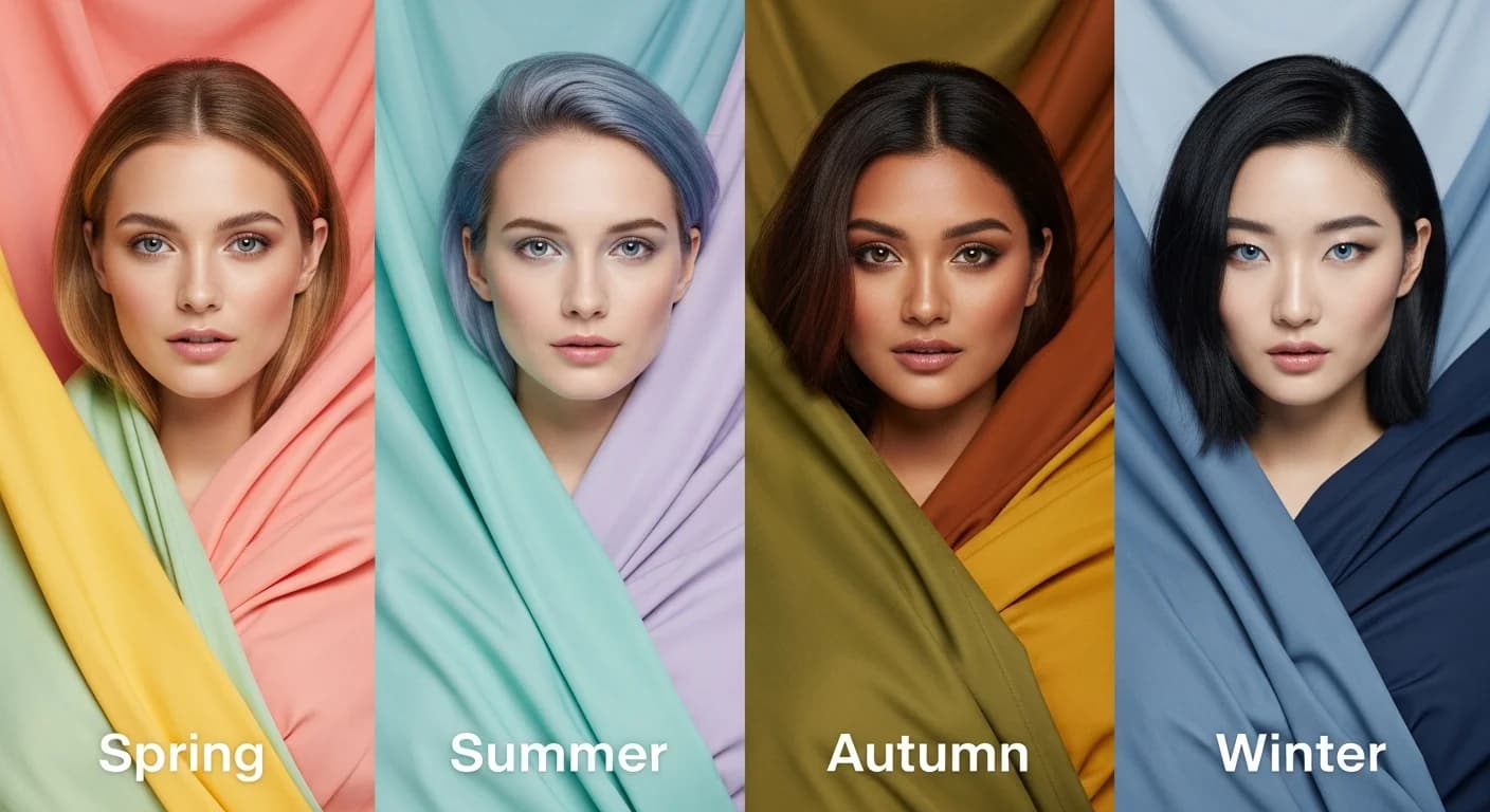
The seasonal color analysis system categorizes human coloring into four primary seasons, each with a corresponding palette. Spring types have warm undertones with light to medium coloring — think golden blonde hair, peachy skin, and light warm eyes. Their best colors are warm, clear, and bright: coral, warm turquoise, golden yellow, ivory, and fresh green. Spring palettes feel sunny, vibrant, and optimistic.
Summer types have cool undertones with soft, muted coloring — ash blonde or light brown hair, pink or neutral skin, and blue or gray eyes. Their most flattering colors are cool, soft, and slightly dusty: lavender, dusty rose, powder blue, soft navy, and sage. Summer palettes feel gentle, elegant, and romantic. Autumn types have warm undertones with rich, deep coloring — auburn, chestnut, or dark golden hair, warm olive or golden skin, and green, hazel, or warm brown eyes. Their palette includes burnt orange, olive green, warm brown, mustard, and teal.
Winter types have cool undertones with high contrast coloring — very dark or very light hair, porcelain or deep cool-toned skin, and striking dark or vivid eyes. Winter palettes are bold and high-contrast: true red, emerald green, royal blue, bright white, and jet black. The twelve-season expansion subdivides each season into three variants — Light, True, and Dark for the warm seasons, and Light, True, and Deep for the cool seasons — providing more nuanced palette recommendations.
How to Determine Your Skin Undertone at Home
Your skin undertone is the foundation of personal color analysis, and several DIY methods can help you determine yours. The vein test is the most popular starting point: examine the veins on the underside of your wrist in natural daylight. If your veins appear predominantly blue or purple, you likely have a cool undertone. If they appear green or olive, you have a warm undertone. If you see a mix of both blue and green, you may have a neutral undertone that bridges warm and cool palettes.
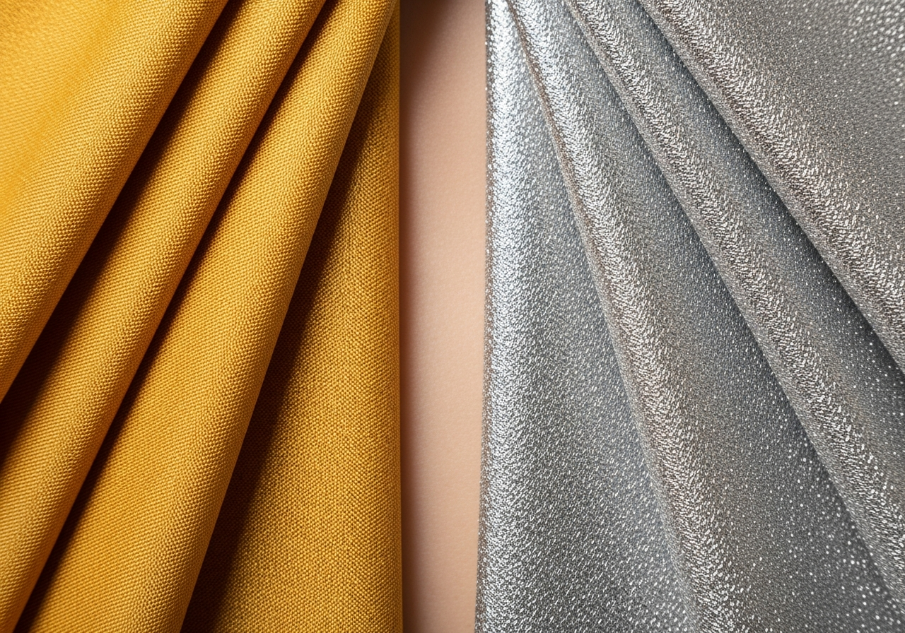
The jewelry test provides another reference point. Hold a piece of silver jewelry and a piece of gold jewelry against your skin alternately. If silver makes your skin look brighter and healthier, you lean cool. If gold is more flattering, you lean warm. If both look equally good, you are likely neutral. This test works because silver has cool blue-gray undertones while gold has warm yellow undertones, and the more harmonious metal will enhance rather than conflict with your natural coloring.
The white paper test helps identify whether your skin runs warm, cool, or neutral. Hold a piece of pure white paper next to your face in natural light. If your skin appears yellowish or golden against the white, you have warm undertones. If it appears pinkish, bluish, or ruddy, you have cool undertones. If neither yellow nor pink dominates, you are neutral. Combine multiple test results for the most accurate undertone determination — no single test is definitive for everyone.
Online Personal Color Palette Generators Compared
Several online tools offer personal color analysis through different approaches. Quiz-based generators ask questions about your hair color, eye color, skin reaction to sun, and jewelry preferences to categorize you into a season. These are straightforward but rely on your self-assessment accuracy. Photo-based generators analyze an uploaded selfie using computer vision to detect skin tone, contrast levels, and warmth — offering more objective results but requiring good lighting and a makeup-free photo.
AI-powered personal color tools represent the newest generation of generators. These use machine learning trained on thousands of professional color analysis results to predict your season from a single photograph. They can detect subtle undertone variations that quiz-based tools miss. The most advanced tools generate not just your season category but a specific customized palette of your 30 to 50 most flattering shades, ranked by how well each harmonizes with your detected coloring.
When using any online generator, photograph yourself in natural daylight without makeup, facing a window or standing outdoors in shade. Avoid direct sunlight which creates harsh shadows that confuse color detection. Wear a neutral gray or white top so your clothing does not influence the analysis. Run the same photo through multiple generators and look for consensus across tools to build confidence in your result.
Applying Your Personal Palette to Home Decor
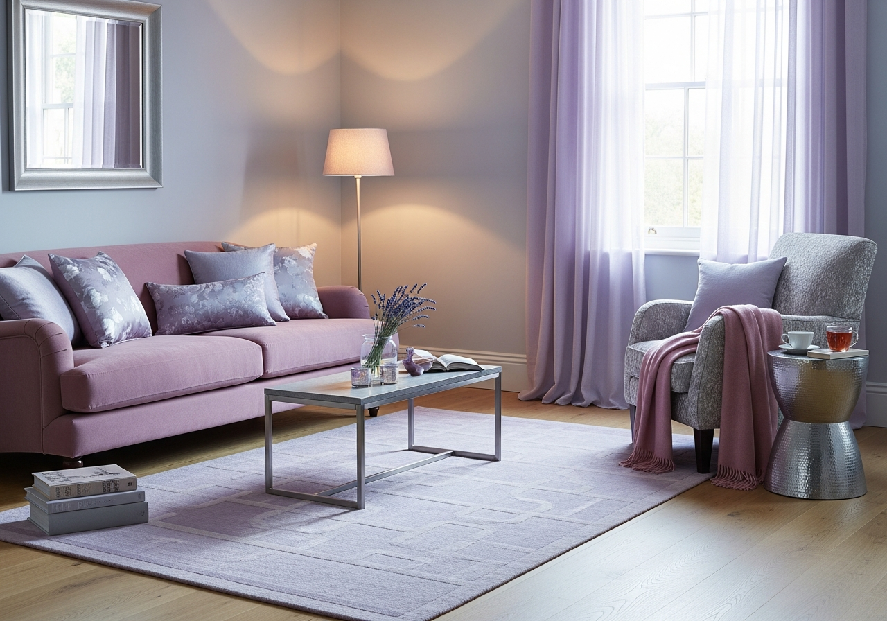
Your personal color palette is not limited to your wardrobe — it can guide home decor decisions that make your living spaces feel instinctively comfortable. Warm-season individuals tend to feel most at home in rooms with warm-toned walls, golden lighting, and natural wood finishes. Cool-season individuals often prefer rooms with blue-gray undertones, silver or chrome hardware, and cool white paint. This is not a rule, but a tendency worth exploring.
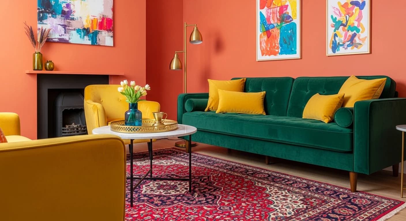
Start by applying your palette to the room where you spend the most time — typically the living room or bedroom. If you are a Soft Summer, consider painting your bedroom walls in dusty blue or soft lavender and choosing bedding in muted rose tones. If you are a Warm Autumn, rich terracotta accent walls, olive green textiles, and warm brass lighting create a space that feels deeply personal. See our home decor style guide for more on aligning personal preferences with interior design.
The connection between personal coloring and home decor extends to art selection, throw pillow colors, and even the wood tone of your furniture. Cool-season individuals often gravitate toward gray-toned woods like ash or weathered oak, while warm-season individuals prefer honey-toned woods like cherry, walnut, or warm maple. Understanding this connection helps you make faster, more confident decorating decisions. Use our room designer tool to test how your personal palette colors look in your actual living spaces.
Building a Wardrobe Around Your Color Season
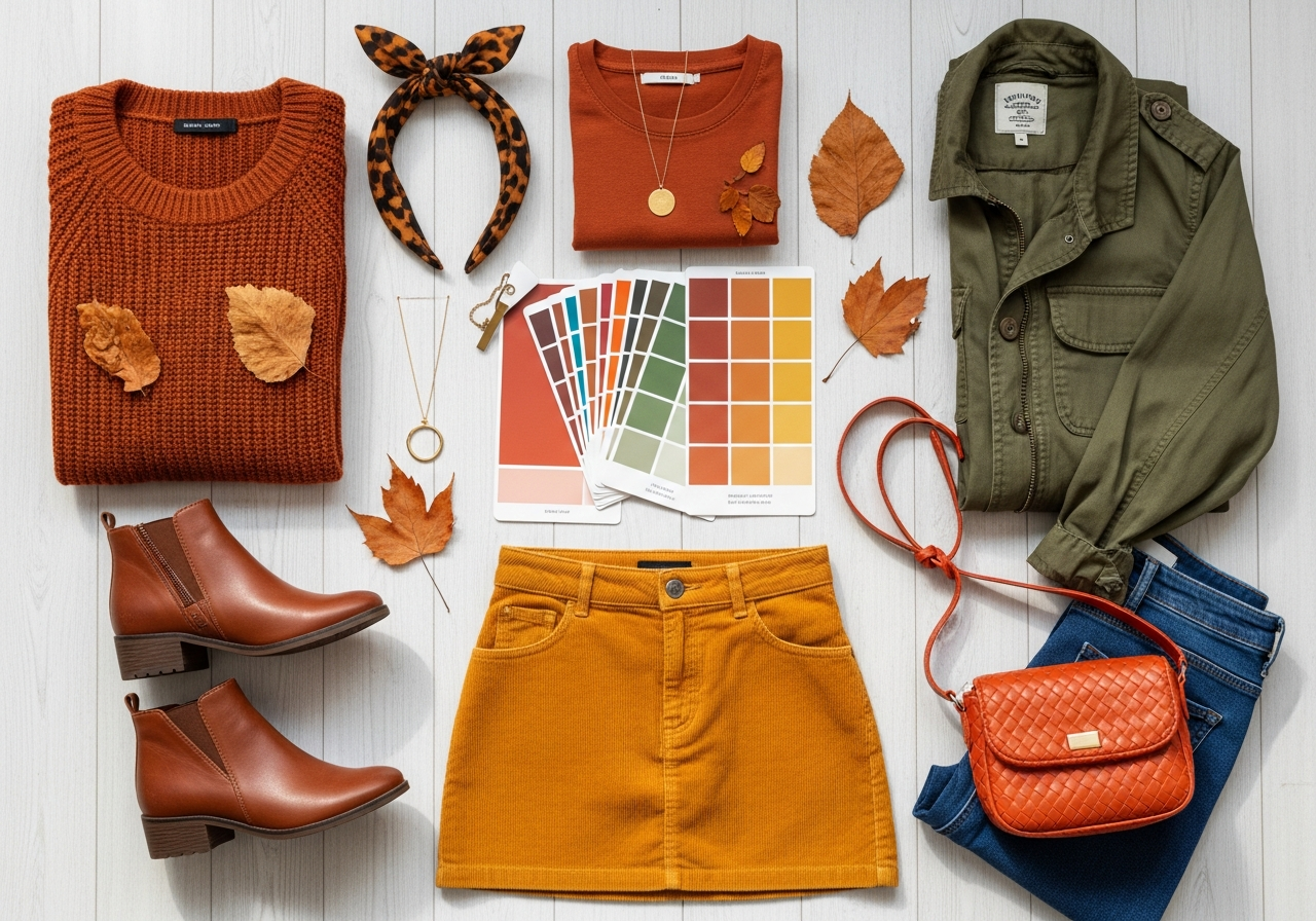
Once you identify your color season, building a cohesive wardrobe becomes significantly easier. Start by selecting three to four neutral base colors from your season's palette — these become the foundation of your closet. For a Soft Summer, that might be soft navy, dove gray, cocoa, and off-white. For a True Autumn, consider warm brown, olive, camel, and ivory. These neutrals should form the majority of your wardrobe and mix interchangeably.
Add three to four accent colors from your palette for tops, scarves, jewelry, and statement pieces. These accent colors bring personality and variety to your base neutrals without disrupting the overall harmony of your wardrobe. A Deep Winter might add true red, emerald green, and royal purple to a base of black, charcoal, and pure white. Every piece in your closet should coordinate with multiple others, eliminating the nothing-to-wear dilemma that comes from random color accumulation.
For more detailed wardrobe color strategies, including capsule wardrobe construction and seasonal rotation systems, explore our clothing color palette guide. And remember that your personal palette is a guideline, not a prison. If a color outside your season makes you feel confident and happy, wear it. Personal style is ultimately about self-expression.
Frequently Asked Questions
Can my personal color season change over time?
Your core undertone remains stable throughout your life, but factors like hair color changes, tanning, aging, and hormonal shifts can shift your best colors within your seasonal family. A Light Spring might shift toward True Spring as their hair darkens naturally. Someone who colors their hair from warm brown to cool platinum may find that cool-season colors become more flattering. Re-evaluate your palette every few years or after significant appearance changes.
What if I fall between two seasons?
Many people do not fit neatly into one season, which is why the twelve-season system exists. If you test between Autumn and Spring, you might be a Warm Autumn or a Warm Spring — both sharing warm undertones but differing in depth and clarity. Try colors from both seasons and observe which feel more natural. The twelve-season system captures these in-between positions more accurately than the basic four-season model.
Do personal color palettes work for all skin tones?
Yes, seasonal color analysis works across all ethnicities and skin tones. Every skin tone has an undertone that can be categorized as warm, cool, or neutral. People with very dark skin can be Winters or Autumns. People with very light skin can be Summers or Springs. The system analyzes undertone and contrast, not surface skin shade, making it universally applicable. Professional analysts are trained to read undertones across the full spectrum of human complexion.
How accurate are online personal color generators?
Online generators provide a good starting direction with roughly 60 to 75 percent accuracy compared to in-person professional analysis. Photo-based AI tools tend to be more accurate than quiz-based tools because they measure actual color values rather than relying on self-assessment. For the most reliable results, use a well-lit, makeup-free selfie and run it through multiple tools to find consensus. Consider the generator result a starting point and refine it through real-world experimentation with clothing and fabric draping.
Should I only buy clothes in my color palette?
Your personal palette is a guide, not a restriction. It identifies colors that make you look your best naturally, but personal style involves self-expression beyond optimization. If you love wearing a color outside your season, wear it confidently. You can also use strategic placement — wearing off-palette colors as bottoms, bags, or shoes where they are further from your face, while keeping your most flattering colors near your complexion in tops, scarves, and jewelry.
Related Articles
Explore more color palette resources: How to Generate a Color Palette from a Name or Word covers creative palette creation methods. Clothing Color Palette Generator dives deeper into wardrobe color strategies. Wedding Color Palette Generator helps extend your personal palette to your celebration. Visit our home decor color palette guide for translating personal colors to room design.
Explore Color Palettes That Match Your Style with HanoDecor
Curious how your personal colors look in a room setting? Our color palette generator creates harmonious palettes that you can preview in real room environments using our AI visualization tools. Upload a photo of your living space and test wall colors, furniture tones, and textile palettes that align with your personal color season.
Explore the HanoDecor Studio for a complete suite of design tools, or use the Room Designer to see your personal palette come alive in your actual rooms. Browse our design gallery for thousands of room designs organized by color family — find your season and discover spaces that feel made for you.
Personal Color Palette Generator FAQs
Written by
Priya Sharma
Priya is an award-winning UX designer who previously led design teams at Airbnb and Pinterest. Her focus on user-centered design ensures that HanoDecor's tools are intuitive and accessible to everyone, regardless of their technical background.