Wedding Color Palette Generator: How to Choose Your Perfect Combination
Quick Summary
A comprehensive guide to using wedding color palette generators for choosing perfect ceremony and reception color combinations. Covers seasonal palettes for spring, summer, fall, and winter weddings, coordination across venue decor, florals, bridesmaid dresses, table settings, and invitations, plus trending 2027 wedding color combinations and AI visualization tools.
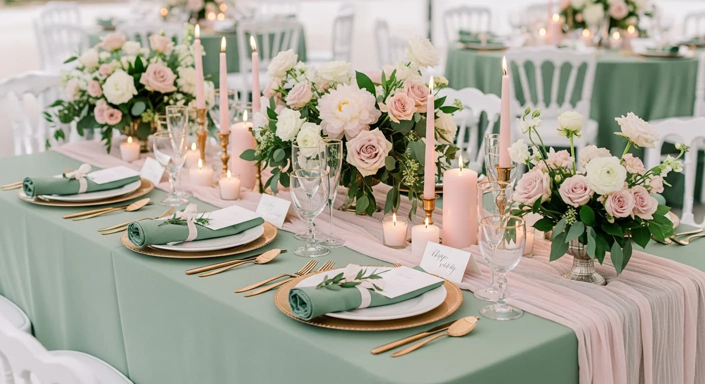
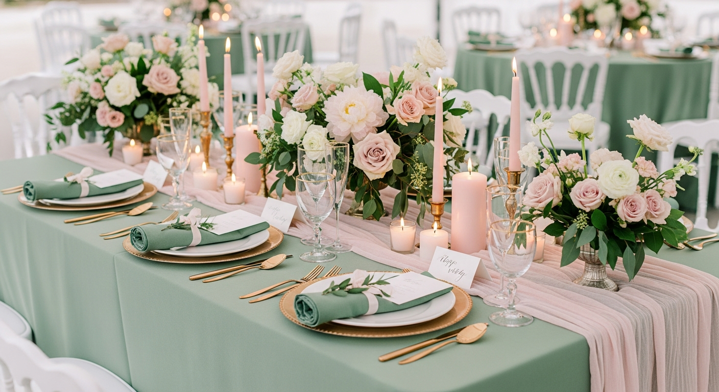
Choosing a wedding color palette is one of the most impactful decisions you will make during the planning process. Your color palette touches every visual element of the celebration — from bridesmaid dresses and floral arrangements to table linens, invitations, and cake design. A wedding color palette generator simplifies this overwhelming choice by producing harmonious combinations backed by color theory, seasonal trends, and proven design principles.
The challenge most couples face is not finding colors they like individually, but ensuring those colors work together across dozens of materials, textures, and lighting conditions. A generator tool solves this by calculating complementary, analogous, or triadic relationships between your chosen hues and presenting complete palette systems ready for vendor communication. This guide walks you through seasonal palette selection, cross-vendor coordination, and the trending combinations defining 2027 weddings.
Why Your Wedding Color Palette Matters More Than You Think
Your wedding color palette is the visual thread that ties every element of your celebration together. When colors are coordinated properly, guests experience a sense of cohesion from the moment they open the invitation to the final dance under string lights. Professional wedding planners consistently rank color palette selection as one of the top three decisions that determine overall aesthetic impact, alongside venue choice and floral design.
A well-chosen palette also simplifies hundreds of downstream decisions. Once you establish your three to five core colors, selecting bridesmaid dresses, groomsmen ties, table runners, napkins, candles, and party favors becomes a matter of matching rather than inventing. Vendors appreciate receiving specific color references — ideally with hex codes or Pantone numbers — because it eliminates guesswork and reduces costly reorders when shades do not match expectations.
Photography is another reason your palette matters deeply. Colors that photograph beautifully in both natural daylight and warm indoor lighting will look stunning in your wedding album for decades. Overly saturated neon tones or clashing combinations that seem fine in person can look jarring in professional photographs. A generator tool helps you preview how colors interact under different lighting simulations before you commit.
How Wedding Color Palette Generators Work
Wedding color palette generators use color theory algorithms to produce harmonious combinations from a starting point you provide. Some tools begin with a single inspiration color — perhaps the shade of your engagement ring setting or a flower you love — and generate complementary, analogous, or triadic palettes around it. Others start with a mood or season, offering curated palettes that match the emotional tone you envision for your celebration.
The best generators go beyond simple color wheels. They factor in material-specific considerations like how fabric dyes render differently than paper inks, how metallic accents interact with floral tones, and how candlelight shifts cool colors toward warmer readings. Some tools even offer vendor-specific outputs, generating Pantone codes for your printer, fabric swatch references for your dressmaker, and hex codes for your wedding website designer.
Spring and Summer Wedding Color Palettes
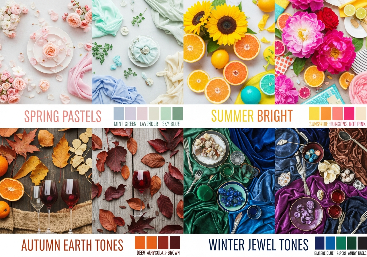
Spring weddings thrive on soft, fresh palettes that echo the season's natural renewal. Dusty rose paired with sage green and ivory creates a romantic, garden-inspired combination that photographs beautifully in natural light. Lavender with soft gold and cream offers a slightly more whimsical feel, particularly suited to outdoor ceremonies surrounded by blooming gardens. Pastel palettes in blush, periwinkle, and mint work wonderfully for April and May celebrations when ambient light is warm but not harsh.
Summer palettes can afford more vibrancy because the season's abundant natural light supports bolder saturation levels. Coral with turquoise and white is a classic summer beach wedding palette. Sunflower yellow paired with navy blue and ivory suits rustic barn or vineyard settings. Tropical palettes featuring fuchsia, mango, and palm green bring destination-wedding energy to any venue. For summer evening celebrations, consider deeper tones like terracotta with dusty blue and champagne gold that glow under string lights and candlelight.
When using a generator for spring or summer palettes, start with your venue photographs. Upload an image of your ceremony site to extract the dominant environmental colors — the green of a garden, the blue of a waterfront, or the warm stone of a courtyard — then build your palette to complement rather than compete with those existing tones. Our photo-based palette generator guide walks through this process step by step.
Fall and Winter Wedding Color Palettes
Fall weddings benefit from the season's naturally rich color story. Burgundy paired with burnt orange, gold, and deep green creates a luxurious harvest palette that feels both warm and elegant. Terracotta with mauve and cream offers a softer autumnal approach popular in modern rustic celebrations. Jewel tones — emerald, sapphire, and amethyst — bring regal depth to October and November ceremonies, particularly in candlelit venues with dark wood or exposed brick.
Winter weddings create opportunities for dramatic, high-contrast palettes that pop against stark seasonal landscapes. Navy blue with silver and white evokes a starry winter night. Deep red with forest green and gold carries classic holiday elegance without feeling like a Christmas party. For a more contemporary winter palette, try charcoal with blush and copper — the warmth of metallic accents prevents the scheme from feeling cold. Icy pastels like pale blue, silver, and white create a frozen wonderland aesthetic suited to January and February celebrations.
Seasonal palettes work best when you account for the specific materials available in that season. Fall palettes should align with in-season flowers like dahlias, chrysanthemums, and ranunculus. Winter palettes pair well with amaryllis, anemones, and evergreen accents. Your floral designer can achieve the most natural, cost-effective arrangements when your palette aligns with seasonal availability. Use a word-based palette generator to explore seasonal themes like autumn harvest or winter twilight.
Coordinating Colors Across Venue, Florals, and Fashion
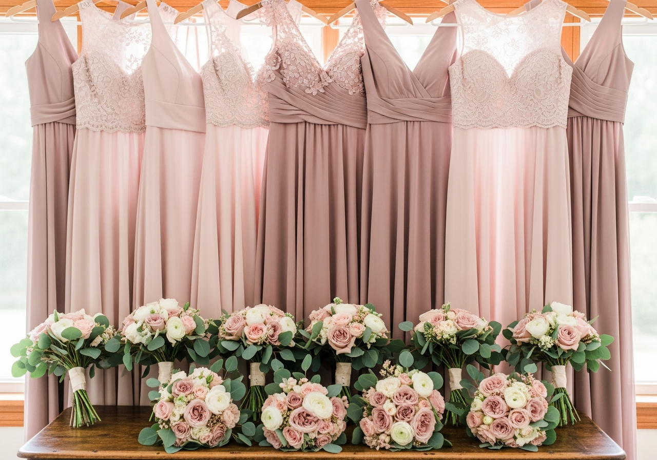
The real challenge of a wedding palette is not choosing colors on a screen — it is translating those digital swatches into consistent color across physical materials. Fabric dyes, flower petals, paper stocks, and frosting tints all render color differently. A sage green in chiffon looks distinct from the same sage green in linen, and both differ from a sage green rose. The key to successful coordination is establishing a range of acceptable variation rather than demanding exact matches across all materials.
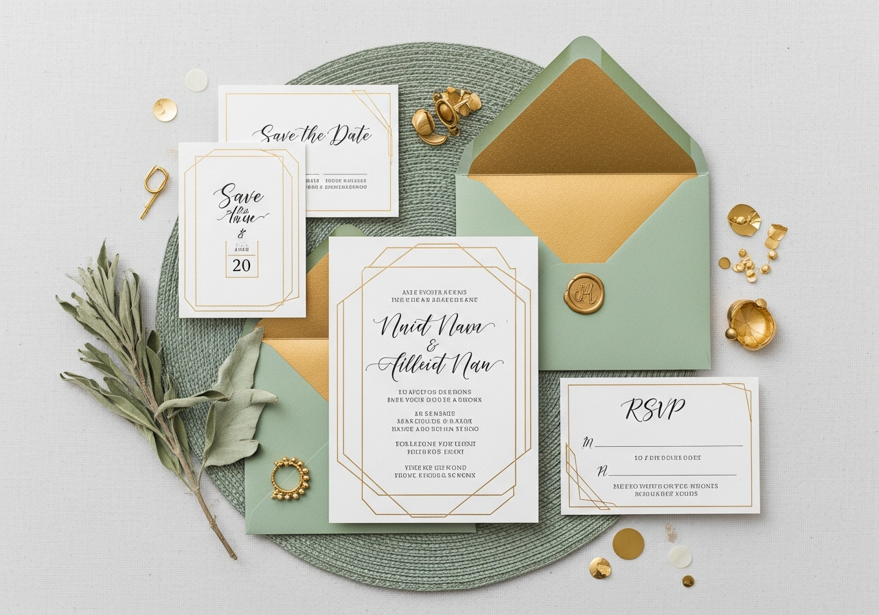
Share your palette with every vendor using multiple reference formats. Provide hex codes for your wedding website and digital invitations. Supply Pantone references for printed materials. Order fabric swatches for your seamstress and bridesmaids. Show photograph references to your florist, who will match by eye rather than code. Create a shared digital mood board on Pinterest or a collaborative tool where every vendor can see the overall vision and understand where their contribution fits within the larger palette.
Consider the ideal number of colors for your wedding palette. Most wedding designers recommend three to five colors: one dominant color that appears most frequently, one secondary color for supporting elements, one accent color for pops of contrast, and optionally one neutral and one metallic. More than five colors risk visual chaos, while fewer than three can feel monotonous.
Trending Wedding Color Combinations for 2027
Wedding color trends for 2027 reflect a broader cultural shift toward organic warmth and quiet luxury. Butter yellow is emerging as a fresh alternative to traditional gold, pairing beautifully with soft white and eucalyptus green for a bright, optimistic palette. Mocha and caramel tones are replacing blush as the go-to warm neutrals, creating sophisticated palettes when combined with ivory and matte black accents.
Sunset-inspired gradients are gaining momentum, where the palette moves through a tonal range rather than presenting distinct separate colors — think peach through apricot to terracotta with warm gold accents. This approach works particularly well for ombre table runners, gradient floral installations, and tonal bridesmaid dress lineups where each attendant wears a slightly different shade within the same color family.
For couples seeking drama, deep teal paired with burnt sienna and antique gold is a standout combination for 2027. Rich chocolate brown with dusty pink and sage green offers a nature-inspired alternative that feels both grounded and romantic. And the timeless combination of navy with blush continues to dominate because it photographs exceptionally well in both daylight and evening settings. Explore pastel palette generators for softer variations of these trending combinations.
Frequently Asked Questions
How many colors should a wedding palette have?
Most wedding designers recommend three to five colors. The ideal structure includes one dominant color appearing in roughly 60 percent of decor elements, one secondary color at 30 percent, and one accent color at 10 percent. You may add a neutral like ivory or cream and a metallic like gold or silver to round out the palette without adding visual complexity. More than five distinct colors can create a chaotic visual experience.
When should I finalize my wedding color palette?
Finalize your wedding color palette 10 to 12 months before the wedding date. This timeline gives you enough lead time to order bridesmaid dresses, design invitations, book a florist, and coordinate with your venue on linens and lighting. If you are planning a wedding in under six months, finalize colors immediately as some fabric and print orders require 8 to 16 weeks for production.
Can I mix warm and cool colors in a wedding palette?
Yes, mixing warm and cool colors creates visual interest when done intentionally. The key is balance — pair a warm dominant color with a cool accent or vice versa. For example, warm terracotta with cool dusty blue creates a complementary tension that feels intentional and sophisticated. Avoid mixing warm and cool tones of the same color family, such as warm pink with cool pink, which can look like a mismatch rather than a design choice.
How do I ensure my colors match across vendors?
Provide every vendor with your palette in multiple formats: hex codes for digital work, Pantone references for print, and physical fabric or paint swatches for materials. Create a shared mood board that shows all palette colors in context together. Order test samples from critical vendors like your printer, seamstress, and linen rental company before finalizing large orders. Accept that slight variations between materials are normal and can even add depth to your overall design.
What if my venue has strong existing colors?
Work with your venue colors rather than fighting them. If your venue has warm red brick walls, choose a palette that complements warm tones — burgundy, gold, and cream — rather than competing with cool blues or purples. Upload a photo of your venue to a color palette generator to extract the dominant environmental colors, then build a complementary palette around those fixed elements.
Related Articles
Continue exploring color palette creation with these guides: How to Generate a Color Palette from a Photo shows you how to extract colors from inspiration images. How Many Colors Should Be in Your Palette explains the rules for 3, 4, 6, and 12-color schemes. How to Choose a Color Palette for Home Decor helps translate your favorite wedding colors into your home design. Browse our design ideas gallery for more visual inspiration.
Create Your Wedding Color Palette with HanoDecor AI
Ready to find the perfect color combination for your celebration? Our AI-powered color palette generator creates harmonious wedding palettes from a single inspiration color, a mood word, or an uploaded photo of your venue. Generate unlimited combinations and download swatches ready to share with your florist, seamstress, and stationer.
Explore the full HanoDecor Studio to visualize how your wedding colors might translate into your home decor after the celebration. Many couples carry their wedding palette into their first home design — and our design gallery shows how color palettes flow beautifully from celebrations to living spaces.
Wedding Color Palette Generator FAQs
Written by
Priya Sharma
Priya is an award-winning UX designer who previously led design teams at Airbnb and Pinterest. Her focus on user-centered design ensures that HanoDecor's tools are intuitive and accessible to everyone, regardless of their technical background.