Pastel Color Palette Generator: Soft Tones for Every Project
Quick Summary
A comprehensive guide to pastel color palette generators covering what defines pastel tones (high lightness, low to medium saturation), the science of creating pastels through tinting and saturation reduction, popular pastel palette combinations for different moods and styles, pastel applications in interior design from nurseries to Scandinavian living rooms, pastel use in weddings, branding, and digital design, and the best generator tools for creating custom soft-toned palettes.
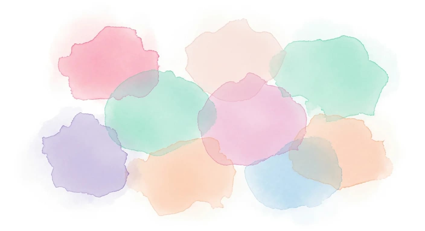
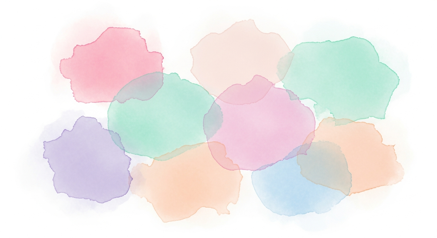
A pastel color palette generator creates the soft, muted tones that bring calm, warmth, and sophistication to design projects of every scale. From nursery walls to Scandinavian living rooms, spring wedding stationery to minimalist brand identities, pastels offer a versatility that bolder palettes cannot match. These gentle hues reduce visual stress, create airy spaciousness, and pair effortlessly with both neutrals and each other — making them the most forgiving color family for beginners and experienced designers alike.
What makes pastel generation unique is the precision required. Too much saturation and a pastel becomes a bold color. Too little and it washes into off-white territory. The best pastel palette generators give you fine control over tint levels, saturation curves, and lightness values to hit that sweet spot where colors feel soft but still identifiable as distinct hues — blush that reads as pink, sage that clearly reads as green, and lavender that unmistakably reads as purple.
What Defines a Pastel Color Palette
Pastel colors are defined by two characteristics in the HSL color model: high lightness (typically 75 to 95 percent) and low to medium saturation (typically 20 to 60 percent). This combination produces colors that appear tinted with significant amounts of white, creating the soft, airy quality that distinguishes pastels from both bold saturated colors and muted earth tones. In practical terms, any color can become a pastel by increasing its lightness above 75 percent and reducing saturation below 60 percent.
The emotional response to pastel palettes is consistently calming and approachable. Color psychology research associates pastels with serenity, innocence, softness, and optimism. Blush pink evokes warmth and tenderness. Powder blue suggests tranquility and openness. Mint green conveys freshness and renewal. Lavender communicates creativity and gentle luxury. These associations make pastels particularly popular for environments designed for rest, healing, care, and celebration.
Pastels differ from other light-toned color families in their saturation level. Off-whites and very light neutrals have near-zero saturation — they are essentially white with a slight chromatic hint. Pastels maintain enough saturation to be clearly identifiable as a specific hue while remaining soft and approachable. This distinction is important when using palette generators: target the 75 to 85 percent lightness range for richly readable pastels, and 85 to 95 percent for the softest whisper tones.
The Science of Creating Pastels: Tint, Saturation, Lightness
Creating pastels is fundamentally a tinting process — adding white to a pure hue. In traditional painting, this means mixing a pigment with white paint until the desired softness is achieved. In digital color systems, tinting is accomplished by increasing the lightness value in HSL (Hue, Saturation, Lightness) while optionally reducing saturation to prevent the color from appearing washed-out or artificially bright at high lightness levels.
The relationship between lightness and saturation requires careful balancing. At very high lightness levels (above 90 percent), even moderate saturation can produce colors that appear neon-tinged on screen due to monitor brightness. Reducing saturation as lightness increases creates more natural-looking pastels. A useful formula: for every 5 percent increase in lightness above 75 percent, reduce saturation by 8 to 10 percent to maintain a natural pastel appearance.
Different hues need different treatment to achieve balanced pastels. Warm hues like red, orange, and yellow appear to reach pastel territory at slightly lower lightness values (70 to 80 percent) because warm tones are inherently perceived as lighter. Cool hues like blue and purple may need higher lightness (80 to 90 percent) to achieve the same perceived softness. Green sits in the middle. Understanding these perceptual differences helps you create pastel palettes where every color feels equally soft despite having different numerical HSL values.
Popular Pastel Palette Combinations
The Scandinavian pastel palette combines powder blue, soft sage, warm cream, and pale blush — all at very high lightness (85 to 95 percent) with low saturation (15 to 30 percent). This creates the airy, luminous quality that defines Nordic interior design. The combination works because all four colors share a similar tonal weight, none dominating the others, with warm cream providing a grounding element among the cooler tones.
The romantic pastel palette features blush pink, lavender, champagne, and soft peach — warmer and slightly more saturated (30 to 50 percent) than Scandinavian pastels. This combination evokes femininity, celebration, and gentle luxury, making it popular for weddings, nurseries, and boutique branding. The analogous color relationship (pink through purple through peach) creates effortless harmony. For wedding-specific palette inspiration, see our wedding color palette generator guide.
The modern pastel palette pairs unexpected combinations — mint green with soft coral, powder blue with pale yellow, or lavender with sage — creating fresh, contemporary tension within the softness of the pastel range. These split-complementary and triadic pastel combinations feel more dynamic than traditional analogous pairings while maintaining the approachability that pastels are known for. Use the color palette generator to explore unconventional pastel combinations.
Pastel Palettes for Interior Design
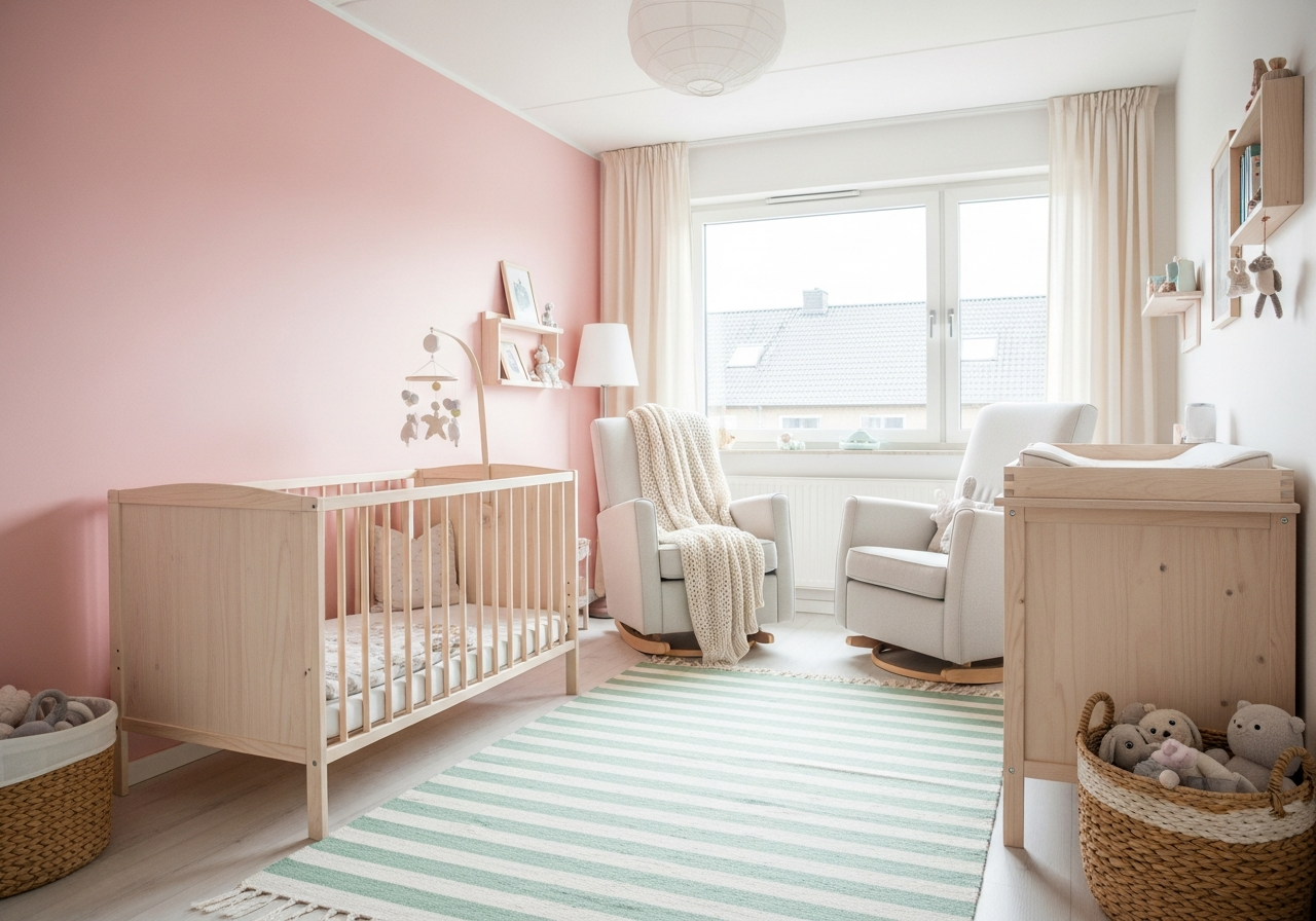
Pastel palettes excel in interior spaces where calm and spaciousness are design priorities. Nurseries and children's rooms benefit from the soothing quality of pastels — soft lavender ceilings, blush pink accent walls, and mint green textiles create a nurturing environment without the overstimulation that bright primary colors can cause. Research in pediatric environments shows that pastel-decorated spaces correlate with reduced stress indicators in both children and parents.
Scandinavian-inspired living rooms use pastels as quiet accents against a white or light gray base. A pale blue sofa, blush throw pillows, and sage green ceramics introduce color without disrupting the minimalist serenity. The trick is choosing pastels with enough saturation (30 to 45 percent) to register as intentional color choices rather than faded or washed-out surfaces. For guidance on minimalist color palettes, explore our dedicated style guide.
Bedrooms gain a restful quality from pastel palettes, particularly combinations of lavender, soft gray, and cream or blush, warm white, and dusty rose. These low-stimulation color environments support better sleep by reducing visual arousal before bedtime. Pair pastel walls with natural wood tones and white bed linens for a contemporary take on the pastel bedroom. For specific bedroom color ideas, see our bedroom decor guide.
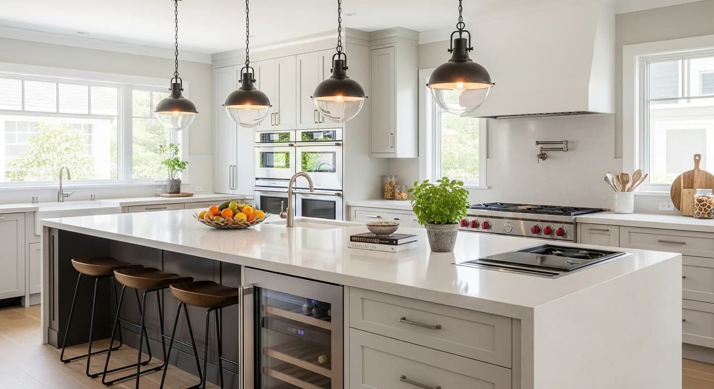
Kitchens and bathrooms are increasingly embracing pastel palettes as alternatives to the all-white trend. Soft green cabinetry, pale pink tile, or powder blue vanities add personality while maintaining a clean, spacious feel. The key is pairing pastel fixtures with white or light neutral countertops and walls to prevent the space from feeling overly themed. Use the room designer tool to test pastel kitchen and bathroom palettes before committing to cabinet paint or tile orders.
Pastel Palettes for Weddings, Branding, and Digital Design
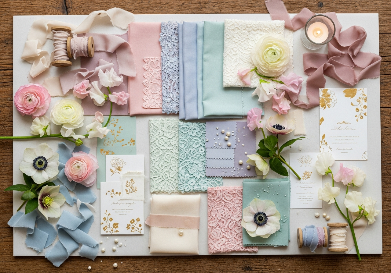
Spring and summer weddings frequently feature pastel palettes because the soft tones photograph beautifully in natural daylight, complement a wide range of skin tones in group photos, and create an atmosphere of romance and celebration. Popular wedding pastel combinations include blush and sage, lavender and dusty blue, and peach with soft gold. Each combination can extend across flowers, linens, bridesmaid dresses, stationery, and cake decoration.
Pastel branding communicates approachability, creativity, and contemporary style. Beauty brands, wellness companies, children's products, and food businesses frequently adopt pastel identities to convey warmth and accessibility. When using pastels for branding, ensure your palette includes at least one darker value (navy, charcoal, or dark green) for text and UI elements — an all-pastel brand palette lacks the contrast needed for readable typography.
Digital design benefits from pastels as background fills and UI surfaces because they reduce eye strain during extended viewing. Apps and websites using pastel interfaces report higher user satisfaction scores in usability testing compared to both dark and bright-white interfaces. Pastel UI palettes work best with medium to high saturation accents for interactive elements like buttons and links to ensure sufficient contrast. For wardrobe palette ideas that complement your pastel aesthetic, explore our fashion color guide.
Tools for Generating Pastel Color Palettes
The HanoDecor color palette generator creates custom pastel palettes by adjusting lightness and saturation parameters to the pastel range. Input any starting color and the tool generates harmonious pastel variations — analogous, complementary, and triadic — all calibrated to the soft tonal range. The results include hex codes, HSL values, and interior design application suggestions.
Coolors offers a pastel-specific exploration mode that locks lightness values above 75 percent while generating random hue combinations, making it easy to discover unexpected pastel pairings. Adobe Color's explore section allows filtering community palettes by lightness range, effectively surfacing thousands of curated pastel combinations. Color Hunt features a dedicated pastel category with trending combinations updated daily.
For the most precise pastel control, use an HSL-based picker and manually set lightness between 75 and 90 percent with saturation between 25 and 55 percent. Adjust these ranges based on hue — warmer pastels tolerate slightly higher saturation, while cooler pastels look best with slightly reduced saturation. For a comprehensive tool comparison, see our interior design palette guide.
Frequently Asked Questions
What HSL values make a color pastel?
Pastel colors typically have HSL lightness values between 75 and 95 percent and saturation values between 20 and 60 percent. The hue can be any value from 0 to 360 degrees. For richer pastels that still read as soft, target 75 to 82 percent lightness with 40 to 55 percent saturation. For the softest whisper tones, push lightness to 88 to 95 percent with 15 to 30 percent saturation.
Do pastel palettes work in dark mode?
Pastel palettes require adaptation for dark mode. The standard pastel lightness range (75 to 95 percent) creates excessive contrast against dark backgrounds, potentially causing eye strain. For dark mode pastels, reduce lightness to 55 to 70 percent while maintaining the same low saturation. These muted mid-tones preserve the gentle quality of pastels while providing comfortable contrast against dark surfaces.
Can pastel palettes work in masculine spaces?
Absolutely. The association of pastels with femininity is culturally specific and increasingly outdated. Dusty blue, sage green, warm gray, and soft terracotta create pastel palettes with no gendered connotation. The key is choosing pastels with slightly lower lightness (72 to 80 percent) and pairing them with natural materials like raw wood, leather, and concrete rather than metallic accents. Many contemporary men's fashion brands successfully use pastel branding.
How do I pair pastels with bolder colors?
Use the 80/20 rule: 80 percent pastels and neutrals with 20 percent bold accent. A blush and cream room with a single emerald green accent chair, a lavender palette with one deep plum pillow, or a mint kitchen with navy hardware all demonstrate effective pastel-bold pairing. The bold accent should be a fully saturated version of one of the hues in your pastel palette or its complement for maximum visual impact.
Are pastel paint colors hard to maintain on walls?
Pastel wall colors show scuffs, fingerprints, and stains more readily than darker colors due to their high lightness. Choose a satin or semi-gloss finish for pastel walls in high-traffic areas — these sheens are easier to wipe clean than flat finishes. In low-traffic rooms like bedrooms, a matte or eggshell finish provides a softer, more sophisticated look. Touch-up paint in pastel shades matches well because the light tones minimize batch-to-batch color variation.
Related Articles
Discover more soft-toned design inspiration: Minimalist Color Palettes Guide covers the intersection of pastels and minimalism. Interior Design Color Palette Generator provides room-by-room palette guidance including pastel options. Wedding Color Palette Generator features seasonal pastel combinations for celebrations. Browse bedroom design ideas for pastel interior inspiration.
Create Soft-Toned Palettes with HanoDecor AI
Our AI-powered color palette generator creates custom pastel palettes calibrated to any design context — from nursery walls to wedding stationery, Scandinavian interiors to digital brand identities. Input your preferred base color, and the tool generates harmonious pastel variations with precise HSL values for every output color.
See how pastels transform your actual space with the HanoDecor Studio. Upload a room photo and apply soft-toned palettes to walls, furniture, and textiles for a realistic preview of your pastel design vision. Browse our design gallery for thousands of real-world pastel interior examples that prove soft tones can be just as impactful as bold ones.
Pastel Color Palette Generator FAQs
Written by
Emily Rodriguez
Interior Design Editor covering living spaces, styling trends, and room makeovers. Former Architectural Digest contributor with a focus on accessible, budget-conscious design.