How to Generate a Color Palette from a Name or Word (4 Methods)
Quick Summary
A comprehensive guide to generating color palettes from names, words, and phrases using four methods: AI text-to-palette tools that use natural language processing, color psychology mapping based on emotional associations, cultural and seasonal word palettes drawn from universal associations, and manual semantic mapping that connects words to color families through deliberate creative exploration.

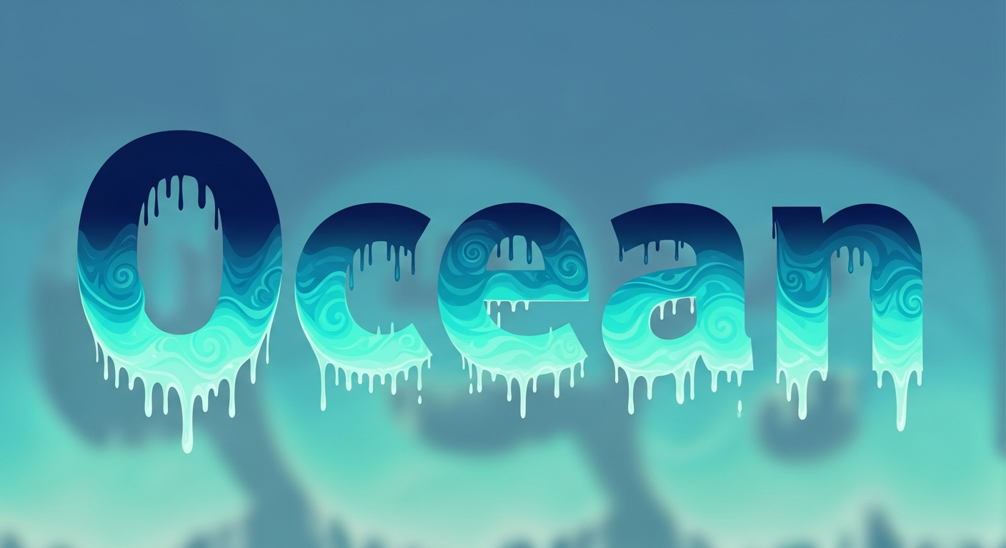
Generating a color palette from a name or word opens a creative approach to color selection that goes beyond traditional color wheels and photo extraction. Every word carries associations — emotional, cultural, seasonal, and sensory — that translate naturally into color. The word 'ocean' instantly evokes deep blues, seafoam greens, and sandy neutrals. A name like 'Sophia' might suggest soft lavender, blush pink, and warm ivory based on its feminine elegance.
This technique is especially powerful for branding, wedding planning, nursery design, and any project where a concept or name drives the aesthetic direction. A color palette generator from words bridges the gap between abstract ideas and concrete color selections, giving you a systematic process for turning inspiration into actionable design choices. Here are four methods that consistently produce beautiful, meaningful palettes from text.
Why Names and Words Inspire Color Palettes
The connection between language and color is deeply rooted in human cognition. Research in synesthesia — a neurological condition where stimulation of one sense triggers automatic experiences in another — shows that approximately 4 percent of people literally see colors when they hear words or names. But even non-synesthetic people have strong word-to-color associations. Studies published in the journal Psychological Science demonstrate that most English speakers associate the word 'anger' with red, 'sadness' with blue, and 'joy' with yellow.
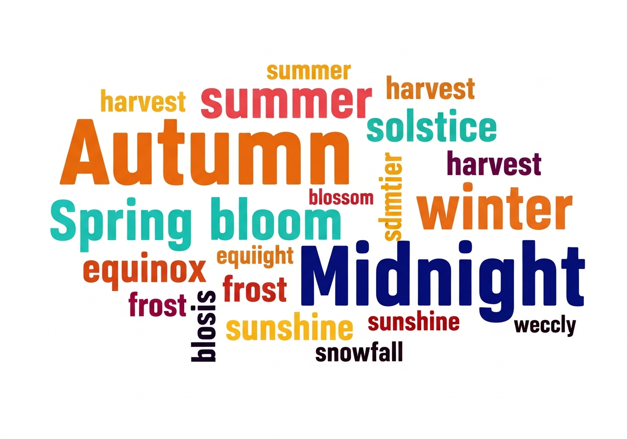
These associations are both universal and culturally specific. Warmth words (summer, fire, spice, passion) consistently map to reds, oranges, and golds across cultures. Coolness words (winter, ocean, ice, calm) map to blues, whites, and silvers. Nature words produce green-dominant palettes, while luxury words (velvet, gold, champagne, silk) produce rich, saturated combinations. Name-based palette generators leverage these associations to produce emotionally resonant color schemes automatically.
The Psychology Behind Word-to-Color Associations
Color psychology provides the framework for understanding why specific words trigger specific color associations. Warm words activate our association with physical warmth and energy — fire, sunlight, body heat — which we perceive as red, orange, and yellow wavelengths. Cool words activate associations with water, sky, and shade, mapping to blue, green, and violet wavelengths. This is not arbitrary preference but evolved neurological wiring.
Texture words add another dimension. 'Rustic' suggests rough, natural surfaces that map to earth tones — browns, tans, olive greens, and weathered grays. 'Sleek' suggests smooth, reflective surfaces that map to blacks, whites, metallics, and high-saturation accent colors. 'Cozy' implies soft, warm textures that map to muted warm tones — burnt sienna, dusty rose, cream, and soft gold. Understanding these mappings lets you translate any descriptive word into a coherent palette.
For deeper exploration of how color psychology influences interior spaces, see our home decor color palette guide.
Method 1 — AI Text-to-Palette Tools
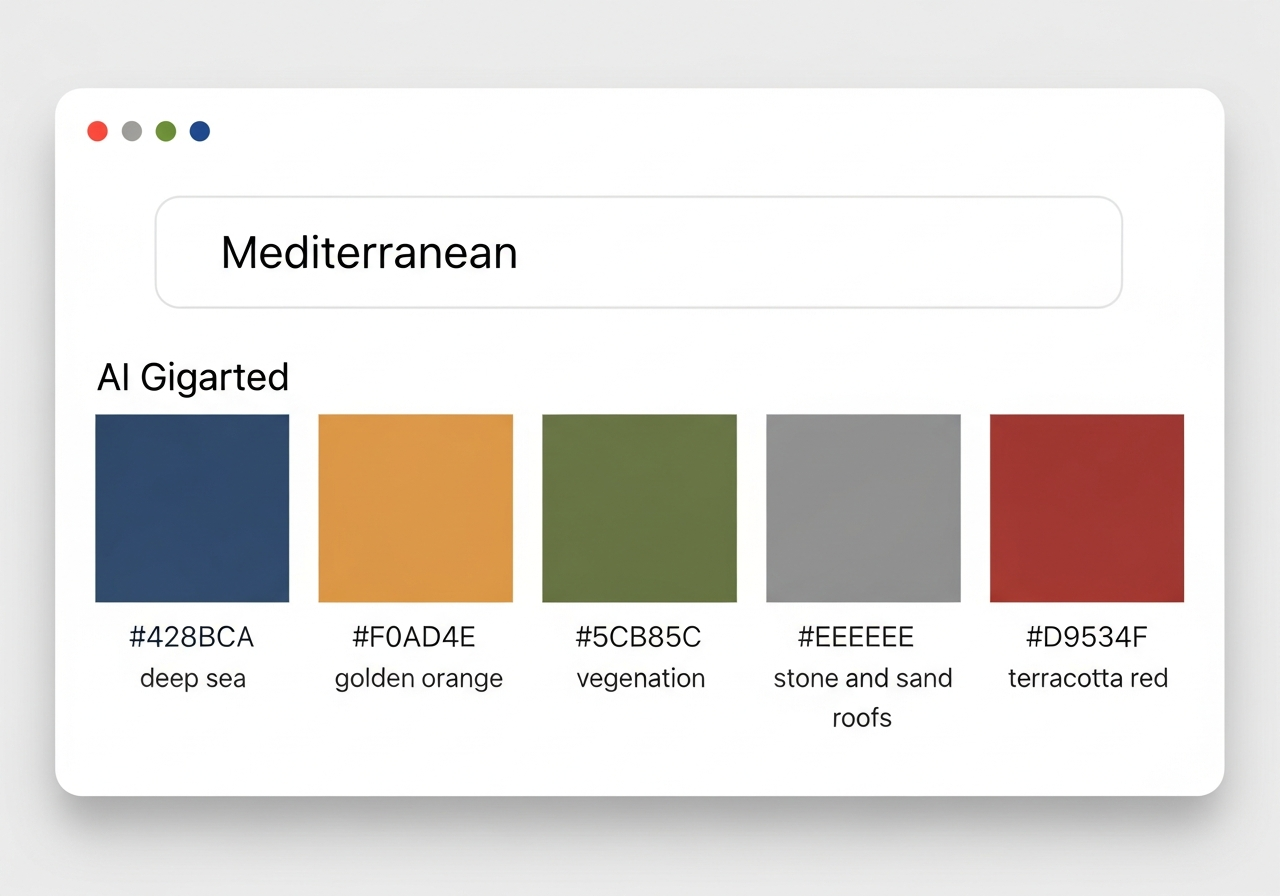
The most direct way to generate a color palette from a name or word is using AI-powered text-to-palette tools. These tools use natural language processing (NLP) combined with color generation models to interpret your text input and produce a corresponding palette. Type 'autumn harvest' and receive a palette of burnt orange, deep burgundy, golden wheat, forest green, and warm brown. Type 'midnight jazz' and receive deep navy, smoky purple, warm brass, charcoal, and cream.
The HanoDecor Color Palette Generator accepts text descriptions and generates palettes optimized for interior design applications. Unlike generic text-to-color tools, it understands that 'coastal retreat' should produce colors suitable for walls, furniture, and textiles — not just abstract swatches. The AI considers how each color works on physical surfaces under typical residential lighting conditions.
For a broader comparison of AI-powered palette tools, including how machine learning models interpret text inputs, see our AI color palette generator guide.
Method 2 — Color Psychology Mapping
Color psychology mapping is a manual method that produces highly intentional palettes. Start by breaking your name or word into its emotional components. Take the name 'Isabella' — it carries associations of romance (soft reds and pinks), Mediterranean warmth (terracotta and golden yellow), classical elegance (cream and ivory), and feminine grace (lavender and blush). Each emotional component maps to a specific color family, and combining them produces a multi-dimensional palette.
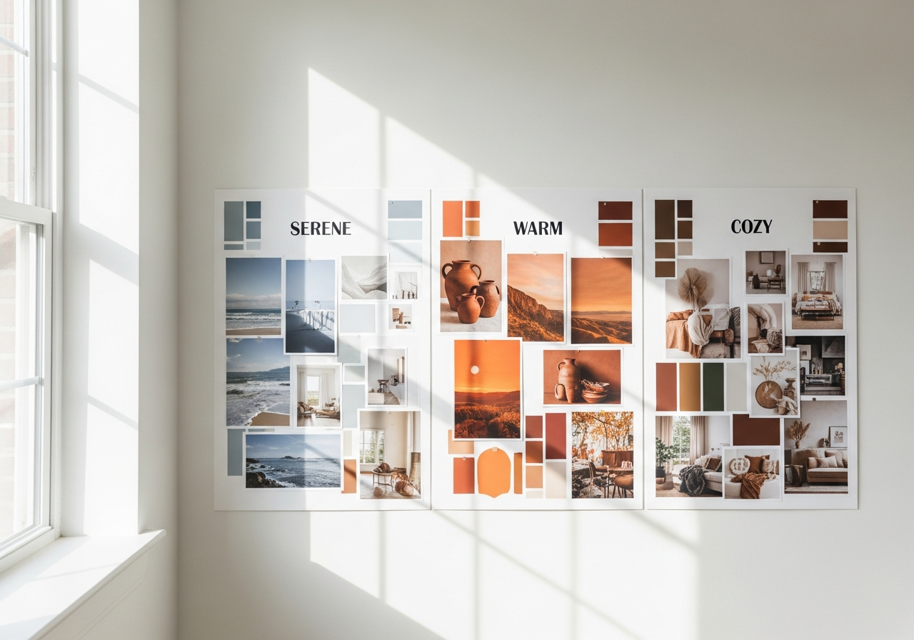
Apply the same technique to descriptive words. 'Serene' combines calm (soft blue), nature (sage green), simplicity (warm white), and balance (warm gray). 'Dramatic' combines intensity (deep burgundy or navy), contrast (black and white), richness (gold or emerald), and impact (a single bold accent). List three to five emotional qualities of your word, assign a color family to each, then select specific shades that work harmoniously together.
This method works exceptionally well for branding projects where the brand name needs to visually communicate specific personality traits. For wedding palettes built from couple names, explore our wedding color palette generator guide.
Method 3 — Cultural and Seasonal Word Palettes
Cultural and seasonal associations provide another rich source of word-to-color mappings. Seasonal words produce particularly reliable palettes because seasonal colors are universally recognized. 'Spring' maps to pastels — soft pink, lilac, mint green, butter yellow, and sky blue. 'Autumn' maps to warm earth tones — burnt orange, deep red, golden brown, olive green, and warm tan. 'Winter' maps to cool neutrals and jewel tones — icy blue, deep evergreen, burgundy, silver, and crisp white.
Regional and cultural words add geographic specificity. 'Tuscan' produces warm yellows, terracotta, olive green, and sienna brown. 'Nordic' generates cool grays, pale blues, warm wood tones, and crisp whites. 'Moroccan' yields vibrant blues, burnt orange, warm gold, deep red, and sandy beige. These culturally grounded palettes carry authentic visual identities because they reference real places and design traditions.
For personal names, consider the cultural origin. A Japanese name might inspire a palette drawn from traditional Japanese aesthetics — muted indigo, blush pink (cherry blossom), warm white (rice paper), soft green (matcha), and charcoal. An Irish name might suggest mossy green, slate blue, cream, warm brown, and heather purple. These cultural connections add depth and meaning to name-based palettes.
Method 4 — Manual Semantic Color Exploration
The most creative approach is manual semantic exploration — a structured brainstorming process that connects words to colors through chains of association. Start with your target word and write down five to ten associated words. Then translate each associated word into a color. Finally, select the five most harmonious colors from your list to form the palette.
For example, the word 'sanctuary' might generate these associations: peace (soft blue), nature (sage green), warmth (cream), protection (warm gray), and light (pale gold). The word 'adventure' might produce: exploration (deep teal), energy (burnt orange), discovery (warm gold), wildness (forest green), and freedom (sky blue). Each chain of association creates a unique palette pathway that reflects the specific meanings embedded in the source word.
This method works particularly well when you need a palette that tells a story. Interior design projects benefit from narrative palettes because they create spaces with emotional coherence — every color connects back to a central theme rather than being selected in isolation. For more on finding your design narrative, see our home decor style guide.
Using Name-Based Palettes for Interior Design
Name-based palettes add personal meaning to room designs in ways that generic color schemes cannot. A nursery designed around the baby's name creates an emotional connection from day one. A home office palette inspired by a business name reinforces brand identity in your workspace. A bedroom palette built from a word that represents your ideal emotional state — 'tranquility,' 'energy,' 'romance' — ensures the room supports the feeling you want to experience in it.
To apply a word-generated palette to a room, follow the 60-30-10 distribution rule. The lightest or most neutral color becomes your 60 percent — walls and large surfaces. The mid-tone color covers 30 percent — furniture, curtains, and rugs. The most saturated or distinctive color serves as the 10 percent accent — throw pillows, artwork, and decorative objects. Use the HanoDecor Room Designer to preview your word-based palette on your actual room before purchasing materials.
Related Articles
Explore more palette generation approaches: Best Free Color Palette Generators Compared covers 10 tools for creating palettes. Brand Color Palette Generator applies name-based techniques to business branding. How to Choose a Color Palette for Home Decor guides room-by-room color selection. Browse the design ideas hub for visual inspiration.
Frequently Asked Questions
Can any word be turned into a color palette?
Yes. Every word carries associations — emotional, sensory, cultural, or conceptual — that can be mapped to colors. Abstract words like 'freedom' or 'balance' produce palettes through emotional associations. Concrete words like 'forest' or 'ocean' produce palettes through direct visual references. Even technical or unusual words generate palettes when you explore their associations through the semantic mapping method.
How accurate are AI text-to-palette tools?
AI text-to-palette tools produce surprisingly accurate results for common words and phrases with strong color associations. Words like 'sunset,' 'ocean,' 'forest,' and 'midnight' consistently generate appropriate palettes. More abstract or unusual inputs may produce less predictable results. In these cases, combine AI output with manual color psychology mapping for the best results. The AI provides a starting point that you refine with personal judgment.
Is this technique useful for branding?
Extremely useful. A brand name is often the first interaction a customer has with your business, and the color palette should reinforce the emotions and associations that name is intended to evoke. Generating a palette from your brand name ensures visual-verbal alignment — the colors you see match the feelings the name communicates. This consistency strengthens brand recognition and recall.
How do I apply a word palette to a room design?
Use the 60-30-10 rule to distribute your word-generated palette across the room. The lightest color covers 60 percent of the space (walls, ceiling, large furniture), a mid-tone covers 30 percent (secondary furniture, curtains, rugs), and the most saturated color provides 10 percent accents (pillows, art, decorative objects). Test the palette with the HanoDecor Room Designer before purchasing materials to ensure the colors work in your specific lighting conditions.
Can I combine name-based palettes with photo-based extraction?
Yes, and this combination often produces the strongest results. Generate a palette from your word or name, then search for photographs that embody that palette. Extract colors from the best-matching photos to refine your palette with real-world accuracy. This two-step approach gives you both emotional intention and visual precision. For photo extraction techniques, see our color palette from photo guide.
Create Custom Color Palettes with HanoDecor AI
Turn any word, name, or mood description into a design-ready color palette with the HanoDecor Color Palette Generator. Type your inspiration word, let the AI generate a harmonious palette, and preview it in your room — all in one seamless workflow. Whether you are naming a nursery, branding a business, or designing a space around a single evocative word, HanoDecor AI translates language into beautiful, functional color.
Explore the full HanoDecor Studio for AI-powered room redesign and visualization tools. Browse our design gallery for thousands of completed room designs organized by color palette and style.
How to Generate a Color Palette from a Name or Word (4 Methods) FAQs
Written by
Priya Sharma
Priya is an award-winning UX designer who previously led design teams at Airbnb and Pinterest. Her focus on user-centered design ensures that HanoDecor's tools are intuitive and accessible to everyone, regardless of their technical background.