Color Drenching: The Bold Interior Design Technique Taking Over Homes in 2026
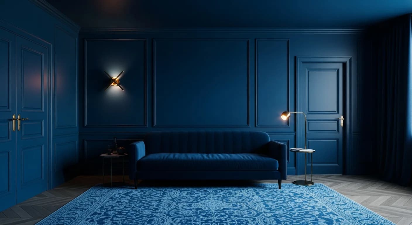
Walk into a room where the walls, ceiling, trim, and even the furnishings share a single, unified color family, and you will experience something rare in interior design: the complete absence of visual noise. This is color drenching — the technique that designers, tastemakers, and homeowners have collectively embraced as the defining color approach of 2026. It is bold, immersive, and surprisingly easy to execute well once you understand the principles behind it.
Color drenching is not an accent wall. It is not painting one room a "fun" color while keeping the rest of the house neutral. It is the deliberate, confident decision to envelop an entire space in a single hue — creating rooms that feel like stepping inside a mood, an emotion, a world unto themselves. And in a design era that prizes warmth, character, and emotional resonance, it has become the most talked-about technique in the industry.
This guide covers everything you need to know: what color drenching is, why it works, which colors perform best, how to execute it room by room, and how to avoid the common mistakes that can turn a stunning concept into a decorating misstep. For context on how color drenching fits into the broader palette direction this year, see our 2026 color trends overview and our complete 2026 trends guide.
What Is Color Drenching?
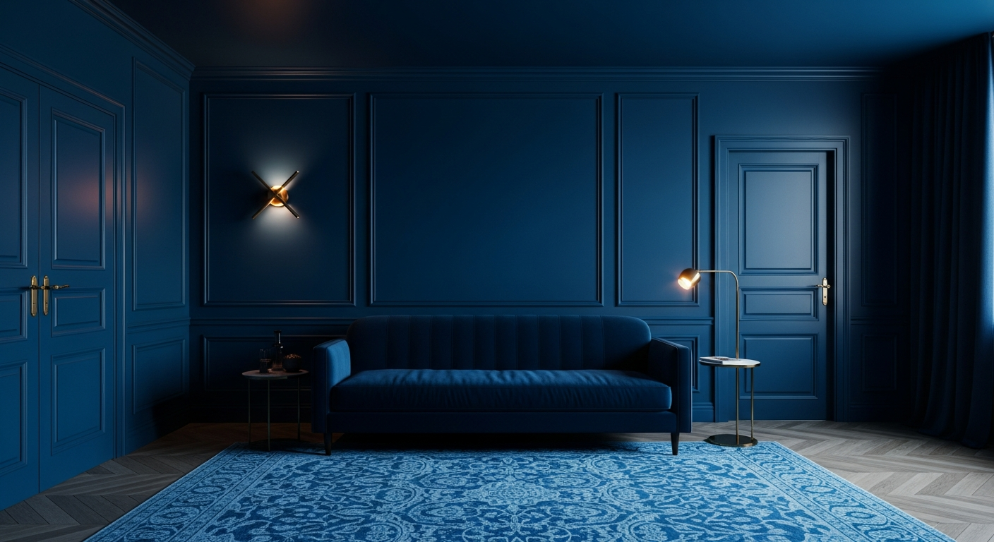
Color drenching is the practice of coating every surface in a room — walls, ceiling, trim, doors, and sometimes furnishings — in the same color or color family. The term "drenching" is intentional: it describes total immersion, not partial application. When done correctly, the room becomes a cohesive, enveloping experience where the eye moves smoothly from surface to surface without the interruptions created by contrasting colors.
This is fundamentally different from traditional approaches to interior color. Conventional painting advice suggests white or light ceilings to "open up" a room, contrasting trim to define architectural details, and accent walls to add interest without risk. Color drenching rejects all of these conventions — and the results are often stunning precisely because of that rejection.
The technique has historical precedent. Georgian and Victorian interiors frequently used single-color schemes across entire rooms, and some of the most celebrated historic interiors — from Versailles to English country houses — employed versions of what we now call color drenching. What is new is the combination of modern color technology, contemporary aesthetics, and a cultural appetite for boldness that makes the technique feel fresh and relevant.
Why Color Drenching Is the Number One Trend of 2026
Industry consensus on color drenching's dominance is nearly unanimous. Architectural Digest, Elle Decor, House Beautiful, and virtually every major design publication has cited it as the top color trend. But what makes it resonate so deeply right now?
First, color drenching aligns with the broader movement toward emotional, immersive interiors. After years of neutral, safe, Instagram-optimized rooms, people crave spaces that make them feel something. A room drenched in deep midnight blue does not just look different from a white room — it feels fundamentally different to inhabit. The psychology is powerful: monochromatic environments reduce cognitive load, allowing the mind to relax instead of constantly processing visual information.
Second, color drenching is surprisingly forgiving. When everything is the same color, there are no jarring contrasts to get wrong, no "does this trim match the wall?" decisions. The uniformity creates built-in cohesion. As long as your single color choice is good, the room will work.
Third, color drenching photographs exceptionally well for social media — which, for better or worse, continues to influence design decisions. A fully drenched room has immediate visual impact that stops the scroll. The technique has gone viral precisely because it produces spaces that are simultaneously dramatic and photogenic.
Best Colors for Color Drenching
Not every color performs equally well in a drenched environment. The best choices share certain qualities: depth, warmth, and complexity — colors that reveal subtle variations under different lighting conditions rather than reading as flat.
Deep blues — midnight, navy, denim — are among the most popular and reliable choices. Blue has an inherently calming effect, and when used as a full drench, it creates rooms that feel both dramatic and restful. Midnight blue in a bedroom is particularly effective: enveloping, sleep-inducing, and sophisticated.
Forest greens and teals bring nature indoors with maximum impact. A living room drenched in forest green feels like inhabiting a dense woodland — immersive, restorative, and deeply grounding. Teal offers a brighter, more energetic alternative that works particularly well in dining rooms and home offices.
Burgundy and deep reds create the most dramatic drenching effects. A dining room or powder room fully enveloped in burgundy is theatrical, romantic, and unforgettable. These colors require confidence but reward it generously.
Warm terracotta and clay provide a softer entry point for those who want the impact of color drenching without the intensity of jewel tones. A room drenched in warm clay feels like being wrapped in a Mediterranean sunset — warm, comforting, and effortlessly beautiful.
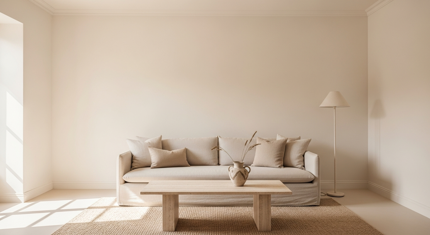
Neutral drenching — using warm whites, creams, or soft taupes — is the quieter sibling of bold color drenching, and it should not be overlooked. A room fully drenched in warm cream, where walls, ceiling, trim, and furnishings all share the same ivory family, achieves remarkable serenity. It is not boring — the uniformity of tone draws attention to texture, form, and light in ways that a multi-colored room cannot.
Colors to approach with caution: Very bright, saturated colors — vivid yellow, hot pink, bright orange — can feel overwhelming as a full drench. Cool, blue-toned grays can feel cold and institutional. Black, while stunning in small doses, requires exceptional lighting design to work as a full drench without feeling oppressive.
Room-by-Room Color Drenching Guide
Living Room
The living room is where color drenching makes its boldest statement. Because this is typically the largest room in the home and the one most frequently used for entertaining, a fully drenched living room creates an immediate impression. Deep teals, forest greens, and rich navy work exceptionally well here. The key is layering textures within your chosen color — velvet sofas, linen curtains, wool rugs, and ceramic accents all in the same tonal family but in different materials. This prevents the space from feeling flat while maintaining the monochromatic cohesion.
Bedroom
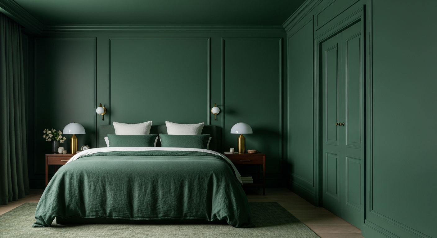
The bedroom may be the single best room for color drenching. The technique creates a cocooning effect — an enveloping sense of warmth and security that is perfect for sleep. Midnight blue, deep plum, warm espresso, and sage green all create exceptional drenched bedrooms. The trick is extending the drench beyond just the walls: headboard, bedding, curtains, and even nightstand accessories should participate in the color story. The result is a room that feels like sinking into a warm blanket.
Home Office
A color-drenched home office creates a distinct psychological boundary between work and home — particularly valuable for remote workers who struggle with separation. Sage green and warm olive support focus and creativity without inducing drowsiness. Deep teal stimulates intellectual energy. The monochromatic environment reduces visual distraction, potentially improving concentration and productivity.
Dining Room
Dining rooms are inherently theatrical spaces — they are designed for gathering, conversation, and shared experience. Color drenching amplifies this theatrical quality beautifully. Burgundy, deep red, and warm plum create intimate, romantic dining experiences. Forest green creates a garden-party atmosphere. Evening dining rooms benefit particularly from drenching because the technique looks extraordinary under warm, low lighting — candles and dimmed fixtures make the single color seem to glow from within.
Powder Room
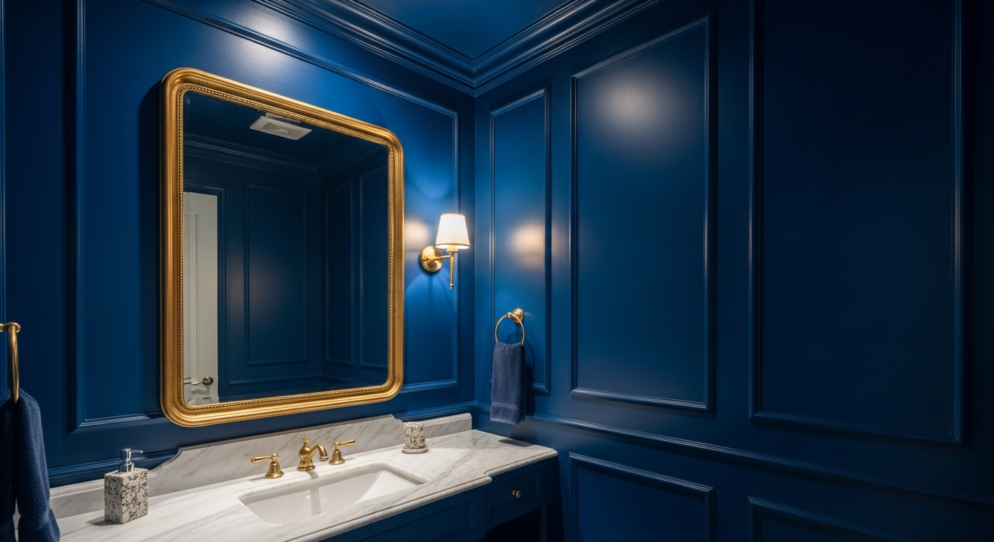
Small powder rooms are the perfect laboratory for bold color drenching. Because the room is small and typically used briefly, you can afford to be far more adventurous than you might in a larger space. Jewel tones — emerald, sapphire, ruby — create tiny rooms that feel like precious gems. The small scale actually enhances the drenching effect: the color wraps around you completely, creating a genuinely immersive experience in a space that might otherwise feel forgettable.

Step-by-Step: How to Color Drench a Room
Step 1: Choose your color family. Select a color that you genuinely love and that aligns with the mood you want the room to convey. Test it by looking at fabric, paint, and material samples in the actual room under both natural and artificial light.
Step 2: Select your paint sheens. This is the secret to successful color drenching. Use the same color in different finishes: matte on walls, satin on trim and moldings, semi-gloss on doors and window frames. The variation in sheen creates subtle depth and architectural definition without introducing contrasting colors.
Step 3: Extend to the ceiling. This is the step that separates true color drenching from simply painting walls a bold color. Painting the ceiling the same shade — typically in a flat or matte finish — eliminates the visual "break" that a white ceiling creates. The room feels taller, more cohesive, and more intentional.
Step 4: Coordinate textiles and furnishings. Curtains, upholstery, rugs, and throw pillows should stay within the same tonal family. They do not need to be identical — slight variations in shade and different textures (velvet, linen, wool, cotton) create richness within the monochromatic scheme.
Step 5: Add contrast through texture and material, not color. A brass lamp, a natural wood side table, a marble vase — these elements add visual interest without breaking the color story. Metallic accents are particularly effective because they reflect the room's color while introducing their own warmth.
Common Mistakes to Avoid
Inconsistent undertones. The most common mistake is choosing paints, fabrics, and furnishings that share a color name but have different undertones. A blue with green undertones next to a blue with purple undertones will clash noticeably. Stay within the same undertone family.
Ignoring natural light. The same color can look completely different on a north-facing wall versus a south-facing wall. Dark colors in rooms with limited natural light can feel oppressive unless you compensate with excellent artificial lighting. Test your chosen color at different times of day before committing.
Flat execution. Drenching everything in the same color and same finish creates a room that feels uniformly flat rather than rich and layered. The sheen variation (matte, satin, semi-gloss) and material variation (fabric, wood, metal) are essential for preventing this.
Forgetting lighting design. Color-drenched rooms rely heavily on good lighting. The single color needs light sources that bring out its depth — warm-toned bulbs, layered lighting (ambient, task, accent), and ideally dimmable fixtures. A fully drenched room under flat overhead fluorescent lighting will look very different from the same room under warm, layered light. For more on how to use lighting to enhance your spaces, read our layered lighting guide.
Color Drenching on a Budget
Color drenching is one of the most cost-effective design transformations you can make because paint is the primary investment. You do not need new furniture to execute a stunning drench. Here is the budget-friendly approach:
Start with paint — walls, ceiling, and trim — which is the foundation of the technique. Then add textiles: cushion covers, throws, and curtains in your chosen color family are affordable and immediately reinforce the drenched effect. Accessories — ceramics, candles, book covers, trays — can be sourced inexpensively and swapped easily.
The furniture you already own can often stay. A neutral sofa works within almost any drench. Even furniture in a contrasting color can work if you layer it with throws and cushions in your drenching color. The key is ensuring the room's dominant visual impression is monochromatic, even if individual pieces break from the palette.
For advice on choosing the right paint finishes, see our complete paint finish guide.
How to Preview Color Drenching Before Painting
The biggest advantage of modern design technology is the ability to see exactly how a color-drenched room will look before you open a single paint can. Traditional methods — buying samples, painting swatches, holding fabric up to walls — can only approximate the finished result.
HanoDecor's AI visualization tool lets you upload a photo of your actual room and see it transformed with any color palette. You can test a burgundy drench in your dining room, compare forest green against teal in your bedroom, and see exactly how your space responds to different colors under your specific lighting conditions. This removes the single biggest barrier to embracing bold color: the fear of getting it wrong.
Frequently Asked Questions
Does color drenching work in small rooms?
Yes — small rooms are actually ideal for color drenching. The technique eliminates visual boundaries between walls and ceiling, which can make small rooms feel more expansive. Powder rooms and small bedrooms are particularly effective candidates. Light-toned drenches (warm cream, soft sage) are especially good for creating spaciousness.
Can I color drench with a neutral color?
Absolutely. Neutral drenching — using warm white, cream, clay, or taupe across all surfaces — creates beautifully serene, cohesive rooms. The key is using different sheens and textures to prevent flatness. Neutral drenching is an excellent starting point for those new to the technique.
How does color drenching affect resale value?
Bold color can be polarizing for buyers, but paint is one of the easiest changes to reverse. If resale is a concern, consider drenching rooms that benefit most from the technique (bedrooms, dining rooms, powder rooms) while keeping common areas in more universally appealing warm neutrals. For comprehensive color advice, see our color psychology guide.
What is the best sheen combination for color drenching?
The standard approach is matte or flat on walls, satin on trim and moldings, and semi-gloss on doors. The ceiling typically gets a flat or matte finish. This combination creates subtle architectural definition through light reflection while maintaining the monochromatic color story.
Color Drenching FAQs
Written by
Emily Rodriguez
Interior Design Editor covering living spaces, styling trends, and room makeovers. Former Architectural Digest contributor with a focus on accessible, budget-conscious design.