Interior Design Color Trends 2026: The Palettes Defining Modern Homes
The era of playing it safe with color is officially over. After more than a decade of cool grays, hesitant neutrals, and carefully curated "greige" palettes, 2026 marks the definitive return of color confidence in interior design. Homeowners and designers are choosing depth, warmth, and emotional resonance over the safe, sterile palettes that defined the 2010s — and the results are transforming how homes look and feel.
This shift is not about following a single trendy color. It is about a fundamental change in attitude: the willingness to use color as a tool for atmosphere, personality, and well-being. From the official Colors of the Year to the moody jewel-tone palettes dominating living rooms and kitchens, 2026 is the year that color moves from accent to anchor.
For a comprehensive overview of how color fits into the broader design landscape this year, see our complete 2026 interior design trends guide.
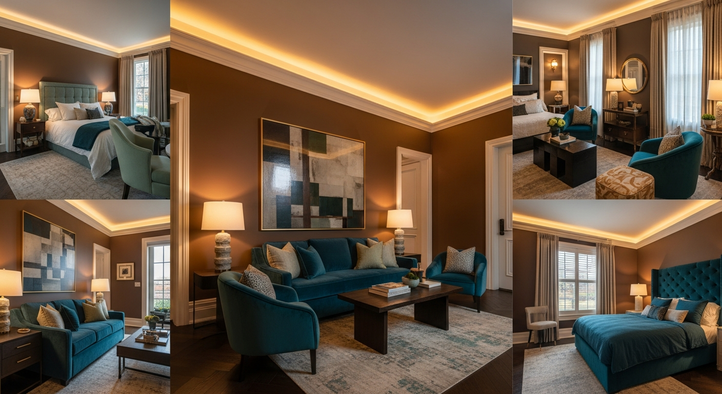
Colors of the Year 2026
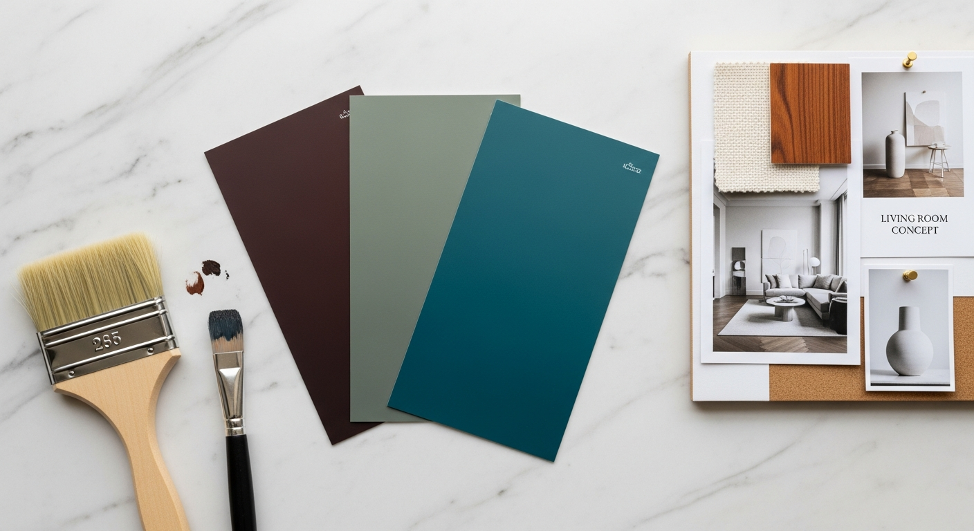
Every major color authority has released its selection for 2026, and for the first time in years, they are telling a remarkably unified story. The consensus points toward warmth, nature, and emotional depth — a dramatic departure from the cool, recessive tones that dominated previous years.
Benjamin Moore — Silhouette AF-655
Benjamin Moore's Silhouette is a complex burnt umber with charcoal undertones that manages to be simultaneously warm and sophisticated. It is not a simple brown — it carries the depth of espresso, the warmth of terracotta, and the gravity of charcoal without committing fully to any single direction. This complexity makes it remarkably versatile: it works as a rich wall color in a dining room, a grounding tone on kitchen cabinets, or a subtle accent on built-in shelving.
What makes Silhouette significant beyond its aesthetic appeal is what it signals about cultural mood. Brown-family colors emerge during periods when people seek stability, rootedness, and comfort. After years of uncertainty, the collective appetite for colors that feel grounded and nurturing makes Silhouette feel less like a trend pick and more like a cultural barometer.
Valspar — Sage Slate
Sage Slate occupies the green-gray spectrum — a color family that has been building momentum for several years but reaches its peak expression in 2026. It is restorative without being clinical, natural without being overtly "earthy," and neutral enough to serve as a whole-room color while carrying enough personality to avoid blandness.
Sage Slate works particularly well in spaces where you want to evoke nature without committing to a bold green. Bedrooms, home offices, and bathrooms respond beautifully to this color — it creates an atmosphere of quiet focus and restoration that aligns perfectly with the broader wellness-centered design movement.
WGSN — Transformative Teal
WGSN's Transformative Teal is the boldest of the three major picks, and it bridges the gap between calming blue and energizing green. This blue-green hybrid has the serenity of ocean tones with enough green warmth to prevent it from feeling cold. It works in both residential and commercial contexts, performing equally well as a statement wall color in a living room or as the primary tone in a color-drenched powder room.
What these three picks tell us collectively is important: 2026 favors warmth, nature, and depth over coolness, sterility, and restraint. All three colors have organic origins — earth, sage, ocean — and all three carry emotional weight without feeling heavy.
The Moody Palette Movement
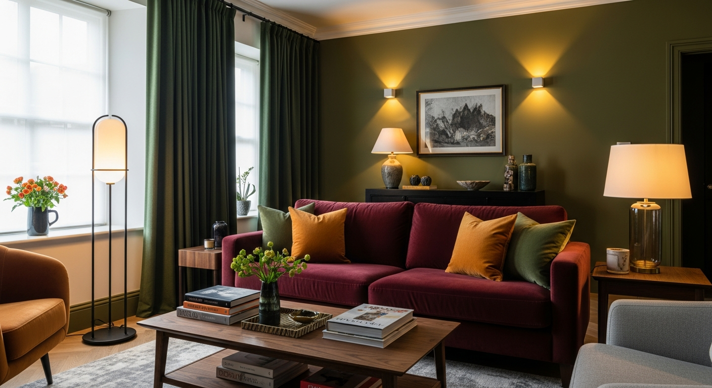
Beyond the official Colors of the Year, the broader palette direction for 2026 skews unmistakably toward deep, saturated, emotionally rich tones. This is the moody palette movement — a collective embrace of colors that carry weight, drama, and character.
Burgundy has emerged as the breakout star of the year. Rich, sophisticated, and unexpectedly versatile, burgundy works in contexts ranging from a velvet sofa to a fully color-drenched dining room. It pairs beautifully with brass hardware, dark walnut furniture, and cream textiles, creating combinations that feel timeless rather than trendy.
Olive green bridges the gap between natural and moody, bringing outdoors energy inside without the brightness of kelly or emerald. It is the color of aged patina and Mediterranean landscapes — mature, settled, and deeply appealing.
Ochre and burnt sienna continue the earth-tone renaissance that began gaining momentum in recent years. These warm, pigment-rich tones add immediate groundedness to any space. Used on walls, they create rooms that feel like they have existed for decades. Used on furniture and textiles, they bring warmth without demanding attention.
Forest green remains strong, particularly in kitchens and bathrooms where it has become the go-to alternative to all-white. Dark, saturated green cabinets paired with brass hardware and natural stone countertops has become one of the defining kitchen aesthetics of 2026.
Tobacco and deep plum round out the moody spectrum, offering alternatives for those who want drama without defaulting to black. Tobacco creates extraordinary warmth in libraries and studies, while deep plum brings a regal quality to bedrooms and formal dining spaces.
Color Drenching — The Technique Everyone Is Talking About
If there is a single technique that defines the color landscape of 2026, it is color drenching. This is not a subtle approach — it is the practice of immersing an entire room in a single color family, from walls and ceiling to trim, doors, and often furnishings.
Color drenching works because it eliminates the visual fragmentation that comes from contrasting colors. When walls, ceiling, and trim share the same tonal family, the room feels larger, more cohesive, and more intentional. The technique is most dramatic with deep colors — imagine a bedroom completely wrapped in midnight blue or a dining room swathed in rich burgundy — but it also works beautifully with warm neutrals like clay, cream, or warm white.
The key to successful color drenching is varying the sheen rather than the color itself. Use matte on walls, satin on trim, and semi-gloss on doors. This creates subtle depth and dimension without breaking the monochromatic envelope. Furnishings within the space should stay within the same tonal family but can introduce texture through fabrics, materials, and patterns.
For a comprehensive step-by-step guide to executing this technique in every room, including common mistakes to avoid and budget-friendly approaches, see our detailed color drenching guide.
Warm Neutrals Replacing Cool Neutrals
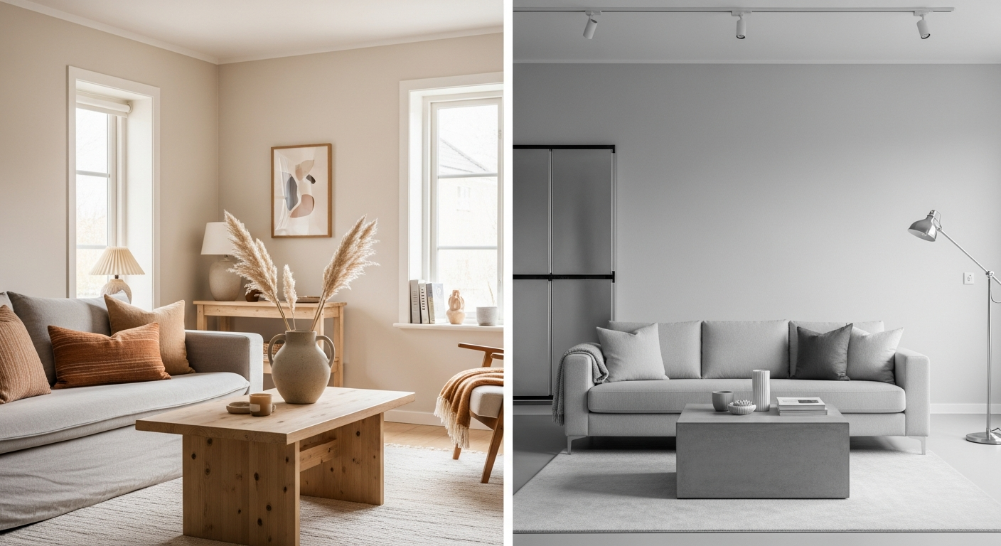
For those who are not ready to commit to bold, saturated color, the neutral landscape has undergone its own significant transformation. Cool neutrals are out. Warm neutrals are in. The distinction matters more than most people realize.
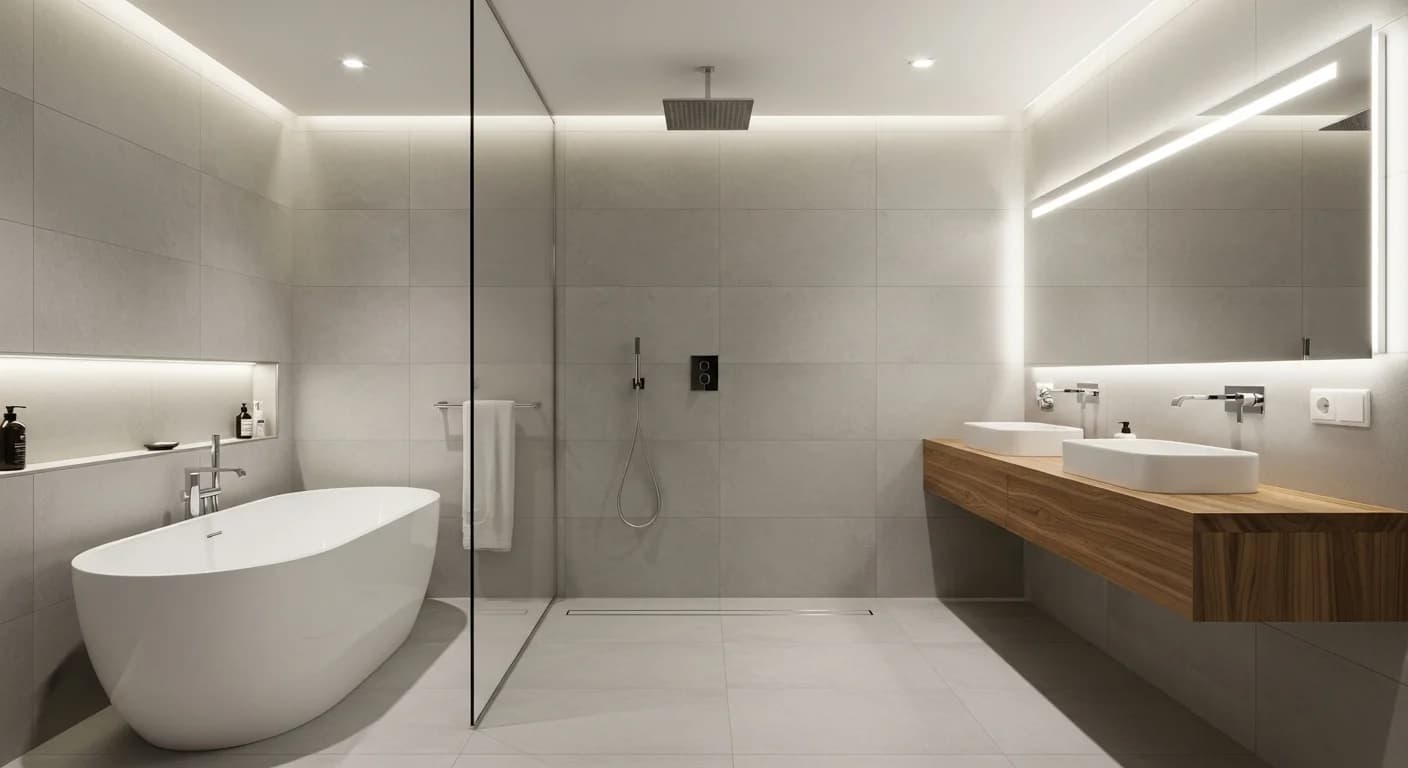
Cool neutrals — the blue-toned grays, icy whites, and steely silvers that dominated interiors for a decade — create environments that read as clean and modern but often feel impersonal and even uncomfortable to inhabit for long periods. Warm neutrals — clay, taupe, caramel, cream, mushroom, and warm white — create environments that feel welcoming from the moment you enter.
The shift from cool to warm neutrals reflects a broader cultural movement toward comfort and authenticity. A room painted in warm white with cream upholstery, caramel leather accents, and natural wood tones feels like a place you want to sit down and stay. A room painted in cool gray with chrome accents and white furniture feels like a place you are visiting.
Building depth within a warm neutral palette is achieved through tonal shifts — using three or four shades within the same warm family. A wall in warm cream, furniture in deeper taupe, textiles in caramel, and accents in clay creates a rich, layered environment without introducing a single bold color. This approach aligns beautifully with the warm minimalism movement that is reshaping modern design. For more on how color choices intersect with broader design philosophy, explore our guide to color psychology in interior design.
Room-by-Room Color Recommendations
Living Room
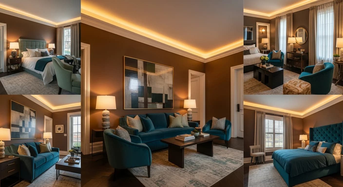
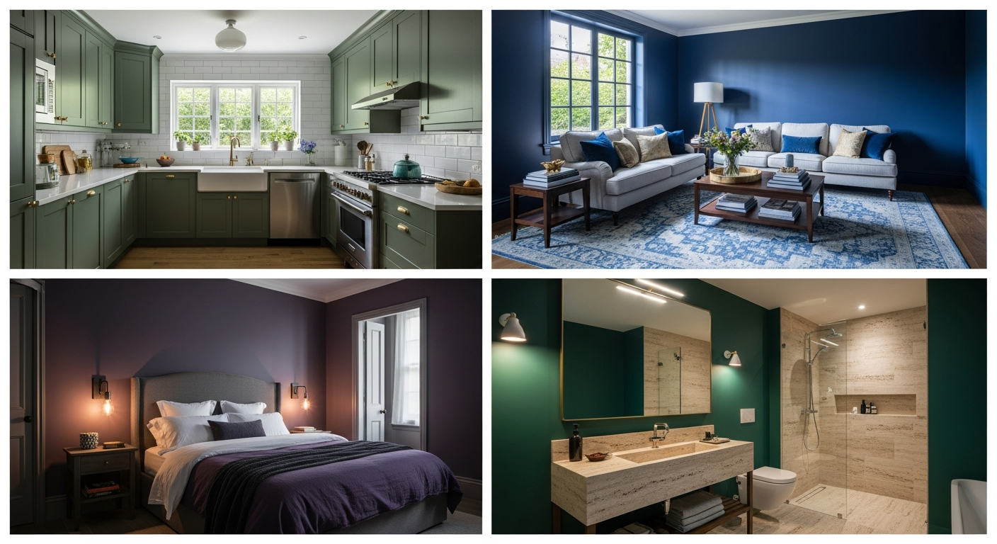
The living room in 2026 embraces color with open arms. Deep blues — navy, midnight, and denim — create sophisticated, enveloping spaces when used on walls or as upholstery fabric. Warm greens — sage, olive, and forest — bring nature indoors and pair beautifully with the dark wood furniture trend that is dominating this year. Terracotta accents through throw pillows, pottery, and area rugs add warmth without overwhelming. For those who prefer a collected, layered look, combining deep teal walls with burgundy upholstery and brass lighting creates a room with genuine character. For detailed living room styling ideas, explore our living room color schemes guide.
Kitchen
The all-white kitchen is giving way to the color-confident kitchen. Forest green cabinets have become a defining feature of 2026 kitchens — dark, dramatic, and surprisingly timeless when paired with brass hardware and natural stone countertops. Burgundy island bases create stunning focal points in otherwise neutral kitchens. Teal backsplash tile adds personality without requiring a full cabinet commitment. The key is balancing bold color with natural materials — wood, stone, and metal — so the kitchen feels warm and inviting rather than overwhelming.
Bedroom
Bedrooms in 2026 are embracing the cocooning philosophy — creating environments so comfortable and enveloping that you never want to leave. Moody plums and deep mauves create romantic, restful atmospheres, especially when combined with rich textiles like velvet and chenille. Soft sage brings a natural calm that supports better sleep. Chocolate brown and warm espresso — colors rarely seen in bedrooms during the gray era — are making a powerful comeback, creating rooms that feel like being wrapped in a cashmere blanket.
Bathroom
Emerald green continues its reign as the most popular non-neutral bathroom color, particularly on vanity cabinets and as tile color. Navy blue creates dramatic, spa-like atmospheres, especially in powder rooms where boldness is expected. Warm stone tones — travertine, sandstone, and warm marble — bring organic warmth that transforms bathrooms from clinical spaces into personal retreats. For more bathroom color inspiration, see our bathroom color schemes guide and bathroom color psychology guide.
Colors Going Out of Style
Understanding what is fading is just as important as knowing what is arriving. Several color approaches that dominated interiors for the past decade are now firmly on the decline.
Cold gray — once the universal safe choice — now reads as dated and impersonal. Gray is not inherently bad, but the specific cool, blue-toned grays that covered millions of walls during the 2010s have lost their appeal. If you love gray, the 2026 approach is warm gray with taupe or mushroom undertones rather than cool gray with blue undertones.
Stark white — the all-white kitchen, the all-white bathroom, the all-white bedroom — feels clinical rather than clean in 2026. White still has its place, but the approach has shifted from bright, cool white to warm, creamy white with depth and character.
Beige-on-beige monotone — the trend that briefly replaced gray — lacks the depth and personality that 2026 demands. Warm neutrals remain popular, but they require tonal variation, texture, and intentional layering rather than a flat wash of identical beige.
Millennial pink is fading from its peak ubiquity. Pink is not going away entirely, but it is evolving from the specific dusty rose that dominated the late 2010s toward deeper, warmer iterations like terracotta pink and warm coral.
For a comprehensive look at all the design trends losing their appeal this year, read our guide to interior design trends going out of style in 2026.
How to Test New Colors Before Painting
One of the biggest barriers to embracing bold color is the fear of commitment. What if that burgundy wall you love in magazine photos feels overwhelming in your actual living room? What if the forest green cabinets you admire online clash with your existing countertops?
This is where AI-powered visualization becomes invaluable. Rather than buying dozens of sample pots and painting test patches — which never truly capture how a color will look across an entire room in different lighting conditions — you can now upload a photo of your actual room and see it transformed with any color palette before purchasing a single can of paint.
The ability to test moody palettes, warm neutrals, and color-drenching techniques on your real space removes the risk from color decisions entirely. You can compare forest green cabinets against teal, test whether sage or olive works better in your bedroom, and see exactly how burgundy upholstery will look against your existing walls — all before spending a cent.
Frequently Asked Questions
What is the most popular interior design color for 2026?
The most popular direction is warm, earthy tones led by Benjamin Moore's Silhouette (burnt umber). However, deep greens, teal, and burgundy are all seeing massive adoption. The overall trend favors depth and warmth over cool, recessive colors.
What colors make a room look bigger in 2026?
Warm whites, light sage, and soft cream make rooms feel more spacious while still following 2026 trends. The color drenching technique — using a single light tone across walls, ceiling, and trim — also creates the illusion of larger space by eliminating visual boundaries. For specific paint recommendations, explore our guide to colors that make rooms look bigger.
Is gray still a good interior color in 2026?
Cool, blue-toned gray is losing favor rapidly. However, warm gray with taupe or mushroom undertones still works beautifully, especially as a transitional neutral. The key is ensuring your gray has warm undertones rather than cool, blue-toned ones.
What are the color of the year picks for 2026?
The three major picks are Benjamin Moore's Silhouette AF-655 (burnt umber), Valspar's Sage Slate (green-gray), and WGSN's Transformative Teal (blue-green). All three signal a shift toward warm, nature-inspired, emotionally rich colors.
Interior Design Color Trends 2026 FAQs
Written by
Emily Rodriguez
Interior Design Editor covering living spaces, styling trends, and room makeovers. Former Architectural Digest contributor with a focus on accessible, budget-conscious design.