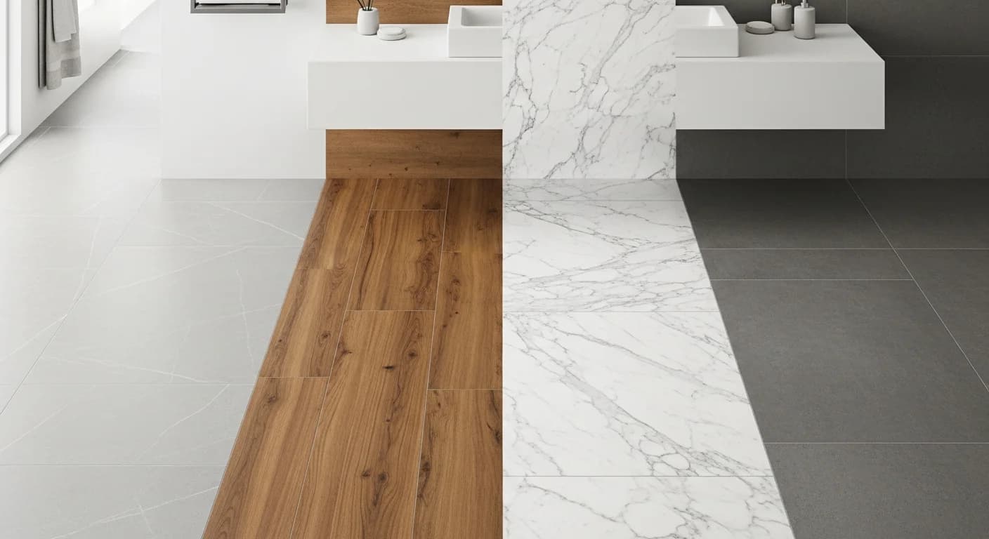
Bathroom Color Psychology: How Color Affects Mood and Space Perception
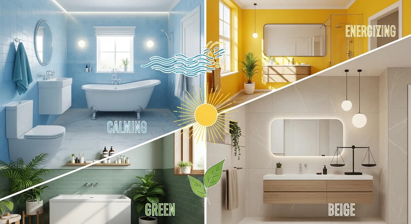
Color is the single most powerful tool in bathroom design — and the least expensive to change. Research from the Institute for Color Research shows that people make a subconscious judgment about an environment within 90 seconds of initial viewing, and up to 90% of that assessment is based on color alone. In a bathroom, where the average person spends 30 minutes daily in close proximity to every surface, bathroom color psychology becomes far more than an aesthetic choice. It directly shapes how calm you feel during a morning shower, how spacious a 50-square-foot powder room appears, and whether the room invites lingering or rushing. Understanding the relationship between color and mood is the foundation of creating a bathroom that truly supports well-being — a principle explored throughout the bathroom design ideas hub.
Unlike living rooms or bedrooms, bathrooms present unique conditions that amplify color's psychological impact. The combination of hard reflective surfaces, moisture, artificial and natural light sources, and intimate scale means that color choices register more intensely here than in any other room. A shade that feels pleasantly warm in a spacious living room can feel oppressive in a 5-by-8-foot bathroom. This guide breaks down exactly how different colors affect mood, spatial perception, and daily experience — using principles from color theory, designer insights, and real-world paint recommendations from brands like Benjamin Moore, Sherwin-Williams, and Farrow & Ball. For complete palette combinations, the bathroom color schemes guide provides complementary reading alongside this psychological framework.
Quick Summary
- Cool colors like blue, green, and lavender promote spa-like calm, reduce heart rate, and make bathrooms feel more spacious
- Warm colors including beige, terracotta, and blush pink create cozy, welcoming atmospheres ideal for master bathrooms
- White bathrooms feel clean but can read as clinical without warm undertones — pair with natural textures to avoid sterility
- Gray bathrooms suit modern aesthetics but require careful undertone selection to avoid feeling cold or institutional
- Natural light direction (north-facing vs south-facing) dramatically shifts how paint colors appear throughout the day
- Light values, monochromatic schemes, and strategic ceiling color choices make small bathrooms feel up to 33% larger
- Colors to avoid include saturated primary yellows (which increase anxiety), neon tones, and high-saturation reds on large surfaces
- Testing paint colors in your actual bathroom lighting conditions is essential — digital tools and large samples prevent costly mistakes
Best for: Homeowners choosing bathroom paint colors, designers selecting material palettes, and anyone planning a bathroom renovation who wants to understand how color choices impact daily mood and spatial perception.
Reading time: 12 minutes
How Color Psychology Works in Bathrooms
Color psychology studies how hues influence human behavior, emotion, and perception. Bathrooms amplify these effects because of three key factors: proximity (you are closer to surfaces than in most rooms), reflectivity (tile, glass, mirrors, and water bounce color throughout the space), and ritual (bathrooms are tied to personal routines that set emotional tone for the entire day).
The human nervous system responds to color before conscious thought occurs. Cool colors with shorter wavelengths — blues, greens, and violets — activate the parasympathetic nervous system, lowering heart rate and blood pressure. Warm colors with longer wavelengths — reds, oranges, and yellows — stimulate the sympathetic nervous system, increasing alertness and energy. This biological response is why hospitals use soft blue-greens in recovery rooms and why fast-food restaurants use red and yellow to create urgency.
Color temperature plays a critical role in bathroom design. Every color leans warm or cool, even within the same hue family. A blue with yellow undertones (such as Benjamin Moore's Palladian Blue HC-144) feels warmer than a blue with gray undertones (such as Farrow & Ball's Stiffkey Blue No. 281). Bathroom lighting will either amplify or counteract the temperature you choose. The bathroom lighting guide covers how light sources interact with color for optimal results. Saturation — a color's intensity — and value — how light or dark it is — are equally important. Lower saturation creates more restful environments, while higher value makes spaces feel larger.
Cool Colors — Calm, Clean, Expansive
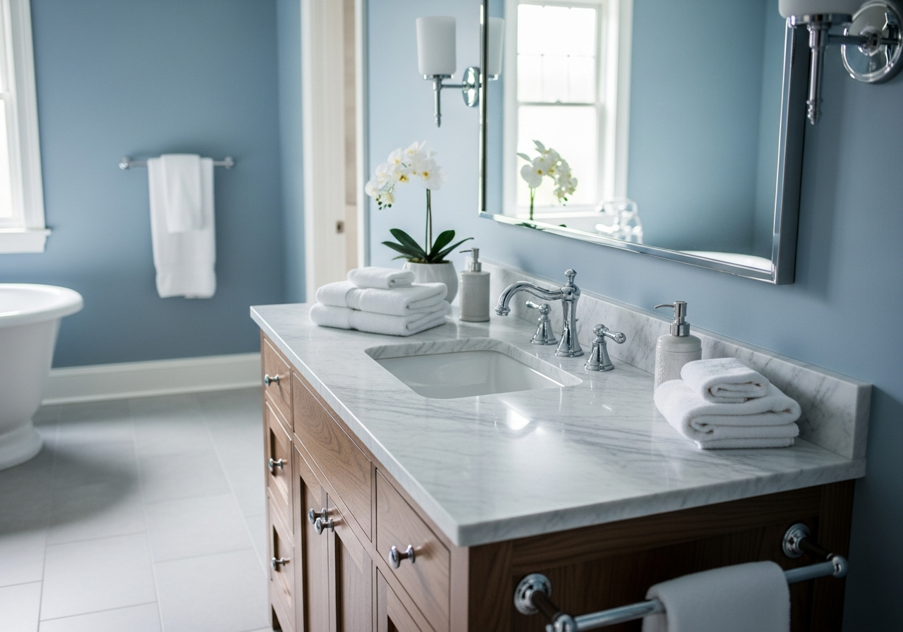
Cool colors sit on the blue-green-violet side of the color wheel and are universally associated with water, sky, and nature. In bathrooms, these hues reinforce the room's inherent connection to water and cleansing, making them the most popular choice among interior designers for creating spa-like calm. Research published in the journal Color Research and Application found that rooms painted in cool tones were consistently rated as more relaxing, more spacious, and more clean-feeling than identical rooms in warm or neutral tones.
Blue Tones
Blue is the most psychologically calming color in the spectrum. A blue bathroom taps into deep associations with water, sky, and tranquility that transcend cultural boundaries. Lighter blues like Benjamin Moore's Breath of Fresh Air (806) or Sherwin-Williams' Sleepy Blue (SW 6225) create an airy, open feeling ideal for small bathrooms. Mid-tone blues such as Farrow & Ball's Stone Blue No. 86 offer depth without darkness, perfect for accent wall applications in bathrooms with generous natural light.
Navy and deep blue tones create dramatic bathrooms that feel intimate and luxurious. Benjamin Moore's Hale Navy (HC-154) has become a designer favorite for powder rooms. Dark blues require balancing with lighter elements — white trim, brass fixtures, and task lighting — to prevent the space from feeling cave-like. The visual weight of deep blue walls draws the eye downward, which can make 8-foot ceilings feel lower unless the ceiling color is lighter. Blue also complements chrome, nickel, and brushed steel finishes. For homeowners pursuing modern bathroom aesthetics, blue provides the perfect backdrop for clean-lined vanities.
Green Tones
A green bathroom connects the space to nature and renewal — psychological associations that make it one of the strongest choices for wellness-oriented design. Green sits at the center of the visible spectrum, making it the easiest color for the human eye to process. This reduced visual strain creates a subconscious sense of balance and restoration, which is why sage green has dominated the 2026 bathroom trends landscape.
Sage greens like Sherwin-Williams' Evergreen Fog (SW 9130) and Benjamin Moore's Cushing Green (HC-125) bring organic warmth without the intensity of jewel-toned emeralds. These muted, gray-green tones work in both north-facing and south-facing bathrooms because their balanced undertones adapt gracefully to changing light. Green pairs beautifully with natural materials — wood vanities, stone countertops, and woven baskets — reinforcing the biophilic design principles central to spa-inspired bathroom design.
Soft Purple and Lavender
Lavender and soft purple tones occupy a unique position in bathroom color psychology. Historically associated with luxury, spirituality, and relaxation, these hues create a distinctly calming atmosphere that differs from blue's coolness or green's earthiness. Farrow & Ball's Great White No. 2006 (with a subtle lavender undertone) and Benjamin Moore's Spring Purple (2070-40) demonstrate the range — from barely-there whispers of violet to confident lilac statements.
The key to using purple successfully in bathrooms is managing saturation. Highly saturated purples can feel theatrical in a small space, while desaturated lavenders achieve relaxation benefits without visual intensity. A Travelodge study found that people sleeping in lavender-toned rooms averaged 7 hours and 36 minutes of sleep compared to 6 hours and 12 minutes in gray-toned rooms — making lavender an excellent choice for master bathrooms connected to bedrooms.
Warm Colors — Cozy, Welcoming, Intimate
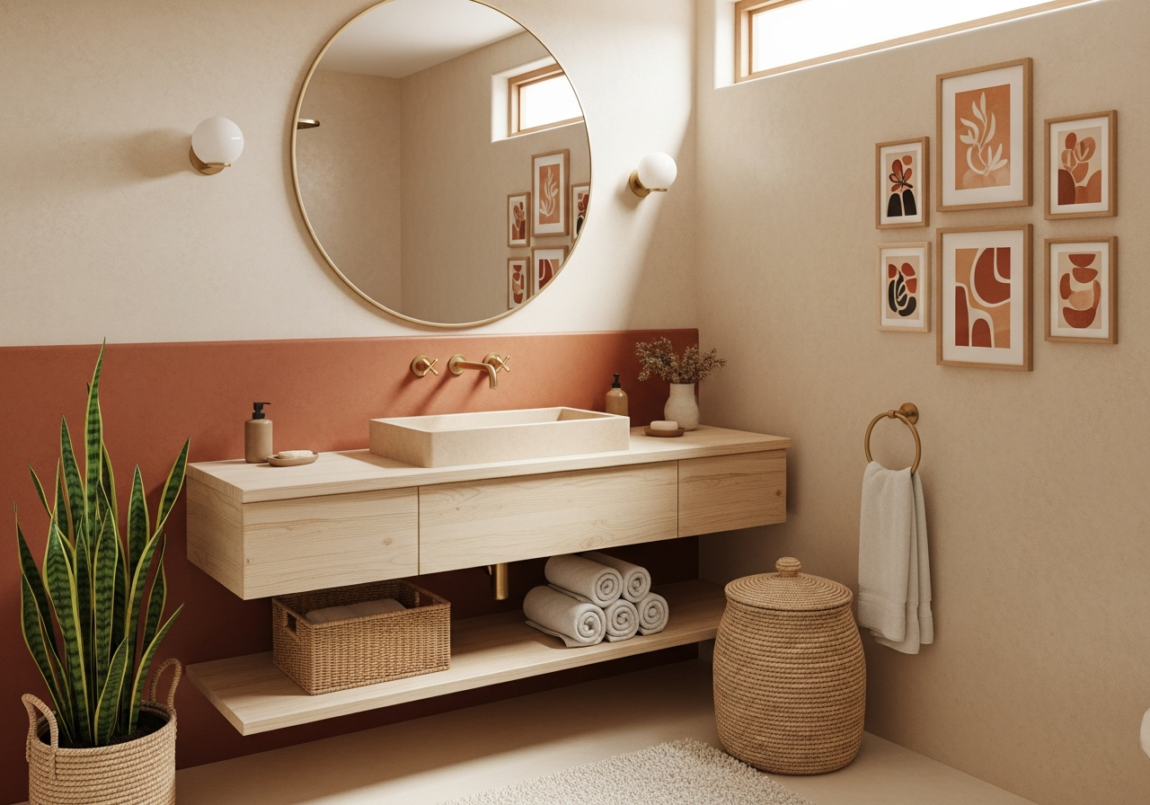
Warm colors — reds, oranges, yellows, and their muted derivatives — activate feelings of comfort, energy, and intimacy. In bathrooms, warm tones create spaces that feel welcoming rather than utilitarian, wrapping the user in visual warmth that counteracts the inherent coldness of tile, porcelain, and water. The trend toward warm colors in bathrooms has accelerated through 2025 and 2026, as designers move away from the cool gray palettes that dominated the previous decade.
Warm Neutrals and Beige
The beige bathroom has undergone a dramatic reinvention. Once dismissed as boring, warm neutrals have returned as the sophisticated foundation for spa-like bathroom design. Colors like Benjamin Moore's White Sand (OC-10), Sherwin-Williams' Accessible Beige (SW 7036), and Farrow & Ball's Jitney No. 293 offer the versatility of white with the warmth of natural stone and sand.
Warm neutrals complement the most popular fixture finishes — brushed gold, champagne bronze, and matte brass. The neutral palette also serves as a forgiving backdrop in bathrooms with inconsistent natural light. Layering different tones within the warm neutral family — lighter walls, a deeper vanity tone, creamy white trim — creates visual depth through a monochromatic approach that makes even small bathrooms feel thoughtfully designed.
Terracotta and Clay
Terracotta, clay, and burnt sienna tones bring an earthy groundedness to bathrooms that no other color family can replicate. Sherwin-Williams' Cavern Clay (SW 7701) and Benjamin Moore's Potters Clay (1221) represent the mid-range of this palette, while Farrow & Ball's Red Earth No. 64 offers a more muted approach.
In bathrooms, terracotta works best as an accent wall or tile application rather than all-over wall color. A terracotta tile floor paired with white walls creates a grounded, Mediterranean-inspired atmosphere particularly effective in north-facing bathrooms where cool light can make other colors feel chilly. Terracotta pairs with matte black fixtures for a contemporary look, or aged brass for a more organic aesthetic.
Blush Pink
Blush pink has emerged as a serious contender in bathroom color psychology. Soft pinks create a uniquely flattering light quality — the warm undertones reflect onto skin, producing a healthy, radiant appearance in the mirror. This effect, long understood by portrait photographers, makes blush-toned bathrooms one of the most universally flattering color choices for the space where you evaluate your appearance most critically.
Benjamin Moore's Pale Pink (OC-72) and Farrow & Ball's Pink Ground No. 202 read as sophisticated neutrals rather than candy colors. Blush works particularly well with marble countertops where pink veining in Calacatta marble creates a natural connection between surfaces. Pairing blush walls with brushed gold fixtures produces a luxurious warmth.
Neutral and Achromatic Colors
Achromatic colors — white, gray, and black — technically exist outside the traditional color wheel, yet they dominate bathroom design more than any chromatic hue. Their psychological impact is profound because they function as frames for everything else in the space: fixtures, materials, lighting, and the human body itself.
White
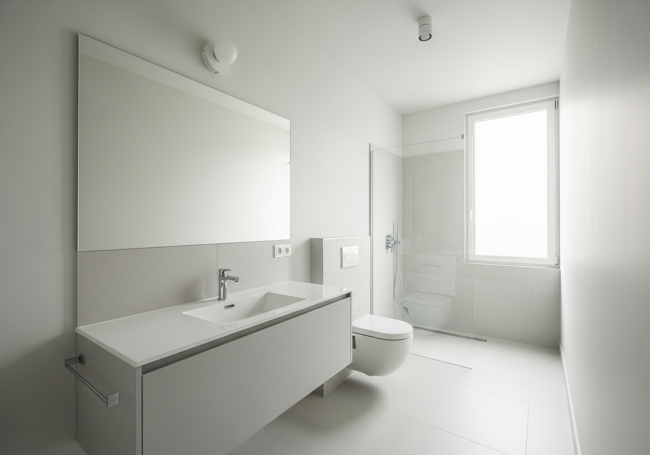
The white bathroom remains the most popular choice in American homes: cleanliness, purity, freshness, and hygiene. White reflects the maximum amount of light, making any space feel larger — a significant advantage in windowless bathrooms. However, an all-white bathroom with cool-toned lighting can feel clinical, triggering hospital associations rather than home comfort.
The solution lies in choosing the right white. Stark whites like Benjamin Moore's Chantilly Lace (OC-65) work best with abundant warm natural light. In most situations, whites with warm undertones — White Dove (OC-17) or Farrow & Ball's All White No. 2005 — create a softer atmosphere. Layering white with natural textures — wood vanities, stone countertops, and greenery — prevents the look from feeling sterile.
Gray
The gray bathroom surged in popularity during the 2015-2022 era and remains a strong choice when executed thoughtfully. Gray's psychological impact is neutrality — it neither stimulates nor calms, making it a sophisticated backdrop. However, gray requires more careful selection in bathrooms than in any other room because of its sensitivity to lighting and undertones.
Every gray has an undertone — blue, green, purple, or warm taupe — that becomes more apparent in a bathroom's variable lighting. Sherwin-Williams' Repose Gray (SW 7015) and Benjamin Moore's Revere Pewter (HC-172) have become industry standards because their balanced undertones perform consistently across different light sources. The psychological risk with gray bathrooms is coldness — counteract it with warm-toned accents: wood shelving, brass hardware, warm-white LED lighting (2700K-3000K color temperature), and textural elements like linen that soften the room's edges.
Black
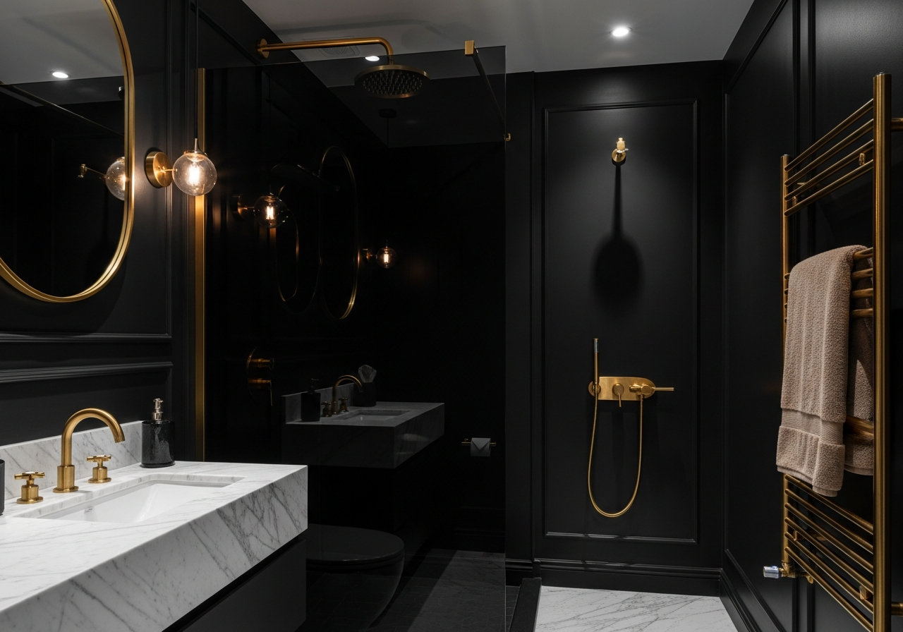
A black bathroom represents the boldest achromatic choice and creates unmistakable drama, luxury, sophistication, and intimacy. Black absorbs light rather than reflecting it, making spaces feel smaller and more enclosed — an effect that works beautifully in powder rooms and larger master baths but can feel claustrophobic in compact bathrooms without adequate lighting. Farrow & Ball's Off-Black No. 57 and Benjamin Moore's Black Beauty (2128-10) offer depth without the flat quality of pure black.
The key to making black work is contrast and light management. Gold or brass fixtures against matte black walls create a sense of opulence. White marble countertops, large mirrors, and strategic lighting prevent darkness from becoming oppressive. The visual weight of black is the highest of any color, meaning every other element becomes a focal point by contrast. The HanoDecor gallery showcases examples of how dark color choices transform bathroom atmosphere when paired with the right fixtures and lighting.
How Natural Light Changes Color Perception
Natural light is the single most important factor in how a bathroom color actually appears once applied to walls. A paint color selected under fluorescent store lighting or judged from a small swatch will look entirely different in your actual bathroom. Understanding directional light is essential before committing to any color.
North-facing bathrooms receive cool, blue-tinted indirect light throughout the day. This light enhances blue and green tones while making warm colors appear slightly duller. In these spaces, warm undertones become critical — choose colors with yellow, pink, or golden bases to counteract the cool light. Conversely, if you want a serene blue bathroom, north-facing light will intensify the effect beautifully.
South-facing bathrooms are bathed in warm, golden light that flatters virtually every color. This is the most forgiving orientation for color selection. However, highly saturated warm colors can feel overwhelming during peak afternoon sun, so consider slightly cooler or more muted versions of your target color.
East-facing bathrooms receive warm morning light and cool afternoon light, while west-facing bathrooms do the opposite. For variable light exposure, mid-value colors with balanced undertones provide the most consistent appearance. Testing with large painted samples (at least 2 feet by 2 feet) viewed at different times of day remains the most reliable method for predicting how a color will perform.
Colors That Make Small Bathrooms Feel Bigger
In a small bathroom, color becomes a powerful spatial tool. The right palette can make a 40-square-foot bathroom feel noticeably more open, while the wrong choice can make even a generously sized room feel cramped. The psychology of perceived space through color relies on three principles: value, continuity, and contrast management.
Light values expand space. Colors with high lightness values reflect more light and recede visually, pushing walls outward in perception. Pale blues, soft greens, warm whites, and light grays all perform well. Benjamin Moore's Healing Aloe (1562) and Sherwin-Williams' Sea Salt (SW 6204) are designer favorites for making compact bathrooms feel airy and spacious.
Monochromatic schemes create continuity. Using variations of a single hue across walls, tile, and trim eliminates the visual breaks that make a room feel chopped up. When the eye moves smoothly from surface to surface without jarring color transitions, the brain interprets the space as larger and more cohesive. A monochromatic approach using three shades of warm gray creates depth while maintaining the visual flow that expands perception.
Ceiling color is the most underused trick for small bathrooms. Painting the ceiling the same color as the walls eliminates the visual boundary between wall and ceiling, making the room feel taller. The traditional rule of always painting ceilings white actually creates a hard line that visually lowers room height. In small bathrooms, seamless color flow from floor to ceiling can add an apparent 6 to 12 inches of height. High-contrast schemes — dark walls with white trim, bold accent walls against light surroundings — have the opposite effect, visually fragmenting the space.
Colors to Avoid in Bathrooms
While personal preference should always play a role, certain colors consistently produce negative psychological responses in bathroom environments. Understanding which colors to approach with caution can prevent costly repainting and daily discomfort.
Saturated primary yellow is the most problematic bathroom color. While pale buttery yellows can feel cheerful, bright or fully saturated yellows trigger anxiety and agitation in enclosed spaces. Research from the University of Hawai'i found that people are more likely to lose their tempers in yellow rooms. In a bathroom, where reflective surfaces amplify the intensity, saturated yellow becomes visually exhausting. Choose warm neutrals or gold-toned beiges instead.
Neon and highly saturated colors overwhelm the senses in a bathroom. Neon green, electric blue, and hot pink may work as small accents, but as wall colors they create visual fatigue. True red on large surfaces raises heart rate and blood pressure. Reserve reds for accents: towels, art, or tile. Similarly, very dark colors in windowless bathrooms without exceptional lighting should be avoided.
Frequently Asked Questions
What is the most calming color for a bathroom? Soft blue consistently ranks as the most calming bathroom color. Specifically, muted blue-greens with low to medium saturation — colors like Benjamin Moore's Palladian Blue (HC-144) or Sherwin-Williams' Sea Salt (SW 6204) — produce the strongest relaxation response. These colors combine the calming properties of blue with the natural balance of green, creating spa-like calm that works in bathrooms of any size.
Does bathroom color affect resale value? Yes. According to a Zillow analysis of over 135,000 photos from sold homes, bathrooms painted in light blue or periwinkle sold for an average of $2,786 more than expected. Neutral and light-colored bathrooms consistently outperform bold or dated color choices in buyer perception.
Should I use the same color on bathroom walls and ceiling? In small bathrooms (under 60 square feet), painting the ceiling the same color as the walls can make the space feel taller and more cohesive. In larger bathrooms, you have more flexibility to introduce a contrasting or complementary ceiling color. Visual continuity between walls and ceiling expands perceived space, while contrast creates definition.
How do I choose between cool and warm colors for my bathroom? Consider three factors: the bathroom's natural light orientation, fixture finishes, and desired mood. North-facing bathrooms benefit from warm colors to counteract cool light. Chrome and nickel fixtures pair naturally with cool tones, while brass and gold fixtures complement warm palettes. For relaxation, lean cool; for coziness, lean warm.
Can dark colors work in a small bathroom? Yes, but with careful execution. Dark colors can create a dramatic, jewel-box effect that feels intentionally luxurious. The key requirements are excellent lighting (both ambient and task), reflective surfaces (glossy tile, large mirrors), and light-colored accents for contrast.
What are complementary colors and should I use them in bathrooms? Complementary colors sit opposite each other on the color wheel — blue and orange, green and red, purple and yellow. Using full-intensity pairs can feel jarring, but muted versions create beautiful tension: a sage green bathroom with dusty pink towels, or a soft blue space with copper-toned fixtures.
Test Colors in Your Bathroom with HanoDecor
The gap between imagining a color and seeing it on your actual bathroom walls is where most remodeling regrets begin. That is why testing is not optional — it is the most important step in your color selection process.
HanoDecor's bathroom remodel visualizer lets you upload a photo of your actual bathroom and see how different color choices transform the space before purchasing a single paint can. Experiment with cool blues, warm neutrals, or dramatic darks — all in your own room with your own lighting conditions.
Upload your bathroom photo, select from curated color palettes, and compare options side by side. For additional inspiration, explore completed transformations in the project gallery. Color is personal, psychological, and powerful — the right bathroom color will make you feel good every single day.
Bathroom Color Psychology FAQs
Written by
Emily Rodriguez
Interior Design Editor covering living spaces, styling trends, and room makeovers. Former Architectural Digest contributor with a focus on accessible, budget-conscious design.