How to Use Bold Colors in Decor: 8 Fearless Tips for a Vibrant Home
Quick Summary
A practical guide to incorporating bold colors into home decor with confidence and balance. Covers 8 tips including starting with one bold accent, balancing vibrancy with neutrals, using the 70/20/10 color rule, choosing the right bold color for your room's light, introducing bold color through accessories first, creating cohesion with complementary bold tones, using bold color on unexpected surfaces, and testing bold colors digitally before committing.
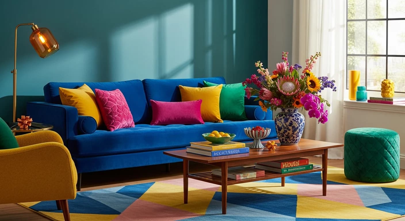
Learning how to use bold colors in decor is one of the fastest ways to inject personality, energy, and visual drama into any room. While neutral palettes have dominated interior design for years, the pendulum is swinging toward richer, more confident color choices — deep emerald greens, saturated terracotta, electric cobalt blue, warm saffron yellow, and moody aubergine purple are all trending strongly in 2026. The challenge is not finding bold colors to love — it is knowing how to incorporate them without overwhelming a space or creating a room that feels visually exhausting.
Bold color decorating follows specific principles that professional designers use to balance vibrancy with livability. The goal is never to drench every surface in saturated hues — it is to use bold colors strategically so they create impact, focal points, and emotional resonance while coexisting peacefully with the calmer elements in the room. These 8 tips will help you embrace bold colors with confidence, whether you are ready for a full accent wall or just dipping your toes in with a jewel-toned throw pillow. For the opposite end of the color spectrum, our pastel color guide covers softer palette strategies.
Tip 1 — Start with One Bold Accent, Not an Entire Room
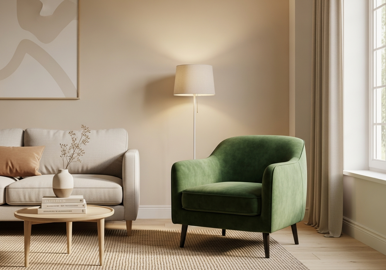
The safest entry point for bold color is a single accent element — one statement piece that introduces the color without committing the entire room. A deep emerald velvet armchair in a neutral living room creates an instant focal point. A cobalt blue front door transforms curb appeal in an afternoon. A terracotta accent wall behind a bed anchors the room with warmth without overwhelming the remaining three walls. Starting with one element lets you live with the color and evaluate whether you want more or less before expanding.
The single-accent approach works psychologically too. Bold colors command attention, so a single statement piece draws the eye immediately and creates a clear visual hierarchy. When bold color appears everywhere, nothing stands out and the room feels noisy. A single bold element surrounded by calmer tones creates the contrast that makes the color appear more vivid and more intentional. Think of it as the design equivalent of an exclamation point — one is impactful, five in a row is overwhelming. Browse our living room ideas gallery for bold accent inspiration across dozens of styles.
Tip 2 — Balance Bold Colors with Generous Neutrals
Bold colors need neutral partners to breathe. For every bold element you introduce, surround it with neutral surfaces that give the color room to shine. A saturated navy accent wall looks strongest when flanked by white or warm gray adjacent walls. A vibrant coral sofa needs a neutral rug, neutral curtains, and neutral wall art to prevent color overload. The neutrals are not boring — they are the canvas that makes the bold color look like a masterpiece rather than a paint-store accident.
Effective neutrals for bold color pairing include warm white (not stark cool white, which can make bold colors feel cold), greige (gray-beige), soft cream, warm taupe, and light charcoal. Natural materials — light oak wood, woven jute, linen fabric, and marble or quartz — provide visual texture in neutral tones that prevent the room from feeling flat. The neutral majority ensures the bold color remains a confident statement rather than a visual assault.
Tip 3 — Apply the 70/20/10 Color Rule
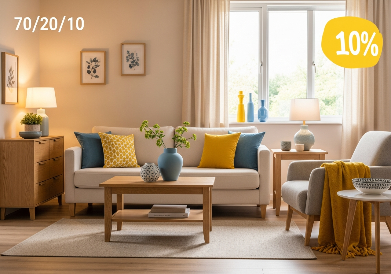
The 70/20/10 rule provides a foolproof framework for distributing bold color. Approximately 70% of the room's visible color should be your dominant neutral — walls, large furniture, and flooring. About 20% is your secondary color — a muted or mid-tone shade that appears on curtains, larger accent furniture, and area rugs. The remaining 10% is your bold accent color — the vibrant hue that appears on throw pillows, artwork, decorative objects, and small textiles.
In practice, a living room might feature warm white walls and a beige linen sofa (70%), dusty blue curtains and a gray-blue area rug (20%), and saffron yellow throw pillows, a yellow glass vase, and a piece of art with yellow accents (10%). The bold saffron yellow captures attention because it occupies the smallest percentage — scarcity creates impact. If you want a bolder room overall, shift the ratio to 60/25/15, but be careful going beyond that unless you are confident in your color coordination skills.
Tip 4 — Choose Bold Colors Based on Your Room's Natural Light
Natural light dramatically affects how bold colors appear in a room. North-facing rooms receive cool, indirect light that can make blue-based bold colors (navy, cobalt, plum) appear darker and more muted than expected. These rooms benefit from warm bold colors — terracotta, saffron yellow, warm coral, and burnt orange — that counteract the cool light. South-facing rooms with abundant warm light can handle cooler bold colors like deep teal, forest green, and rich plum, which the warm light prevents from feeling cold.
East-facing rooms get strong morning light and softer afternoon light — bold colors will look different at 9 AM versus 5 PM. West-facing rooms reverse this pattern with the strongest, warmest light in the late afternoon. Before committing to a bold wall color, paint a 2x2-foot test swatch and observe it at multiple times of day. Bold colors shift more dramatically than neutrals between morning and evening light, and a color that looks perfect at noon may feel overwhelming under golden-hour sunlight. Use the AI house painter to preview bold wall colors in your room's actual lighting conditions before picking up a paintbrush.
Tip 5 — Introduce Bold Color Through Accessories First
If painting a wall or buying a bold sofa feels too permanent, start with accessories that are easy to swap. Throw pillows in jewel tones — ruby, sapphire, emerald, amethyst — instantly change a room's energy and cost $20 to $60 per pillow. A bold area rug anchors a room with color without touching the walls. Vibrant artwork — even a single large canvas in a saturated hue — creates a bold statement that can be replaced when your taste evolves.
Other low-commitment bold color vehicles include ceramic vases, decorative bowls, lamp bases, fresh or dried florals, table runners, and decorative book collections sorted by color. These accessories let you experiment with specific hues before scaling up. If you love living with emerald green pillows for six months, you will feel more confident investing in an emerald accent chair or painting the powder room a deep green. Accessories are the test drive before you buy the car.
Tip 6 — Create Cohesion with Complementary Bold Pairings
Using a single bold color can feel intentional, but pairing two complementary bold colors creates a sophisticated, designer-level palette. Complementary colors sit opposite each other on the color wheel: blue and orange, green and pink, yellow and purple. When paired in the right proportions — one dominant, one accent — complementary bold colors create visual energy and contrast that makes both colors appear more vibrant.
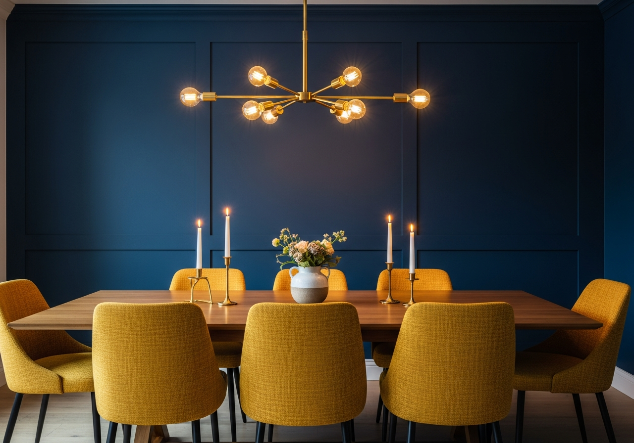
The key to successful bold color pairing is keeping one color significantly more dominant than the other. A room with teal walls (the dominant bold) and copper or terracotta accents (the complementary bold) uses about 70% neutral, 20% teal, and 10% copper. Both bold colors are present, but the teal leads while the copper adds warmth and contrast. Avoid a 50/50 split between two bold colors — the visual competition creates tension rather than harmony. A navy dining room with mustard yellow dining chairs and brass accents exemplifies this principle: navy dominates, mustard punctuates, and brass ties them together.
Tip 7 — Use Bold Color on Unexpected Surfaces for Surprise
Bold color on expected surfaces — an accent wall, a sofa — is effective but predictable. Bold color on unexpected surfaces creates delight and surprise. Paint the inside of a bookcase a rich emerald green. Apply a bold lacquer to the underside of open shelving. Use a saturated color on the ceiling — sometimes called a "fifth wall" — to add drama overhead. Paint your interior doors a deep navy or forest green while keeping walls neutral. Bold color in unexpected places feels creative and intentional.
Other unexpected bold applications include painting the backs of cabinets with glass doors, coloring the risers of a staircase, using bold tile on a kitchen backsplash island, or selecting a vibrant bold color for bathroom vanity cabinetry. Bold-colored vintage furniture pieces — a bright red credenza, a yellow mid-century dresser — introduce color through objects that have personality and patina. For bookcase interiors specifically, our bookshelf styling guide covers how to integrate bold color backdrops with curated shelf displays. These unexpected placements demonstrate decorating confidence and create conversation-starting moments throughout the home.
Tip 8 — Test Bold Colors Digitally Before You Commit
Bold color mistakes are more visible and more expensive to correct than neutral ones. A wrong shade of beige is barely noticeable — a wrong shade of cobalt blue on an accent wall is unmissable. Digital visualization tools eliminate the guesswork by letting you see bold colors in your actual room before purchasing paint, fabric, or furniture. Upload a photo of your space, apply the bold color to walls, furniture, or accents, and evaluate the result in photorealistic detail.
The AI house painter tool lets you test bold wall colors in your room with a single photo upload. Try deep teal, burnt orange, or moody plum on your walls and see how they interact with your existing furniture and lighting. Compare three or four bold options side by side to identify which hue creates the mood you want. This digital preview costs nothing but saves potentially hundreds of dollars in paint, primer, and repainting costs. For broader room transformations beyond wall color, the AI room designer previews bold furniture, textiles, and decor in your space.
Bold Color Combinations That Work in Every Room
| Room | Bold Color | Pairing Neutrals | Best For |
|---|---|---|---|
| Living Room | Emerald green or deep teal | Warm white, cream, light oak | Sophisticated, nature-inspired energy |
| Bedroom | Navy blue or aubergine purple | Soft gray, linen white, walnut | Cozy, cocoon-like retreat |
| Dining Room | Terracotta or burnt sienna | Ivory, sand, brushed brass | Warm, inviting gathering space |
| Kitchen | Cobalt blue or saffron yellow | White marble, light gray, chrome | Energetic, creative cooking space |
| Bathroom | Forest green or coral pink | White tile, marble, brushed nickel | Fresh, spa-like vibrancy |
| Home Office | Rich burgundy or hunter green | Cream, dark walnut, brass | Focused, library-like atmosphere |
Related Articles
Continue building your color confidence with these related guides: learn how to choose a whole-home color palette that flows room to room, discover techniques for mixing metal finishes alongside bold wall colors, explore geometric patterns in home decor to pair with saturated hues, and browse bedroom color combinations for bold palette inspiration in restful spaces.
Frequently Asked Questions
What bold colors are trending in home decor in 2026?
The top trending bold colors in 2026 include deep forest green, warm terracotta, rich cobalt blue, moody aubergine purple, and earthy saffron yellow. These colors reflect a broader shift toward nature-inspired palettes and warm, saturated tones that create emotional comfort. Jewel tones like emerald, sapphire, and ruby remain strong for accessories and accent pieces.
How do I use bold colors without making a room feel small?
Limit bold color to one or two walls or to accent pieces rather than painting all four walls. Use lighter neutrals on the remaining surfaces to maintain an airy feel. Ensure adequate lighting — both natural and layered artificial light — because bold colors absorb more light than neutrals. High-gloss or satin paint finishes reflect light and prevent bold walls from feeling heavy.
Can you use bold colors in a small room?
Yes, bold colors can actually enhance small rooms when used strategically. A deep bold color on all four walls of a small powder room or closet creates a dramatic, jewel-box effect that feels intentional rather than cramped. In small rooms, go fully bold or use the color on a single accent wall — half measures in tiny spaces tend to feel indecisive.
What neutrals pair best with bold accent colors?
Warm white, cream, greige, soft taupe, and warm gray pair best with most bold accent colors. Avoid stark cool white unless your bold color is also cool-toned. Natural material neutrals — light oak, woven jute, raw linen, and marble — add texture without competing with bold color accents. Metallic neutrals like brushed brass, matte black, and polished nickel complement both warm and cool bold hues.
How many bold colors should I use in one room?
One to two bold colors per room is the safest approach. Use one as your primary accent and, if adding a second, make it complementary and use it in a smaller proportion. Three bold colors in one room can work in maximalist designs but requires expert-level color coordination and generous neutral buffers between each bold element.
Bring Bold Color to Life with HanoDecor
Bold color decorating is not about being reckless — it is about being intentional. The 8 tips in this guide — starting with a single accent, balancing with neutrals, following the 70/20/10 rule, considering natural light, testing through accessories, pairing complementary bolds, using unexpected surfaces, and previewing digitally — give you a structured approach to color confidence.
Ready to see bold colors in your actual space? Try the AI house painter to preview vibrant wall colors with a single photo upload, or use the AI room designer to experiment with bold furniture, textiles, and accent pieces in your room. Bold color has never been easier to get right — visualize before you commit and decorate with confidence.
How to Use Bold Colors in Decor FAQs
Written by
Lisa Wang
Sustainable Design Writer focused on eco-friendly materials, energy efficiency, and budget-conscious home improvement. LEED Green Associate with expertise in low-impact renovation strategies.