How to Use Pastel Colors in Decor: 8 Stunning Tips for a Soft, Elegant Home
Quick Summary
A complete guide to using pastel colors in home decor with 8 expert tips for creating sophisticated interiors. Covers grounding pastels with neutral anchors, layering multiple pastel tones, room-by-room application, the 60-30-10 rule for soft palettes, and avoiding the nursery-look pitfall.
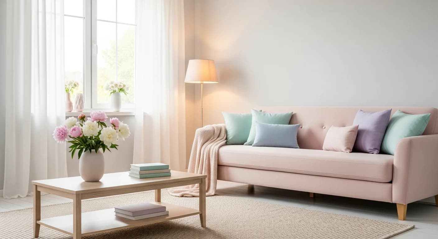
Pastel colors have made a major comeback in interior design, but many homeowners hesitate to use them — worried their rooms will end up looking like a nursery or an Easter basket. Understanding how to use pastel colors in decor properly means learning the techniques that ground soft tones in sophistication. When applied correctly, pastels create spaces that feel serene, elegant, and effortlessly modern — far from childish.
The pastel palette includes blush pink, sage green, lavender, sky blue, soft peach, mint, butter yellow, and lilac — all characterized by high lightness values and low saturation. These soft color tones reflect more light than their saturated counterparts, making rooms feel open and airy while adding personality that all-white interiors lack. According to Pantone color trend reports, pastel-adjacent colors have appeared in the top 10 palette picks for three consecutive years, driven by consumer desire for calming, wellness-oriented environments. These 8 tips will help you incorporate pastels into your home with confidence and sophistication.
Why Pastels Work in Adult Interiors (When Done Right)
The reason pastels sometimes look immature is isolation: a single candy-colored accent against stark white walls reads as juvenile because there is no visual context grounding it. Professional designers avoid this by using pastels as part of a larger tonal strategy — pairing them with warm neutrals, natural materials, and darker anchor elements that add weight and maturity. A blush pink pillow on a cream linen sofa with brass accents and a dark walnut side table looks sophisticated because the surrounding elements provide contrast and gravitas.
Color psychology research from the University of British Columbia confirms that soft, muted tones reduce perceived stress by 17% compared to high-saturation colors and 12% compared to stark whites. Pastels activate the same calming neural pathways as nature-based hues because many pastels derive from natural sources: the blush of dawn, the sage of herb gardens, the lavender of wildflower fields, and the sky blue of clear mornings. These colors feel restful because they are biologically familiar. For deeper understanding, explore our guide to color psychology for interiors.
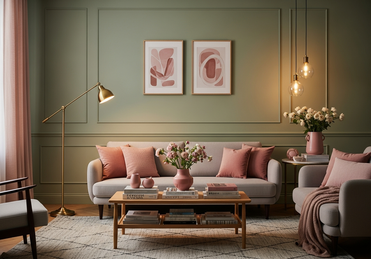
Tip 1 — Ground Pastels with Warm Neutrals, Not White
The most common pastel decorating mistake is placing soft colors against bright white backgrounds. White amplifies a pastel's candy-like quality and strips away the warmth that makes it feel grown-up. Instead, pair pastels with warm neutrals: cream, linen, warm gray, oatmeal, camel, and mushroom. These undertone-rich neutrals add depth and sophistication that crisp white cannot provide. A lavender throw on a warm taupe sofa looks elegant; the same throw on a bright white sofa looks like a children's room.
For walls, choose warm-based off-whites as your backdrop rather than cool blue-whites or stark true whites. Benjamin Moore's Simply White (OC-117) or Sherwin-Williams Alabaster (SW 7008) provide enough warmth to support pastel accents without competing. If you want pastel walls, choose undertone-rich versions — a sage with gray undertones rather than a pure mint, a blush with beige undertones rather than a bubblegum pink. The undertone is what separates sophisticated pastel from juvenile pastel.
Tip 2 — Add Dark Anchor Elements for Contrast and Weight
Every pastel room needs at least one dark anchor to prevent the space from feeling washed out or insubstantial. Dark anchor elements include: a black or dark brown wood coffee table, charcoal upholstered dining chairs, matte black picture frames, dark walnut floating shelves, or a deep navy accent piece. These dark elements provide visual weight that grounds the lighter pastel tones and prevents the "cotton candy" effect where everything looks sweet but nothing feels substantial.
The ideal ratio is approximately 10 to 15% dark elements in a pastel-dominant room. A dark wood side table beside a blush armchair, black iron curtain rods holding sage linen panels, or a deep graphite area rug under a lavender seating arrangement all provide the grounding contrast that makes pastels feel intentional rather than accidental. Without these dark anchors, pastel rooms feel like they are floating — pretty but insubstantial.
Tip 3 — Layer Multiple Pastels for Tonal Richness
One pastel in isolation can look tentative. Two or three pastels layered together create a confident, intentional palette. The key is choosing pastels with the same undertone family: warm pastels (blush, peach, butter yellow, warm sage) layer beautifully together, as do cool pastels (lavender, sky blue, mint, soft lilac). Mixing warm and cool pastels requires more skill — a blush and sky blue combination works when bridged by a neutral like warm gray, but placing them directly adjacent can feel disjointed.
Apply the 60-30-10 rule within your pastel palette: 60% your primary pastel or warm neutral, 30% your secondary pastel, and 10% your darkest or brightest accent. For example: 60% warm white walls and linen sofa, 30% sage green in curtains, pillows, and a throw, and 10% blush pink in a vase, candle, and art print. This distribution creates visual movement across the room while maintaining the soft, calming quality that makes pastels appealing.
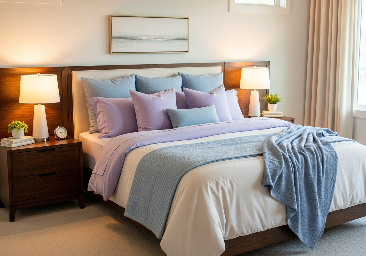
Tip 4 — Use Natural Materials to Add Warmth and Texture
Natural materials are pastels' best friend. Raw wood, rattan, jute, linen, marble, and terracotta provide organic warmth and tactile texture that prevents pastel rooms from feeling flat or overly precious. A sage green accent wall backed by a rattan headboard, a blush velvet sofa on a jute area rug, or lavender ceramic vases on a raw wood shelf — in each case, the natural material adds earthiness that grounds the pastel and prevents sweetness overload.
Prioritize visible wood grain, woven textures, and stone surfaces in pastel rooms. These materials have inherent visual complexity — grain patterns, weave variations, and natural imperfections — that adds the depth and interest pastel colors sometimes lack on their own. A room with soft colors and smooth, uniform surfaces feels flat; the same room with textured natural materials feels layered and inviting. Aim for at least three different natural material textures in every pastel room.
Tip 5 — Introduce Pastels Through Textiles First
If committing to pastel walls or large furniture feels daunting, start with textiles — the lowest-risk, highest-impact way to introduce soft colors. Swap out throw pillow covers ($15 to $35 each), add a pastel throw blanket ($40 to $80), change curtain panels ($30 to $100 per window), or introduce a pastel area rug ($150 to $400). These changes are easily reversible if you decide the color is not right, and they provide enough color presence to judge whether you want to expand the pastel palette further.
Textiles also introduce pastels in varied textures — a velvet pillow in dusty rose, a linen throw in pale sage, a cotton rug in soft sky blue. Each material absorbs and reflects light differently, creating natural color variation within a single pastel tone that prevents the flat, uniform look. Two pillows in the same blush shade but different fabrics (one velvet, one linen) read as more sophisticated than two identical pillows because the texture variation adds visual complexity.
Tip 6 — Apply Pastels Room by Room for Best Results
Different rooms respond differently to pastel palettes. Bedrooms are the ideal starting point because the goal is relaxation — sage, lavender, and soft blue create calm, sleep-promoting environments. Our bedroom decorating guide covers complementary techniques. Living rooms work well with warm pastels like blush and peach, grounded by substantial furniture in neutral tones. Bathrooms benefit from mint and soft blue, which complement white fixtures and create a spa-like atmosphere. Kitchens suit sage green and butter yellow, which add warmth without competing with cabinetry.
Home offices require pastel caution — very light pastels can feel too relaxing for productive work, so opt for slightly more saturated versions (dusty sage rather than pale mint, slate blue rather than baby blue). Dining rooms benefit from blush and warm peach, which make skin tones look warm and inviting under candlelight. Match the pastel intensity to the room's function: softer for rest, slightly deeper for gathering, and more saturated for energy.
| Room | Best Pastel Tones | Ground With | Avoid |
|---|---|---|---|
| Bedroom | Sage, lavender, soft blue | Warm whites, dark wood | Bright mint, bubblegum pink |
| Living Room | Blush, warm peach, muted sage | Taupe, camel, charcoal | Baby blue, lemon yellow |
| Bathroom | Mint, sky blue, soft gray-green | White tile, brass hardware | Pink (clashes with fixtures) |
| Kitchen | Sage green, butter yellow | Natural wood, marble | Lavender (conflicts with food) |
| Home Office | Dusty sage, slate blue | Dark desk, metal accents | Ultra-light pastels (too calming) |
Tip 7 — Use Metallic Accents to Elevate Pastel Palettes
Metallics add glamour and sophistication that prevent pastels from reading as overly soft. Brass and gold tones pair exceptionally well with warm pastels (blush, peach, sage), adding richness and warmth. Chrome and silver complement cool pastels (lavender, sky blue, mint) with a modern edge. Copper bridges both warm and cool palettes with its unique amber tone. Use metallics in lighting fixtures, picture frames, hardware, decorative objects, and small furniture legs.
Keep metallic accents to approximately 5% of the room's visual weight — enough to sparkle and add luxe without competing with the soft palette. A brass table lamp, a gold-framed mirror, and copper curtain rings might be all the metallic a pastel room needs. The reflective quality of metals bounces light around the room, enhancing the airy quality pastels provide while adding the visual weight and warmth that prevent the space from feeling insubstantial. For a complete guide to combining different metal finishes, read how to mix metals in home decor.
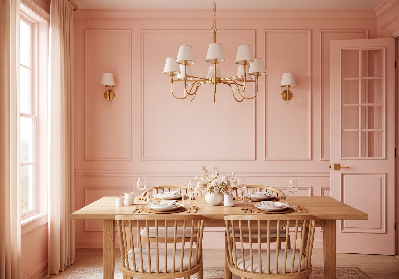
Tip 8 — Commit to Full-Room Execution, Not Scattered Accents
The difference between a room that "has some pastel pieces" and one that feels intentionally pastel is commitment. A single blush pillow on an otherwise neutral sofa looks accidental. A cohesive scheme — blush pillows plus a complementary sage throw plus a pastel print on the wall plus a matching candle on the side table — reads as a deliberate design decision. When working with pastels, go all-in within a room rather than sprinkling random pastel touches across the house.
This does not mean painting every wall and upholstering every piece in pastel. It means ensuring that every pastel element connects to at least one other pastel element in the room through color, tone, or material. A pastel accent that appears only once looks like a mistake; one that appears three to five times in varied forms looks like a decision. Build your pastel story through repetition: a blush pillow, a blush-toned print, a blush ceramic vase, and a blush candle create a theme even if 80% of the room remains neutral.
Related Articles
Deepen your color and styling knowledge with these guides: master how to choose a color palette for your home, learn how to mix patterns in decor to complement your pastels, find inspiration in Scandinavian interior design ideas that pair naturally with soft tones, browse our bedroom ideas gallery for pastel-friendly rooms, and explore bedroom color combinations for restful palettes.
Frequently Asked Questions
How do I use pastel colors without the room looking childish?
Ground pastels with warm neutrals instead of white, add dark anchor elements (black frames, dark wood furniture) for contrast, use natural materials (rattan, jute, raw wood) for texture, and layer multiple pastel tones rather than using just one in isolation. Choose undertone-rich pastels (dusty sage, warm blush, muted lavender) rather than pure, saturated versions. The key is context: pastels look grown-up when surrounded by sophisticated materials and grounding dark accents.
What pastel colors go well together?
Warm pastels layer beautifully: blush pink with sage green and butter yellow. Cool pastels also harmonize: lavender with sky blue and soft mint. Bridging warm and cool requires a neutral connector — blush and sky blue work when linked by warm gray or cream. The most fail-safe pastel combination is sage green with blush pink and cream, which has been a designer favorite for three consecutive trend cycles.
Can I use pastel colors in a modern or minimalist room?
Pastels work exceptionally well in modern and minimalist interiors. The clean lines and open spaces of minimalist design provide the perfect canvas for soft colors to make a subtle statement. Use one pastel tone as your accent color against white and warm gray — a single sage accent wall, blush dining chairs, or a sky blue area rug. The restraint of minimalism prevents pastels from becoming overwhelming, and the soft color adds warmth that all-neutral minimalist rooms sometimes lack.
What metals pair best with pastel decor?
Brass and gold pair best with warm pastels (blush, peach, sage), adding richness and warmth. Chrome and silver complement cool pastels (lavender, sky blue, mint) with a sleek, contemporary edge. Matte black works with all pastels as a grounding element that adds contrast. Avoid mixing more than two metal finishes in a pastel room — the visual simplicity of pastels benefits from metal consistency.
Preview Your Pastel Palette with HanoDecor
Curious how pastel colors would transform your space? Upload a photo of your room and use our AI tools to preview different pastel palettes — from subtle blush accents to full sage-and-lavender schemes. See the exact effect before buying a single paint can or pillow.
Try the AI House Painter free to preview pastel wall colors on your actual room photos, or use the AI Room Designer to see full room transformations with pastel-toned furniture and decor. For more color guidance, explore our bold color guide for the opposite approach, or visit the design gallery for real rooms styled with soft pastel palettes. Learn more about color coordination in our living room decorating guide.
How to Use Pastel Colors in Decor FAQs
Written by
Emily Rodriguez
Interior Design Editor covering living spaces, styling trends, and room makeovers. Former Architectural Digest contributor with a focus on accessible, budget-conscious design.