How to Mix Patterns in Decor: 7 Proven Rules for Effortless Harmony
Quick Summary
A practical guide to mixing patterns in home decor with confidence and intentionality. Covers 7 proven rules including varying pattern scale, anchoring with a shared color palette, the 60/30/10 pattern ratio, mixing pattern types, using solid-color bridges, repeating patterns for cohesion, and testing combinations before committing. Includes room-specific examples for living rooms, bedrooms, and dining rooms.
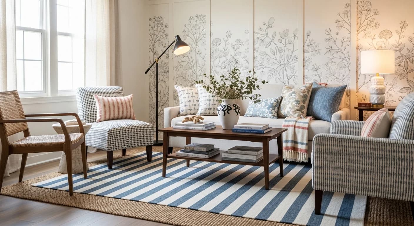
Understanding how to mix patterns in decor is one of the most sought-after styling skills — and one of the most misunderstood. Pattern mixing separates rooms that feel flat and predictable from spaces that feel layered, dynamic, and professionally designed. Yet most homeowners stick to safe solids because they fear that combining stripes with florals, or geometrics with plaids, will create visual chaos. The truth is that pattern mixing follows predictable rules, and once you learn them, combining prints becomes intuitive rather than intimidating.
Interior designers regularly layer three to five patterns in a single room — on throw pillows, curtains, area rugs, upholstered furniture, and accent pieces — to create spaces with depth and personality. The difference between a room that looks chaotic and one that looks effortlessly curated comes down to scale, color, and proportion. These 7 rules will give you the confidence to mix patterns in any room without second-guessing your choices. For style-specific pattern mixing, see our guide on mixing modern and vintage decor.
Rule 1 — Vary Pattern Scale: Large, Medium, and Small
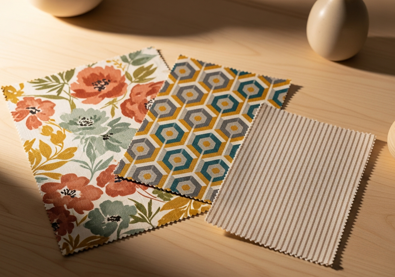
The most important rule in pattern mixing is varying the scale of each pattern. When you combine patterns of the same scale — two medium florals, for example — they compete for visual attention and create a busy, uncomfortable effect. When you combine patterns at different scales — a large floral, a medium geometric, and a small stripe — each pattern occupies its own visual lane and the eye processes them as complementary rather than competing elements.
In practice, this means your largest-scale pattern goes on the biggest surface — an area rug, curtains, or a large upholstered piece. The medium-scale pattern appears on mid-sized elements like accent chairs, throw pillow pairs, or a table runner. The smallest-scale pattern sits on the smallest accents — a single toss pillow, a napkin, or a lamp shade. A large-scale chinoiserie curtain paired with a medium-scale geometric rug and small-scale striped throw pillows is a classic combination that works because the three scales never overlap. For more on working with geometric prints specifically, see our guide to geometric patterns in home decor.
Rule 2 — Anchor All Patterns with a Shared Color Palette
Color is the thread that ties mixed patterns together. Every pattern in a room should share at least one common color — preferably two. If your rug contains navy, cream, and terracotta, then your curtain pattern should include at least one of those colors, your throw pillows should pull from the same palette, and your accent textiles should echo the same tones. This shared color language tells the eye that the patterns belong together, even when their designs are completely different.
Start by identifying your room's dominant color. Pull that color from the largest patterned piece — usually the rug or curtains — and ensure it appears in every other patterned element, even if only as a small accent within the print. A navy floral rug, a cream-and-navy striped pillow, and a terracotta geometric throw create cohesion because navy appears in all three. Without the color anchor, the same patterns would look random and disconnected. For more on building cohesive color stories, see our pastel color decorating guide and bold color decorating guide.
Rule 3 — Follow the 60/30/10 Pattern Ratio
Just as the 60/30/10 rule governs color distribution in a room, it also applies to patterns. Approximately 60% of your room's textiles and surfaces should be solid colors or very subtle textures. About 30% should feature your primary pattern — the dominant print that sets the room's visual tone. The remaining 10% introduces your accent pattern or patterns — the supporting prints that add variety without overwhelming the space.
In a living room, this might mean solid upholstery on the sofa (60%), a bold patterned area rug and matching curtain panels (30%), and patterned throw pillows plus a printed throw blanket (10%). The solid majority gives the patterns room to breathe and prevents the "pattern overload" that makes rooms feel exhausting. If you want to push toward a more maximalist look — sometimes called pattern drenching — increase the 30% to 40 to 50% and keep solids at 40%, but maintain the scale variation rule to prevent chaos.
Rule 4 — Mix Pattern Types, Not Just Pattern Sizes
Pattern mixing works best when you combine different types of patterns, not just different sizes of the same type. The five main pattern categories are organic (florals, botanicals, animal prints), geometric (stripes, chevrons, hexagons, trellis), textural (damask, jacquard, brocade), abstract (watercolor, brushstroke, ikat), and graphic (toile, plaid, check). Combining one pattern from each category creates maximum visual diversity with minimum risk of clashing.
Two florals of different scales can work together, but a floral paired with a geometric creates a more dynamic contrast. A striped pillow next to a botanical print generates visual tension that makes both patterns more interesting. Toile curtains paired with a simple plaid chair and an abstract watercolor rug create a three-pattern combination that spans three distinct categories — the variety is what makes the room feel curated rather than matchy-matchy.
Rule 5 — Use Solid Colors as Visual Bridges Between Patterns
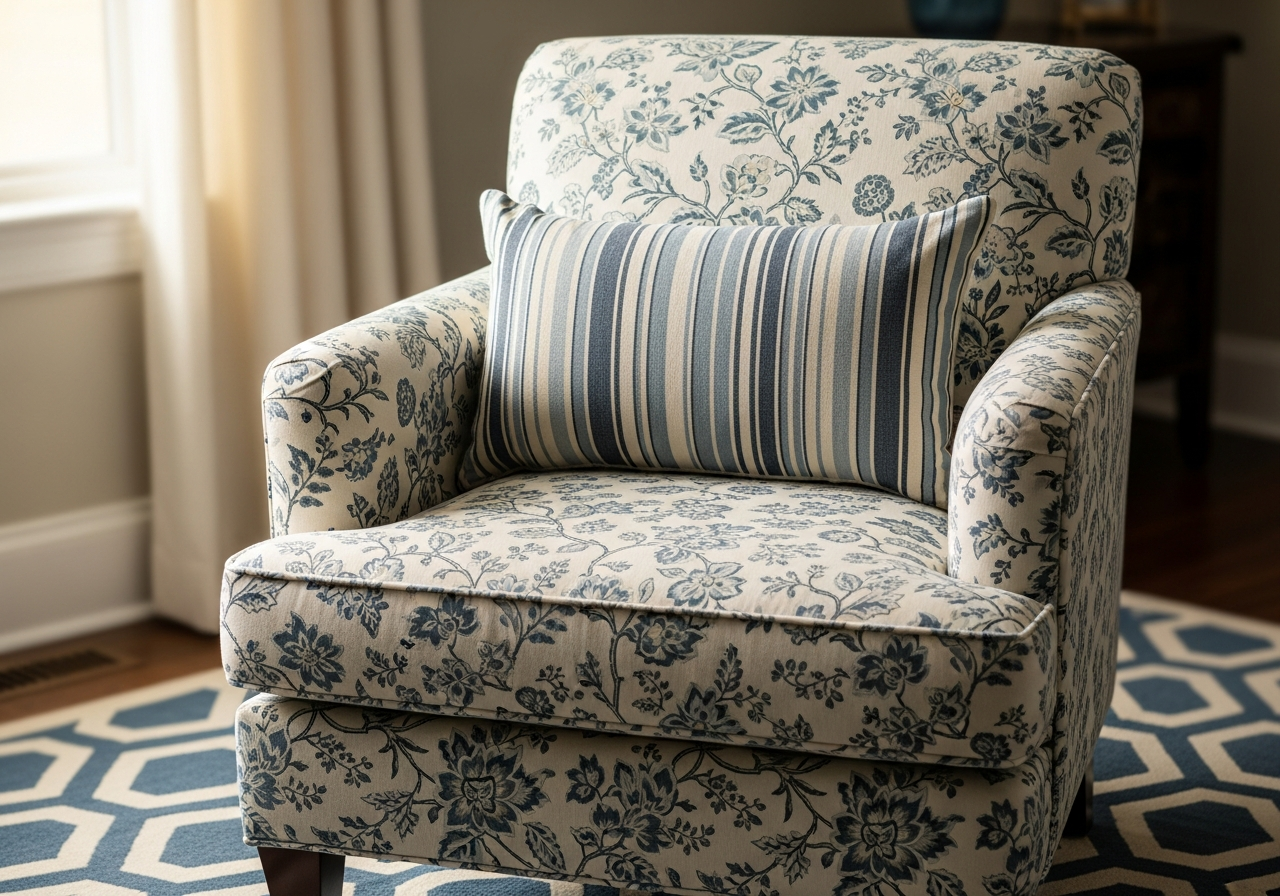
Solid-color elements between patterned ones prevent visual overload and give the eye transition zones to rest. A solid sofa between two patterned accent chairs creates breathing room. A plain lampshade between patterned curtains and a patterned pillow below it provides a visual pause. Solid-colored throw pillows mixed into a group of patterned pillows break up the print density and prevent the arrangement from looking like a textile sample board.
The color of your solid bridge pieces should be pulled directly from the patterns surrounding them. If your patterned rug contains dusty rose, a solid dusty-rose velvet pillow on the sofa acts as a bridge between the rug pattern and any pattern on the curtains. These solid pieces reinforce the shared color palette while giving each pattern space to be appreciated individually. In rooms with three or more patterns, solid elements should make up at least 50 to 60 percent of the textiles.
Rule 6 — Repeat Your Patterns for Intentional Cohesion
Using a pattern only once in a room makes it look accidental. Using it two or three times makes it look intentional. If you choose a striped fabric for your curtains, echo that stripe — in the same color family but perhaps a different scale — on a throw pillow or table runner. This repetition creates visual rhythm that your eye follows around the room, reinforcing the sense that the pattern choices were deliberate and coordinated rather than random.
Repetition does not mean exact matching. Repeat the pattern family (stripes, florals, geometrics) or the specific colorway without duplicating the exact print. A ticking stripe on curtains can be echoed by a wider awning stripe on a pillow — both are stripes, both share the same colors, but they differ in scale. This technique is called "rhyming" in design theory: the patterns reference each other without being identical, creating a sophisticated conversation across the room.
Rule 7 — Test Pattern Combinations Before Committing
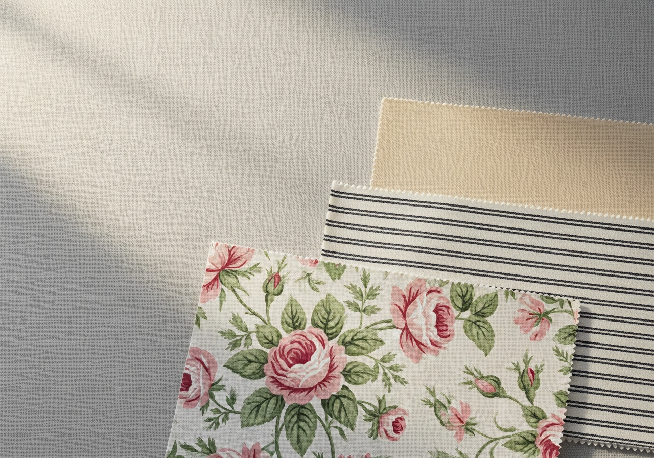
Before purchasing patterned textiles, test the combination in your actual space. Request fabric swatches or purchase small yardage samples and lay them together on your existing furniture. View them in both natural daylight and evening artificial light — patterns look different under warm versus cool lighting, and colors shift significantly between morning sun and lamplight. Step back and view the grouping from across the room — patterns that look great up close may merge into muddy blobs from 10 feet away.
Digital tools can accelerate this testing process. The AI room designer lets you upload a photo of your room and preview different textile patterns and color combinations in your actual space — far more accurate than holding a swatch against a sofa cushion. Layer your proposed patterns in the visualization, evaluate the overall effect, and iterate before spending money on fabric, pillows, or curtains that might not work together.
Pattern Mixing by Room: Practical Examples
In a living room, start with a patterned area rug as your foundation — our complete living room decorating guide covers complementary techniques — then add a complementary print on curtain panels, and finish with two to three patterned throw pillows mixed with solids on the sofa. In a bedroom, begin with patterned bedding — a duvet cover or quilt — as outlined in our bedroom decorating guide, then add a printed Euro sham in a coordinating pattern, and place a small-scale patterned accent on a reading chair. In a dining room, patterned seat cushion fabric paired with a printed table runner and solid linen napkins creates layered interest without overwhelming the table setting.
The safest pattern combination for beginners is a stripe + floral + solid. Stripes are predictable and grounding, florals add organic energy, and the solid bridges them. Once you are comfortable with this trio, graduate to a four-pattern mix by adding a geometric or abstract element. Pattern drenching — covering 60% or more of surfaces in print — is a maximalist technique that requires confident color anchoring and scale variation but creates dramatic, personality-rich spaces.
Related Articles
Continue mastering pattern and style mixing with these guides: learn how to match furniture with your decor style, discover how to match a rug to your existing decor, explore bohemian interior design for maximalist pattern inspiration, browse our living room ideas gallery for real pattern-mixed rooms, and see how to mix modern and traditional decor styles seamlessly.
Frequently Asked Questions
How many patterns can you mix in one room?
Most rooms work well with two to four patterns. Beginners should start with two — a dominant pattern and a supporting accent pattern in coordinating colors. Experienced decorators can successfully mix up to five or six patterns by maintaining strict scale variation, a shared color palette, and sufficient solid-color breathing room between patterned elements.
Can you mix florals with stripes?
Yes, florals and stripes are one of the most classic and reliable pattern combinations in interior design. The key is choosing different scales — a large-scale floral with a narrow stripe, or a small ditsy floral with a wide awning stripe — and ensuring both patterns share at least one common color. This combination works because the organic curves of florals contrast beautifully with the linear structure of stripes.
What is pattern drenching?
Pattern drenching is a maximalist decorating technique where 50 to 70 percent of a room's surfaces are covered in pattern — matching or coordinating prints on walls, upholstery, curtains, and even ceilings. The technique gained popularity through British design houses and works best when all patterns share a tight color palette and vary dramatically in scale. It creates bold, personality-rich rooms but requires confident color coordination.
How do I mix patterns if I prefer a minimalist style?
Minimalist pattern mixing uses subtle, tonal patterns — a textured solid pillow, a tone-on-tone striped rug, and a linen curtain with a faint woven check. Keep patterns in the same color family and choose prints with low contrast between the background and the motif. The effect is layered and sophisticated without visual noise — pattern mixing does not require bold prints or high contrast.
What patterns should you never mix together?
Avoid mixing two patterns of the same scale and type — two medium-scale florals, for example, or two similar-width stripes in different colors. Also avoid combining more than two high-contrast patterns in the same sight line. If both your rug and curtains have bold, high-contrast prints, keep pillows and other accents in solids or very subtle textures to prevent visual overload.
Start Mixing Patterns with Confidence Using HanoDecor
Pattern mixing is one of the most powerful tools in a decorator's toolkit — it adds depth, personality, and visual energy that solid-only rooms cannot achieve. The 7 rules in this guide — scale variation, color anchoring, the 60/30/10 ratio, mixing pattern types, solid bridges, intentional repetition, and testing before committing — give you a reliable framework for combining prints with confidence in any room.
Ready to see how different pattern combinations look in your actual space? Try the AI room designer — upload a photo of your room, experiment with different textile patterns and color palettes, and preview the results before purchasing a single swatch. Pattern mixing has never been easier to get right on the first try.
How to Mix Patterns in Decor FAQs
Written by
Priya Sharma
Priya is an award-winning UX designer who previously led design teams at Airbnb and Pinterest. Her focus on user-centered design ensures that HanoDecor's tools are intuitive and accessible to everyone, regardless of their technical background.