How to Match Furniture with Your Decor: 8 Expert Coordination Secrets
Quick Summary
This guide reveals 8 expert coordination secrets for matching furniture with your existing decor style. Learn how to harmonize wood tones, coordinate upholstery fabrics, match leg styles, balance visual weight, and create cohesive rooms where every piece feels intentional — without buying everything from one collection.
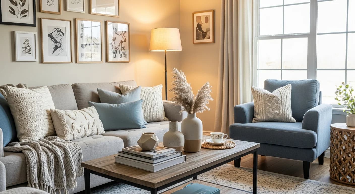
Understanding how to match furniture with your décor style is the difference between a room that feels collected and cohesive and one that looks like a showroom floor of disconnected pieces. The challenge is not buying matching sets — that approach often feels sterile and predictable. True coordination means selecting pieces that share underlying design DNA: compatible wood tones, complementary upholstery textures, harmonious leg profiles, and balanced visual weight. Interior designers achieve this by applying consistent coordination principles rather than matching catalogs, allowing rooms to feel curated over time rather than purchased all at once. This guide breaks down 8 secrets that professionals use to make mismatched furniture feel unified.
Why Matching Sets Feel Wrong (And What to Do Instead)
Buying a complete furniture set from a single collection guarantees that everything matches — and that is precisely the problem. Rooms filled with identical wood finishes, uniform fabric, and synchronized design details feel like catalog pages rather than lived-in spaces. A 2024 study by the American Society of Interior Designers found that homeowners rated rooms with coordinated (but not matching) furniture as 34% more attractive than rooms with identical sets. The key distinction: coordination creates harmony through shared elements like color undertones, material families, and proportional relationships, while matching creates uniformity through identical repetition.
The goal is a room where each piece feels like it belongs — not because every item came from the same store, but because shared design threads connect them visually. A walnut mid-century sideboard can coexist beautifully with a contemporary linen sofa and vintage brass side tables when they share warm undertones and clean-lined silhouettes. The following 8 secrets show you exactly how to create this kind of intentional cohesion. For mixing vintage and modern pieces specifically, see our modern and vintage mixing guide.
Secret 1 — Match Wood Tone Undertones, Not Exact Shades
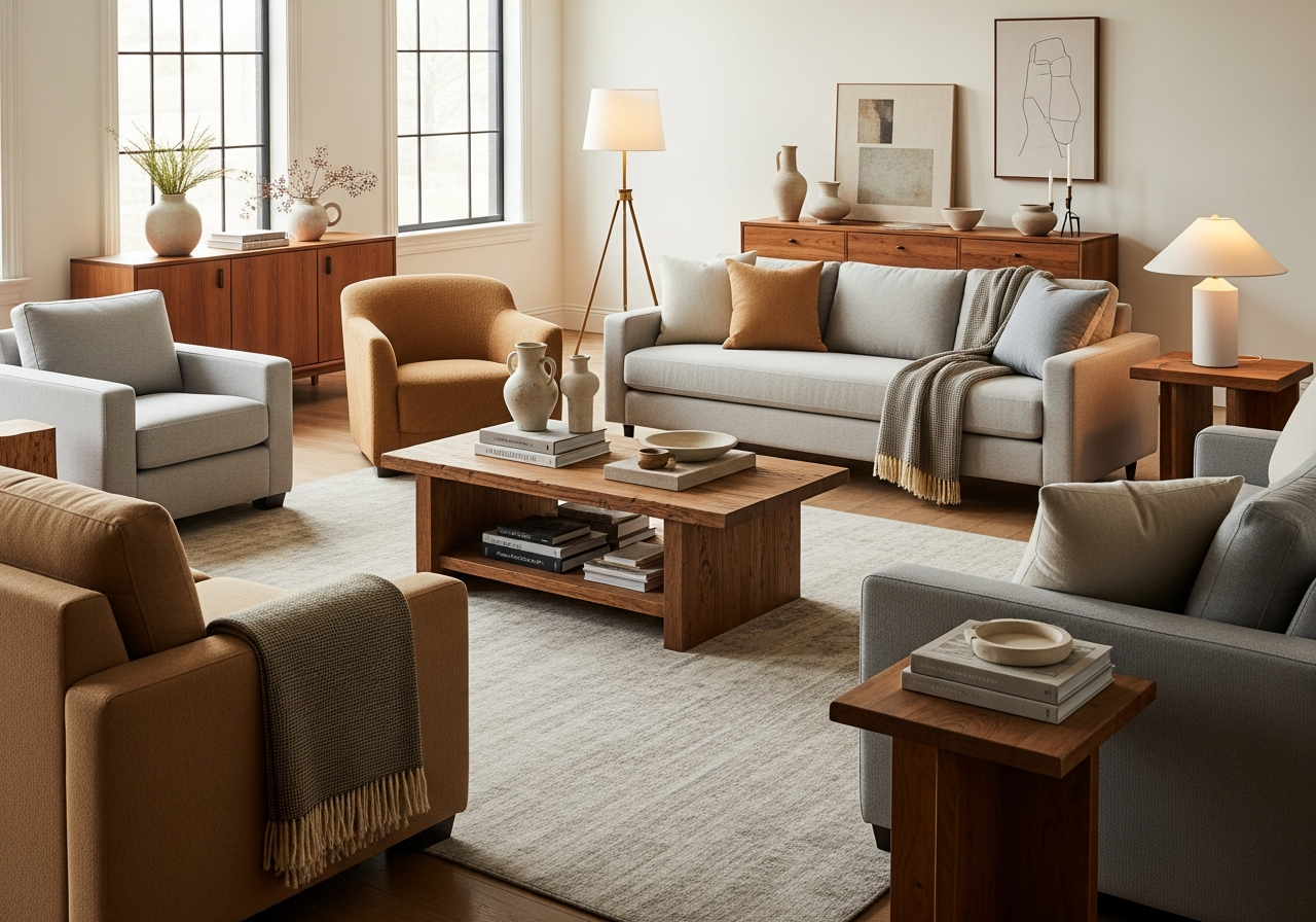
Different wood species and stains can coexist harmoniously when they share the same undertone family: warm (yellow, orange, red) or cool (gray, ashen, blue-tinted). A honey oak dining table, a walnut media console, and a cherry bookcase all share warm, golden undertones and will look cohesive despite being three different shades. Problems arise when you mix warm woods (golden oak) with cool woods (gray-washed pine) without a visual bridge. If you must combine warm and cool tones, use a transitional piece — like a painted or lacquered item — between them. Limit a room to 2 to 3 wood tones maximum to prevent visual fragmentation.
Secret 2 — Coordinate Upholstery Through a Shared Color Family
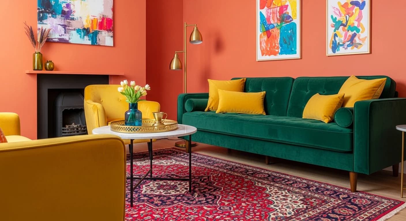
Upholstered pieces — sofas, armchairs, dining chairs, ottomans — should share a color relationship even when their fabrics differ. The easiest approach is a tonal range: choose one color family (neutrals, blues, earth tones) and vary the shade and texture. A charcoal linen sofa pairs naturally with a heather gray velvet armchair and stone-colored boucle throw pillows — all are neutral-family fabrics with different textures that create visual depth without clashing. When you layer multiple fabric patterns across upholstered pieces, our pattern mixing guide explains the scale and color rules that prevent visual chaos. If you want to introduce a contrasting accent color, limit it to 10 to 15% of the room's upholstered surfaces (typically one accent chair or a set of throw pillows).
Secret 3 — Pay Attention to Leg Profiles
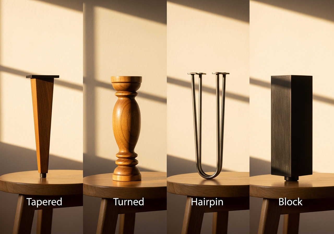
Furniture legs are one of the most overlooked coordination details, but they profoundly affect a room's visual cohesion. Tapered legs (mid-century modern) create a different mood than turned legs (traditional), which feel distinct from hairpin legs (industrial) or block legs (contemporary). You do not need identical legs on every piece, but the legs visible within a single sightline should share a general profile family. In a living room, a sofa on tapered wooden legs, a coffee table on slim metal legs, and an armchair on tapered legs all share the slim, elevated profile that creates visual lightness and consistency.
Secret 4 — Balance Visual Weight Across the Room
Visual weight refers to how heavy a piece appears based on its size, color, material density, and how much floor space it occupies. A massive leather Chesterfield sofa carries far more visual weight than a slim-profile modern linen settee. When arranging furniture, distribute visual weight evenly — avoid clustering all heavy pieces on one side of the room. If you have a substantial sofa, balance it with a weighty bookcase or cabinet on the opposite wall. Our living room layout guide covers furniture placement strategies that balance visual weight across the full floor plan. A room with all heavy furniture feels oppressive; a room with all lightweight pieces feels insubstantial. The ideal mix combines 2 to 3 substantial anchor pieces with lighter supporting pieces.
Secret 5 — Use Scale and Proportion as Your Guide
Furniture should relate proportionally to the room's dimensions and to each other. A common mistake is placing a petite loveseat in a large living room with a massive fireplace — the loveseat looks lost. Conversely, an oversized sectional in a small apartment living room overwhelms the space. As a guideline, the sofa's width should be 60 to 75% of the wall it faces. Side tables should be within 2 inches of the sofa arm height. A coffee table should be 12 to 18 inches shorter than the sofa seat height and roughly two-thirds the sofa's length. These proportional relationships create visual harmony that the eye recognizes instinctively.
Secret 6 — Repeat One Element Three Times
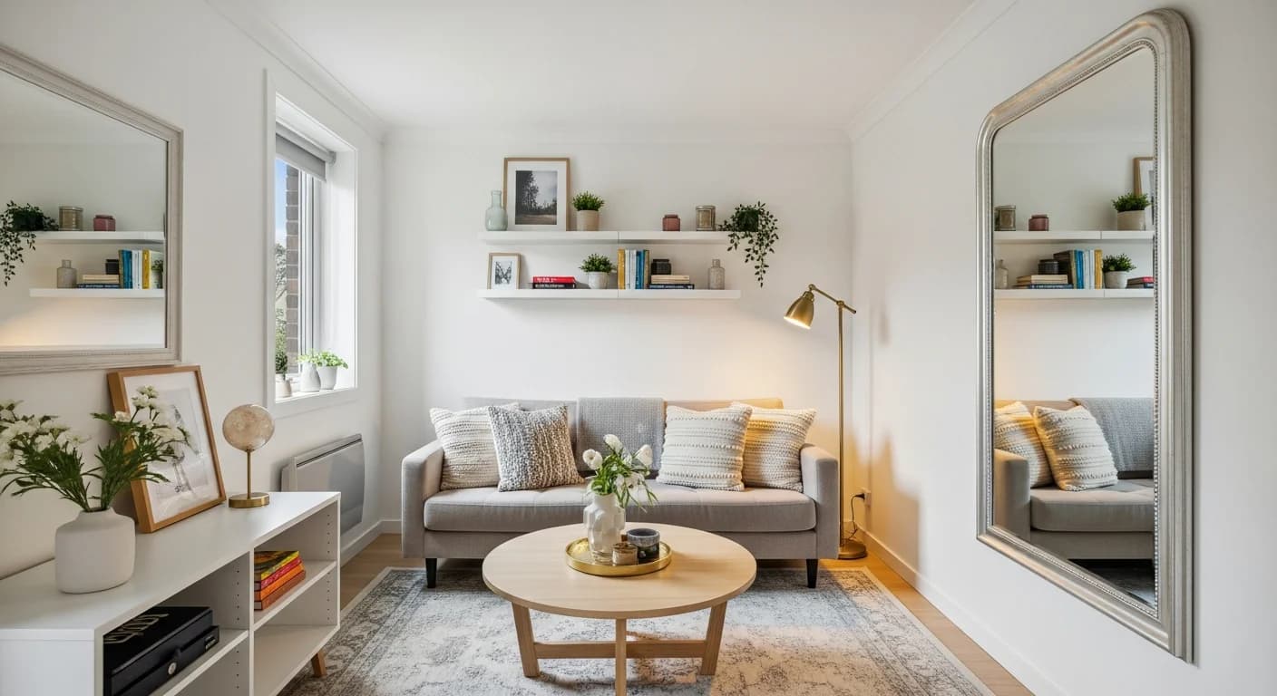
The rule of three is a design principle that creates rhythm through repetition. Choose one design element — a specific metal finish, a curve motif, a fabric texture, or a color accent — and repeat it at least three times across the room. For example, if your light fixture is brushed brass, echo brass in the side table base and picture frame hardware. If your sofa has a curved arm profile, repeat curves in a round coffee table and an arched mirror. This repetition creates visual threads that tie disparate pieces together, making the room feel designed rather than assembled. Learn how to coordinate metal finishes specifically in our metal mixing guide.
Secret 7 — Bridge Styles with Transitional Pieces
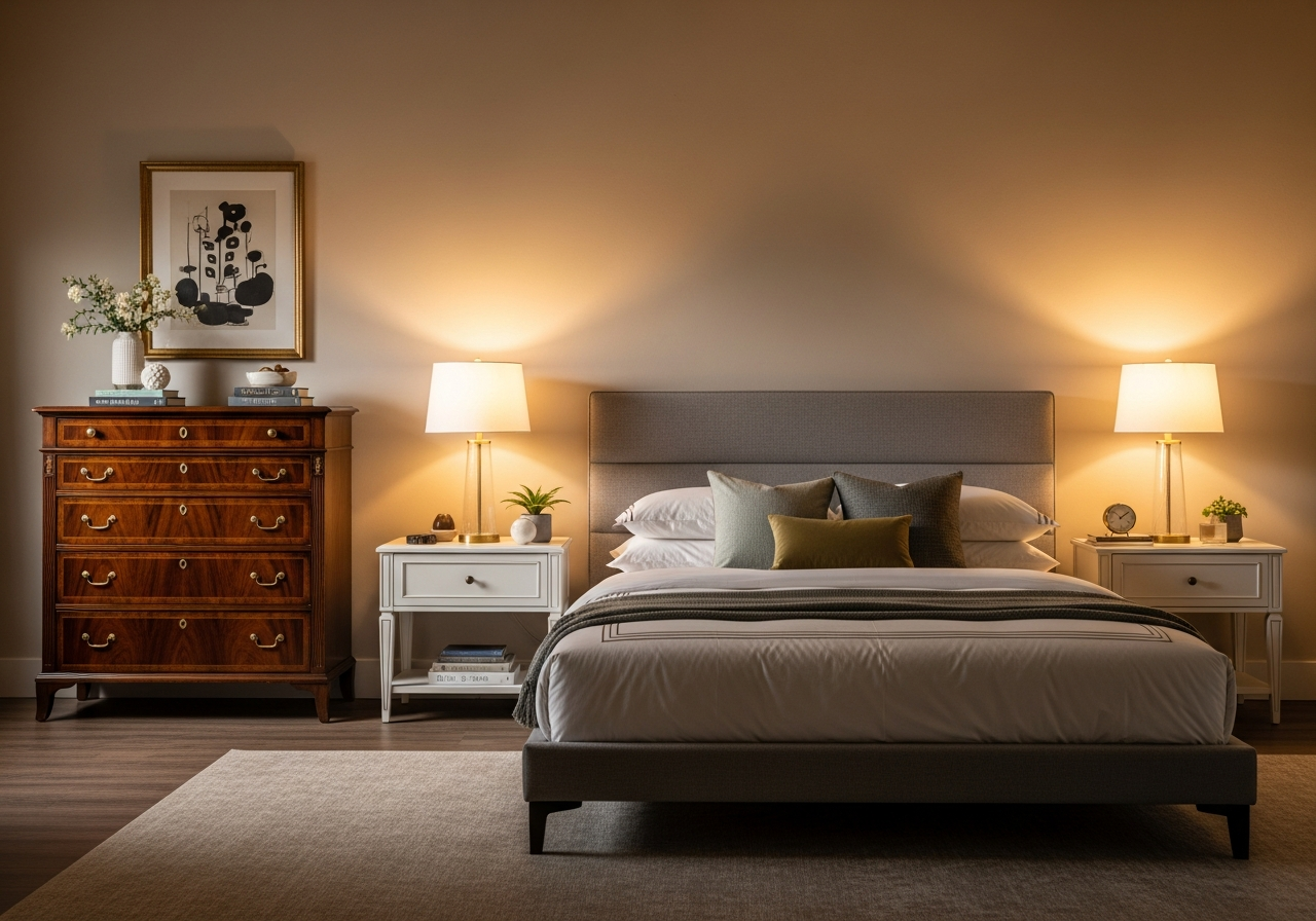
When your existing furniture spans multiple styles — a traditional heirloom armoire next to a modern platform bed, for instance — transitional pieces bridge the gap. Transitional furniture blends elements from both traditional and contemporary design: clean lines with subtle curves, neutral finishes with refined detailing, and simple silhouettes with quality materials. A transitional nightstand with tapered legs and a single decorative drawer pull can sit comfortably between a modern bed frame and a traditional dresser, connecting both without matching either. Use 1 to 2 transitional bridge pieces in rooms where style mixing would otherwise create jarring contrasts. For techniques on mixing modern and traditional aesthetics, see our modern and traditional blending guide.
Secret 8 — Use Textiles and Accessories as the Final Unifier
When furniture pieces are close but not quite cohesive, textiles and accessories bridge the remaining gap. A throw blanket that picks up the sofa's gray and the accent chair's mustard ties the two together. Pillows in a print that combines the room's dominant and accent colors create a visual bridge across seating pieces. A rug that incorporates multiple colors present in the room's furniture anchors everything into a unified ground plane. These soft elements are the easiest and most affordable way to create cohesion — and they are simple to swap seasonally for a refreshed look without replacing furniture.
Room-by-Room Furniture Coordination Tips
In living rooms, coordinate the sofa, coffee table, side tables, and accent chairs through shared wood tones and a unified upholstery color family. In bedrooms, the bed frame, nightstands, and dresser should share a wood tone undertone, but nightstands do not need to match each other — mismatched nightstands add personality when they share a similar height and visual weight. In dining rooms, the table and chairs should relate in formality level — a rustic farmhouse table with delicate Louis XVI chairs creates a disconnect, while a farmhouse table with simple Windsor chairs or upholstered parsons chairs feels appropriately casual. For specific chair coordination advice, see our guide on matching chairs with room decor.
Related Articles
Deepen your furniture coordination skills with these guides: learn how to match a rug to your existing decor for the perfect grounding element, discover how to incorporate antiques into modern rooms seamlessly, explore choosing a whole-home color palette that supports furniture coordination, and browse modern farmhouse living room ideas for style-mixing inspiration. Visit our living room ideas gallery to see coordinated furniture in action across dozens of design styles.
Frequently Asked Questions
Do all wood furniture pieces in a room need to match?
No, wood pieces do not need to match exactly. They should share the same undertone family — either warm (golden, honey, amber) or cool (gray, ash, whitewashed). Mixing 2 to 3 different wood species within the same undertone family creates a collected, curated look that feels richer than identical finishes throughout.
How do I coordinate furniture I already own?
Start by identifying what your existing pieces share: similar wood undertones, a common color in the upholstery, or matching metal hardware. Strengthen those shared elements with accessories — a throw pillow that bridges two furniture colors, a rug that contains both dominant tones, or matching lamp bases on mismatched side tables. If a single piece feels disconnected, a slipcover, new hardware, or a coat of paint can bring it into the family.
Is it okay to mix furniture from different eras and styles?
Yes, mixing eras and styles creates the most interesting interiors. The key is finding a shared thread — consistent proportions, matching undertones, a repeated material, or a unifying color palette. A vintage brass side table next to a modern sofa works when the sofa's throw pillows include brass-gold tones that echo the table's finish.
What is the biggest mistake people make when matching furniture?
The biggest mistake is buying complete matching sets. While matching sets guarantee compatibility, they sacrifice the personality and visual depth that coordinated (but varied) pieces provide. The second most common mistake is ignoring scale — placing small-scale furniture in large rooms or vice versa, creating proportional discord that no amount of accessorizing can fix.
Visualize Your Furniture Coordination with HanoDecor
Wondering how new furniture will look alongside your existing pieces? Upload a photo of your room to HanoDecor's Room Designer and experiment with different furniture styles, wood tones, and upholstery colors in your actual space. See how a mid-century walnut coffee table looks next to your contemporary sofa, or test whether a traditional accent chair creates the right contrast. Visualize the coordination before committing to a purchase.
How to Match Furniture with Your Decor FAQs
Written by
Priya Sharma
Priya is an award-winning UX designer who previously led design teams at Airbnb and Pinterest. Her focus on user-centered design ensures that HanoDecor's tools are intuitive and accessible to everyone, regardless of their technical background.