Neutral Home Decor Ideas: Warm Tonal Palettes for Serene Spaces

Neutral home decor has emerged as one of the most sought-after interior design approaches in 2026, and for good reason. A well-executed neutral palette transforms any space into a serene retreat that feels both timeless and deeply personal. Unlike the sterile, all-white minimalism of years past, today's neutral interiors embrace warmth, depth, and rich tonal layering that makes every room feel inviting and lived-in.
Whether you're drawn to creamy beiges, sandy taupes, or earthy terracotta undertones, neutral decorating offers a versatile foundation that adapts to any home style. In this comprehensive guide, we'll explore how to master warm tonal palettes, layer textures for visual interest, and create spaces that feel anything but boring. If you're looking for broader inspiration across all design styles, start with our complete home decor ideas guide for 2026.
Quick Overview: The Power of Neutral Decor
Neutral decorating is far more than simply choosing beige walls and calling it done. It's a deliberate design strategy that uses a carefully curated range of muted, earth-inspired tones to create cohesive, calming environments. The approach has surged in popularity as homeowners seek refuge from the visual noise of heavily saturated interiors and busy pattern-driven designs.
Why Neutral Is Trending in 2026
Several factors drive the neutral decor movement. First, the wellness-at-home trend has homeowners prioritizing spaces that reduce visual stress and promote relaxation. Second, the sustainability movement favors timeless palettes over trend-driven colors that feel dated within a year. Third, neutral foundations offer unparalleled flexibility: swap out accessories seasonally without repainting or replacing furniture. For more on creating calming environments, explore our cozy home decor ideas guide.
Warm vs. Cool Neutrals
Not all neutrals are created equal. Warm neutrals carry yellow, orange, or red undertones: think beige, cream, camel, sand, and terracotta. They create inviting, cozy atmospheres perfect for living rooms and bedrooms. Cool neutrals lean toward blue, green, or purple undertones: gray, silver, stone, and cool white. They feel more modern and architectural. The most sophisticated neutral interiors often blend both warm and cool tones, using warm neutrals as the dominant palette with cool accents for contrast and depth.
Understanding Neutral Color Theory
Before selecting your neutral palette, understanding color theory fundamentals will help you avoid the most common mistakes. Every neutral color has an undertone, and matching those undertones is what makes a neutral room feel harmonious rather than disjointed.

Warm Neutrals: The Foundation
Beige remains the quintessential warm neutral, but 2026's beige is far from the builder-grade tan of the early 2000s. Today's beiges are nuanced and complex: think greige (gray-beige), mushroom, oatmeal, and linen. Cream and ivory offer softer alternatives to bright white, adding warmth without heaviness. Camel and cognac bring richness through leather accents and woven textiles. Terracotta and clay add earthy warmth reminiscent of sun-baked landscapes. Sand and wheat tones bridge the gap between beige and gold, adding subtle luminosity to any surface.
Cool Neutrals: The Balance
Cool neutrals serve as essential counterpoints in a warm-dominant palette. Greige (the perfect marriage of gray and beige) works as a bridge between warm and cool. Stone and concrete tones add architectural gravitas. Warm white (with just a hint of yellow or cream) prevents spaces from feeling clinical. Charcoal provides dramatic contrast without the harshness of pure black, anchoring lighter tones and creating visual depth.
Tonal Ranges and Undertone Matching
The secret to a professional-looking neutral palette is maintaining consistent undertones throughout a space. If your sofa is a warm beige with yellow undertones, your throw pillows, rug, and curtains should share that same warm base. Mixing warm and cool undertones carelessly creates visual tension that makes a room feel 'off' even when you can't identify why. Use the Room Designer tool to experiment with different neutral combinations before committing to purchases.
Texture: The Key to Neutral Spaces
Here's the fundamental truth of neutral decorating: without texture, neutral rooms fall flat. When you remove color as the primary source of visual interest, texture must step in to carry the design. This is where neutral decor becomes genuinely exciting, because the possibilities for textural layering are virtually endless.

Essential Textures for Neutral Rooms
Linen is the backbone of neutral interiors. Its natural slub weave adds organic character to curtains, upholstery, bedding, and throw pillows. Wool brings warmth and depth through chunky knit throws, bouclé upholstery, and felted accessories. Leather introduces richness and develops beautiful patina over time; cognac, tan, and saddle leather are natural partners for warm neutral palettes. Wood grain adds organic pattern and warmth: light oak for Scandinavian-influenced spaces, walnut for mid-century warmth, or reclaimed wood for rustic character. Our farmhouse decor guide explores wood textures in depth.
Stone provides cool, grounding weight through marble trays, travertine vases, and limestone accessories. Woven materials like rattan, cane, jute, and seagrass add handcrafted character and organic geometry. Ceramic and pottery offer smooth or rough surfaces that complement softer textiles. Each material brings its own visual weight and tactile quality, and the interplay between smooth and rough, soft and hard, matte and glossy is what gives neutral rooms their soul.
The Layering Technique
Professional designers layer a minimum of five different textures in any well-designed neutral room. Start with large-scale textures (upholstery fabric, rug material, wall treatment), add mid-scale textures (throw blankets, curtains, accent pillows), then finish with small-scale textures (decorative objects, books, candles, pottery). The goal is creating visual rhythm that guides the eye naturally around the room without any single element demanding attention.
Neutral Living Room Decor
The living room is where neutral palettes truly shine. This high-traffic, multi-purpose space benefits enormously from the calming, adaptable nature of warm neutral tones. A well-designed neutral living room feels simultaneously elegant and approachable, polished yet perfectly comfortable.
Tone-on-Tone Sofas and Seating
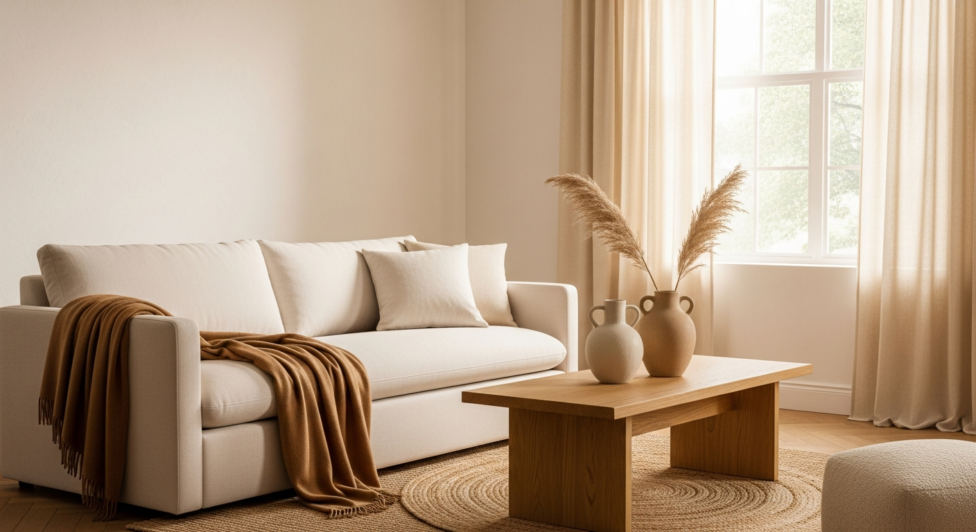
Start with a generously proportioned sofa in a warm neutral tone: oatmeal linen, sand-colored performance fabric, or creamy bouclé. Layer with throw pillows in varying shades of the same tonal family; a cream sofa might feature pillows in wheat, camel, and warm taupe. This tonal layering approach creates depth without visual clutter. Add a pair of accent chairs in a complementary neutral, perhaps a cognac leather club chair or a mushroom-toned velvet armchair. If you appreciate the clean-lined approach, our modern home decor guide covers contemporary neutral arrangements.
Natural Wood Accent Pieces
Natural wood furniture grounds neutral living rooms with organic warmth. A live-edge walnut coffee table, oak console, or teak side table introduces grain patterns and tonal variation that enriches the palette. Choose wood tones that complement your neutral base: lighter woods (white oak, ash, birch) for cooler neutrals, darker woods (walnut, teak, mahogany) for warmer palettes.
Woven Area Rugs and Accessories
A jute, sisal, or wool area rug anchors the seating area while adding crucial textural contrast. Natural fiber rugs in particular bring warmth and casual elegance that perfectly suits neutral schemes. Accessorize with stone coasters, ceramic sculptural objects, woven baskets for storage and display, and warm-toned art featuring abstract organic forms or muted landscape photography. For inspiration on overall room arrangement, visit our project gallery.
Neutral Bedroom Decor
Neutral bedrooms are the ultimate expression of restful design. The bedroom is where the calming properties of neutral palettes deliver the greatest impact, promoting better sleep and genuine relaxation through visual tranquility.

Linen Bedding and Bouclé Throws
Invest in high-quality linen bedding in warm white, natural flax, or soft oatmeal. Linen's natural texture and subtle wrinkles add character that percale or sateen simply cannot replicate. Layer a chunky bouclé or waffle-knit throw at the foot of the bed for textural contrast and warmth. Add euro shams in a slightly deeper neutral, perhaps warm taupe or mushroom, to create depth against lighter sheets.
Wood Nightstands and Warm Accents
Flanking the bed with natural wood nightstands introduces organic warmth. Choose nightstands with visible grain patterns and simple, clean silhouettes. Top them with ceramic table lamps in matte finishes, small potted plants or dried botanical arrangements, and a few carefully curated books with neutral-toned covers. The luxury home decor guide explores premium materials for elevated neutral bedrooms.
Ambient Lighting and Organic Mirrors
Lighting dramatically affects how neutral tones read in a space. Warm-toned bulbs (2700K-3000K) enhance cream, beige, and taupe tones, while cooler bulbs wash out warm undertones. Use dimmer switches to control atmosphere throughout the day. An organic-shaped or irregularly framed mirror above the dresser reflects light while adding sculptural interest. For those seeking minimalist simplicity, pair these mirrors with pared-back accessories for a clean, gallery-like feel.
Neutral Kitchen and Dining
Neutral kitchens and dining spaces feel simultaneously sophisticated and welcoming, the perfect backdrop for shared meals and daily life. The key is balancing warm tones with practical, durable materials that stand up to daily use while maintaining visual serenity.
Whitewashed Cabinets and Natural Stone
Whitewashed or off-white cabinets create a soft, luminous backdrop that avoids the starkness of pure white. Pair them with natural stone countertops in warm-toned marble, quartzite, or travertine to add organic pattern and visual weight. Open shelving in natural wood provides display space for ceramic dishware and woven baskets while breaking up expanses of cabinetry.
Rattan and Cane Dining Chairs
Rattan-backed or cane-seat dining chairs introduce woven texture and casual elegance to neutral dining spaces. Pair them with a natural wood dining table in oak, ash, or walnut. A simple linen table runner, ceramic vase with dried grasses or fresh greenery, and wooden cutting boards displayed as wall art or leaning against the backsplash complete the look without adding clutter.
Ceramic and Pottery Accents
Handmade ceramic vases, stoneware crocks, and artisan pottery add subtle tonal variation and tactile interest to neutral kitchens. Group pieces in varying heights and shapes on open shelving or along the countertop backsplash. Choose pieces with imperfect, organic shapes and matte or satin glazes in cream, sand, terracotta, and stone tones. Wooden cutting boards, marble trivets, and woven placemats round out the textural palette.
Adding Interest Without Color
One of the most common questions about neutral decorating is: how do you prevent rooms from feeling monotonous? The answer lies in strategic use of metallics, greenery, contrast, sheen variation, and architectural details to add visual interest without introducing saturated color.

Metallic Accents: Brass, Gold, and Copper
Warm metallics are neutral decor's best friend. Brushed brass cabinet hardware, gold-framed mirrors, copper pendant lights, and antique bronze accessories add warmth and luminosity that enriches neutral palettes. The key is consistency: choose one or two metallic finishes and repeat them throughout the space for cohesion. Avoid mixing more than two metallic tones in a single room.
Greenery and Natural Elements
Living plants add life, energy, and the only 'color' most neutral interiors need. Olive trees, fiddle leaf figs, trailing pothos, and architectural snake plants bring organic forms and verdant freshness that prevents neutral rooms from feeling stale. Dried botanicals, including pampas grass, dried eucalyptus, and wheat bundles, offer lower-maintenance alternatives that complement warm neutral tones beautifully.
Black Accents and Contrast
Strategic black accents provide the contrast neutral rooms need to avoid feeling washed out. Matte black picture frames, iron candle holders, wrought iron light fixtures, or a single piece of black-framed furniture create visual anchors that give the eye places to rest. Use black sparingly, as too much can overwhelm the softness of a neutral palette. Think of black accents as punctuation marks in a neutral sentence.
Varying Sheen Levels
Mixing matte and glossy surfaces within the same tonal range creates subtle visual interest that rewards closer inspection. A matte ceramic vase next to a glossy glazed bowl, a satin-finish wood table paired with a high-gloss lacquer tray, or matte linen curtains beside polished marble accessories. These sheen variations catch and reflect light differently, adding dimension to monochromatic spaces. Check our design service pricing for professional consultation on perfecting these details.
Architectural Details
Crown molding, wainscoting, board-and-batten walls, arched doorways, ceiling beams, and built-in shelving add structural interest through form rather than color. These elements create shadow lines and dimensional depth that give neutral rooms character and sophistication. Even in rental spaces, temporary solutions like peel-and-stick molding or removable panel strips can add architectural interest without permanent changes.
Common Neutral Decorating Mistakes
Even the most well-intentioned neutral interiors can fall flat when these common pitfalls aren't addressed. Avoiding these mistakes is what separates sophisticated neutral spaces from rooms that simply feel unfinished.
Mistake 1: Too Matchy-Matchy
Buying every piece in the exact same shade of beige creates a flat, dimensionless room that feels like a furniture showroom rather than a home. Instead, vary your neutrals across a tonal range: pair light cream with warm taupe, medium oatmeal with deep cognac, sandy tan with rich walnut. Each piece should be recognizably part of the same neutral family while contributing its own tonal voice.
Mistake 2: Ignoring Undertones
Mixing warm-undertoned neutrals with cool-undertoned neutrals without intention creates visual discord. A warm beige sofa against a cool gray wall can feel jarring rather than harmonious. Before purchasing, compare samples in your space's specific lighting conditions. Natural daylight, incandescent bulbs, and LED fixtures all shift how undertones read. The Room Designer helps you visualize tonal combinations before buying.
Mistake 3: Forgetting Contrast
A room needs tonal contrast to have visual structure. Without darker anchor pieces (a walnut coffee table, charcoal throw, espresso-toned basket) and lighter highlights (cream pillows, white ceramics, pale linen), neutral rooms become a undifferentiated blur. Aim for at least three tonal levels: light, medium, and dark within your neutral palette.
Mistake 4: Skipping Anchor Pieces
Every neutral room needs at least one substantial piece that carries visual weight: a large-scale piece of art, a statement light fixture, an oversized mirror, or a dramatic piece of furniture. Without an anchor piece, neutral rooms lack a focal point and feel aimless. This anchor doesn't need to be colorful; a large abstract painting in warm neutrals and metallics, a sculptural pendant light in brushed brass, or an oversized organic-shaped mirror all serve beautifully.
Frequently Asked Questions
What is the best neutral color for living room walls?
Warm white with a slight cream or beige undertone works universally well for living room walls. Colors like Benjamin Moore's White Dove, Sherwin-Williams Accessible Beige, or Farrow & Ball Skimming Stone provide the warm, inviting backdrop that complements most furniture and decor. Test samples in your specific lighting before committing, as north-facing and south-facing rooms read neutral tones very differently.
How do I make a neutral room not look boring?
Layer at least five different textures (linen, wool, leather, wood, stone), incorporate metallic accents for warmth and luminosity, add living greenery, use artwork with organic forms, and ensure you have tonal contrast from light to dark. Texture is the single most important element that prevents neutral rooms from feeling flat.
Can I mix warm and cool neutrals together?
Yes, but intentionally. Use one temperature as your dominant palette (typically warm) and the other as an accent. A warm beige and cream room benefits from touches of cool gray or stone-toned accessories. The ratio should be approximately 80% dominant temperature to 20% accent for the most harmonious result.
What accent colors go with neutral decor?
Neutral palettes pair beautifully with muted, nature-inspired accents: sage green, dusty blue, terracotta, rust, mustard, and plum. These colors complement rather than compete with neutral foundations. Introduce accent colors through easily changeable elements like throw pillows, small artwork, or decorative objects so you can refresh the look seasonally.
Is neutral decor going out of style?
Neutral decor is inherently timeless, which is precisely its appeal. While specific neutral shades cycle in popularity (greige dominated 2018-2022, warm beige returned in 2023-2026), the overall approach of building rooms around muted, natural tones remains perpetually relevant. Unlike trend-driven palettes, neutral foundations age gracefully and adapt easily to evolving tastes.
How do I choose between beige and gray for a neutral palette?
Consider your home's fixed elements (flooring, countertops, fireplace material) and your personal warmth preference. Beige works best with warm-toned hardwood floors, natural stone, and in rooms with abundant natural light. Gray suits cooler-toned flooring, contemporary architecture, and spaces where you want a more modern, architectural feel. Greige offers a versatile middle ground that bridges both temperatures.
What materials are essential for neutral decorating?
The five essential materials are linen (softness and organic texture), wood (warmth and grain pattern), leather or suede (richness and patina), stone or marble (cool contrast and weight), and woven naturals like jute or rattan (handcrafted character). These materials provide the textural variety that makes neutral rooms visually engaging.
How do I add personality to a neutral room?
Personal collections, travel souvenirs, family photos in simple frames, vintage or antique finds, and handmade artisan pieces all inject personality without disrupting a neutral palette. The beauty of neutral rooms is that personal objects become the stars rather than competing with bold wall colors or busy patterns. Choose objects that tell your story, and they'll naturally become conversation pieces.
Create Your Calm, Neutral Retreat
Designing a beautiful neutral interior is about understanding the nuances of tone, the power of texture, and the art of restraint. From warm beige living rooms to serene cream bedrooms, neutral palettes offer a timeless foundation that grows more beautiful with each carefully chosen addition.
Ready to see how warm neutral tones would look in your own space? Use our AI-powered Room Designer to experiment with different neutral palettes, texture combinations, and furniture arrangements. Upload a photo of your room and visualize the transformation before making a single purchase.
For more style-specific inspiration, explore our guides to modern home decor, luxury interiors, farmhouse charm, and minimalist living. Each guide offers room-by-room advice and expert tips for achieving your ideal aesthetic.
Neutral Home Decor Ideas FAQs
Written by
Lisa Wang
Sustainable Design Writer focused on eco-friendly materials, energy efficiency, and budget-conscious home improvement. LEED Green Associate with expertise in low-impact renovation strategies.