How to Arrange Wall Decor: 9 Stunning Gallery Wall Layouts That Work
Quick Summary
This guide covers 9 proven wall decor arrangement layouts — from classic gallery walls to modern asymmetric groupings. Learn the spacing formulas, measurement techniques, and composition rules that interior designers use to create visually balanced wall displays in every room of your home.
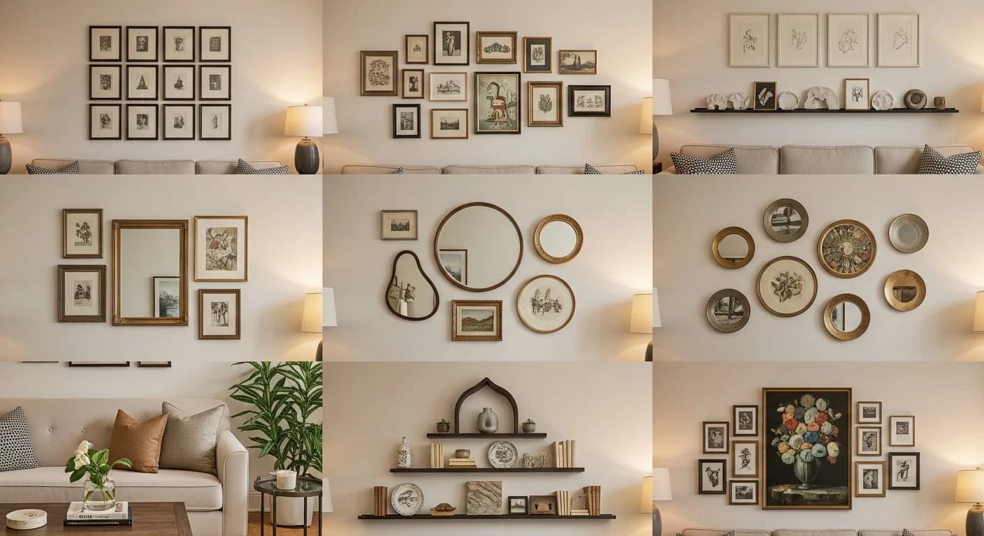
Knowing how to arrange wall decor transforms blank walls into curated design statements that anchor an entire room. Whether you are creating a gallery wall above a sofa, a grid arrangement in a hallway, or an asymmetric grouping in a stairwell, the difference between a professional-looking display and a haphazard collection comes down to spacing, alignment, and visual weight distribution. Designers use specific formulas — consistent 2 to 3 inch gaps, center-line alignment at 57 inches from the floor, and the rule of thirds for asymmetric compositions — to create arrangements that feel intentional rather than random. This guide walks you through 9 arrangement templates that work in any room, with exact measurements and step-by-step hanging instructions.
Why Wall Arrangement Matters More Than the Art Itself
Even expensive artwork looks disjointed when hung at inconsistent heights or with uneven spacing. A 2025 Houzz survey found that 68% of homeowners who felt unsatisfied with their wall decor cited arrangement issues rather than the pieces themselves. The composition — how pieces relate to each other and to the furniture below — determines whether a wall feels polished or chaotic. Gallery wall arrangements create visual cohesion by grouping individual pieces into a unified display, while grid layouts impose order through repetition and symmetry. Understanding these principles lets you mix frame sizes, art styles, and decorative objects with confidence. Wall art is also a key step in our complete living room decorating guide, where it ties together furniture, textiles, and lighting.
Proper wall arrangement also affects how a room feels spatially. Hanging art too high makes ceilings feel lower and disconnects the decor from the furniture below. Clustering pieces too tightly creates visual tension, while spreading them too far apart loses the sense of grouping. The sweet spot — and the foundation of every layout in this guide — starts with the 57-inch rule and builds from there. If you need help with the physical hanging process, see our guide on how to hang wall decor at the right height.
Layout 1 — The Classic Symmetrical Grid
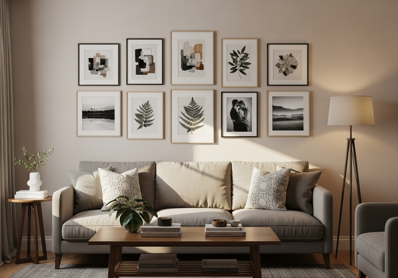
The symmetrical grid is the most beginner-friendly gallery wall layout and works best with identical or same-sized frames. Arrange frames in rows and columns with exactly 2.5 inches between each piece — this spacing creates visual breathing room without losing the grid's cohesion. A 3x3 grid of 11x14 inch frames creates a striking 41-inch-wide display that anchors a wall above a 72-inch sofa perfectly. For hallways, a vertical 2x4 grid of 8x10 frames fills narrow wall space elegantly. The key to grid success is precision: use a level and measure every gap consistently. Even a half-inch variance breaks the visual rhythm.
Grid arrangements work particularly well with black-and-white photography, botanical prints, or architectural sketches where the uniform framing reinforces the content's visual consistency. Choose frames in a single finish — matte black, natural oak, or brushed brass — to maintain the grid's clean geometry. This layout pairs beautifully with modern, minimalist, and Scandinavian interiors where clean lines are a design priority.
Layout 2 — The Salon-Style Gallery Wall
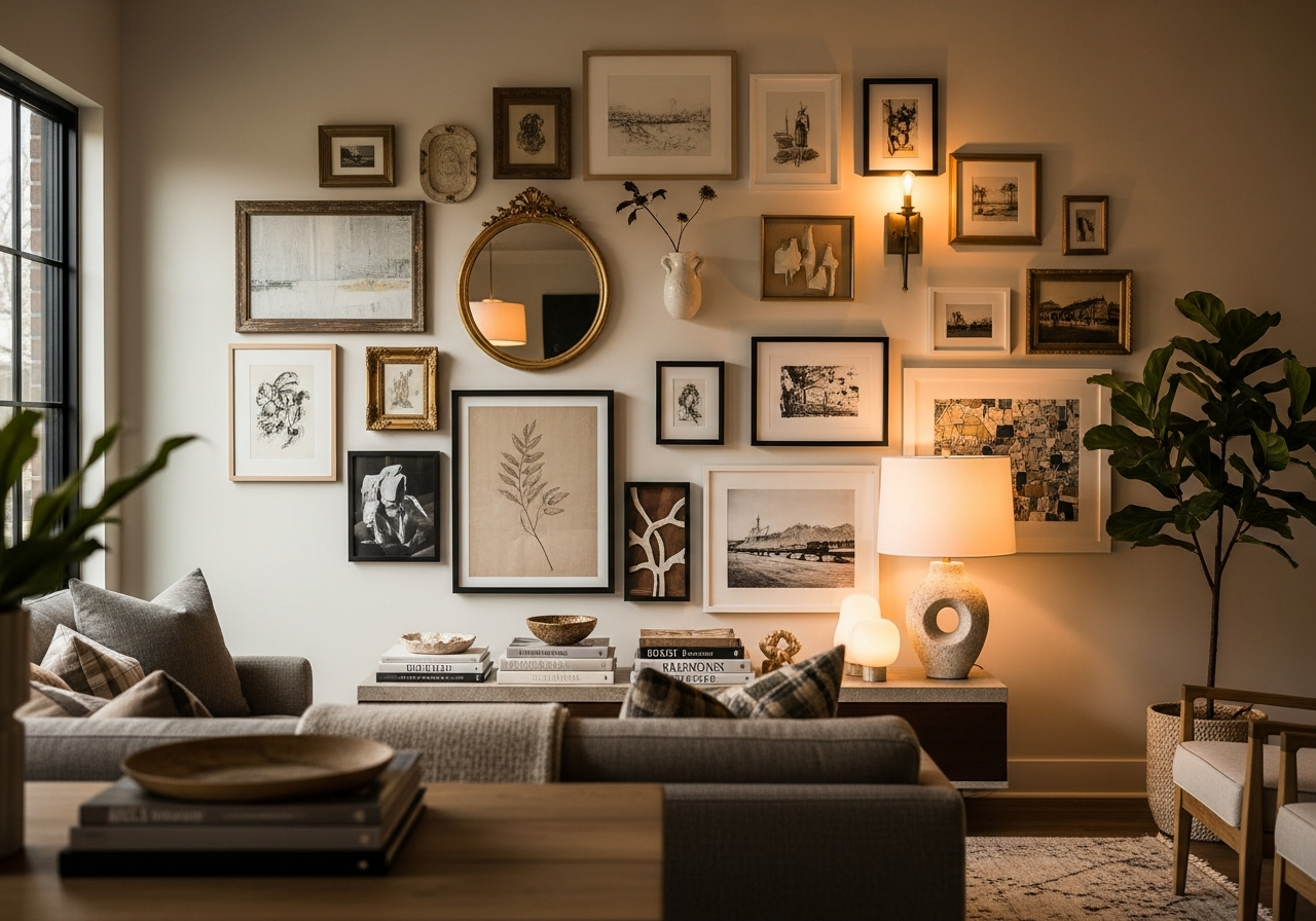
Salon-style arrangements — inspired by 18th-century Parisian galleries — fill an entire wall with mixed-size frames arranged in a seemingly organic but carefully planned composition. The secret is the invisible boundary: define a rectangular or square perimeter first, then fill it from the center outward. Start with your largest piece slightly off-center, then build around it with medium and small frames, maintaining 2 to 3 inches between each piece. The outer edges of the arrangement should align loosely with the invisible boundary, creating an orderly perimeter even though the interior is asymmetric.
This layout accommodates diverse frame sizes, orientations (portrait and landscape), and even three-dimensional objects like small shelves, decorative plates, or textile art. Aim for a mix of 60% framed art, 25% photographs, and 15% dimensional objects for visual variety. The salon style suits eclectic, bohemian, traditional, and maximalist interiors where personality and layered aesthetics are celebrated.
Layout 3 — The Horizontal Line Arrangement
A single horizontal row of frames creates a clean, contemporary look that works above furniture, along hallways, and in narrow spaces like above a headboard. Align all frames along their center line at 57 inches from the floor — the standard museum hanging height that places art at average eye level. Space frames 3 to 4 inches apart for a relaxed look, or tighten to 1.5 inches for a more cohesive band. Three to five pieces in a row is the ideal range; fewer than three feels sparse, while more than five can overwhelm a wall. This arrangement works best when all frames share the same height, though widths can vary for visual interest.
Layout 4 — The Staircase Step Arrangement
Staircase walls present unique challenges because the wall angle follows the stairs' incline. The solution is a stepped arrangement where frames ascend at the same angle as the staircase, with each piece's center approximately 57 inches above its respective stair tread. Maintain consistent spacing of 3 to 5 inches between pieces. Use frames of the same size for a clean look, or graduate from smallest at the bottom to largest at the top to mirror the staircase's upward movement. Measure the staircase angle using a protractor app on your phone, then replicate that angle with your frame arrangement using a taut string as a guide.
Layout 5 — The Diptych and Triptych
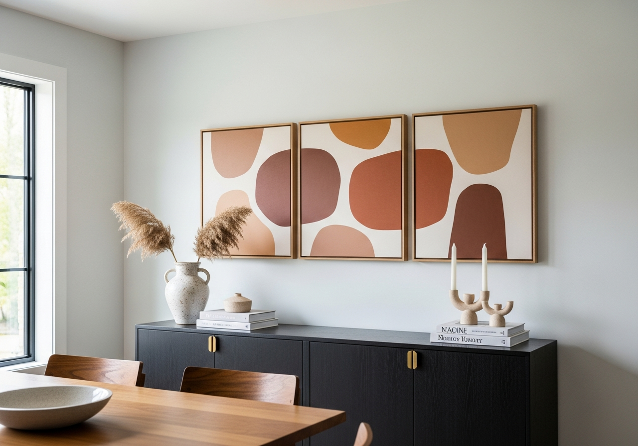
Diptychs (two-piece sets) and triptychs (three-piece sets) create a unified artwork from multiple panels. Hang panels with just 1 to 2 inches between them so the pieces read as a single composition rather than separate artworks. Center the overall grouping above the furniture below, ensuring the combined width is roughly 60 to 75% of the furniture's width. A triptych of 24x36 inch canvases with 1.5-inch gaps creates a dramatic 75-inch-wide statement piece that commands attention above a dining room buffet or living room sofa. This format works especially well with landscape photography, abstract art, and panoramic prints.
Layout 6 — The Asymmetric Cluster
Asymmetric clusters create dynamic visual energy by balancing unequal pieces through visual weight rather than symmetry. Place a large anchor piece off-center, then group two to four smaller pieces on the opposite side to counterbalance. The visual weight of the small group should roughly equal the large piece — a 24x30 inch frame balances well against a cluster of three 8x10 inch frames and one 5x7 inch frame. Keep spacing within the cluster tight (1.5 to 2 inches) while leaving 4 to 6 inches between the anchor piece and the cluster. This layout suits contemporary and mid-century modern rooms where dynamic composition adds character. Pairing vintage frames with modern prints is a hallmark of modern-vintage blending — asymmetric clusters are the ideal format for this style contrast.
Layout 7 — The Shelf-Ledge Display
Picture ledges and narrow floating shelves offer a flexible alternative to nail-based gallery walls. Lean frames against the wall on 3 to 4 inch deep ledges, layering pieces front to back for depth. Place larger frames in the back and smaller ones in front, overlapping edges by 1 to 2 inches for a collected, casual look. This approach allows you to swap art seasonally without patching nail holes — a particular advantage for renters. Install ledges 8 to 12 inches above furniture or 48 to 54 inches from the floor in hallways. Two stacked ledges spaced 16 to 20 inches apart create a layered display with double the capacity. For renter-friendly hanging options, explore our guide on hanging wall decor without nails.
Layout 8 — The Statement Single Piece
Sometimes one oversized piece creates more impact than a gallery of smaller works. A single 36x48 inch or larger artwork, photograph, or textile creates a bold focal point that simplifies the wall while commanding attention. Center the piece above the primary furniture piece, with the artwork's center at 57 inches from the floor. The width should be 50 to 75% of the furniture's width — an oversized piece above a narrow console looks top-heavy, while an undersized piece above a wide sofa looks lost. This minimalist approach suits modern, Scandinavian, and Japanese-inspired interiors where restraint is a design principle.
Layout 9 — The Mixed-Media Wall
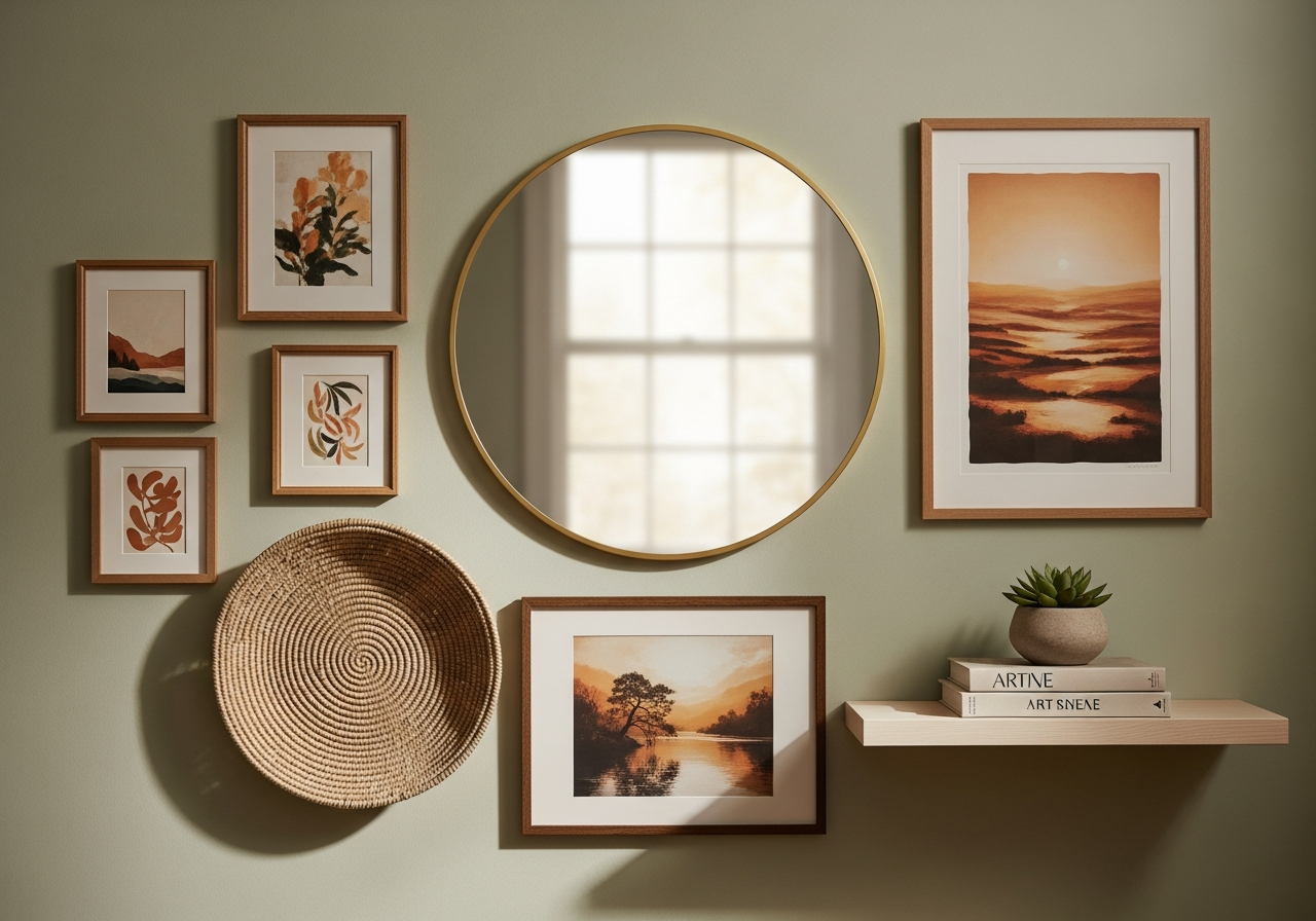
Mixed-media walls combine framed art with mirrors, woven baskets, metal sculptures, floating shelves, and decorative plates for a richly layered display. Start with two to three framed pieces as anchors, then fill gaps with dimensional objects. Mirrors work especially well in mixed-media arrangements — a round mirror among rectangular frames breaks up the geometry and bounces light across the room. Limit your palette to three to four finishes (for example, natural wood, brass, black metal, and woven rattan) to prevent the display from feeling cluttered — our metal mixing guide explains how to balance warm and cool finishes in these displays. Space objects 2 to 4 inches apart, grouping similar materials together for visual coherence within the larger arrangement.
The Paper Template Method for Perfect Placement
Before driving a single nail, use the paper template method that professional stylists rely on. Trace each frame onto kraft paper or newspaper, cut out the shapes, and tape them to the wall with painter's tape. Step back and evaluate the arrangement from across the room — adjust spacing, swap positions, and experiment freely without making holes. Mark hanging hardware locations directly on the paper templates, then transfer those marks to the wall. This method eliminates the trial-and-error of hanging and re-hanging that damages walls. For complex salon-style layouts, lay out all templates on the floor first to establish the composition, photograph it, then transfer to the wall section by section.
Room-by-Room Arrangement Guidelines
In living rooms, center your arrangement above the sofa with the grouping's width at 60 to 75% of the sofa's width. The bottom edge of the lowest piece should sit 6 to 8 inches above the sofa back. For dining rooms, hang art 6 to 12 inches above the table or buffet so seated guests can appreciate it without craning their necks. In bedrooms, center art above the headboard with 4 to 6 inches of clearance — too close feels cramped, too high disconnects the art from the bed. Hallways benefit from linear or stepped arrangements that draw the eye along the corridor, with center-line height at 57 inches.
For bathrooms, choose humidity-resistant frames (metal or sealed wood) and hang pieces at least 4 inches away from splash zones. Kitchens work well with small clusters of 3 to 5 pieces in open wall areas between cabinets and appliances. Entryways set the tone for your entire home — a bold statement piece or a curated cluster above a console table creates an immediate impression. Browse living room design ideas for more inspiration on creating focal-point arrangements.
Frequently Asked Questions
What is the ideal spacing between frames in a gallery wall?
The ideal spacing between frames in a gallery wall is 2 to 3 inches for most arrangements. Grid layouts benefit from a consistent 2.5-inch gap, while salon-style compositions can vary between 2 and 4 inches. Tighter spacing (1 to 1.5 inches) works for triptychs and diptychs where panels should read as a single artwork. Always use consistent spacing within a single arrangement for visual cohesion.
How do I arrange wall decor above a sofa?
Center your arrangement horizontally above the sofa, keeping the total width between 60% and 75% of the sofa's width. The bottom edge of the lowest piece should be 6 to 8 inches above the sofa back. Choose a layout that complements the sofa's shape — a horizontal line or symmetrical grid for straight-back sofas, or a salon-style cluster for sectionals with varied heights.
Can I mix different frame styles in one gallery wall?
Yes, mixing frame styles creates a collected, eclectic look that adds personality. Limit your frame finishes to 2 or 3 complementary materials — such as matte black, natural wood, and brass — for cohesion. You can also unify mixed frames by using a consistent mat color (white or off-white works universally) or by sticking to a common color palette in the artwork itself.
What is the best wall arrangement for a small room?
In small rooms, a single statement piece or a tight cluster of 3 to 5 small frames creates impact without overwhelming the space. Avoid salon-style arrangements that cover large wall areas, as they can make small rooms feel busy. Mirrors incorporated into wall arrangements help small rooms feel larger by reflecting light and creating visual depth.
How do I arrange pictures on a staircase wall?
Arrange staircase pictures in a stepped diagonal line that follows the staircase angle. Center each piece 57 inches above its corresponding stair tread and maintain 3 to 5 inches between frames. Use the paper template method to test the arrangement before hanging, and keep frame sizes consistent or gradually increasing from bottom to top for visual flow.
Visualize Your Wall Decor Arrangement with HanoDecor
Planning a gallery wall or wall decor arrangement is easier when you can see the result before committing. Upload a photo of your wall to HanoDecor's Room Designer and experiment with different art arrangements, frame styles, and compositions virtually. See how a symmetrical grid compares to an asymmetric cluster, or test whether a single oversized piece suits your space better than a curated collection. Visualize the possibilities, then hang with confidence.
Related Articles
Explore more wall decor and styling guides: How to Hang Decor on Brick Walls covers fastener options for masonry surfaces. How to Hang Decor from the Ceiling adds a vertical dimension to your display. Renter-Friendly Hanging Guide provides damage-free solutions for apartments. For styling the shelves and surfaces below your gallery wall, see How to Style Wall Shelves and How to Decorate a Bedroom for headboard wall arrangement ideas.
How to Arrange Wall Decor FAQs
Written by
Lisa Wang
Sustainable Design Writer focused on eco-friendly materials, energy efficiency, and budget-conscious home improvement. LEED Green Associate with expertise in low-impact renovation strategies.