Living Room Wall Painting Ideas: Designs That Define Your Space
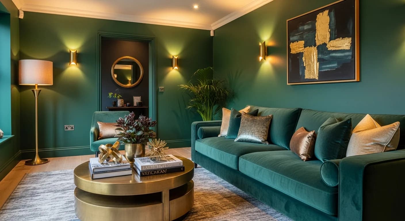
The living room is the room guests see first, the room where families gather, and the room that sets the tone for an entire home's design identity. That means its walls carry more visual weight than any other surface in the house. A thoughtfully painted living room wall does more than add color — it defines zones in open floor plans, creates depth in narrow rooms, draws the eye to architectural features, and establishes a mood that ripples through every adjacent space.
The good news is that most high-impact living room wall painting techniques require nothing more than quality paint, precise tape work, and a weekend. Whether you are considering a single bold accent wall or a full room color transformation, the ideas in this guide range from beginner-friendly to advanced — with material costs, color palette recommendations, and design rationale for each approach. For the complete overview of techniques across all rooms, see the full wall painting ideas guide.
Jewel-Tone Feature Walls: High Drama, Low Effort
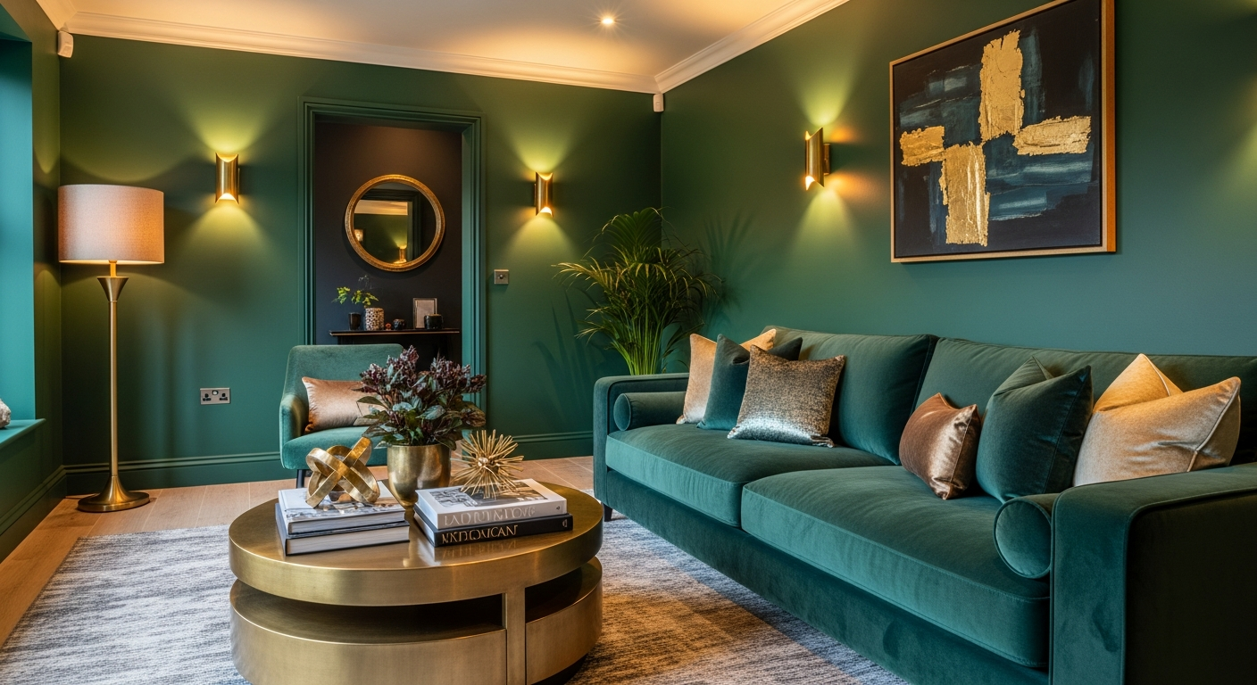
Emerald green: Emerald has emerged as the dominant living room accent color in 2026, and for good reason. It pairs naturally with warm metals (brass, gold, copper), complements both light and dark wood tones, and reads as sophisticated without feeling cold. Paint the wall directly behind the sofa for maximum impact. Two coats of a premium paint like Benjamin Moore's "Hunter Green" or Sherwin-Williams' "Shamrock" over a gray-tinted primer delivers full, even coverage. Budget $40-55 for a gallon of premium paint plus primer for a single accent wall.
Deep sapphire: Navy and sapphire blues create a cocooning effect that makes large living rooms feel more intimate and small living rooms feel intentionally moody rather than cramped. Pair sapphire walls with cream upholstery, natural linen curtains, and warm wood accents. The contrast between the deep wall and light furnishings creates visual drama without requiring any additional decoration. This color works particularly well in north-facing rooms where natural light tends toward cool tones — the blue leans into that quality rather than fighting it.
Rich amethyst: Purple is the most underused jewel tone in living room design, which makes it an excellent choice for homeowners who want their space to stand apart. Deep plum and amethyst shades pair beautifully with sage green accents, brushed nickel hardware, and warm-toned hardwood floors. Avoid pairing purple walls with cool gray furnishings — the combination reads as corporate rather than residential. Instead, choose creamy whites, warm taupes, and olive greens.
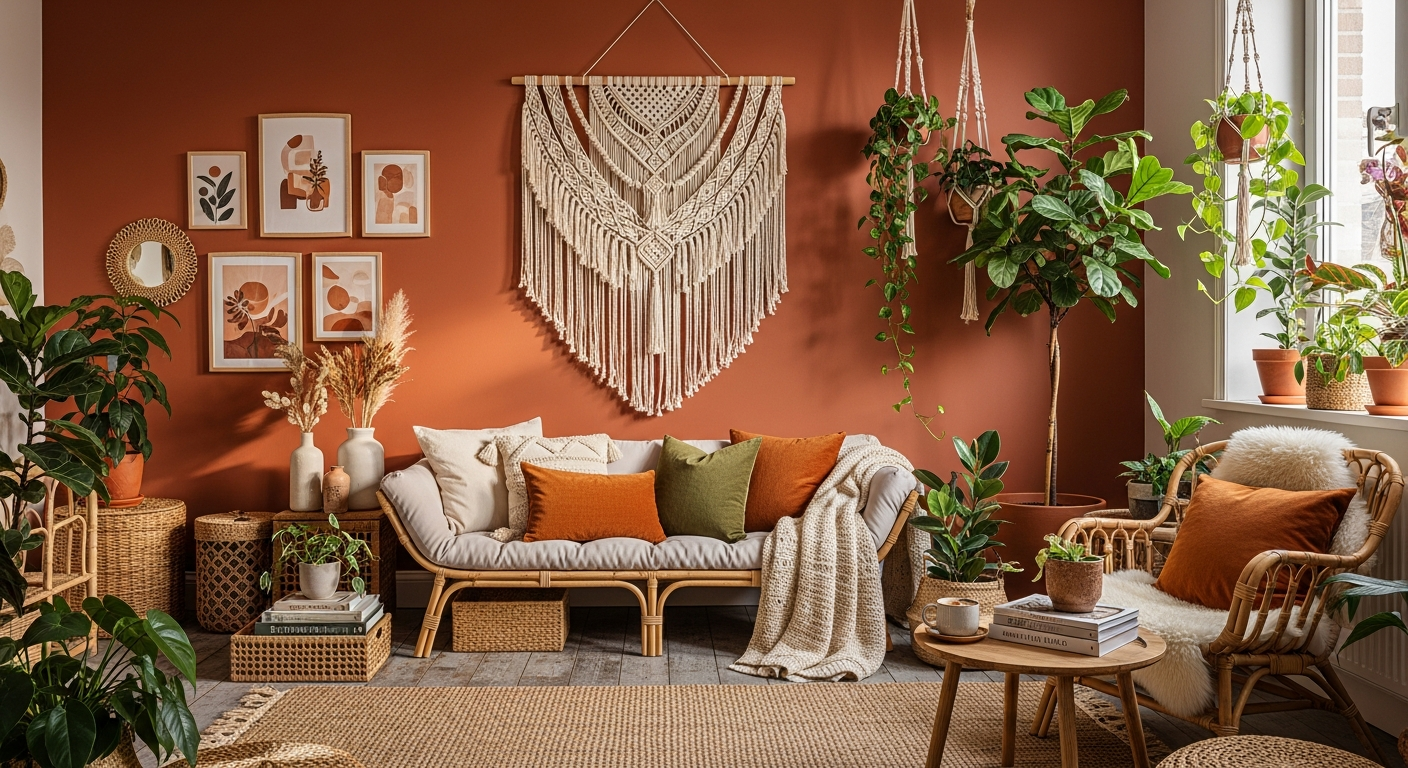
Burnt sienna and terracotta: These warm earth tones bring Mediterranean warmth to living rooms of any style. A terracotta accent wall behind built-in shelving creates a sense of depth that makes the shelves appear recessed. Pair with thoughtful wall decor — woven baskets, ceramic plates, or botanical prints — for a layered, collected look.
Two-Tone and Split Walls
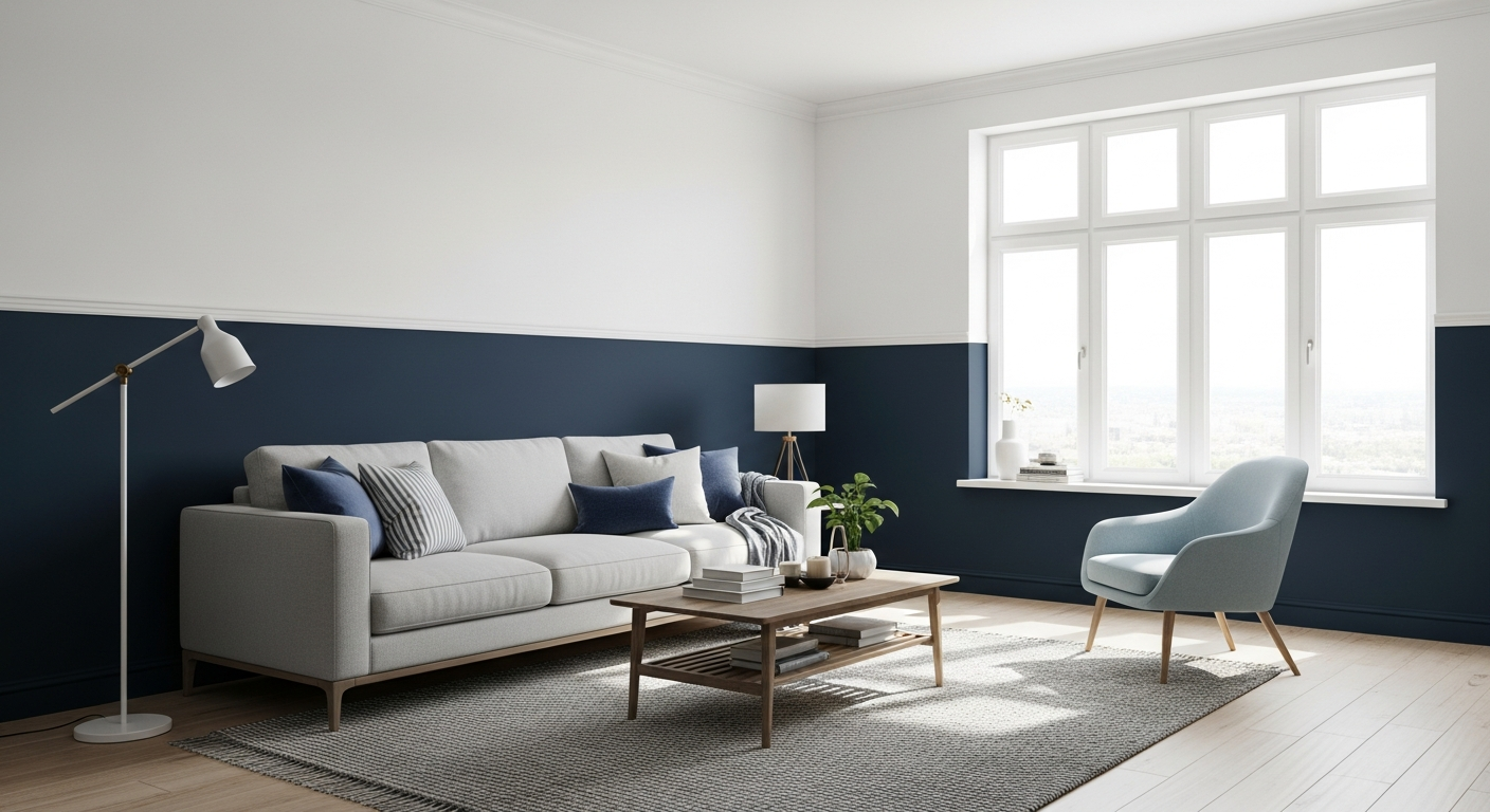
Horizontal split with chair rail illusion: Divide the wall at approximately 36 inches from the floor. Paint the lower section in a deeper, bolder color and the upper section in white or a very pale neutral. The visual effect mimics traditional wainscoting without any carpentry. For a clean transition line, apply a thin strip of quarter-round molding at the paint break (available at any hardware store for $2-4 per 8-foot length) and paint it the same color as the lower section. This technique works especially well in living rooms with 9-foot or higher ceilings where the wall space above the furniture can feel vast and empty.
Two-thirds split: Instead of splitting at the midpoint, paint the lower two-thirds in a bold color and leave the upper third white. This creates a more dramatic effect and draws the eye upward toward crown molding or ceiling details. The two-thirds proportion follows the golden ratio and naturally looks balanced without careful measurement — just divide the wall height by three and mark the upper third boundary with painter's tape.
Vertical split — the pillar effect: Paint a wide vertical band (3-4 feet wide) in a contrasting color centered behind a piece of art, a console table, or a fireplace. The vertical band creates the illusion of an architectural pillar or recessed panel. Deep charcoal on a white wall, or rich teal on a warm gray wall, both deliver striking results with minimal paint required.
Striped Walls: From Subtle to Bold
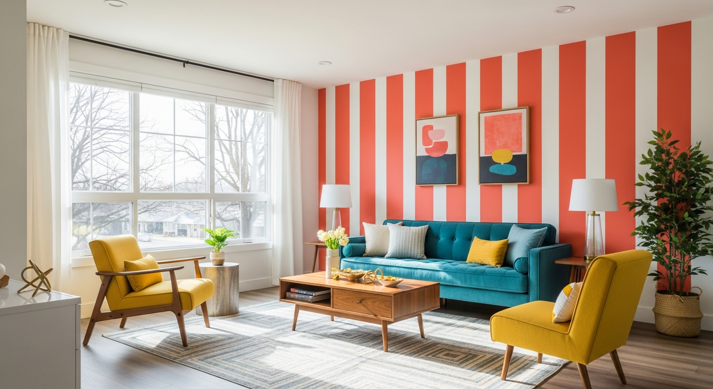
Wide horizontal stripes: Horizontal stripes visually widen a room, making them ideal for narrow living rooms or those with low ceilings. Use two closely related tones — like dove gray and pale silver — for a subtle, textured look, or go bold with contrasting pairs like coral and white for a mid-century modern statement. Stripes 8-12 inches wide create a classic proportion. Calculate the number of stripes by dividing your wall height by the stripe width, then adjust slightly so you end with full stripes at both the ceiling and baseboard.
Thin pinstripes: For a more refined look, use 1-inch painter's tape to create thin accent lines on a painted wall. Apply tape in a pinstripe pattern — one stripe every 12-18 inches — paint the entire wall in your base color over the tape, let it dry, then peel to reveal thin lines of the original wall color. This creates a wallpaper-like effect at a fraction of the cost. The technique pairs well with color psychology principles — blue pinstripes on white create a calm, coastal feel, while gold pinstripes on charcoal create a luxurious atmosphere.
Vertical accent stripes: Three to five wide vertical stripes in alternating colors behind a TV wall or bookshelf create visual structure. They draw the eye upward and make standard 8-foot ceilings feel taller. Choose colors within the same tonal family — varying shades of blue-green, for example — for a cohesive look that does not compete with the furnishings in front of it.
Color Drenching and Monochromatic Approaches
Full color drench: Color drenching — painting walls, trim, ceiling, and even doors in the same rich color — has become one of the most impactful living room trends in 2026. When every surface shares the same hue, the room becomes an immersive environment where architectural details (crown molding, window frames, built-ins) create visual interest through shadow and light rather than color contrast. Deep forest green, warm charcoal, and rich burgundy are the most popular drenching colors this year. The effect is dramatic and surprisingly calming. See the broader context in our 2026 interior design trends guide.
Tonal gradient across walls: Instead of drenching every surface in the same shade, use three to four tones from the same color family across different walls. The wall behind the sofa gets the deepest shade, adjacent walls get progressively lighter tones, and the wall with the most natural light gets the palest version. This creates a natural sense of depth and spatial flow without the commitment of a full color drench.
Monochromatic with textured contrast: Paint all walls the same color but use different finishes — matte on the main walls, satin on the accent wall, and semi-gloss on trim. The finish variations catch light differently throughout the day, creating a subtle, constantly shifting visual experience that looks far more intentional than a simple single-color paint job. Learn more about how different paint finishes affect a room's character.
Open Floor Plan Strategies
Using paint to define zones: In open-concept living spaces, wall paint is the most effective tool for defining functional areas without physical barriers. Paint the living area walls in one color family and the dining area walls in a complementary palette. For example, a warm gray living room flowing into a deep sage dining zone creates clear distinction while maintaining visual harmony. The color transition should occur at a natural architectural break — a column, a change in ceiling height, or where two walls meet at a corner.
Accent walls as room dividers: A single bold painted wall behind the sofa creates a visual anchor for the "living room" portion of an open plan. The rest of the walls can remain in a neutral tone. The accent wall functions as a spatial marker — guests instinctively understand that the bold color defines the social area, just as clearly as if a physical wall existed.
Consistent trim color: In open floor plans with multiple wall colors, keep the trim, baseboards, and ceiling one consistent color (usually bright white or warm white) throughout the entire open space. This visual thread connects the different color zones and prevents the open plan from looking disjointed. The trim acts as a picture frame for each painted section.
Small Living Room Color Strategies
Light-reflecting colors: Small living rooms benefit from colors that bounce natural light — soft whites, pale warm grays, and light sage greens visually expand the space. But "go light" does not mean "go boring." A pale sage green wall with white trim, combined with a single piece of bold artwork, creates a space that feels both airy and intentional. For more techniques, see our guide to paint colors that make rooms look bigger.
The dark accent paradox: Counterintuitively, a single dark accent wall in a small living room can actually make the space feel larger. Dark colors recede visually, so a navy or charcoal wall behind the sofa appears to push backward, creating an illusion of depth. The remaining three walls should be a light neutral to maintain the sense of openness. This technique works best when the accent wall has the fewest windows and doors — uninterrupted dark surfaces create the strongest depth effect.
Vertical emphasis: In low-ceilinged small rooms, paint the ceiling a shade or two lighter than the walls and extend the wall color up to a line 6 inches below the ceiling. Paint the top 6-inch band the same pale shade as the ceiling. This pulls the perceived ceiling height upward. Alternatively, vertical stripes or an ombre that fades lighter toward the ceiling achieves the same height-enhancing illusion.
Visualize Your Living Room Wall Painting
Choosing a living room wall painting idea is one decision — seeing exactly how that idea looks in your actual room is another. Lighting conditions, existing furniture, and adjacent room colors all affect how a paint color reads on your walls. A shade that looks perfect in a showroom can feel completely different at home.
HanoDecor's AI House Painter lets you upload a photo of your living room and preview paint colors, accent wall placements, and two-tone combinations before committing to a purchase. Test bold jewel tones against your existing sofa, see how a color drench looks with your ceiling height, and compare multiple options side by side — so you choose the wall painting idea that transforms your living room exactly the way you envision.
Related Articles
Living Room Wall Painting Ideas FAQs
Written by
Emily Rodriguez
Interior Design Editor covering living spaces, styling trends, and room makeovers. Former Architectural Digest contributor with a focus on accessible, budget-conscious design.